WHAT WE’RE CREATING:
Hello Design Cutters! Simon here, for a second tutorial featuring the contemporary creative design collection.
We’ll be looking at how to work with the beautiful vectors in this collection – tweaking, customising and combining them to create a striking conference poster.
Ready? Let’s dive right in!
TECHNICAL CONSIDERATIONS
We’ve had plenty of Illustrator-centric tutorials recently, and this one is no exception.
The fact that we’ll customize elements of rich assets (size, color) also impacted that decision. If we had used the vector elements straight out of the box, we could have rapidly pasted them as smart objects in Photoshop.
STEP ZERO: DETAILED BRIEF
Poster content
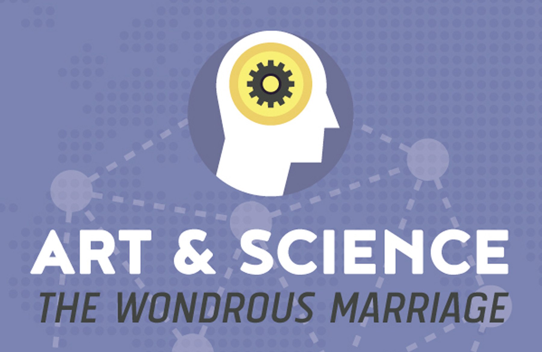
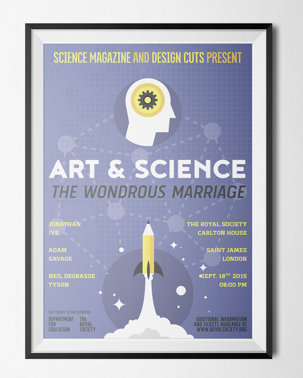
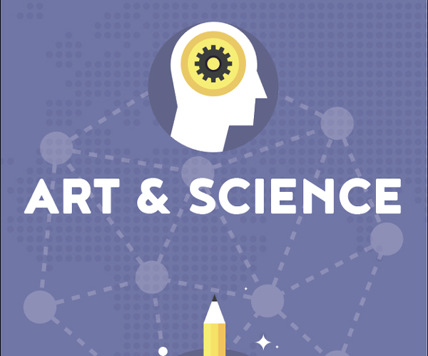
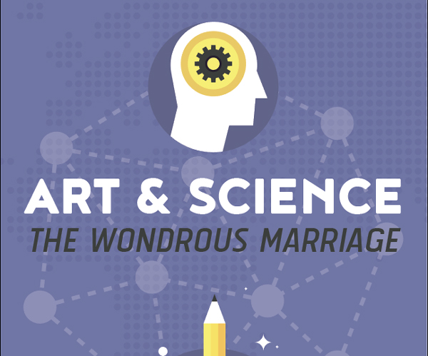
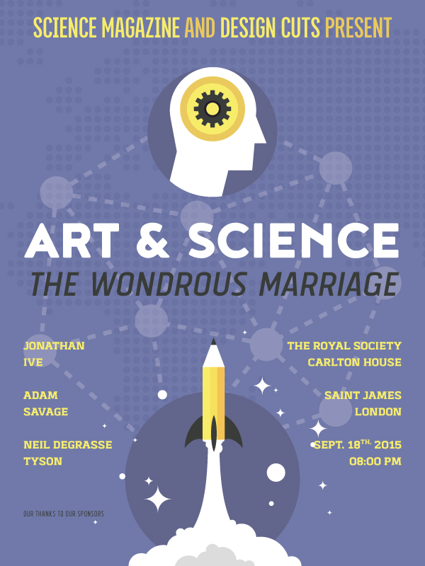
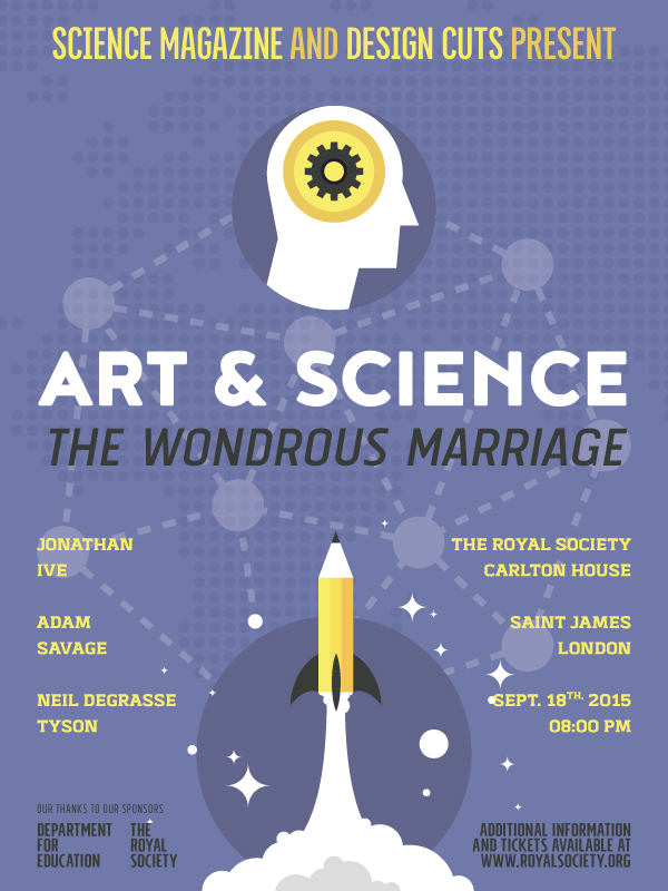
The (fictitious) event we need to promote is called “Art & Science / The wondrous marriage.” It is produced by The Science Magazine and Design Cuts.
It will feature three guest speakers: Sir Jonathan Ive (of Apple fame), Adam Savage (of Mythbusters and Tested fame), and Neil DeGrasse Tyson (of Cosmos and StarTalk fame).
The event will take place at The Royal Society which is located at Carlton House Terrace, in Saint James, London. The event is scheduled for September 24th, 2015, at 08:00 PM.
Finally, the Her Majesty’s Department for Education, along with The Royal Society, are sponsoring the event. Additional information and ticket purchase options can be found on the Royal Society’s website, royalsociety.org.
The resources we’ll use
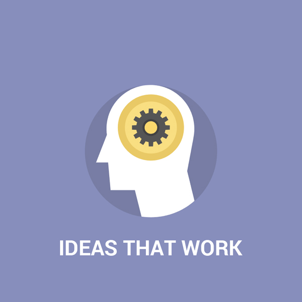
The main iconographic elements will be from Bloomua’s Flatty Icons 2.0 set (\bloomua\Bundle of Flatty Icons 2.0\AI). They are the “Ideas that work,” and the “Research” icons.

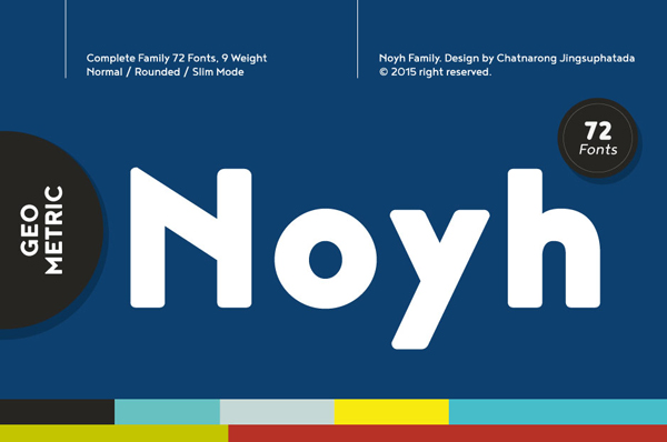
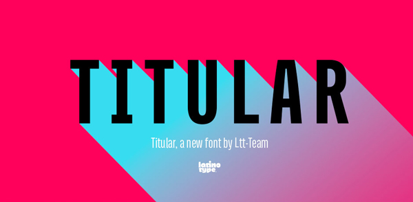
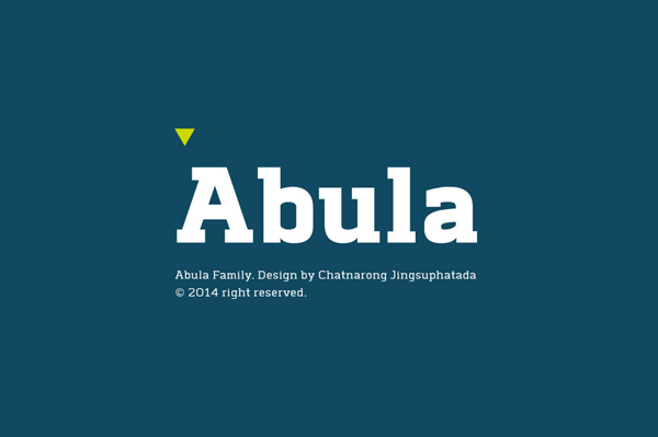
Noyh, Titular, Tolyer (No. 1, and No. 4), and Abula will be our typefaces.

We’ll extract a background element from the Flatty icon set as well.

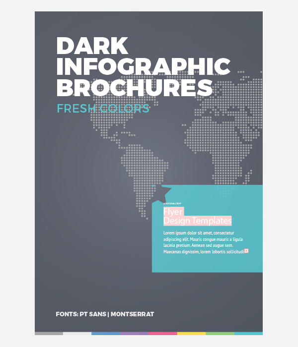
Finally, The Infographic Template Shop will provide us with a world map in a dot pattern asset that we’ll use to make our background less flat. We’ll find it in the \infographic-template-shop\Infographic-Brochure-1-Dark\AI folder.
STEP ONE: DOCUMENT SETUP
While our event is happening in the United Kingdom’s (Europe, and metric system), we’ll go back to our 18″x24″ canvas format. After all, two of the speakers will be flying from the USA, and the event needs to be promoted there as well.
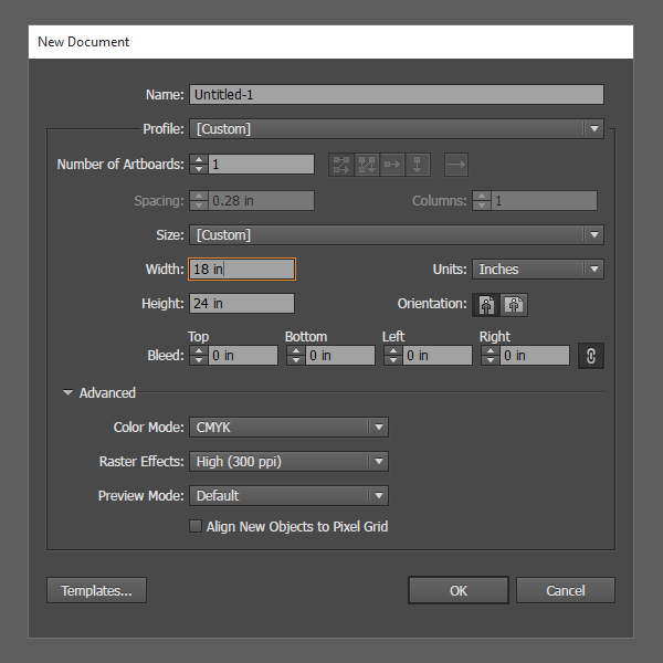
After creating the document, we’ll put guides in place to mark its center, as well as a 0.5″ zone around its edge.
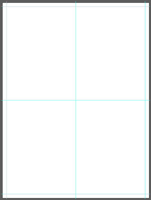
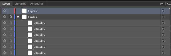
The guides are assigned their own layer, that we can then lock.
STEP TWO: THE BACKGROUND
There are three elements constituting our background:
- A solid color
- The dot map overlay
- The network element overlay
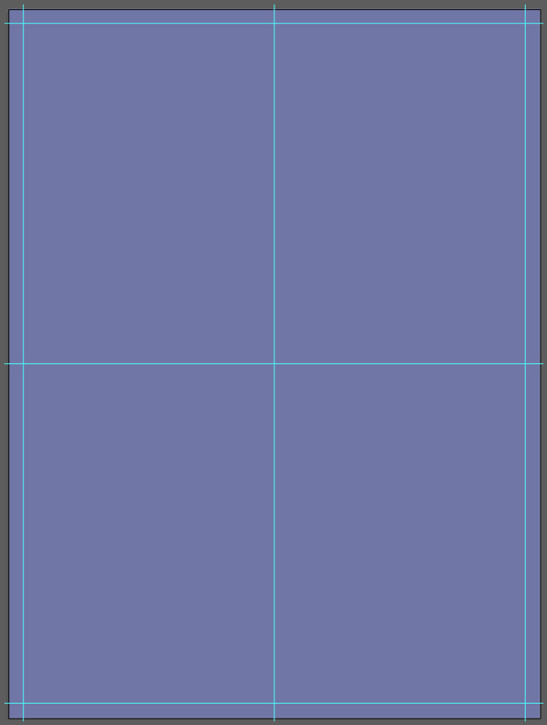
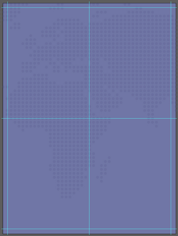
Let’s start with the solid color. The color palette we’ll use is a contrast-enhanced version of the icon’s color palette.
We need a centered rectangle, covering the full canvas, filled in medium purple (#7078A8).
Next, we’ll need to add in the world map (\infographic-template-shop\Infographic-Brochure-1-Dark\AI\InfographicBrochure1-Dark.ai). It is hidden in a clip group, towards the bottom of the layer palette.

After creating a dedicated sub-layer in our document, we can paste it in for adjustments.

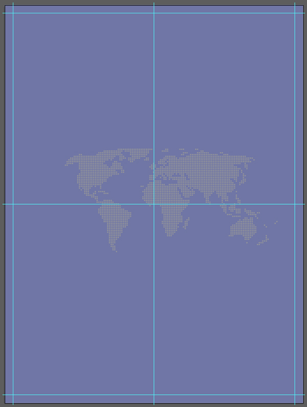
It then needs to be scaled up to 24″ tall, and its center point positioned to X: 7″, and Y: 12″. This will ensure that the group of dots representing the British Isles is visible within our composition.
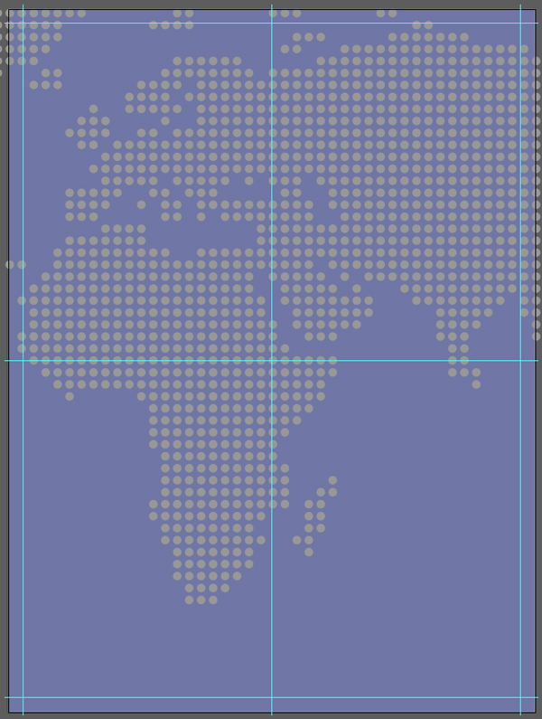

Last set of manipulations for the map: to change its color to the background’s (#7078A8), and its blending mode to multiply @ 15% opacity.
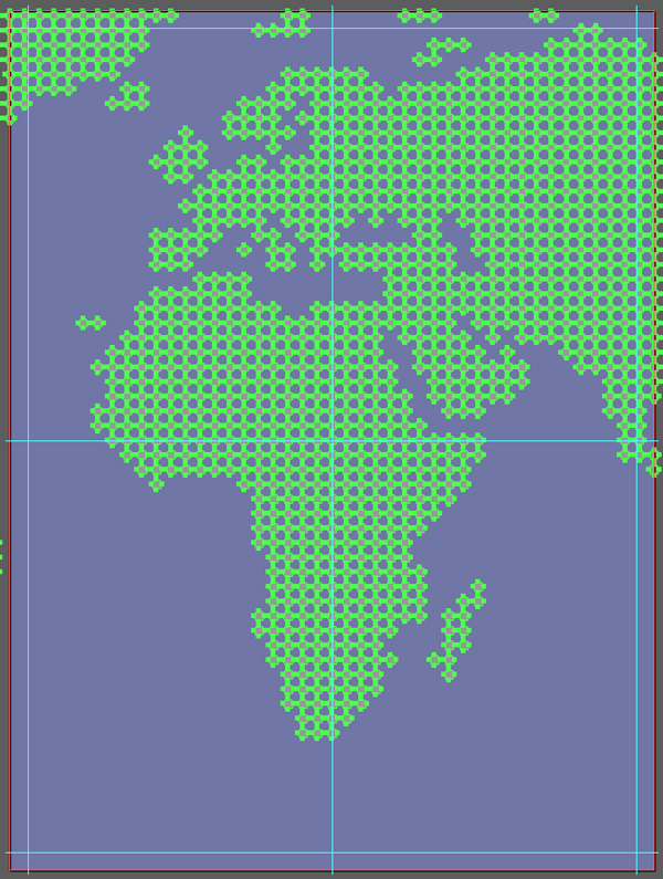
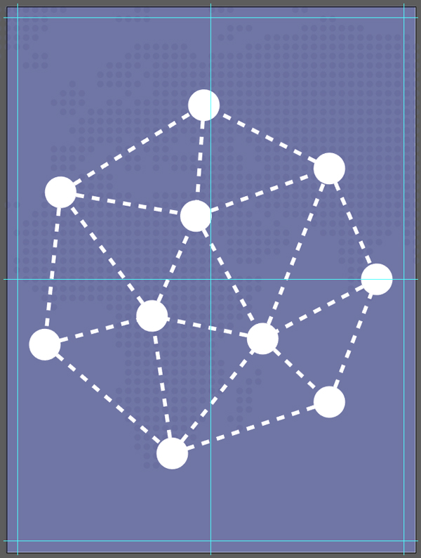
The next asset to put in place is the network motif. Just like before, we’ll give it its own sub-layer.
What interests us from the icon are only the nods and lines, not the supporting circle, or background, or type.

Once pasted in the appropriate layer, it needs to be centered in the canvas, and scaled up to 16″ wide.
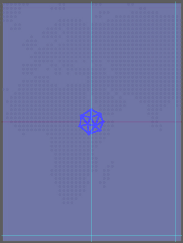
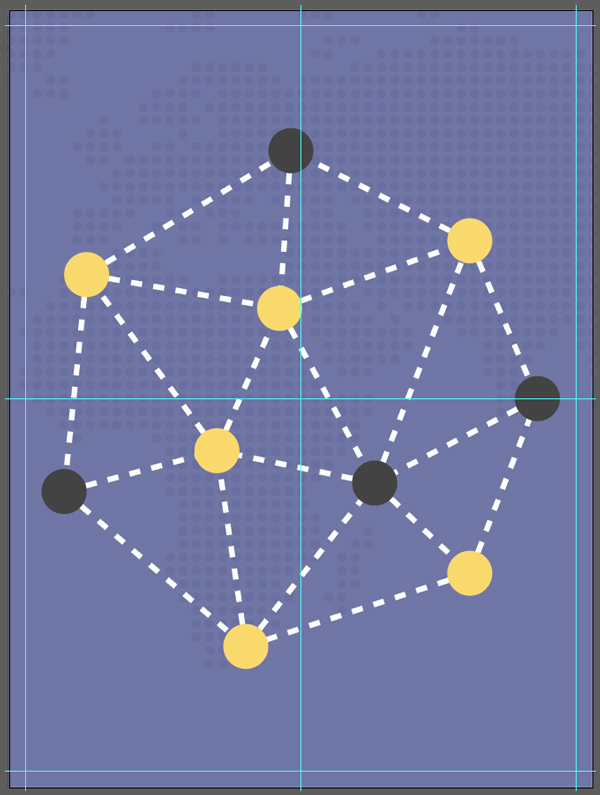
Its colors need to be changed to pure white (#FFFFFF), and its blending mode to screen @ 25% opacity.
And our background is done. Time to put the main iconography in place.
STEP THREE: ICONS
As stated before, we’ll use icons as illustration elements for the poster. But we will tweak them some, in order to personalize our poster.
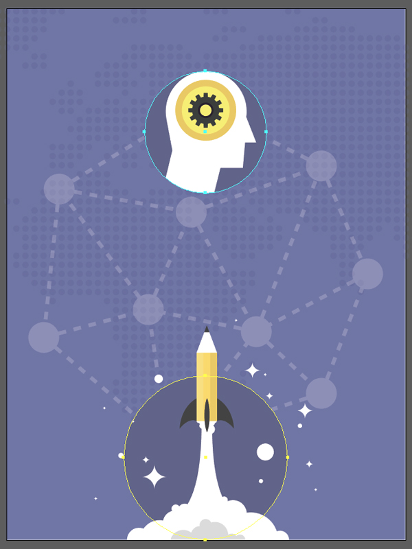
The first icon we’ll put in place is the “Ideas that work” one.
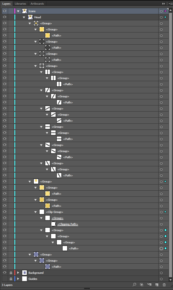
As with the background elements, we are going to give each icon its own sub-layer.
Let’s start by copying the icon and its supporting circle only (not the type nor the supporting square).

It needs to be pasted scaled up to 5.5″ wide, and positioned at X: 9″, and Y: 5.6″.


From there, we need to flip the icon on its vertical axis, so its gaze is oriented to the right (Right click menu > Transform > Reflect).
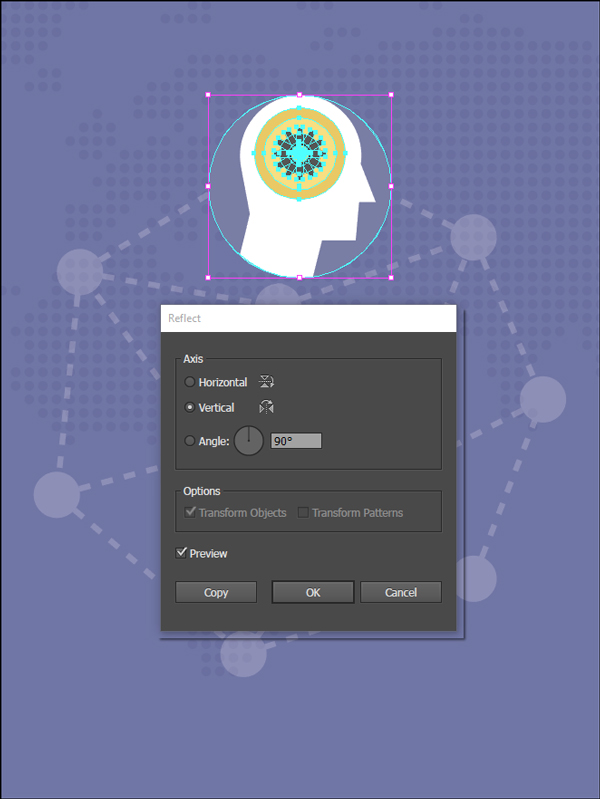
Finally, we need to tweak its colors some to make it “pop” more within our composition.
The icon’s supporting circle needs to be switched to a darker purple, #61648B.

The light yellow needs to be changed to an even lighter, more saturated yellow, #FAEA6C (the inner rim around the gear).


The gear’s main shape needs to be changed to a darker grey, #393B39.

Finally, the gear’s small inner rim needs to be switched to a very dark grey, #241D2B.

And with that, the head icon transformation is complete. We can now tackle the rocket icon.
It needs a dedicated sub-layer as well.
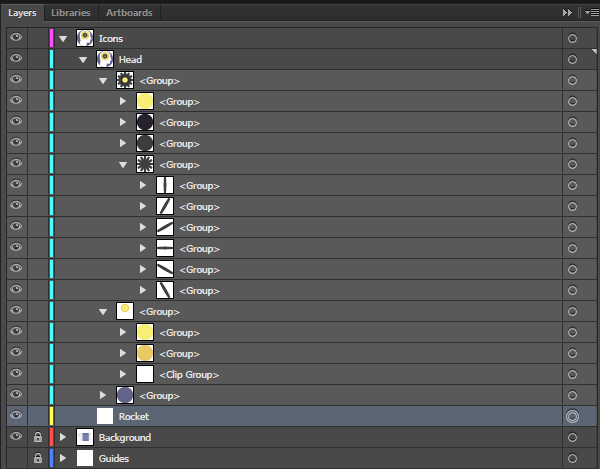
Just as before, only the icon needs to be copied and pasted over in our new document.


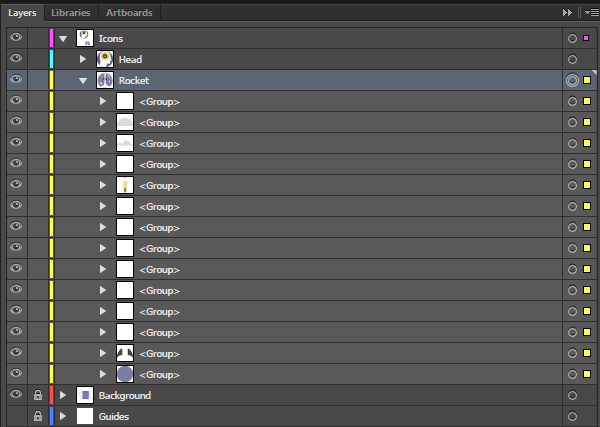
Its placement will be two fold. First, we need to bring it to X: 9″, and Y: 24″, but using its bottom center point as reference for the coordinates.


Next, we need to increase the size of the icon’s supporting circle, to 7.4″ tall, still using its bottom center point as the reference for the transformation.
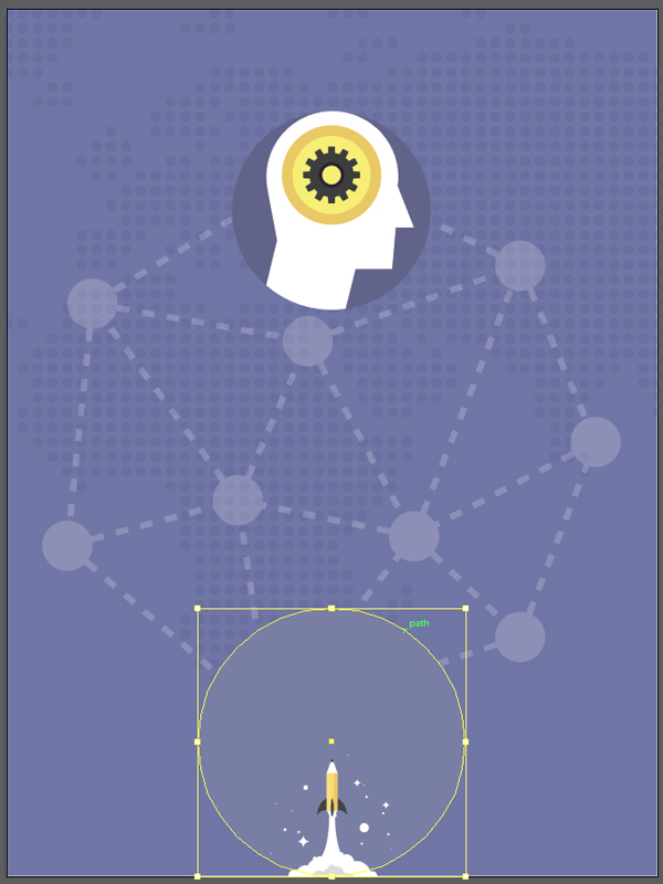

Next, we can scale the rest of the icon (the rocket itself, the clouds of smoke, and the stars) to 10″ tall, still using the bottom center point as the reference.
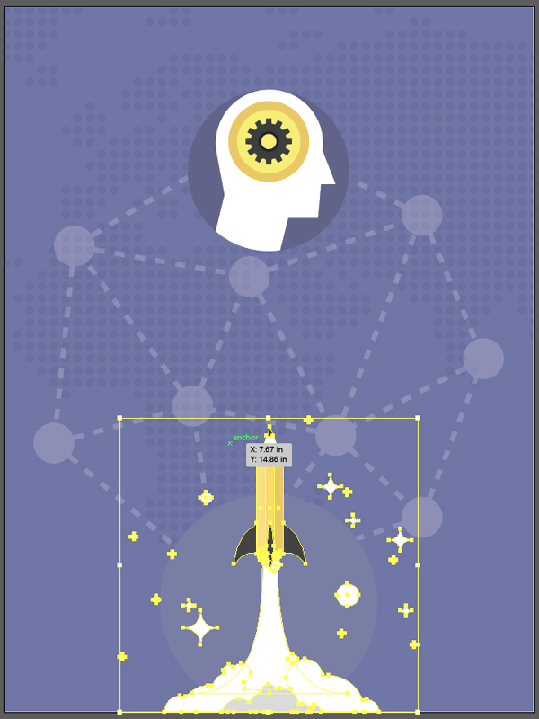

From there, it’s time to adjust the colors on this icon as well.

We can sample the color of the supporting circle from the first icon.
The rocket’s tip and fins are to be switched to the same dark grey as the main gear shape.

The left strip of the rocket is changed to a bright yellow, #FAEA6C.
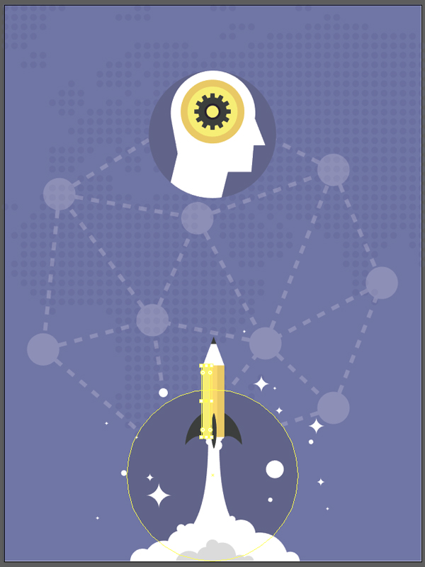
The center strip of the rocket stays the same. The right strip of the rocket is changed to #F2C456.

Now that the colors have been addressed, we can move to type!

STEP FOUR: TYPE ELEMENTS
There are a series of type elements throughout the piece, as stated in the detailed brief earlier:
- The producer line (Science Magazine and Design Cuts present)
- The main title (Art & Science / The wondrous marriage)
- The additional information blocks
- Speakers
- Location/date/time of day
- The sponsor’s block
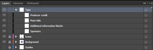
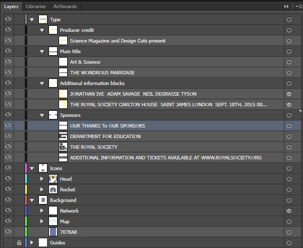
Each of these four elements should receive its own sub-layer. This will help to keep our file structured.
Producer’s credit
The copy reads Science Magazine and Design Cuts present. It’s set in Titular Bold, in all caps, that’s 96 points tall. The text element is centered, and its kerning set to optical.

Color-wise, the block of text is set in #EAC95D, with Science Magazine and Design Cuts highlighted in #F9E96B (the dark and light yellows of the head icon).


Finally, the text block is positioned at X:9″, and Y: 0.5″, with the reference point being the middle top point.


The main title
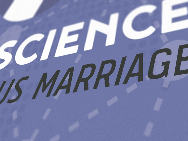
Art & Science is written in all caps, set in Noyh Black, that’s centered, 186 points tall, with kerning set to optical, and colored in white.

The text block is located at X:9″, and Y: 10.25″.

The wondrous marriage is set in Tolyer No.1 Italic, that’s 144 points tall, with kerning set to optical, and colored in the same dark grey as the rocket’s fins. The text block is placed at X:9″, and Y: 12″.

Additional information blocks
There are two blocks, one of them with the speakers’ names, and the other with the when/where information. The only difference between them is their alignment (one to the left, and one to the right).
The blocks are set in Abula Black, in all caps, that’s 42 points tall, with kerning set to optical, and colored in the gear’s bright yellow (#F9E96B). The left text block is placed with its left edge flush with the left edge of the Art & Science title element, and the top of the block located at Y: 14.5″. The right block mirrors that.
The left block reads “JONATHAN/IVE // ADAM/SAVAGE // NEIL DEGRASSE/TYSON”


The right block reads “THE ROYAL SOCIETY/CARLTON HOUSE // SAINT JAMES/LONDON // SEPT. 18TH, 2015/08:00 PM”


The sponsors
That block is made of four elements as well.
- “Our thanks to our sponsors” message
- Department/for/education
- The/Royal/Society
- Additional information/and tickets available at/www.royalsociety.org
Our thanks to our sponsors is written in all caps, set in Tolyer No.4 Regular, that’s 24 points tall, with kerning set to optical, and colored in the same dark grey as the rocket’s fins.
The text block is placed left side flush with the main title, and guest speaker elements, and Y: 22″, with the bottom left corner being the point of reference.

Department/for/Education is written in all caps, set in Tolyer No.4 Medium, that’s 36 points tall, with kerning set to optical, and colored in the same dark grey than the rocket’s fins.
The text block is placed left side flush with the main title, and guest speaker elements, and Y: 23.5″, with the bottom left corner being the point of reference.


The/Royal/Society is written in all caps, set in Tolyer No.4 Medium, that’s 36 points tall, with kerning set to optical, and colored in the same dark grey as the rocket’s fins.
The text block is placed at X: 3.5″, and Y: 23.5″, with the bottom left corner being the point of reference.
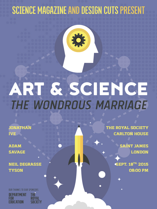

Finally, Additional information/and tickets available at/www.royalsociety.org is written in all caps, set in Tolyer No.4 Medium, that’s 36 points tall, with kerning set to optical, and colored in the same dark grey as the rocket’s fins.
The text block is placed right side flush with the main title, and Y: 23.5″, with the bottom right corner being the point of reference.


And with that, our poster is complete!
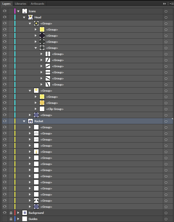
Here’s a last look at the layer stack.
WRAPPING THINGS UP
I can’t believe we’re already done! On the other hand, it shows that these resources can be a tremendous time saver for designers. A fast designer is a designer that can have more customers, and therefore more revenue and/or more time to focus on his/hers own pursuits.
I hope that you’ve had as much fun going through the tutorial than I had writing it, and that your outcome fulfils the goals you set up when starting.
Did I leave anything unclear? Any suggestions? Don’t hesitate to reach out in the comments below! The Design Geeks and myself will be happy to help out.

We’d love to see your tutorial outcomes! Please share them with us on the Design Cuts Facebook page. We’ll share the best ones with the whole community.
The contemporary creative design collection is available for a few more days, for an staggering 98% off its original price. Don’t miss out! If you already purchased the collection, I hope you enjoy your new assets, that they’ll be real time savers, and that this tutorial gave you a sense of what you’ll be able to accomplish with them.
And on that note, that’s it for me! Until next time, cheers!
Hi!
I could not find the template you are using, could you please tell me more spesific where i could find it.
Morten
Hello Morten!
This isn’t a template, but a poster put together using the resources of the contemporary creative design collection (https://www.designcuts.com/product/contemporary-creative-design-collection). We used the included icons, typefaces, and other assets to compose this poster.
I will use the icons from this deal for my impending business page :)
Sweet! Don’t hesitate to share it with us on the Design Cuts Facebook page.
Honestly, you use my font better than me LoL.
Hand down for your design skill :-DD
Hey Chatnaong,
Wow- that is high praise indeed and i know Simon will be honoured to hear your super kind words :).
Your fonts are so beautiful and we are so happy to be able to use them for this tutorial!
Ha, thank you! I’d love to work on more stuff with your typefaces!
Thank you thank you thank you! I originally purchased this bundle solely for the fonts, but this tutorial made me realize the value of all those many icons (which aren’t in my normal style). Time to go look at those in more detail…
Hey Sarah, thank you for your kind words. I totally agree — I use to overlook icons as well, and for the longest time. Now, since the trend is to create some nicely detailed ones, there’s plenty that’s possible to do with them.
Cheers, and don’t hesitate to share your outcome here, or on the Design Cuts Facebook page. I’d love to have a look at it.
Love the concept and execution, Simon. I really like how you showed the versatility of the icons in the bundle. Was going to pass on this one, but will now have to give it a second thought.
Good stuff!
Hey Chris, thank you for the kind words. I’m as impressed by these icons as you are.
More and more, when icon packs come out, I go through the mental exercise of imagining some of them as illustrative elements for posters, flyers, etc. If the icons pass the test, then the pack is worth purchasing.
Also, the typefaces in the bundle are worth the purchase alone – they are super extended families, and I’m already exploring other uses for them.