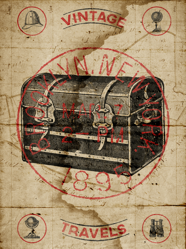
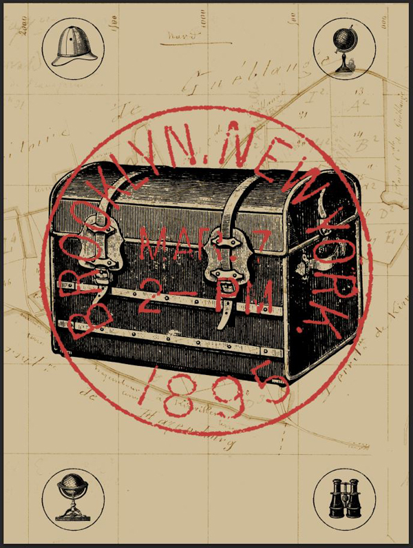
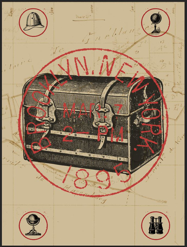
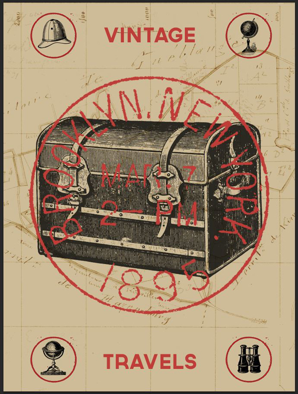
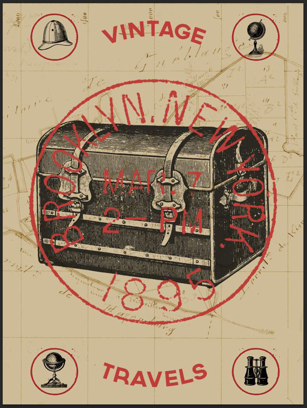
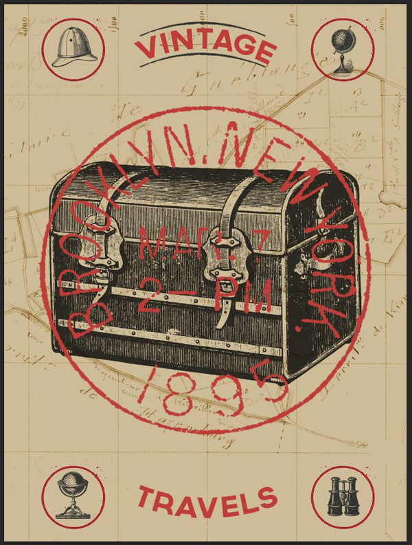
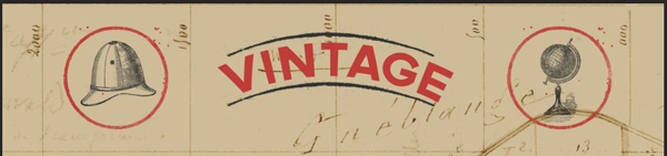
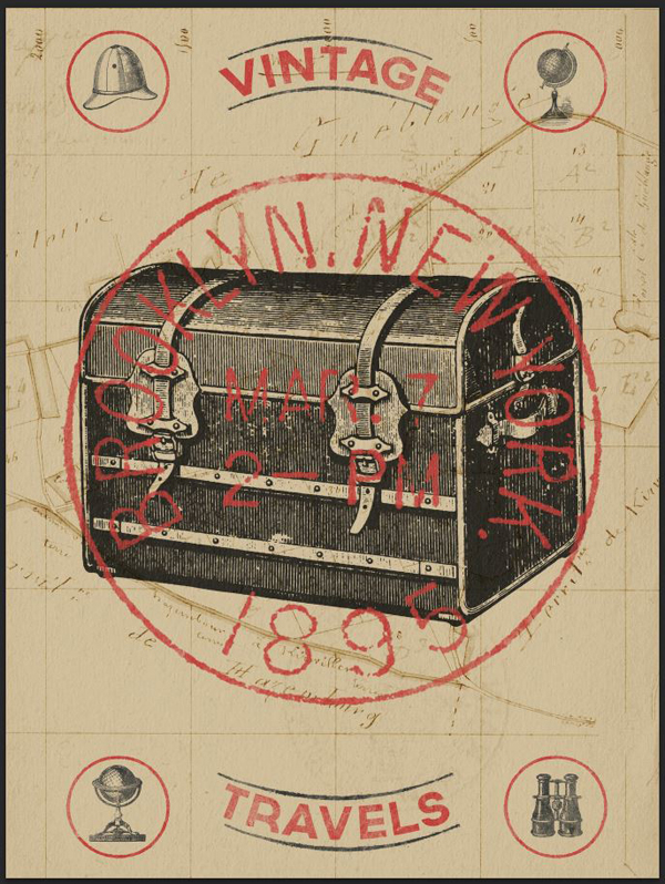
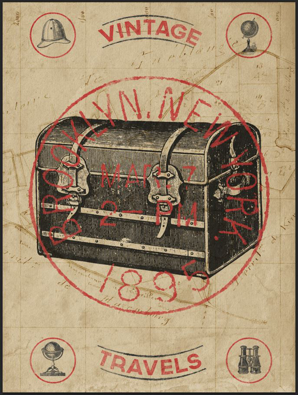
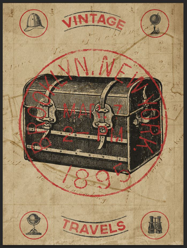
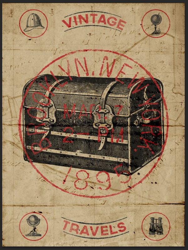
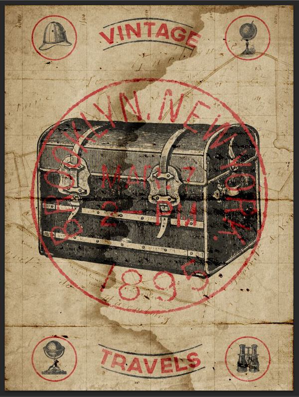
WHAT WE’RE CREATING:
Hey Design Cutters, Simon here!
Today I’m really excited to show you how to use your new vintage resources, to create an authentic old time travel poster. We’ll be looking at plenty of fun techniques, from extracting vintage objects from their backgrounds, to applying tons of grungy textures, and bringing your entire piece together.
Let’s get started shall we?
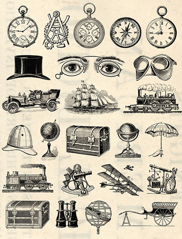
AN EXTENSIVE LIBRARY OF REAL VINTAGE ELEMENTS
What’s interesting with Design Cuts’ latest bundle is that it’s filled with REAL vintage assets. These are not just elements that were drawn or created to look vintage, they’re the real deal. So we’re talking about stuff that was created, and released before the turn of the last century. That means that we can make use of all the artifacts that come along with that: not so precise printing, aged paper textures, 100+ year-old wear and tear, etc.
While this is great, one of the biggest challenges we’ll face when using these resources will be to extract just the element we want for our piece. Don’t be afraid, there’s a technique for that. Other than that, we’ll have loads of fun with textures, type, and all the rest.
BEFORE WE GET STARTED
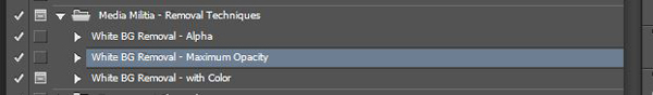
Before we get started, I need you to grab a very helpful set of Photoshop actions. They were created by the good folks at Media Militia, and are free.
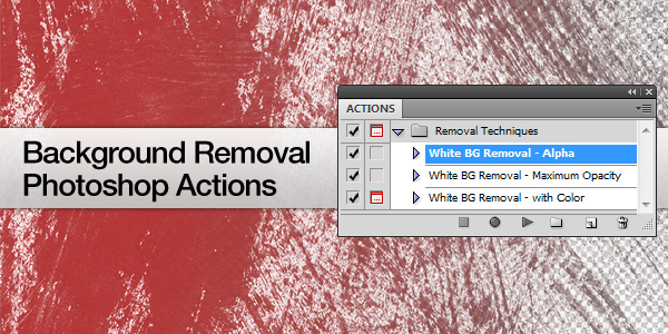
These actions allow to quickly and efficiently remove the white background of some of the assets we’ll use for our composition. Will just a bit of careful masking, the use of the level palette, and this actions, you’ll be able to extract just that one element you’d like to use in your piece. They are a set of very useful tools.
Consider reading the accompanying post, as it contains background information on what the actions leverage to work, and on how to install them.
Once you have the actions set up, we’ll be ready to get started!
STEP 1: CONCEPTUALIZATION
The layout
In my case, a complex piece always starts the same way: with pens and a piece of paper.
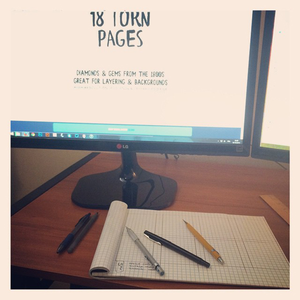
Using analog tools to quickly create generate ideas allows me to come up with so many more concepts than just dabbling with tools in Photoshop. I highly recommend doing this versus diving straight onto the computer. And I’m not the only one, there has been plenty of literature on the subject (#1, #2, and #3).
After 15 to 45 minutes of browsing the bundle’s content and brainstorming, I came up with 8 primary ideas.
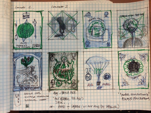
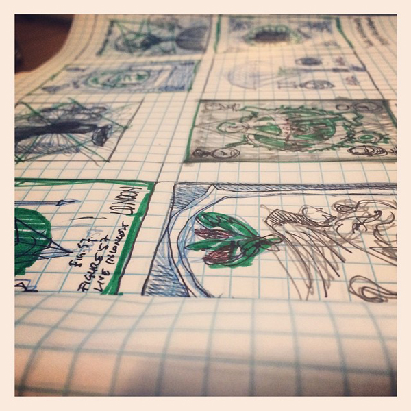
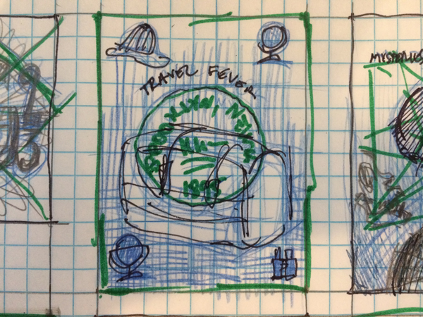
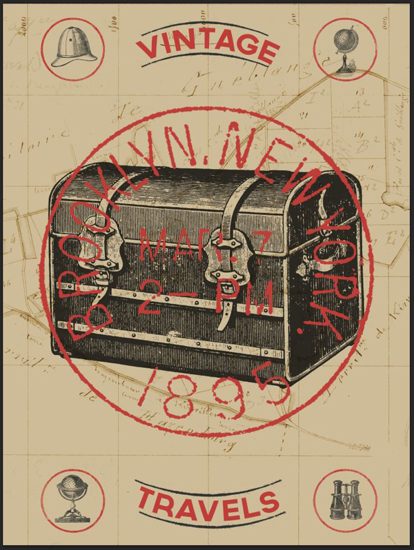
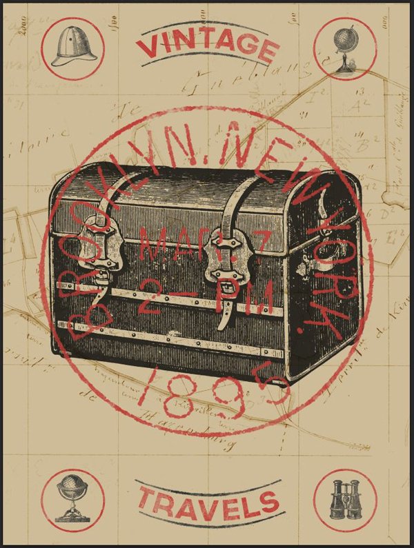
Today, we’ll focus on this one. It’s a poster inspired by some of the travel-oriented assets found in the bundle: globes, maps, and trunk.
The primary assets we’ll use
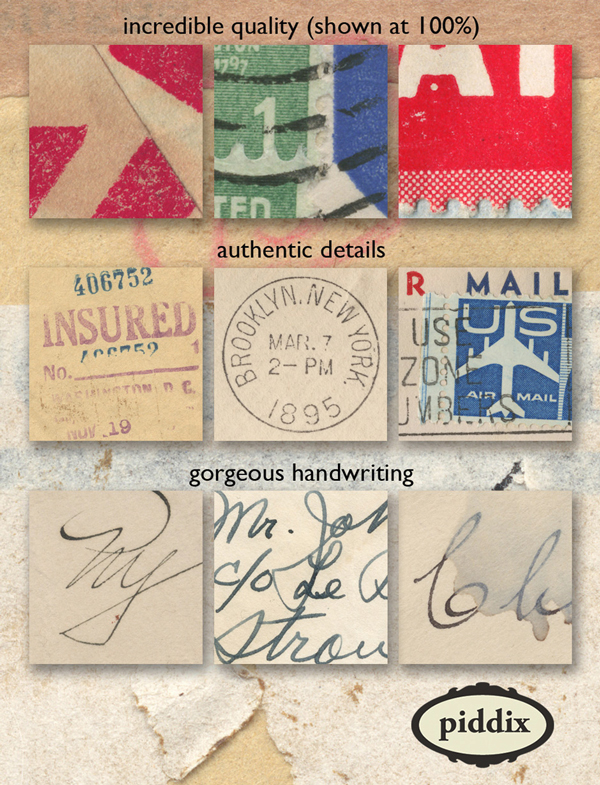
Here’s a quick rundown of the main assets we’ll use for the poster.
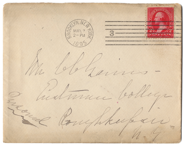
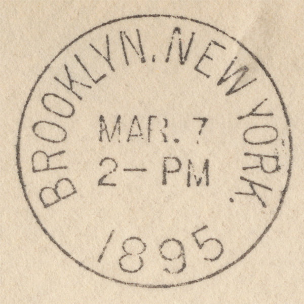
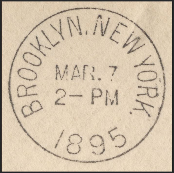
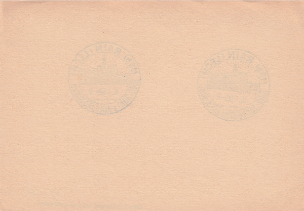
1. This vintage envelope, for its cool postage stamp
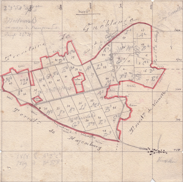
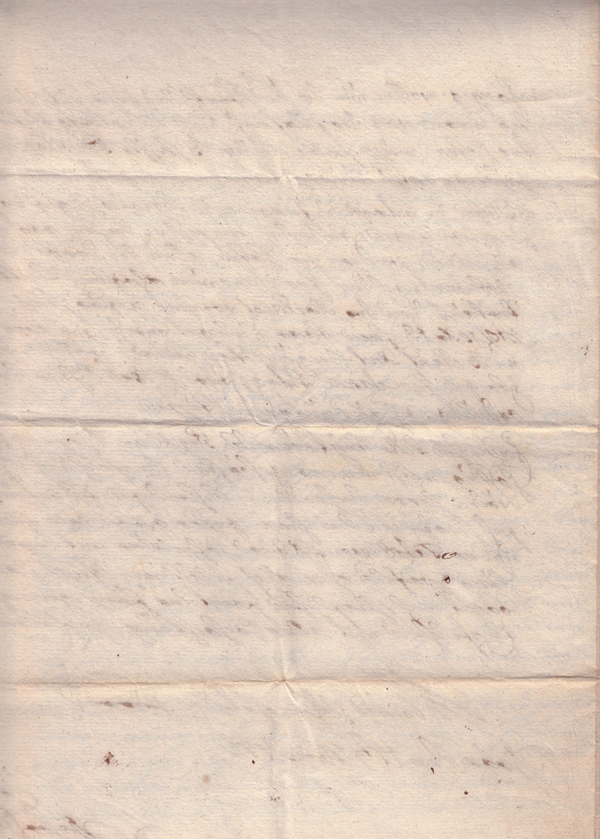
2. This XIXth century map of Kirviller, a French village in north-eastern France
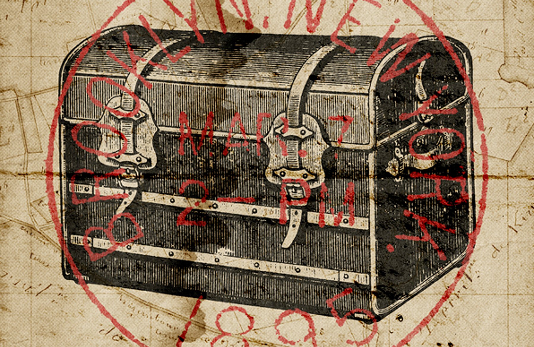
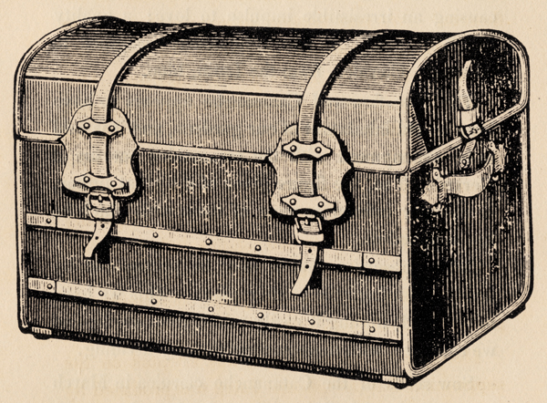
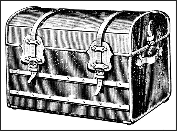
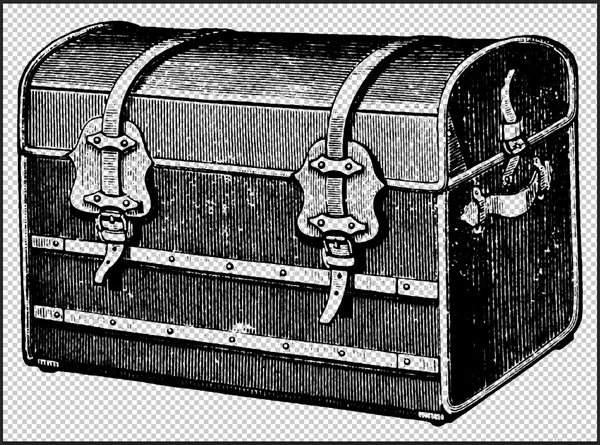
3. This old engraving of a travel trunk
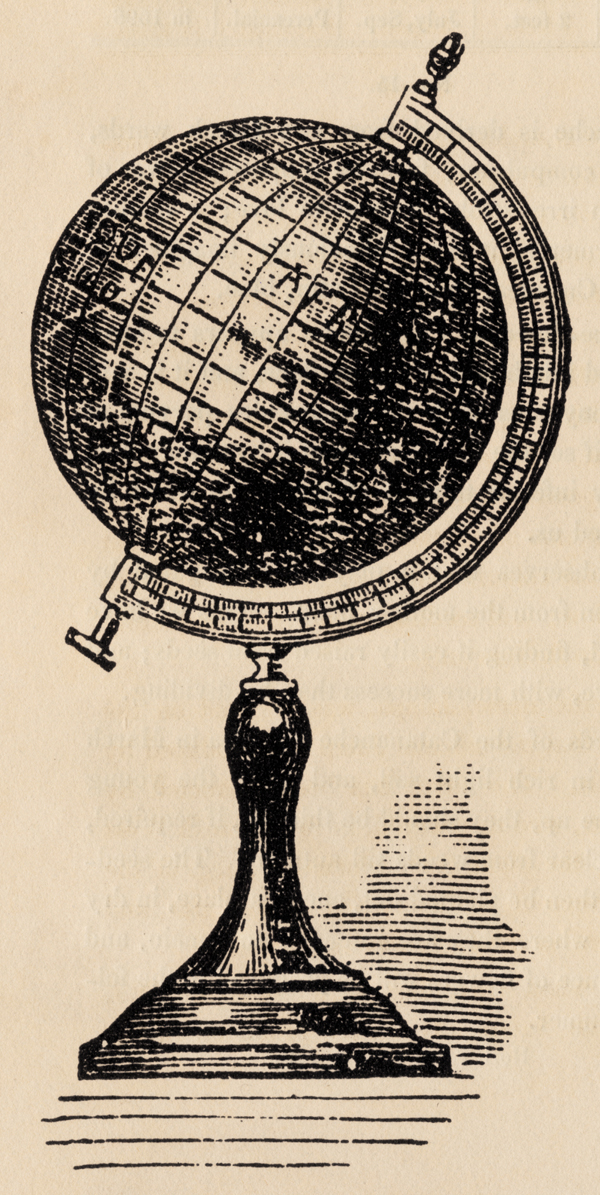
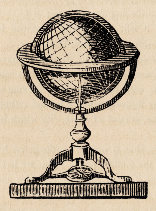
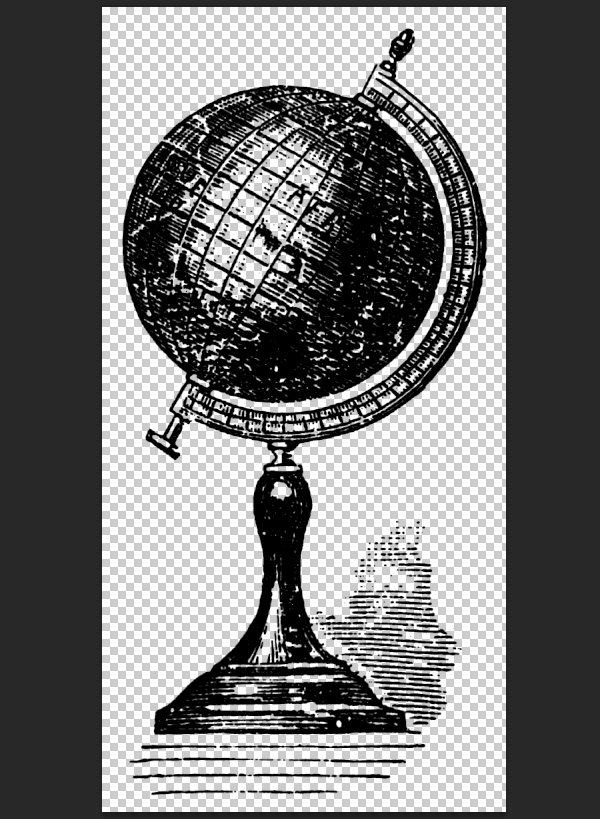
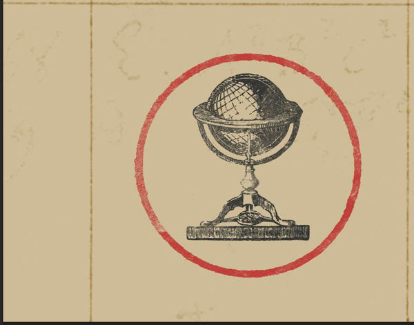
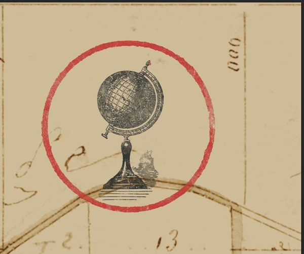
4. These engravings of old globes
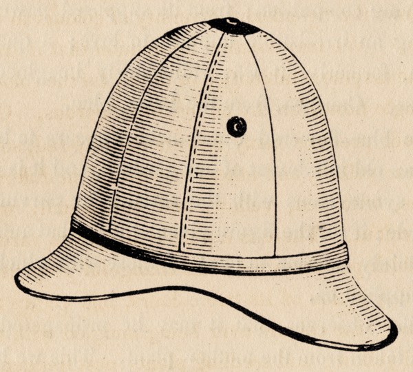
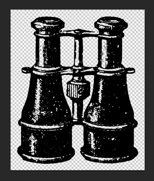
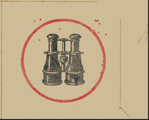
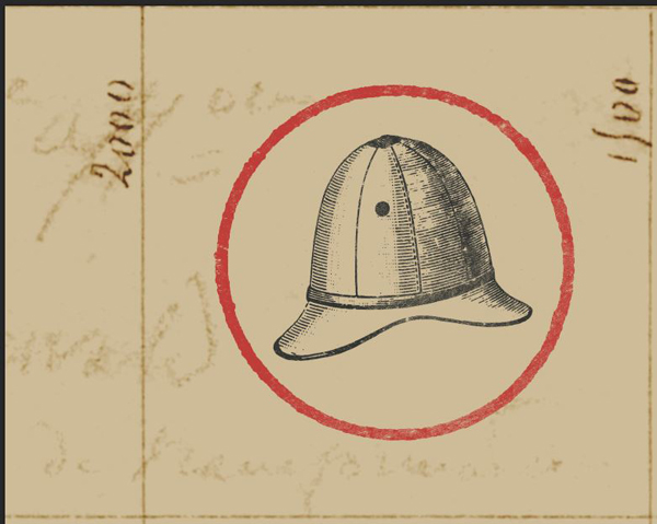
5. These engravings of an colonial hat, and of binoculars

STEP 2: COLORS
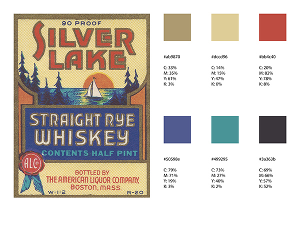
We should talk about the color scheme of our future poster now. In order to get a convincing retro feel for our piece, we’ll grab our colors straight from the source. The bundle features a collection of matchbox tops, and adult beverages labels. It’s time to get the eyedropper tool out, and to sample colors away!
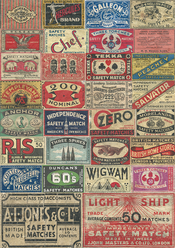
Printing techniques weren’t as diverse as today, or as accurate as today, over a hundred years ago. Printing wasn’t a commodity the way it is now either. This explains why we typically see old labels featuring less colors than today: it was cheaper, faster, and presented less opportunities for a misshape. The artists had to be quite creative to convey often times complex compositions with a reduced array of colors.
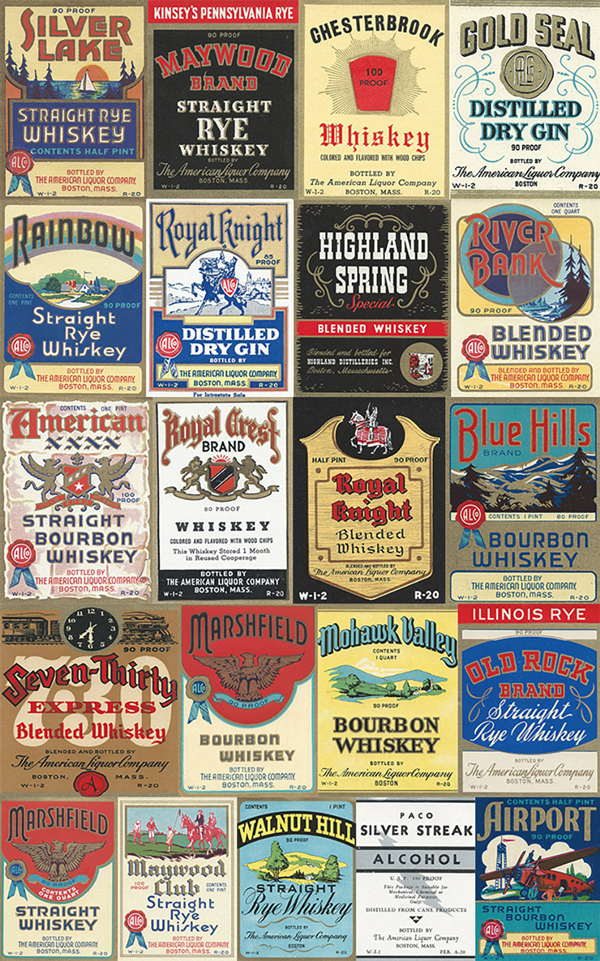
I went through both packs of labels, and selected a few. I created my color palette from there, sampling colors that faded because of real exposure, and not thanks to a vintage filter.
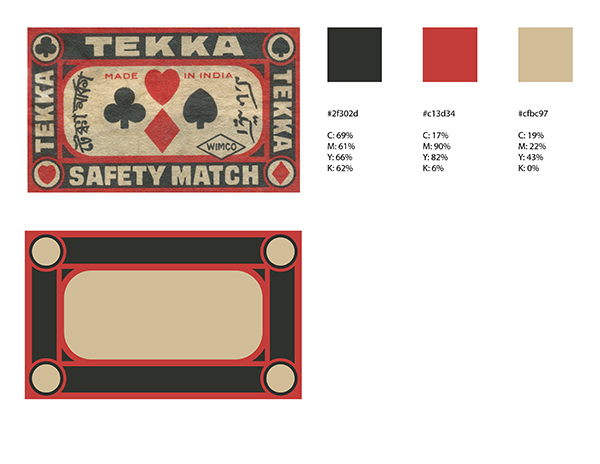
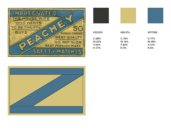
We’ll use the first color scheme. Our piece will have a light background, so the textures can shine through our tan color (#cfbc97), with dark iconography (off-black – #2f302d), and with a bright highlight color (faded red – #c13d34).
STEP 3: PREPARING THE ASSETS
Now that we know our general layout, and how our colors are going to flow, we can start preparing our assets for the piece. This is the step in which we’ll extract the various elements we want to use in the piece from their white background.
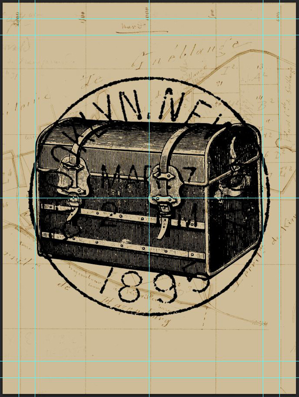
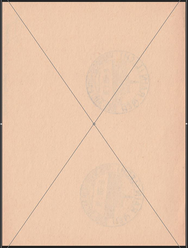
The postage stamp will be the most demanding of all. This is because it isn’t passed on to use on a white background.
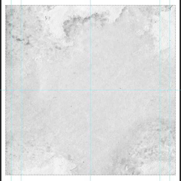
Start by opening up the envelope’s file (AirMailEnvelopes_12953_piddix.jpg).
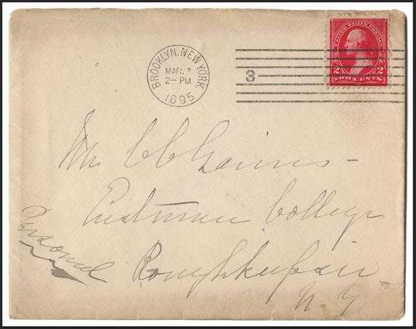
Select the stamp.
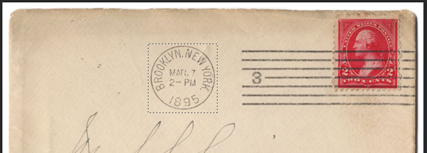
Crop the image (Image > Crop).
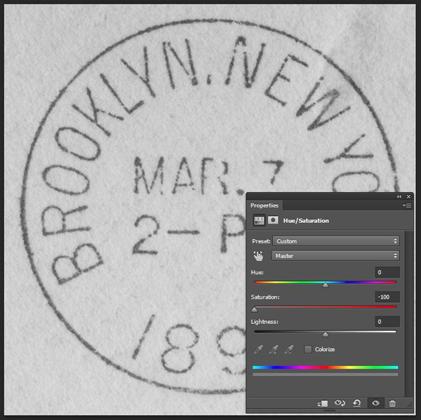
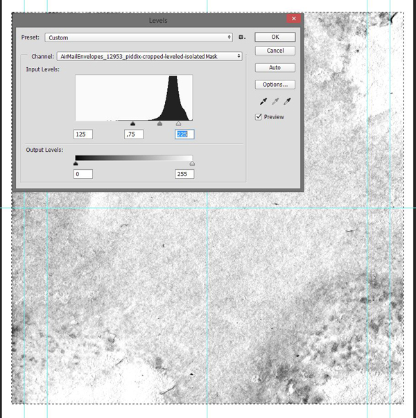
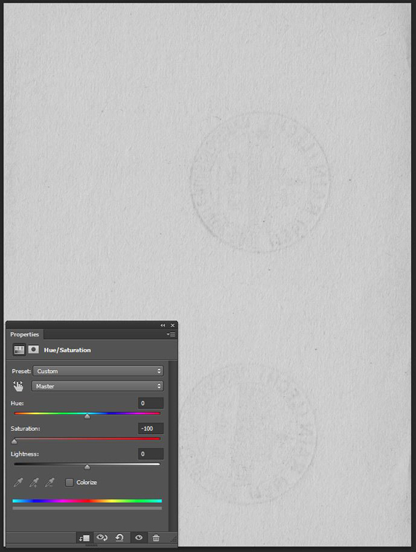
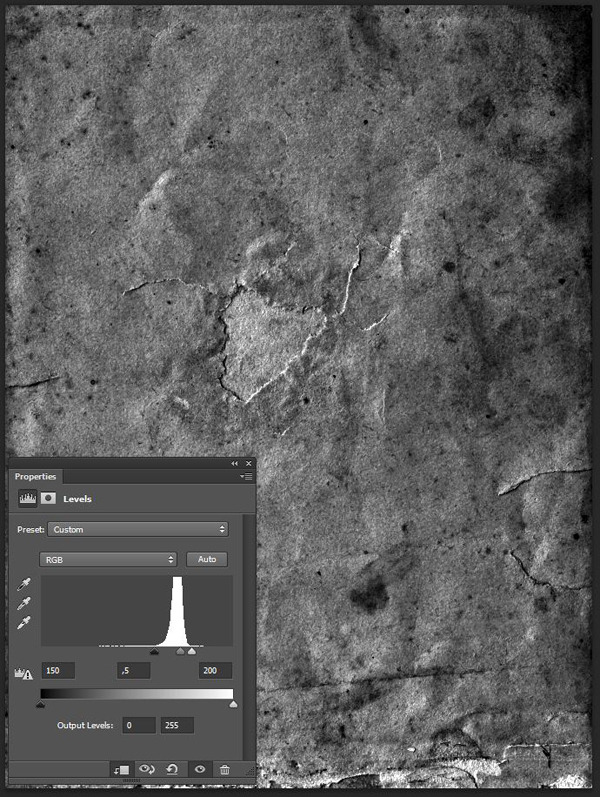
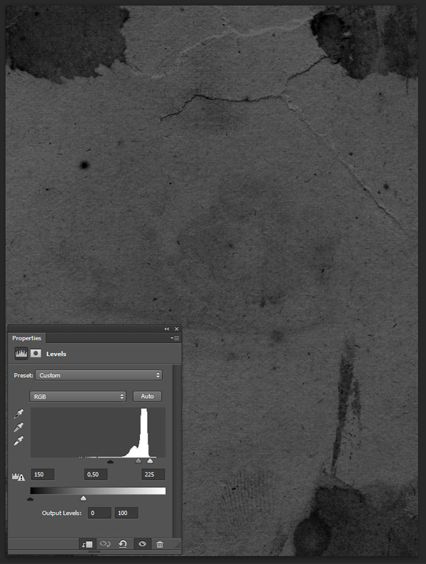
Convert the locked background layer to an independent layer by double-clicking on it. Use a hue/saturation adjustment layer to desaturate the image.
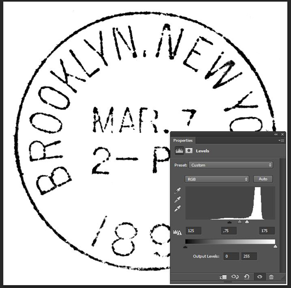
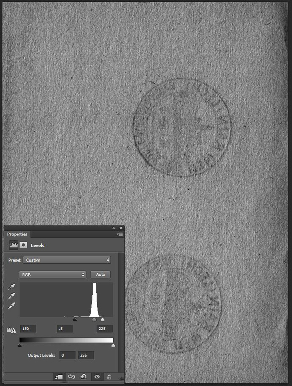
Finally, use a levels adjustment layer to “wash out” the paper texture behind the stamp.
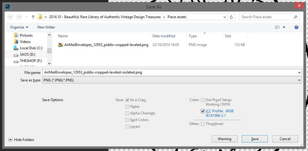
Once that’s done, save this file in a safe place – we might use it again later. I created a Piece assets folder in which I’m placing all of source assets to have them at hand while I’m designing. Save also a flattened copy of the leveled stamp for our next step. The format doesn’t matter (JPG or PNG), as long as the image properly flattened.
Once you have the flattened image ready, open it.
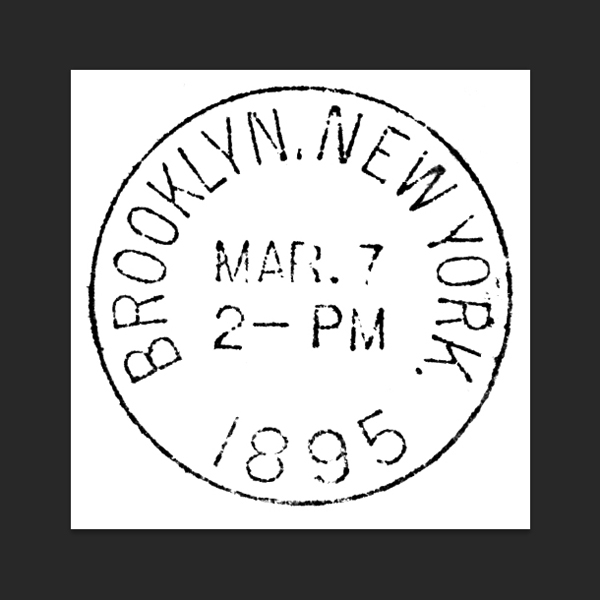

The next step is to run one of Media Militia’s actions. I personally like White BG Removal – Maximum Opacity the most, as it offers a good ratio between background removal and opacity left to the elements that are kept.
Once the action has run its course, we’re left with our element on a transparent background. Victory!
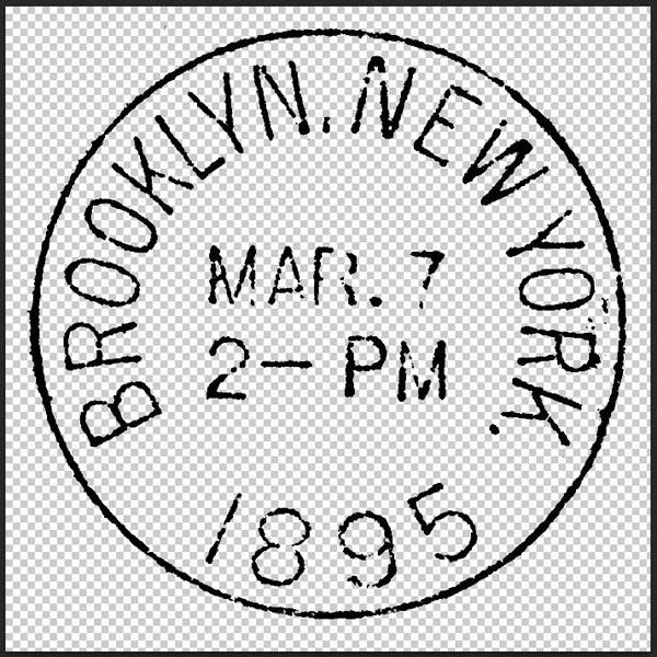
Save the cropped, and isolated stamp as a PNG in your assets folder.
One more version we need to save of that stamp is one featuring only the ring of the stamp.

From there, simply repeat the background removal process on the other assets (trunk, globes, hat, and binoculars). Save the result as transparent PNGs in that asset folder. I’d suggest to start from the white background version of the asset, as you won’t have to fiddle with levels.


Now that we have all of our assets ready, we should probably get started, like, for real.
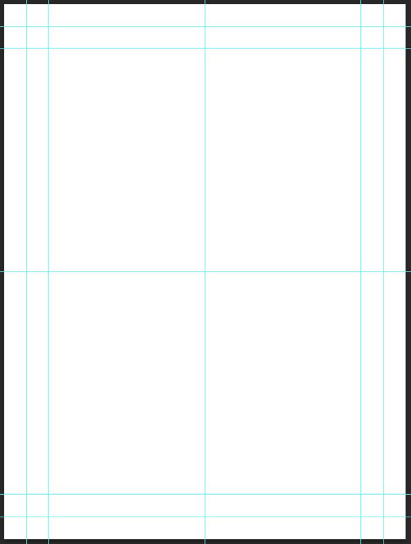
STEP 4: DOCUMENT SETUP
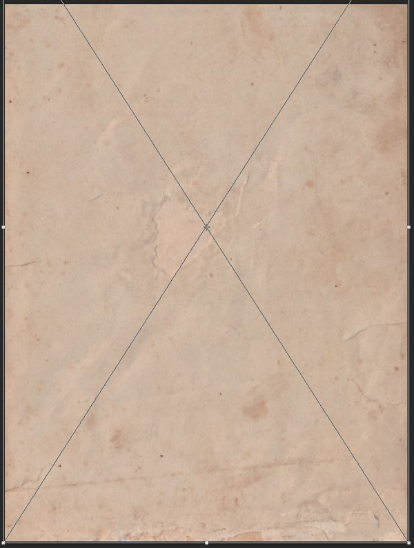
I’m working with an 18″x24″ canvas, at 300 dpi (RGB).
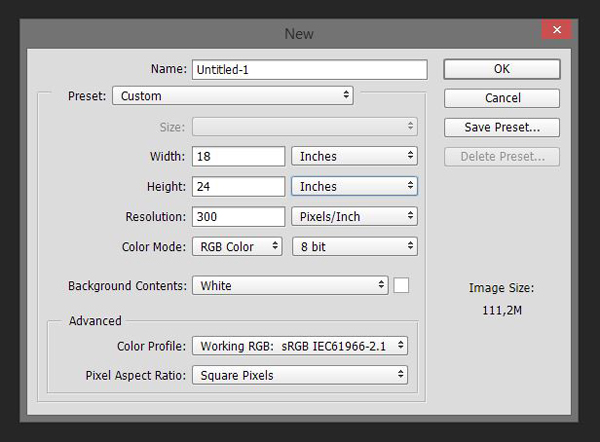
I’ve placed a few guides for reference. I’m marking the center of the canvas, a border at 1″ from the edges, and another one at 2″ from the edges.
STEP 5: THE BACKGROUND
Start by filling the background with our tan color (#cfbc97).

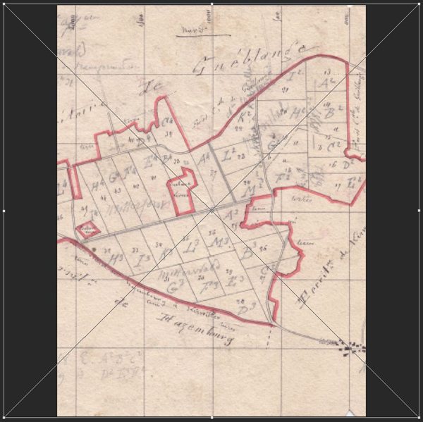
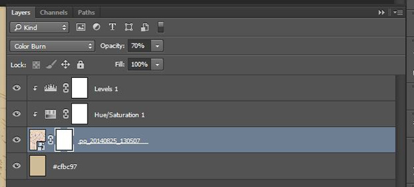
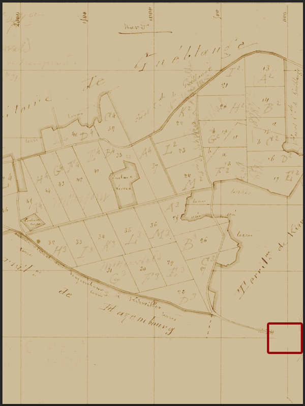
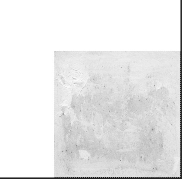
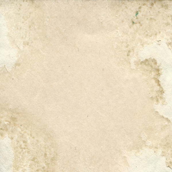
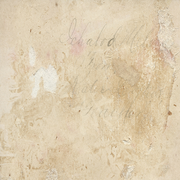
Next, locate our map (po_20140825_130507.jpg) in \Authentic-Vintage-Magic-tees\Vintage Texture Pack4.

Place it in your document. Don’t forget to keep it as a smart object, as we’ll try ot keep a workflow as non-destructive as possible.
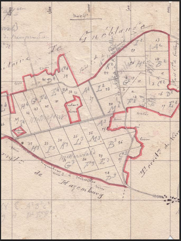
Desaturate it with a clipped hue/saturation adjustment layer.
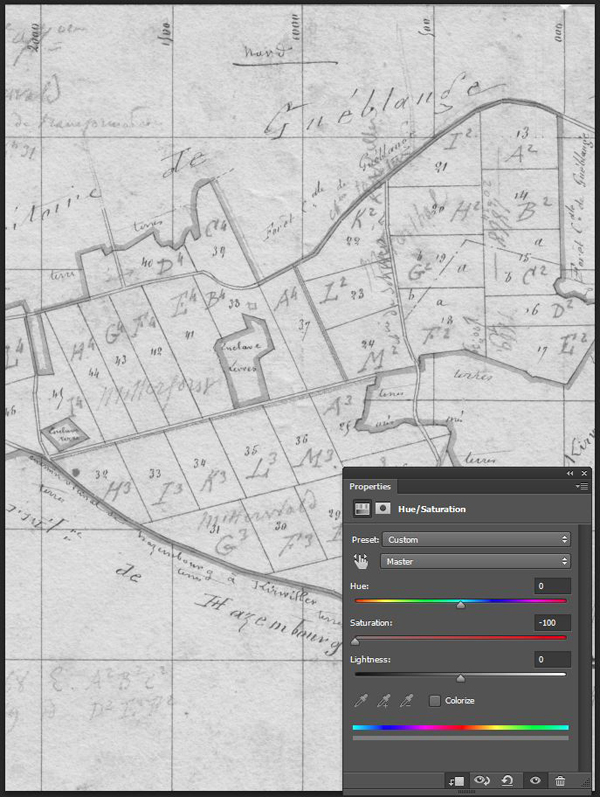
Adjust its contrast thanks to a clipped levels adjustment layer.
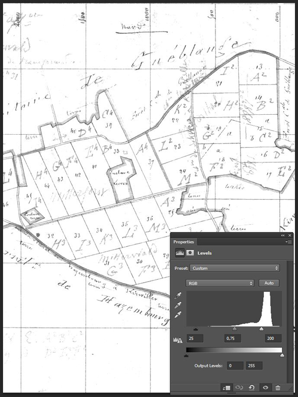
Change its blending mode to Color burn @ 75% opacity.
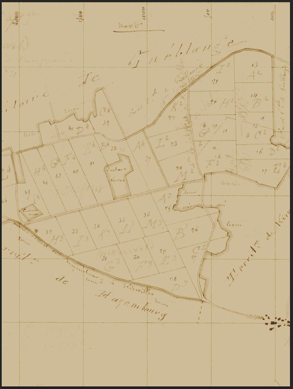
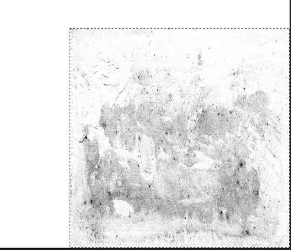
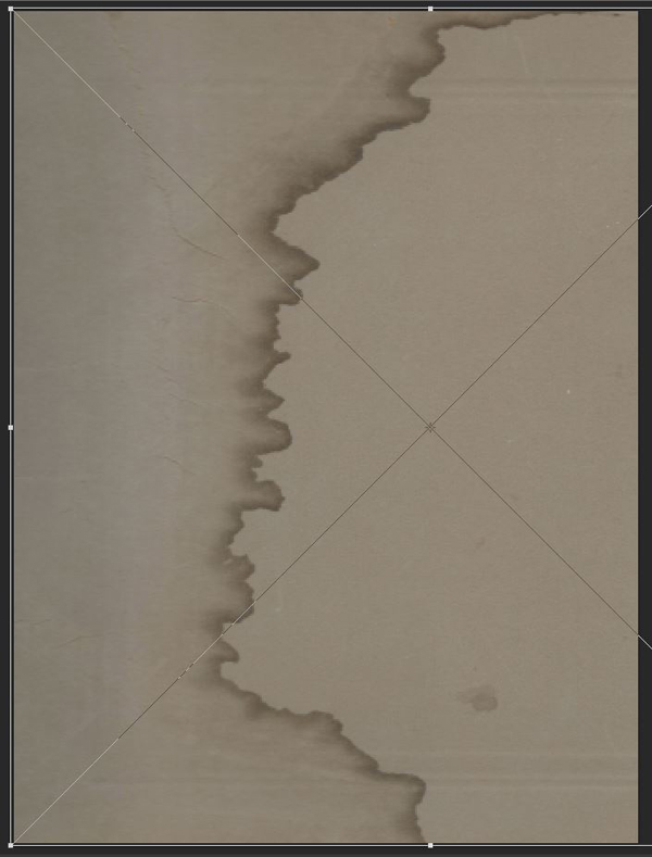
Finally, we’re going to erase some of the map’s markings at the bottom right corner.
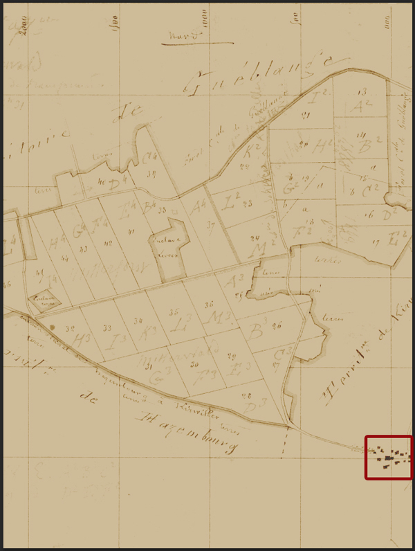
Add a layer mask to the map layer, and paint the spots away. Don’t worry about erasing the map’s grid, as we’ll place another element in there later that will camouflage that removal.
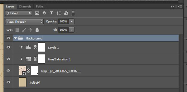
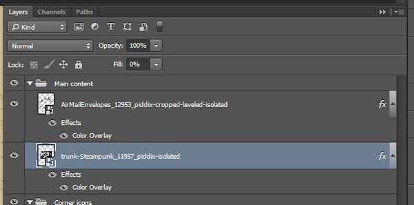
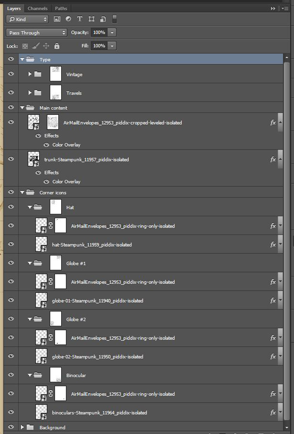
Our background is now ready. Don’t forget to organize your layers properly.
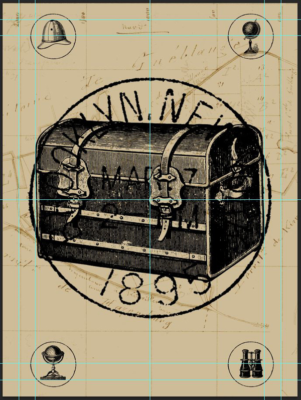
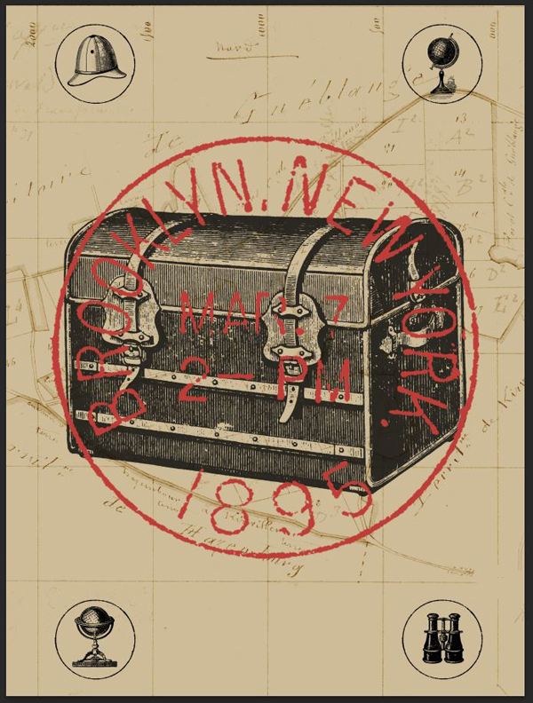
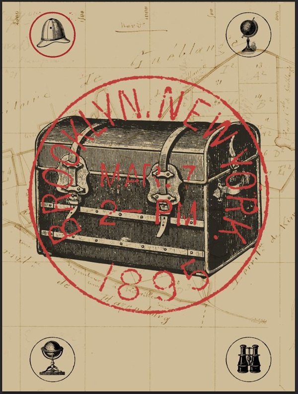
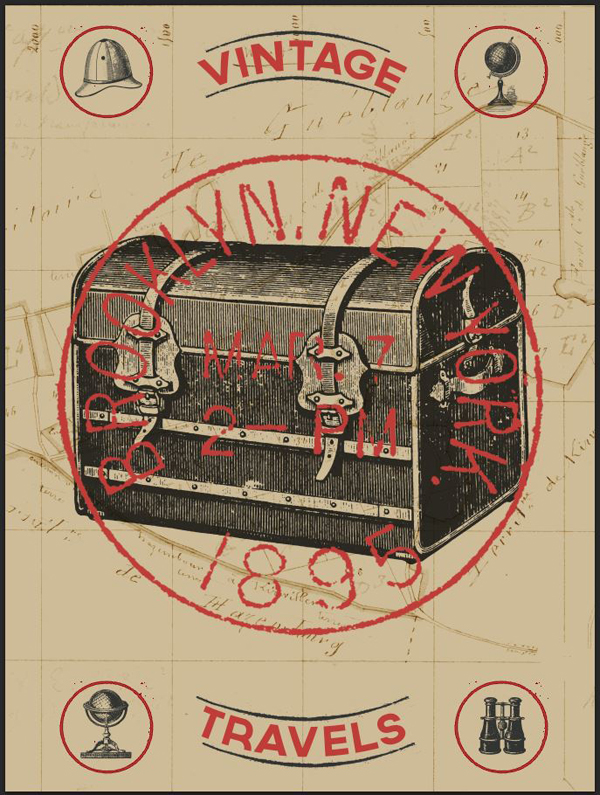
STEP 6: PLACING THE ELEMENTS
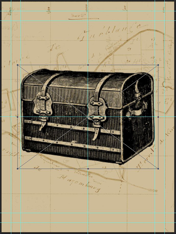
It’s time to place our main elements in the frame. Let’s have another look at the sketch I made.
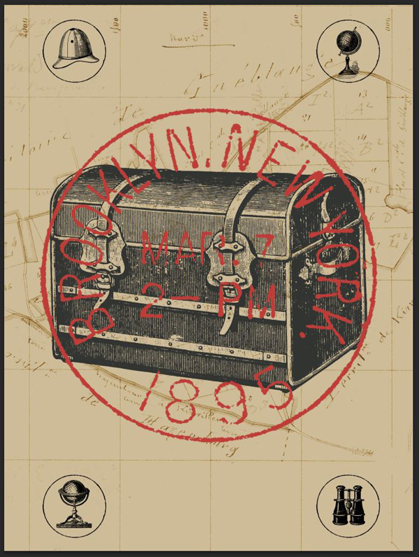
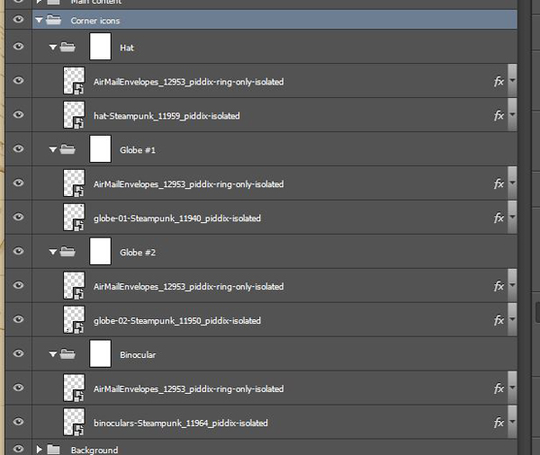
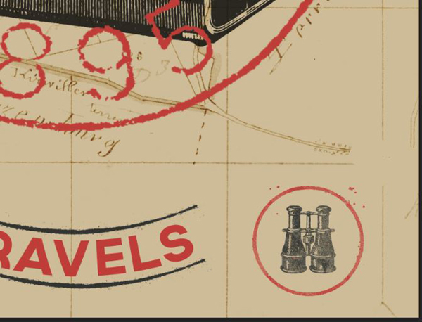
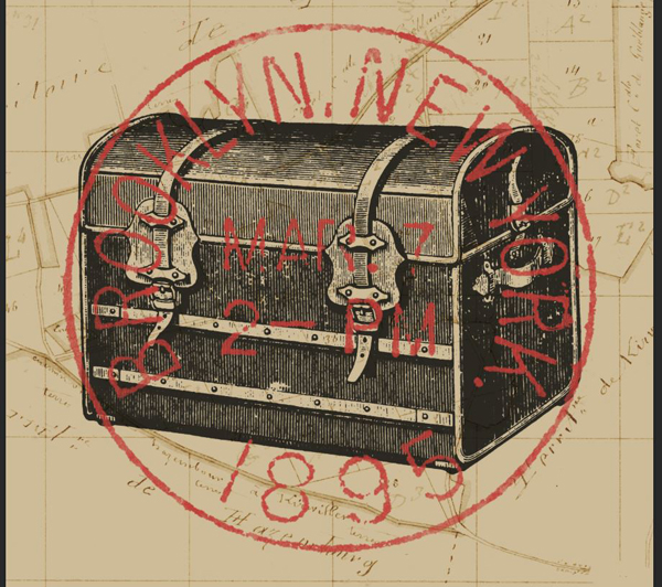
The center of the piece is occupied by the travel trunk, and by the postage stamp. The other travel icons (globes, hat, and binoculars) are located at the corners.
Let’s start by placing the trunk. I’m making it roughly 14″ wide.
Next, add the isolated stamp. It should cover the trunk, and be slightly wider than it.
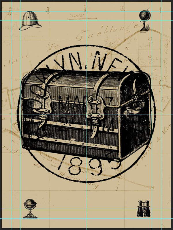
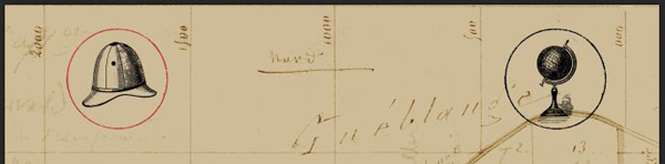
Next, we’ll be placing the various corner icons. I’m using the grid of the map to place them, rather than the grid I created with the guides. Size wise, I’m trying to have each corner object to have the same visual importance.
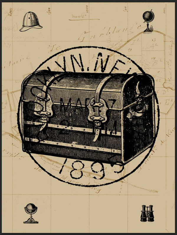
Here’s a view with the guides, to get a sense of placement and proportions.
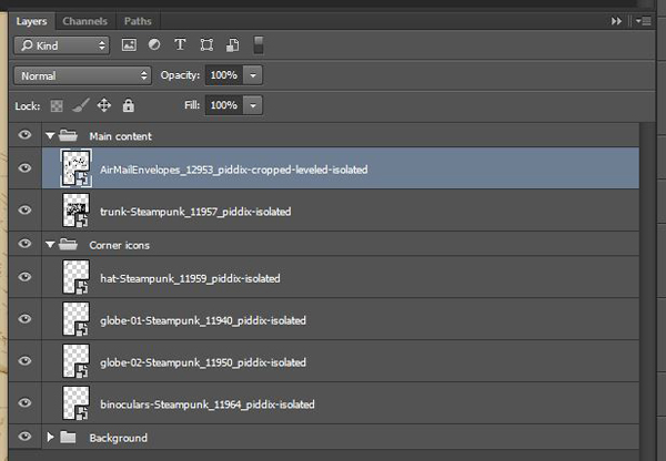
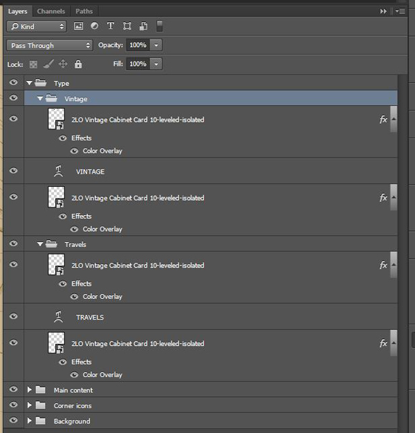
Organize you layers now, because it’s going to get more complicated soon.
Remember the version of the postal stamp we created that only contains the circle? It’s time to get it out of our asset folder. We’ll be enclosing each icon in its own circle. You can rotate the circle each time, so it doesn’t look the same for each icon. Don’t hesitate to use the layer alignment tools to facilitate the job (Layer > Align and Layer > Distribute).
It took me a good deal of time to adjust the circle size compared to the icons. There was actually some back and forth tweaking for the sizes of the icons, and of the circle.
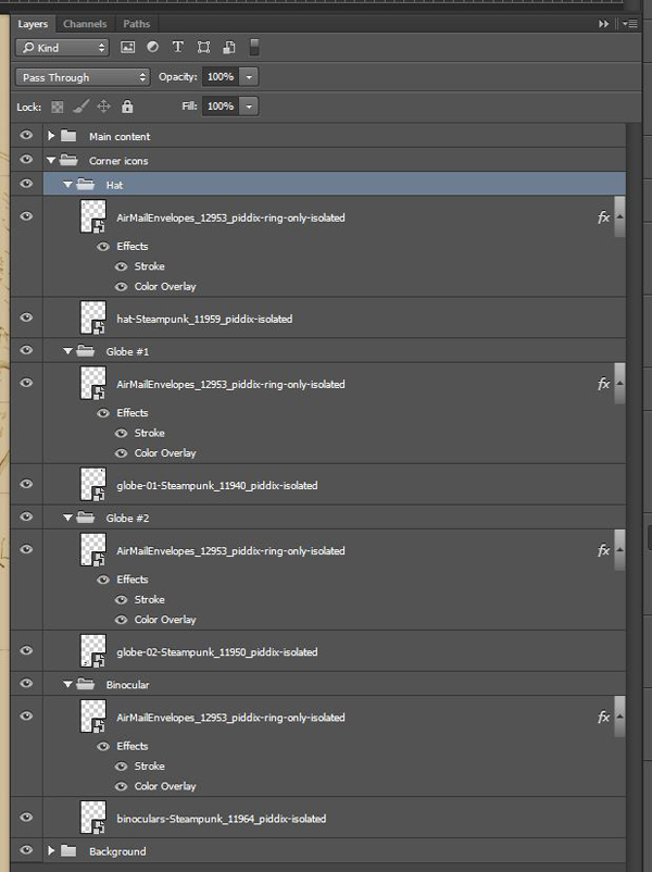
And here’s a view of my layers.
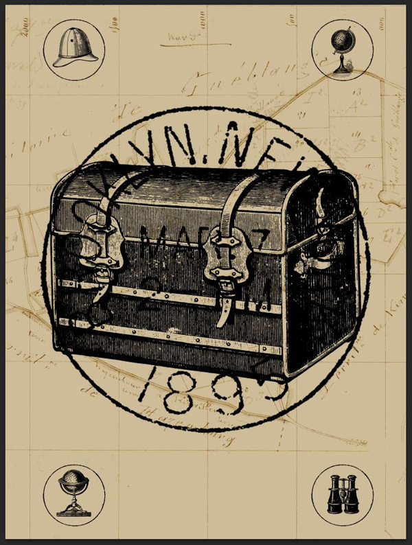
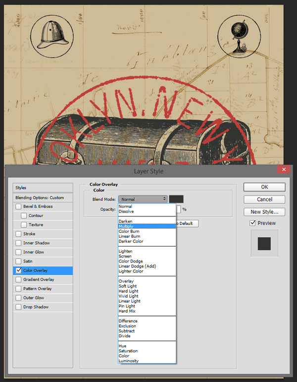
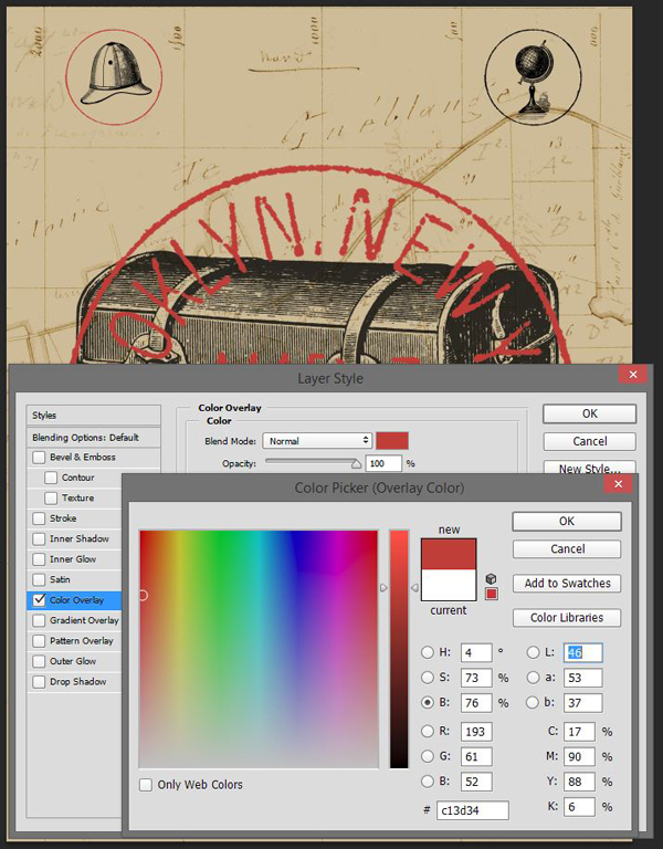
STEP 7: ASSIGNING COLOR
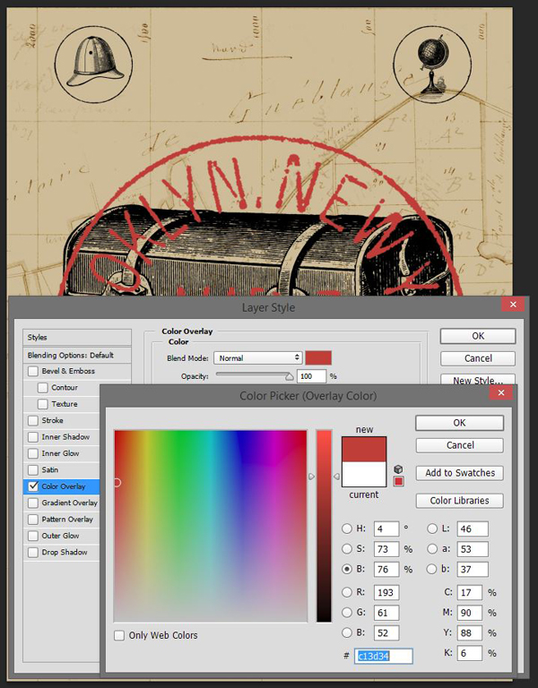
This step is actually fairly simple. We’ll leverage the option to give a color overlay to layers.
Start by making the postage stamp red (#c13d34). Double-click on the layer to bring up the blending options panel.
Next, let’s color the trunk with our off-black (#2f302d).
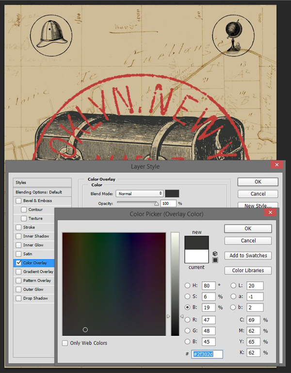
The contrast level between the red and the off-black isn’t very strong. To increase it, we’ll darken the trunk a little bit by changing its blending mode to Multiply. Because the color has been assigned to the object through a color overlay, we’ll need to go through a few additional steps.
Start by reducing the trunk layer’s Fill to 0.
Next, head back to the layer blending options to set the color overlay’s blending mode to Multiply @ 100% opacity.
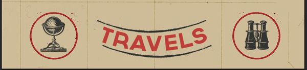
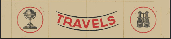
Next, we need to assign a red color overlay (#c13d34) to the circles around our icons. Let’s start with the one around the hat.
The result looks nice, but the circle is a bit thin.
In order to fix this, we’ll simply give the circle a red stroke of a few pixels. I’m using 8 pixels.
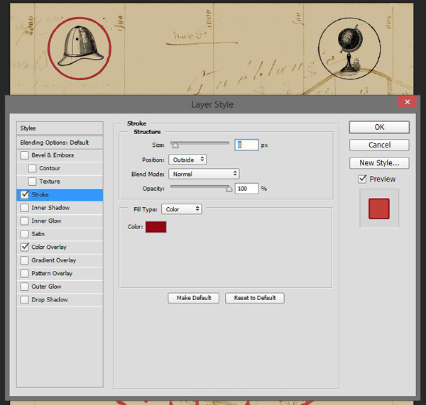
The result is satisfying. From there, we’ll simply apply the same settings to the other circles. In order to do so very quickly, start by right-clicking on the layer of the circle you just edited. Select the Copy layer style option.
Then, select all the circle layers, right-click, and choose the Paste layer style option.
We just applied the color overlay and stroke effortlessly to the three remaining circles.
In a similar fashion, you can now quickly apply an off-black (#2f302d) overlay to all the icons.
With that done, it’s time to group each icon with its container. This will be helpful later.
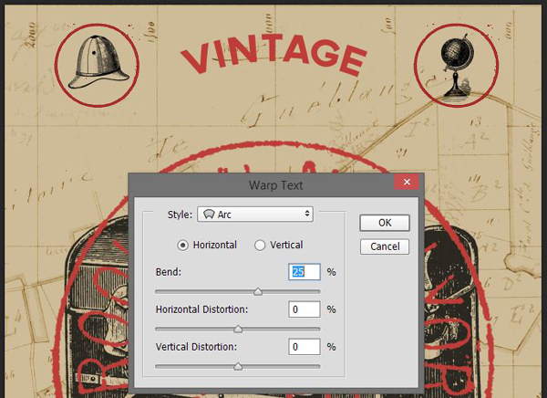
STEP 8: TYPE
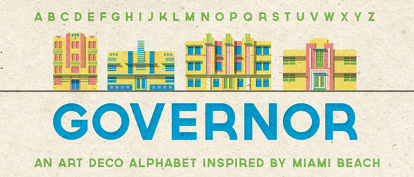
A poster wouldn’t be complete without some type. We’ll use the beautiful Governor font, from Lost Type Co-op.
The text we’ll include is Vintage travels. It’ll be split at the top and at the bottom of the poster. My type is set at 90 points. The placement of my type object isn’t final.
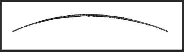
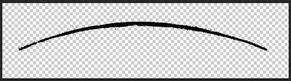
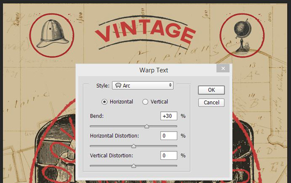
Next, we’ll give each type object a warp effect, in order to visually match the curvature of the postage stamp.
Highlight your Vintage type layer, and head to Type > Warp text. Choose Arc, with a 25% bend value.
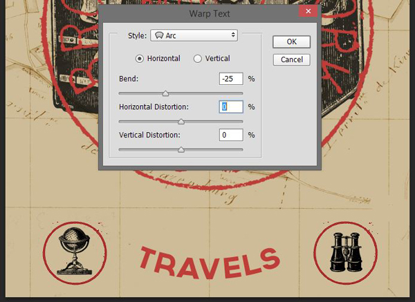
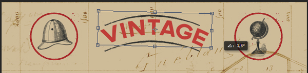
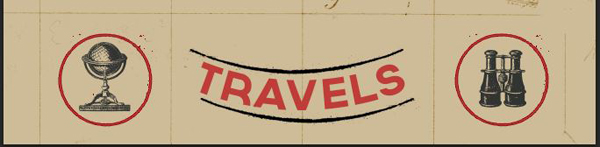
Repeat the process for the Travels type object, but with a -25% bend value.
From there, you can tweak the placement of the type objects, to line them up with the icons nearby.
Time to organize things neatly.
The type elements look like they are floating in the canvas. In order to fix this, we’ll be adding some framing elements. The various frames available are often of a style that doesn’t match our piece. The solution? To grab ornaments from some of the more complex vintage labels, and cards at hand.
Track down 2LO Vintage Cabinet Card 10.jpeg from \Authentic-Vintage-2-Lil-Owls-Vintage-Other\Vintage Cabinet Cards. We’re going to grab one of curve ornaments that’s shown above the word “Gallery.”
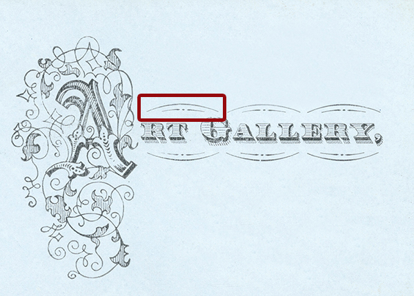
I’d suggest to follow the same process that when isolating the postage stamp.
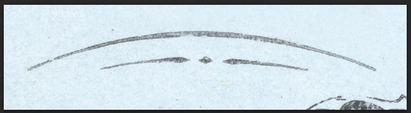

Once ready, place it twice in your document, to frame the word Vintage.
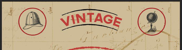
Don’t forget to give the ornaments an off-dark overlay. This will make them fit the piece better.
You can tweak the warp effect, and the rotation of the text layer to match the curvature of the ornament better as well.
Repeat the process to frame Travels.

And here are the layers so far.
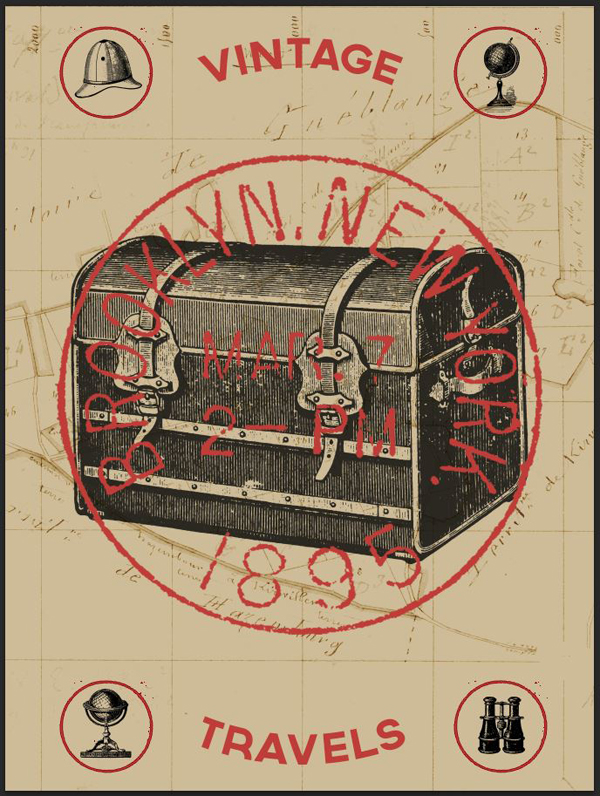
Now, we can finally move to masking (grunge effects), and texturing!
STEP 9: MASKING ELEMENTS
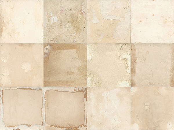
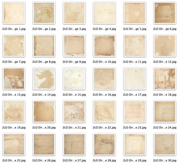
We’ll be leveraging 2 Lil’ Owls dirty grunge textures for our masking, and weathering, effects. These textures might be lifted from old paper, their grain, stains, and tears will work wonders to fade and age our various design elements.
The technique we’ll use for our weathering is simple: we’ll paste the textures in layer masks attached to the various elements.
To paste a texture in a layer mask, simply ALT/OPTION+CLICK a layer mask to access its content. From there, you can do almost whatever you want: painting, erasing, copy and pasting… Make sure the element’s layer and its layer mask are unlinked, so you’ll be able to transform the layer and its layer mask independently from each other.
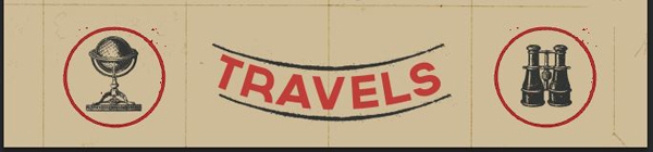
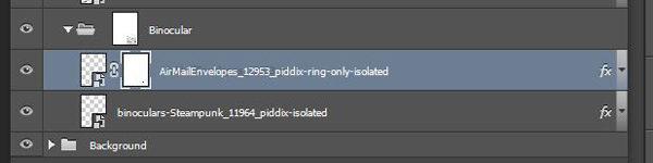
Let’s start with the icons and their respective circles. Start by adding an unlinked layer mask to each of the layer groups.
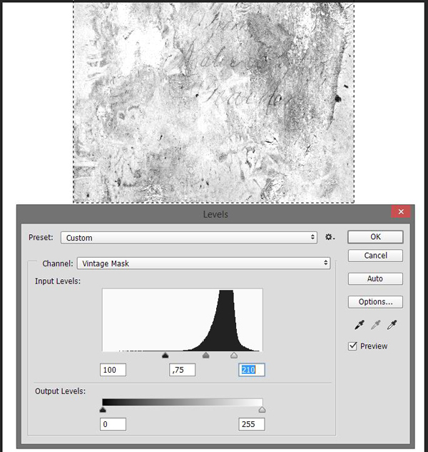
Next, open 2LO Dirty grunge 19.jpg. This is the texture we’ll use for each element. In order for the wear pattern to look organic, we’ll simply rotate it and/or resize it a bit each time.
Let’s start with the binoculars’ layer group. Copy the texture, and paste it in the layer mask.
Resize it to fit closer to our icon.
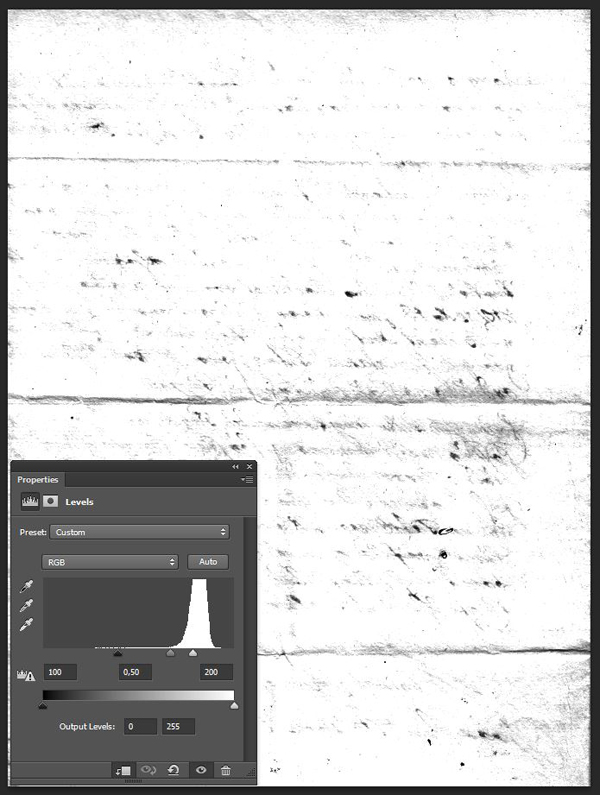
Make it a bit stronger by using the levels palette (CTRL/CMD+L).

Admire the result!
Repeat for each icon, simply rotating the texture by 90° each time to change the wear pattern on the icon. You could also copy and paste the layer mask’s content around.

If you look closer, each circle features some artifacts. That comes from the extraction process that was slightly imperfect.
Paint these away by adding a layer mask to the circles themselves.


The result of that speckle erasing makes the overall piece look cleaner.
Next, we’ll be masking the postage stamp. This will give it a vibe closer to a real stamp. We’ll use 2LO Dirty grunge 7.jpg for that.
Next, we need to weather the type elements. We’ll use 2LO Dirty grunge 2.jpg for that.
Start with Vintage. The process is the same.
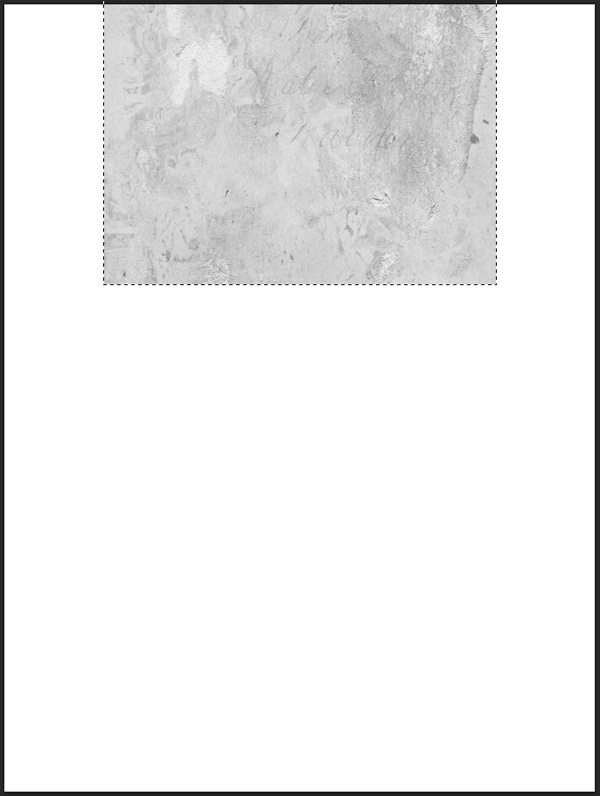

Finally, we’re going to mask off Travels. I’m using the same layer mask content, rotated so that the wear pattern is different.
And here’s a view of all the layer masks we just added.
And now, let the fun begin.
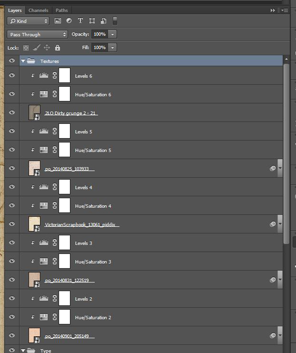
STEP 10: TEXTURES!
Working with textures is not only fun, it’s also a very good way to unite the piece together. The various grains, stains, and other artifacts the textures will bring to the piece will unite all the disparate elements together visually.
Because we want to stick to our non-destructive workflow, we’ll always use adjustment layers to manipulate the textures. Let’s get to it.
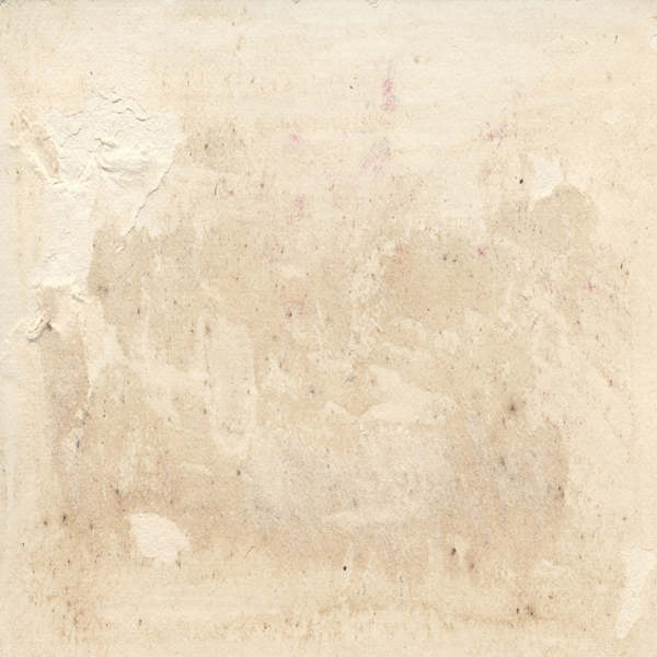
locate po_20140901_205149.jpg from \Authentic-Vintage-Magic-tees\Postage Texture Pack1. It’s a beautiful paper texture, with a very thick grain, and some faint stamps.
Place it to cover your whole canvas.
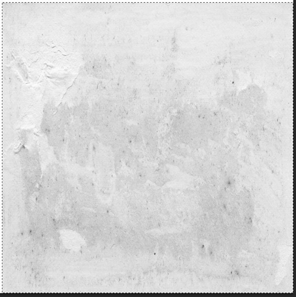
Use a clipped hue/saturation adjustment layer to desaturate the texture.
TWeak it using a levels adjustment layer.
Change its blending mode to Soft light @ 50% opacity.
The next texture is po_20140831_122519.jpg, from \Authentic-Vintage-Magic-tees\Postage Texture Pack5.
Blending mode: Soft light @ 50% opacity.
The next texture is VictorianScrapbook_13061_piddix.jpg. You’ll find it in \Authentic-Vintage-Piddix-Other-Vintage\VictorianScrapbook_piddix\VictorianScrapbook_CoverAndBacks_piddix.
Blending mode: Soft light @ 50% opacity.
Next is po_20140825_103933.jpg. You’ll find it in \Authentic-Vintage-Magic-tees\Postage Texture Pack5. This one will give us some nice fake folds.

Blending mode: Color burn @ 100% opacity.
The final texture is the mother of all water stain textures. It’s called 2LO Dirty grunge 2 – 21.jpg, and you’ll find it in \Authentic-Vintage-2-Lil-Dirty-Grunge-Textures\Dirty Grunge 2.

Blending mode: Soft light @ 100% opacity.
Let’s look at our layers.
We’re almost there!
STEP 11: THE FINISHING TOUCH
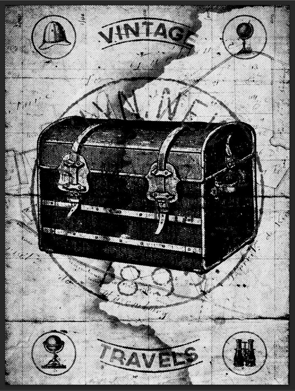
Before we can call it a day, we need to add one thing: a halftone effect. This will allow us to emulate some of the feel of that old style printing.
Start by creating a merged copy of all visible layers (CTRL/CMD+SHIFT+ALT/OPTION+E). I renamed that layer Halftones.

Transform that layer into a smart object (Filter > Convert for smart filters on Photoshop CC).
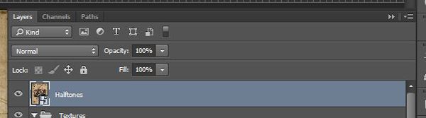
We’ll apply a halftone effect from the Filter gallery (Filters > Filter gallery > Sketch > Halftone pattern). I’m using values of 8 for the dot size, and 25 for contrast.
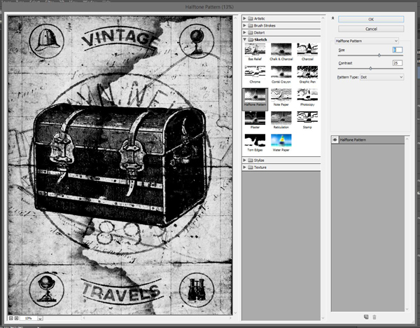
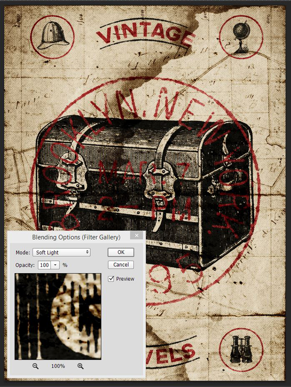
Next, we need to change the effect’s blending mode. Double-click on this symbol in the layer palette.
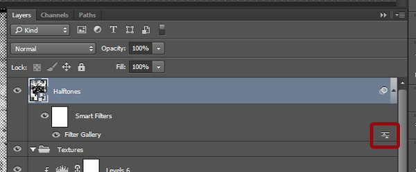
Change the blending mode to Soft light @ 100% opacity.
Finally, change the layer’s blending mode to Lighter color @ 35% opacity.
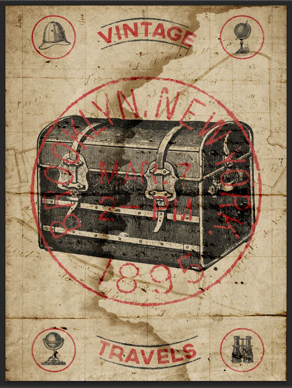
And we’re finally done with our poster!
CONCLUDING THOUGHTS
Phew, that was a long one.
I hope you had as much fun going through the tutorial as I had writing it. If you’ve grabbed the bundle, I hope you enjoy your new resources.
If you haven’t yet, go check out the bundle’s collection of vintage design treasures. The diversity of the gems that have been harvested by the bundle’s participants is fantastic, and their uses are many. You can grab all of these best-selling resources for the next few days only, for 97% off the regular price.


Finally, I’d love to see your tutorial outcomes! Please share them on the Design Cuts Facebook page! If you have questions or concerns, don’t hesitate to get in touch! Use the comments below, the Design Cuts Facebook page, or tweet at us.
That’s it for today. Until next time, cheers!
Well, it took me a while, but I did it!
Great tutorial, lots of fun. Can’t wait to do another one.
Thanks!
N
Woohoo! That is fantastic news, Nathalie! :) I’m so pleased to hear you enjoyed this tutorial!
I hope you enjoy our other tutorials on offer, if you had a suggestion for any techniques, tips & tricks you’d like to learn please do let me know!
Thanks again, Nathalie! If there is ever anything I could assist you with please do get in touch. I’m always happy to help.
Where is the maps located? I am having difficulty finding that graphic. There are so many of them.
Found the one I need. It was a long tutorial but a good one.
Thank you.
Hey Jeanne,
The map Simon used in this tutorial is located in the Magic Tees part 1 > Vintage Texture Pack 4 under image file number po_20140825_130507.jpg. I hope this helps, and you’ll enjoy the tutorial. :)
Thank you for your kind words Jeanne! That pack indeed has a bunch of resources, and the file naming scheme isn’t the clearest.