")
")
")
Design Training #3:
Design a Wartime Poster With Wings Art Studio
Fire in the hole! A lesson in wartime graphics with Wings Art.
Stop! Before you start this free training…
Before you start this expert design training you should watch the video above.
Then, download the freebies you need to follow this tutorial below by entering your email:
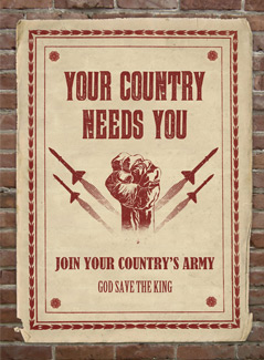
What We’re Creating:
Today you’ll learn how to create an authentic wartime poster design, using some awesome high-res paper textures from Wings Art Studio. You’ll learn how to layer up multiple textures, and use them to apply realistic surface impact.
Let’s get started by looking at the end result we’ll be creating:

Resources For This Tutorial:
• Wings Art Old Paper Texture Pack (Download Using Form Above)
• Brick Wall Texture
• Lost & Taken Noise Textures
Step 1:
Open up Photoshop and create a new document 29.45cm X 41.2cm, at 300 DPI resolution.
Download the brick wall texture from the resources section for this tutorial, and paste it into your canvas. Enlarge as necessary.
To make the brick surface a little darker, apply a levels adjustment layer.
Levels Adjustment Layer Settings:
43 / 0.94 / 230

Step 2:
Download the freebies pack for this tutorial above.
Inside, you’ll find 5 high res, authentic vintage paper textures, as well as the source file for this tutorial:

Grab the ‘sections.jpg’ texture from the pack, and import it into your canvas.
Extract it from it’s background, and then apply a hue/saturation adjustment layer. Ensure this adjustment layer has a clipping mask, so that it only affects the underlying paper texture layer, not your entire composition.
Hue/Saturation Adjustment Layer:
Hue: 0
Saturation: +45
Lightness: 0
Also, apply an outer glow blending option:
Outer Glow Settings:
Blend Mode: Normal
Opacity: 18%
Color: Black
Spread: 0
Size: 68


Step 3:
Download the redflowers.jpg paper texture from your freebies pack.
Paste it over the original paper texture in your canvas, resizing it to fit perfectly over it.
Apply a layer mask and mask the edges of this new paper texture, exposing the edges of the underlying paper texture, which are a better fit for this composition.
Now apply a hue/saturation adjustment layer, but this time DO NOT apply a clipping mask, as we want these adjustments to effect the entire canvas.
Hue/Saturation Adjustment Layer Settings:
Hue: 0
Saturation: -40
Lightness: 0

Step 4:
Download a wartime vector design of your choice.
I chose a vector from the awesome GoMedia wartime vector pack, which luckily for you guys will be available as one of our first deals, once Design Cuts launches.
I paste the vector into the center of my design:

Apply a layer mask to your vector, and use a rough, black paintbrush to mask off the bottom of the vector.
Also, apply a color overlay blending option (color: 912f2a).

Download the noise textures from LostandTaken (see resources section for this tutorial).
Grab one of the textures and paste it into your main canvas, directly above your central vector design.

Now change this layer’s blend mode to ‘screen’. Because it has a black background this will hide everything in this layer apart from the lighter noise.
Apply a clipping mask so that the remaining noise is clipped to your central vector design.
And voila! You have given your vector an old time, distressed look to match the rest of your poster.

Step 5:
Repeat the exact same technique as step 4 to apply further distressed vectors to the center of your poster:

Step 6:
Now you know how to apply distressed noise effects to your work, you can use the same techniques to create some cool distressed text for your poster.
I used the following fonts in my design:
Banger
Bernard MT Condensed
Birch Std
Step 7:
It’s always good to think about texture and lighting and strive to make your outcome as realistic as possible.
If a poster was positioned on a brick wall, it wouldn’t appear perfectly flat.
It’s likely that some of the shadow/texture from the wall would show through the paper, and make it’s surface appear less perfect.
To achieve this subtle touch, duplicate your original brick background layer and position it above all other layers.
Then use a layer mask to clip it to the shape of your poster.

Finally, change this brick overlay’s layer settings to:
Layer blend mode: multiply
Layer opacity: 9%
This should give a very subtle impression of the shadows from the brick work showing through your poster design:
Step 8:
To finish things up, we need to add a few adjustment layers.
Photo Filter Adjustment Layer Settings:
Filter: Warming Filter (85)
Density: 20%
Preserve Luminosity: Yes
Black & White Adjustment Layer Settings:
Layer blend mode: Linear Light
Layer opacity: 5%
Curves Adjustment Layer Settings:
Minor tweaks to the RGB curve (see below):

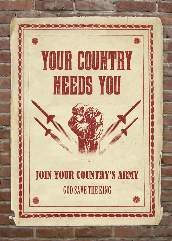
And here’s the final outcome you’ve created!
CONGRATULATIONS! YOU’RE ALL DONE.
Here’s the final outcome you’ve created. Be sure to show it off to friends and family to get valuable feedback.
Download the source file for this tutorial (plus exclusive freebie):
 Today’s tutorial uses Wings Art Studio’s Antique Paper Textures, exclusively available to Design Cuts subscribers. Download this awesome freebie and the source file for this tutorial using the form below. Entering your email will allow notify you of our big launch.