
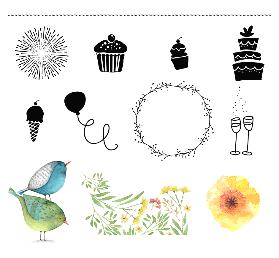
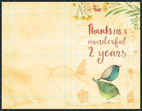
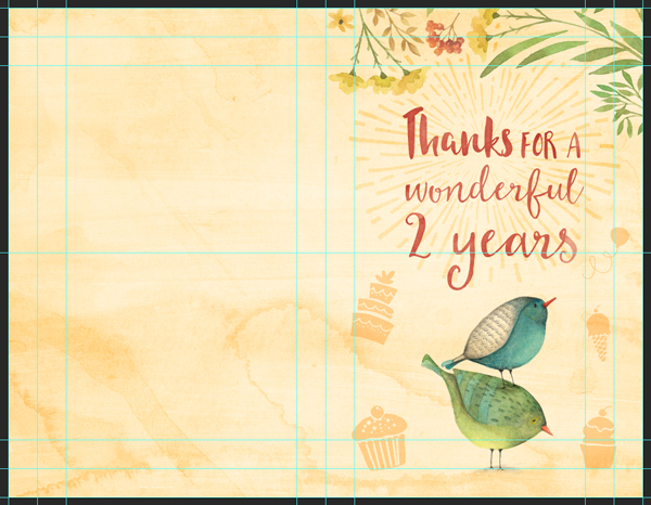
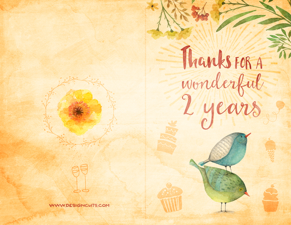
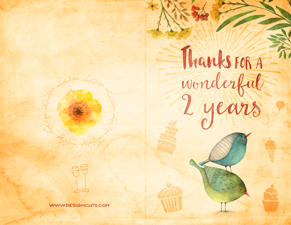
WHAT WE’RE CREATING:
Hello Design Cutters! It’s Simon here for tutorial number 2 of Design Cuts’ 2nd birthday multi-deal fest. This time, we’ll create a cute, watercolor-themed birthday card, dedicated to our favorite team of design geeks!
We’ll use techniques including texture layering, masking, layer styles, and more! Quick word of caution: we’ll be layering a lot of elements, so this tutorial may take a bit longer than usual. But it will be just as much fun!

Follow along with this tutorial: Download the freebies
We have a huge freebie pack of textures, illustrations, and vector elements for you. It’s a tiny sample of the amazing variety of resources to be found in the past year’s 19 most successful bundles, available as part of Design Cuts’ 2nd birthday event.
TECHNICAL NOTES
We will use both Photoshop and Illustrator for this piece. We’ll use Photoshop as our main tool, and Illustrator to manipulate the various vector assets present in the composition.
Because we’ll manipulate raster textures, these few PSAs are necessary:
- Don’t know what a clipped layer is? Glad you asked! This means that the layer is only visible/applies to the layer directly below it. You can very quickly do this by holding ALT down on your keyboard and clicking between the two layers. Here’s a quick demonstration.
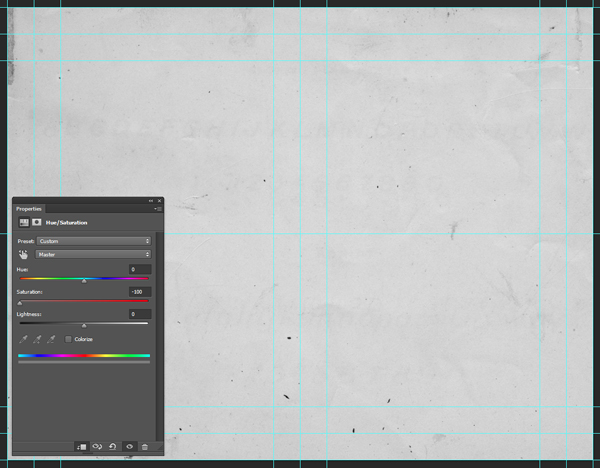
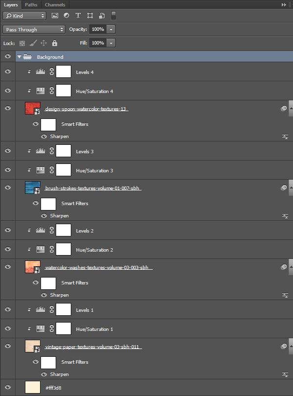
- Every time we’ll work with textures, we’ll follow this simple process: place as smart object, sharpen1, desaturate, enhance contrast with levels, and modify the blending mode.
- Placing the textures as smart objects, and using adjustment layers to tweak them, allows us to stick to a non-destructive work flow. We’ve explored in depth the numerous pros and few cons of such a work flow in this past tutorial: “How to Use Textures The Right Way.”
Notes: 1 – accessed through the Filter > Sharpen > Sharpen menu.
With all of this out of the way, let’s get started, shall we?
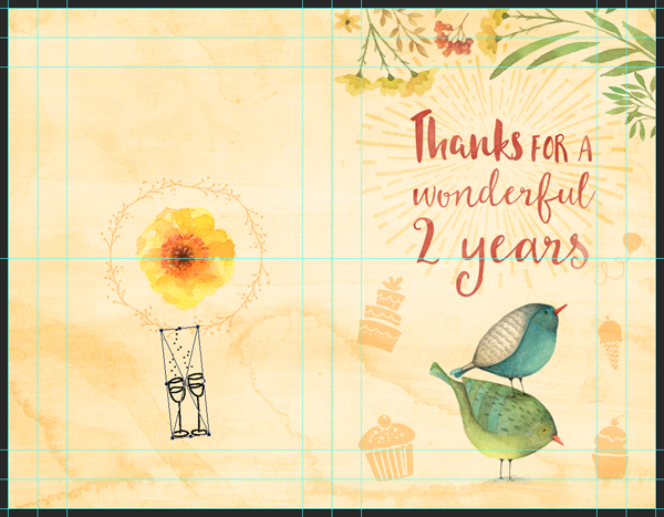
STEP ZERO: THE BRIEF
The concept
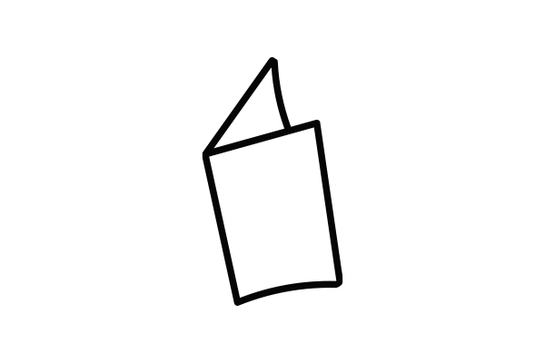
As announced in the introduction, we’ll create a cute birthday card for our favorite design geeks. It’ll be a simple, letter-sized document folded in half. This gives us access to four panels for information, and visuals.
We’ll use Lisa Glanz’ fantastic watercolor birds as our focal point, and will support them with Nicky Laatz’ cute vector elements.
Document setup
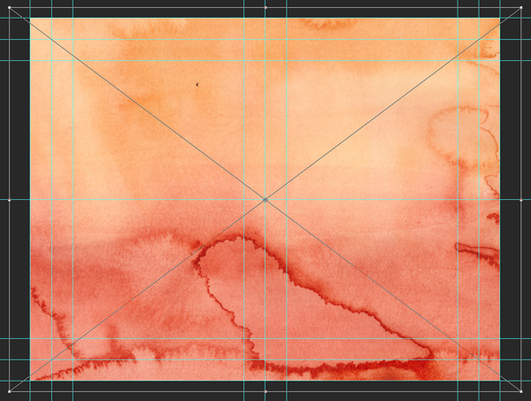
As stated above, the base canvas will be an horizontal letter-sized sheet of paper. It’s the American cousin to the A4 format, and stands at 8.5″x11″.
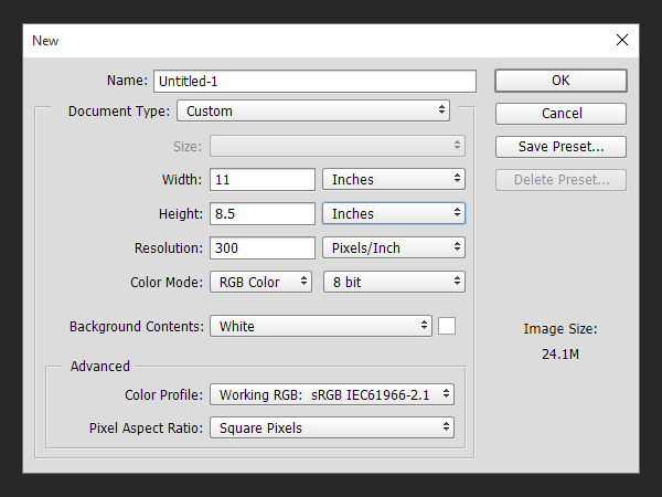
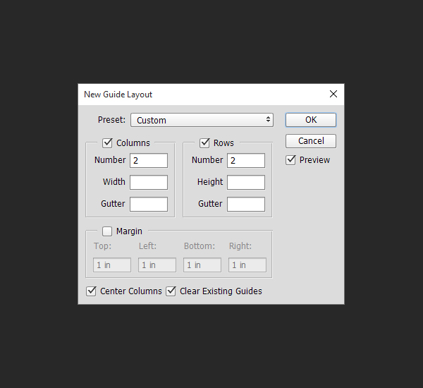
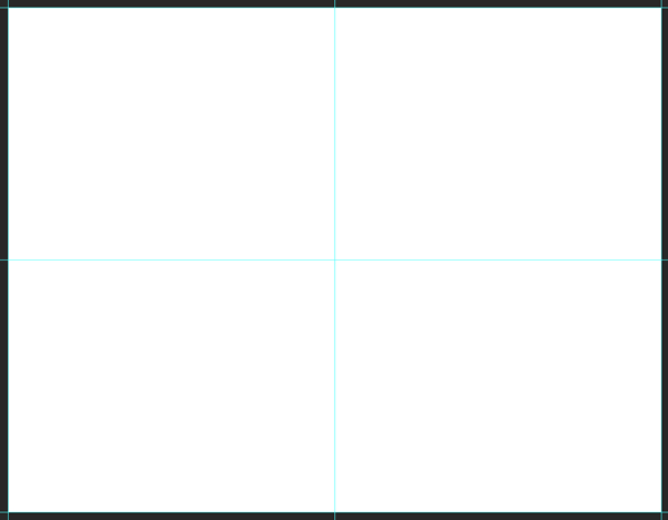
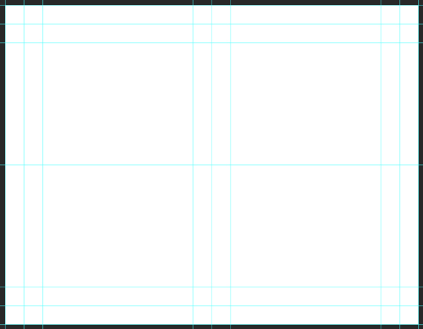
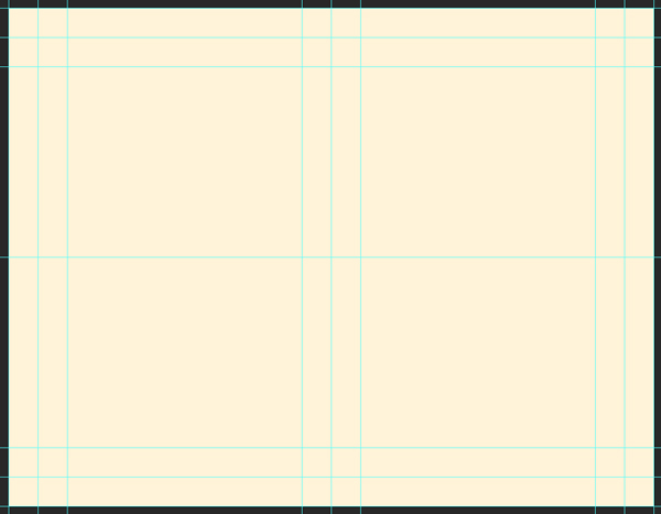
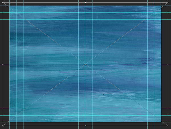
We’ll need a few guides to quickly find our way around the document. Let’s start by marking the center of the canvas.
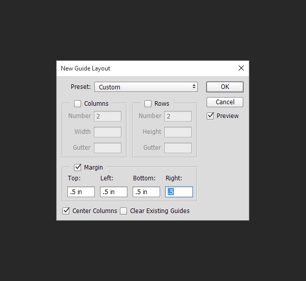
Next, we need to mark two zones around the edges of the canvas. The first one is a 0.5″ perimeter, and the second one a 1″ perimeter.
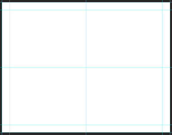

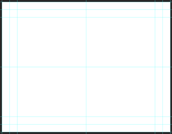
Finally, we also need to place vertical guides at X: 5″, and X: 6″.
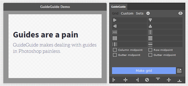
Reminder: GuideGuide is a solid alternative to Photoshop CC’s new guide layout feature (View > New guide layout).
Now that our canvas is ready, let’s do this! Note that we’ll use a single file, properly layered and organized, for both the inside and the outside of the card. The latest CC iterations of Photoshop include the multiple artboard feature already found in Illustrator since CS4. We won’t use it here, but it could be a good way to exploit it.
STEP ONE: THE OUTSIDE BACKGROUND
A note about the color palette
The color palette we’ll use today is called Birthday Special, was created by Savannah.Rudy, and made available via Colourlovers.com.
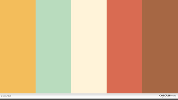
It features five colors, from left to right:
- Bright yellow – #f3bd5b
- Faded green – #b9dcbf
- Soft yellow – #fff3d8
- Burnt red – #d96b52
- Rust brown – #a66844
We’ll use the soft yellow as our background color, and build upon it with the darker colors on top.
A solid color, and texture layers
Let’s start by setting our background layer to soft yellow (#fff3d8).
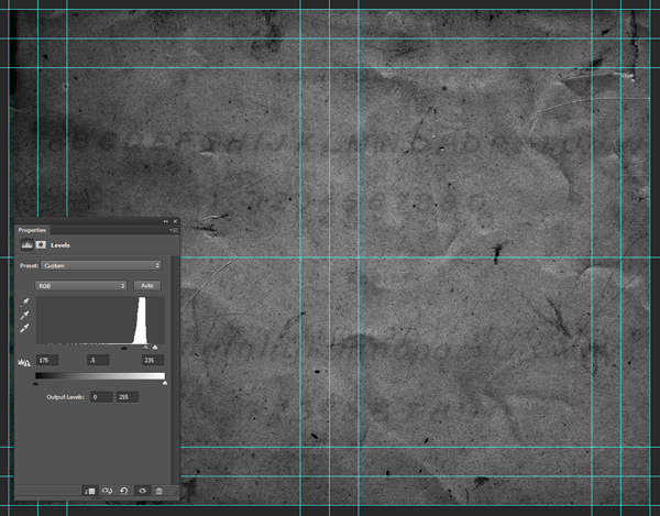
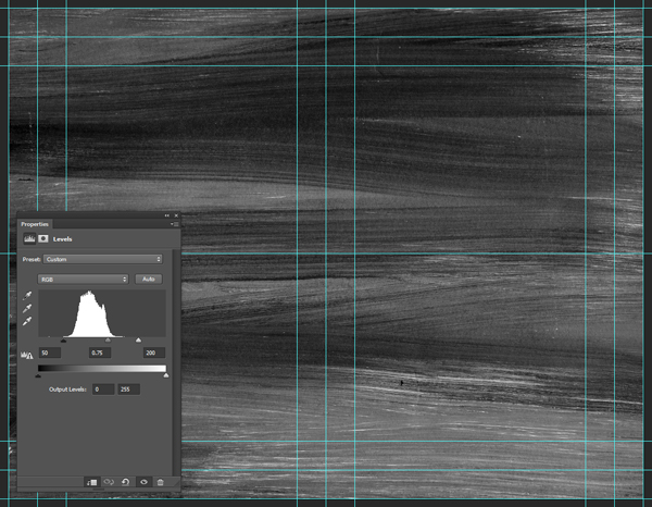
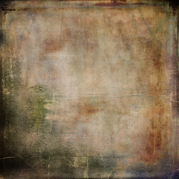
Now, onto textures. There will be four of them for this stage of the piece. The process will always be the same (as detailed in the PSAs at the beginning): place as smart object, sharpen, desaturate, enhance contrast with levels, and modify the blending mode. We’ll walk through the first one in details.
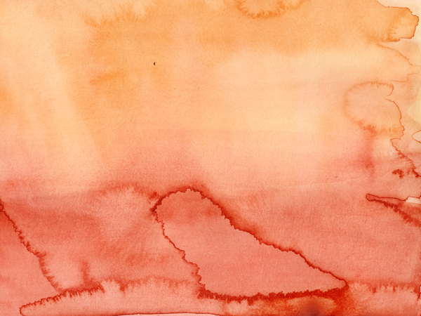
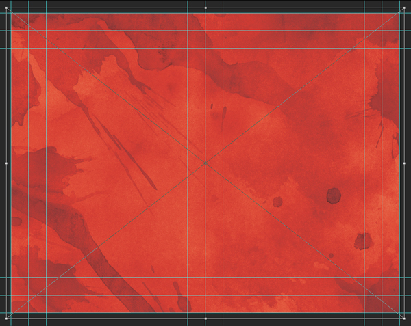
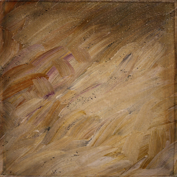
The first texture is vintage-paper-textures-volume-03-sbh-011.jpg, by The Shop.

It’s placed scaled up to 210%, and slightly off centered at X: 6.35″, and Y: 4.25″.
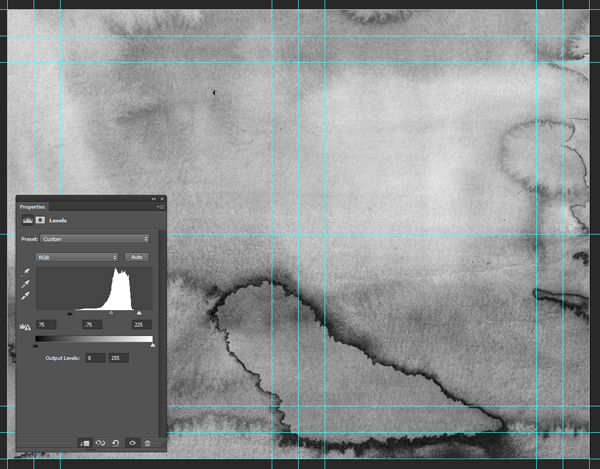
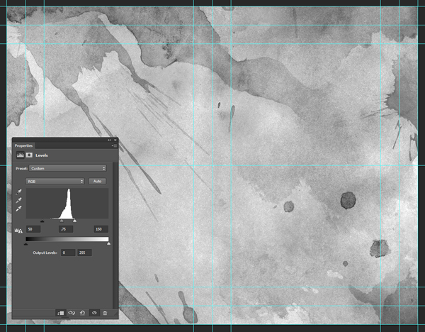
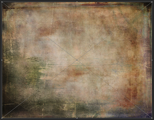
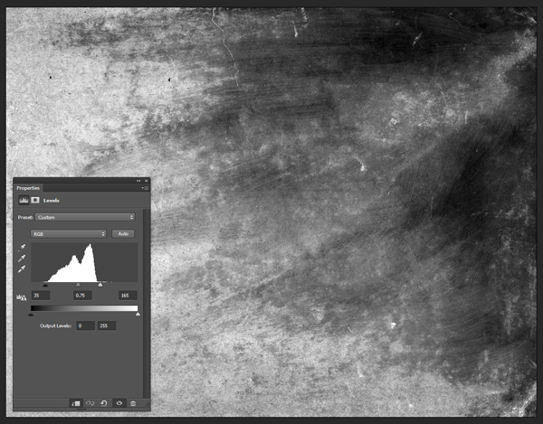
After sharpening it (Filter > Sharpen > Sharpen), we can desaturate it with a clipped hue/saturation adjustment layer.
Next, we’ll use a clipped levels adjustment layer to enhance the texture’s contrast, and get its artifacts to show in a stronger fashion (values: 175, .5, 235).
Texture blending mode: soft light @ 100% opacity.

The next texture is watercolor-washes-textures-volume-03-003-sbh.jpg, also by The Shop.
It’s placed centered in the canvas, and scaled down to 50%.

Levels: 75, .75, 225.
Blending mode: soft light @ 100% opacity.

The next texture is from The Shop as well, and is called brush-strokes-textures-volume-01-007-sbh.jpg.
It’s positioned centered in the canvas, rotated 90° clockwise, and scaled down to 50%.
Levels: 50, .75, 200.
Blending mode: soft light @ 75% opacity.
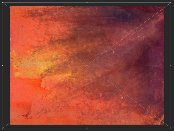
The next texture is design-spoon-watercolor-textures-13.jpg, by Design Spoon.
It’s placed centered in the composition, and scaled down to 98%.
Levels: 50, .75, 150.
Blending mode: color burn @ 35% opacity.

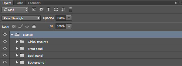
The background is done. It’s time to organize our layers some.
Time to move on to the front panel!
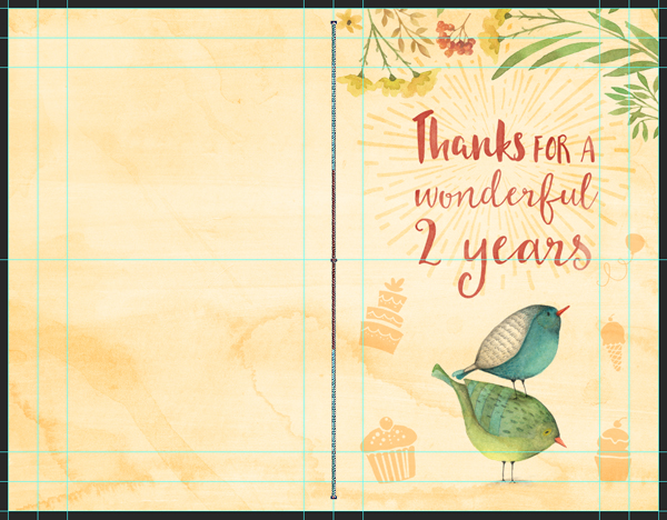
STEP TWO: THE FRONT PANEL
We’ll tackle the front panel in multiple passes. First, the vector assets. Then, the raster assets. Finally, the type.
Placing vector elements
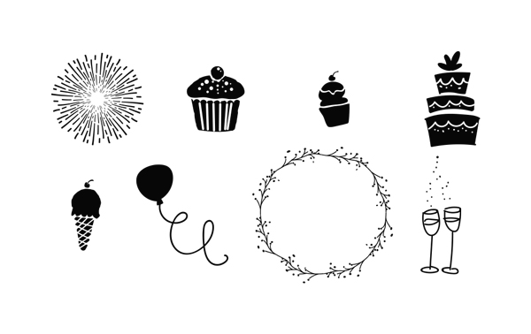
The vector assets we’re using all come from Nicky Laatz’ awesome vectors, originally included in the Mammoth watercolor media maker kit.
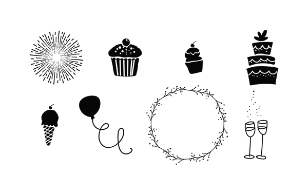
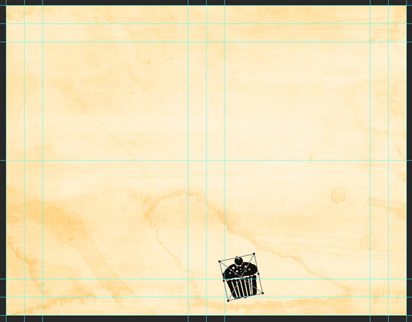
Let’s get started. The first asset is the one called cupcake 1 in the vector freebie file.

It’s placed at X: 6.45″, and Y: 7.45″, scaled up to 125%, and rotated 12° counterclockwise.
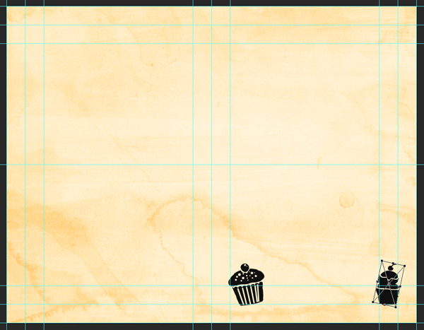
Logically, the next asset is cupcake 2. It’s placed at X: 10.25″, and Y: 7.45″, scaled up to 150%, and rotated 12° counterclockwise.

The next asset is tall cake. It’s placed at X: 6.40″, and Y: 5.15″, and rotated 18° clockwise.

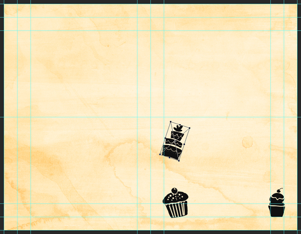
Then, the ice cream cone. It’s placed at X: 10.25″, and Y: 5.65″, and rotated 12° counterclockwise.


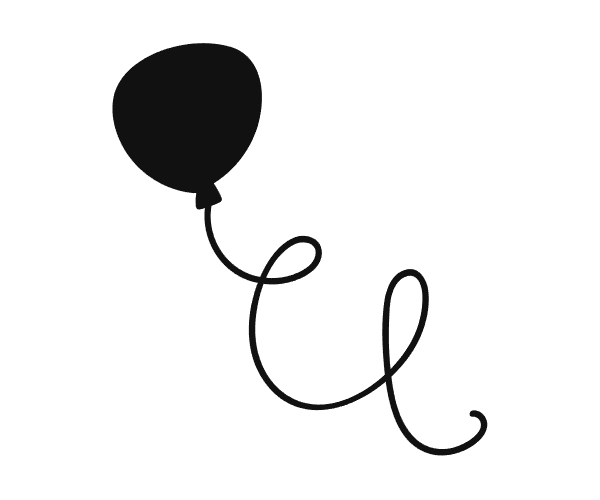
The next to last vector asset is the balloon. It’s placed at X: 10.35″, and Y: 4.25″, scaled down to 65%, and flipped on its vertical axis.
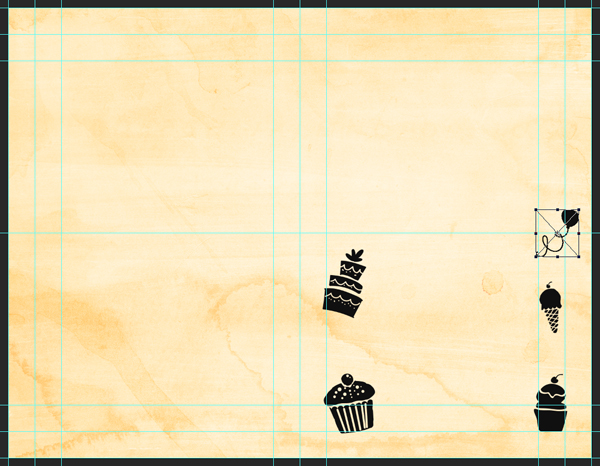
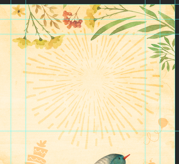
The last asset is the burst. It’s placed at X: 8.25″, and Y: 2.50″, scaled up to 375%.

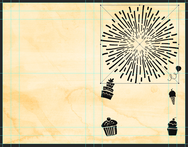
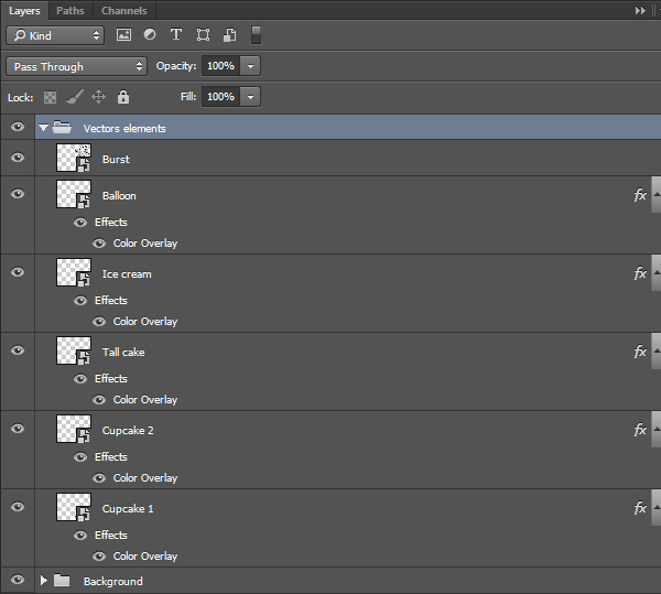
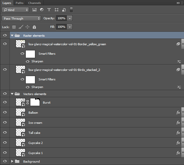
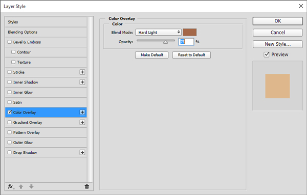
We now have all the vector assets for the front panel in place. We now need to assign all the vector elements a layer style, so they blend with the background. As we learned in one of our recent tutorials, we can establish the layer style on one layer/asset, and then duplicate it across the board.
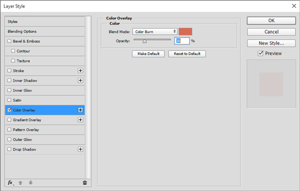
Let’s start with cupcake 1. First, let’s put the layer fill to 0%.
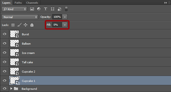
From there, we need to assign a color overlay to the layer. It’ll be in rust brown (#a66844), set to hard light @ 75%.
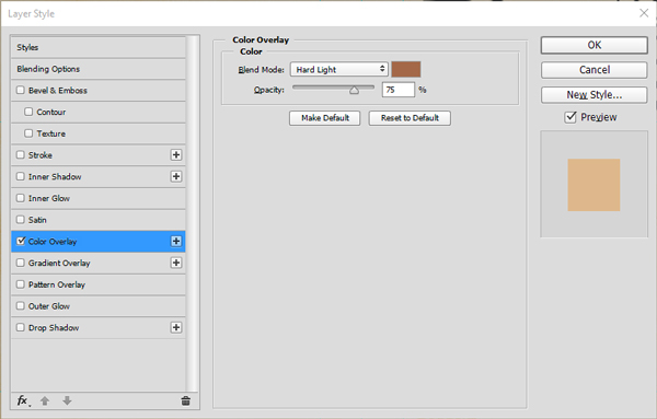
The result is a watermark-like appearance (100% zoom detail).

From there, we can copy and paste the layer style to all the other vector assets so far, minus the burst.


Finally, we can put the burst on overlay @ 100% opacity (after trying to assign it the layer style, the burst was too present in the composition – overlay makes it more subtle).

A little bit of layer organization, and we’re ready to move onto raster assets.
Raster assets
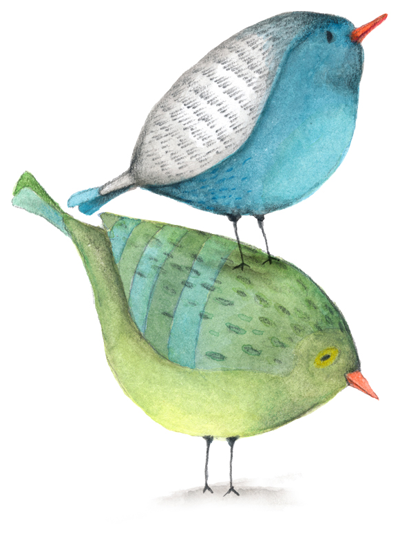
The first asset to put in place is the set of stacked birds (lisa-glanz-magical-watercolor-vol-01-Birds_stacked_2.png).
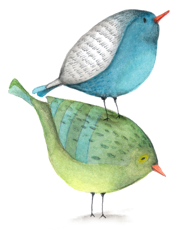
It’s placed at X: 8.35″, and Y: 6.60″, scaled down to 40%.
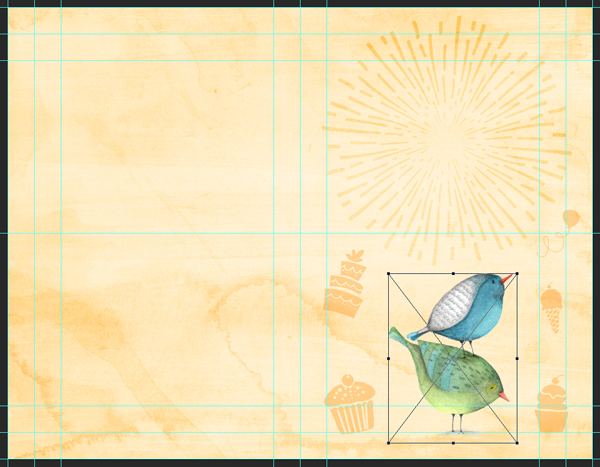
Blending mode: multiply @ 100% opacity.

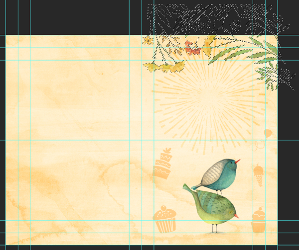
The next asset will require a bit more leg work. It’s lisa-glanz-magical-watercolor-vol-01-Border_yellow_green.png, and is used as the edge at the top of the card front. It’s placed at X: 8.60″, and Y: 0.50″, rotated to 90° counterclockwise, and scaled down to 60%.
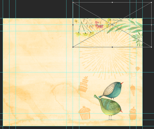
Blending mode: multiply @ 100% opacity.

The “tricky” part is to hide the burst element parts that are behind the floral border. The overlay creates visual tensions that we need to eliminate. To accomplish that, we simply have to CTRL/CMD+CLICK the thumbnail of the border layer. This will load its content as a selection.
Next, we’ll need to invert the selection (CTRL/CMD+I).
From there, we need to contract the selection by 25 pixels (Select > Modify > Contract).

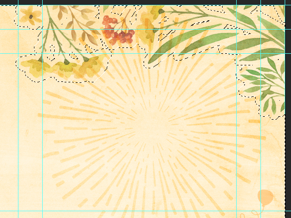
Finally, we can add a layer mask to the burst layer. Because the selection is active, that’s what the layer mask will “follow.”

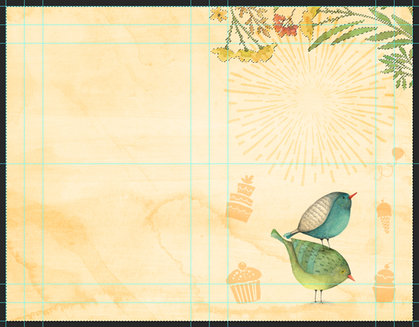
Et voilà.
A little bit of layer clean-up.
And now, the type!
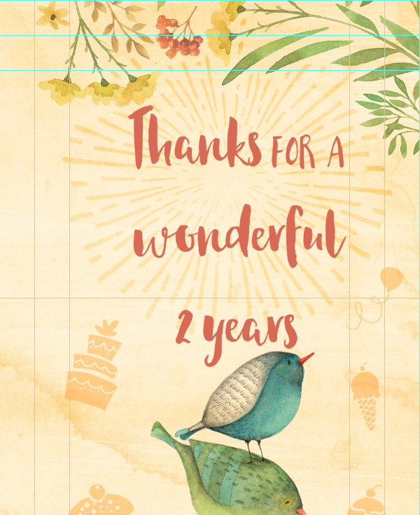
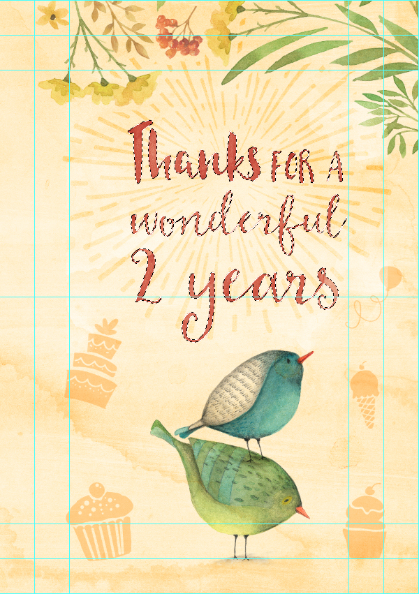
The text reads “Thanks for a / wonderful / 2 years.” It is split into three different typefaces: Habaneros (Thanks), Botanica (FOR A), sugarbush (wonderful / 2 years).
The majority of these fonts are available as part of our Typographer’s Dream Bundle.
The text block is placed at X: 8.40″, and Y: 3.30″, and centered.
Let’s start by typing the whole text block, in Habaneros that is 78 points tall, and colored in burnt red (#d96b52).
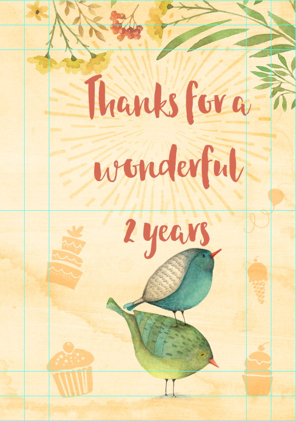
Let’s change “FOR A” to Botanica, that 36 points tall, and has a baseline shift of -2 points.
“wonderful” is set in Sugarbrush, that’s 78 points tall, with a leading of 60 points.
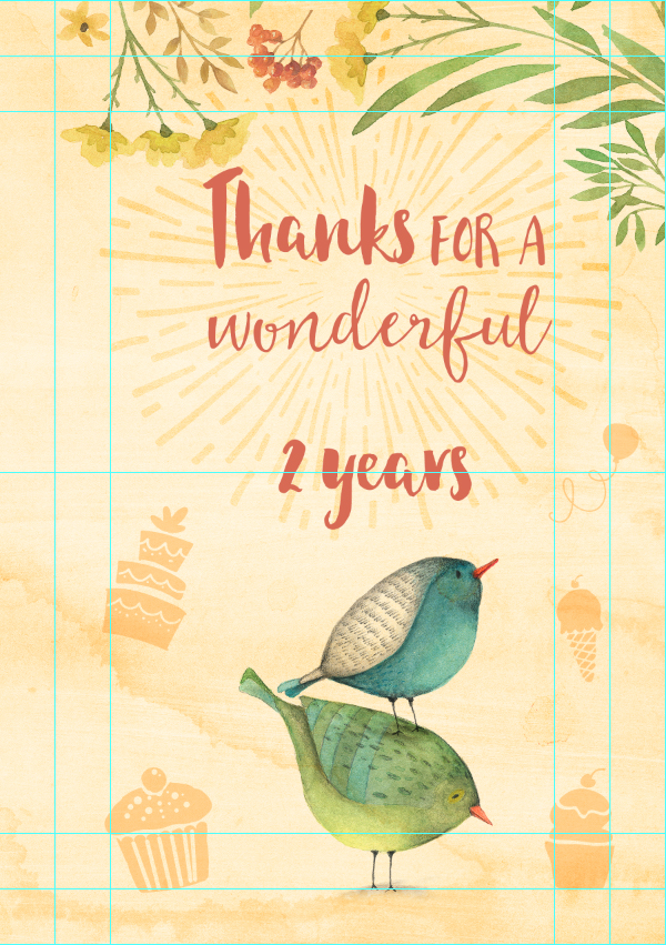
“2” is set in Sugarbrush, that’s 144 points tall, with a leading of 72 points.
“years” is set in Sugarbrush, that’s 120 points tall, with a leading of 72 points.
Finally, we can make sure that the text block is properly positioned (X: 8.40″, and Y: 3.30″).
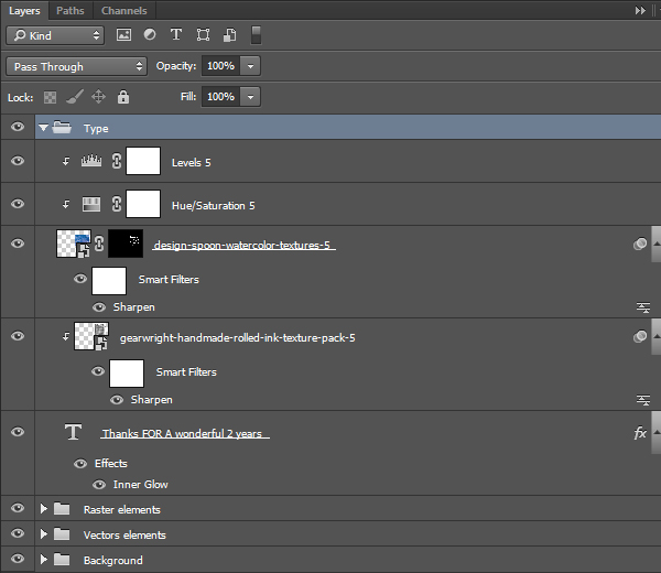
Next, we are going to give the text block a layer style to get it closer to a watercolor style. We’re leveraging an inner glow for that.
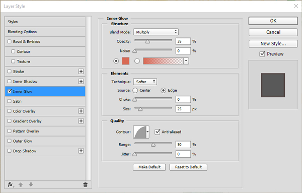
Next, we need to add some texture to it, for extra depth. The first one is gearwright-handmade-rolled-ink-texture-pack-5.jpg. It’s positioned above the text block, at X: 8.25″, and Y: 3.00″, and scaled down to 50%.
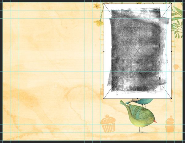
The texture is clipped to the text block, and its blending mode set to soft light @ 65% opacity.

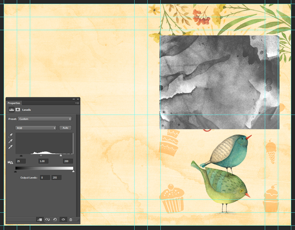
The second texture we need to add to the text is the sibling to Design Spoon’s watercolor texture #13, design-spoon-watercolor-textures-5.jpg. It’s positioned above the text block, at X: 8.25″, and Y: 3.25″, and scaled down to 40%.
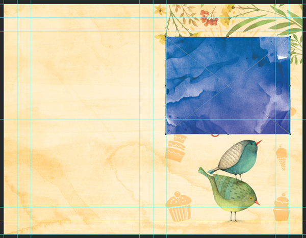
Levels: 25, 1, 200.
Blending mode: overlay @ 50% opacity.
Finally, we are going to limit the application of the texture to the type, by using a layer mask. We have to CTRL/CMD+CLICK on the text layer’s thumbnail to load its content as a selection, and to add a layer mask to the texture layer.

Let’s organize the layers some. First, the type.
Then, let’s assemble the front panel elements in their dedicated layer group.
From there, we can now move on to the back side.
STEP THREE: THE BACK PANEL
The back panel is much simpler to assemble than the front. There are only five elements to it:
- A divider between the front and back panels
- Lisa Glanz’ yellow flower
- The vector wreath drawn by Nicky Laatz
- The champagne flutes drawn by Nicky Laatz
- A text block for the Design Cuts URL
The first asset is the divider. It’s from Dreamstale set of hand drawn dividers.

It needs to be placed X: 5.50″, and Y: 4.25″, and scaled down to 75%.
After setting the layer’s fill to zero, we’ll give it a rust brown color overlay, set to hard light @ 75% opacity.
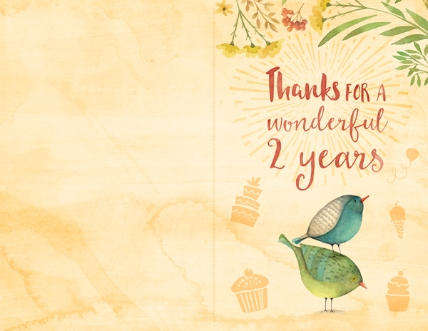
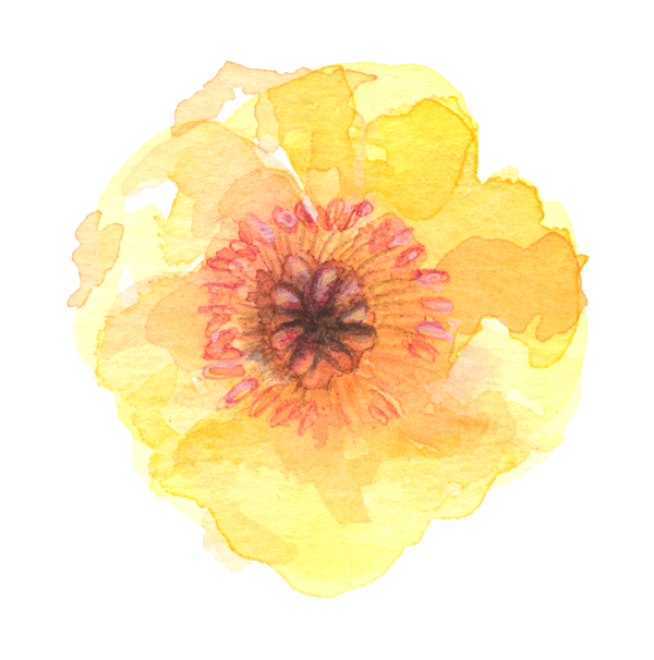
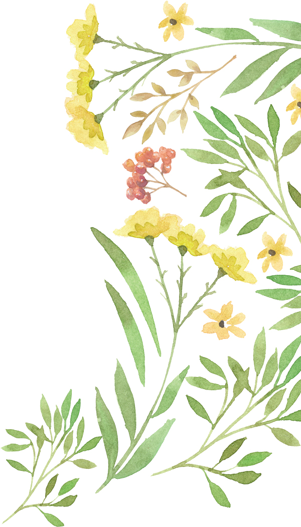
The next asset is the flower (lisa-glanz-watercolor-floral-edges-and-backgrounds-yellow_flower_front.png).
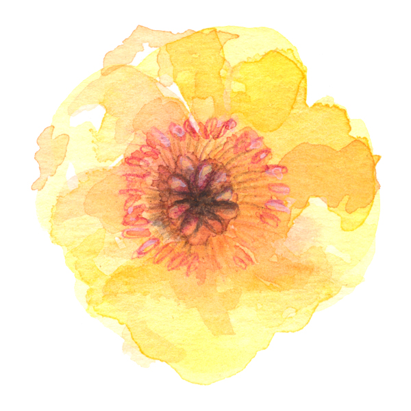
It’s placed at X: 3.0″, and Y: 4.25″, and scaled down to 50%.
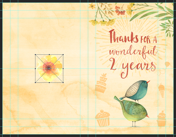
Blending mode: linear burn @ 100% opacity.

The following asset is the vector wreath. It’s placed at X: 3.00″, and Y: 4.25″, and scaled up to 150%.
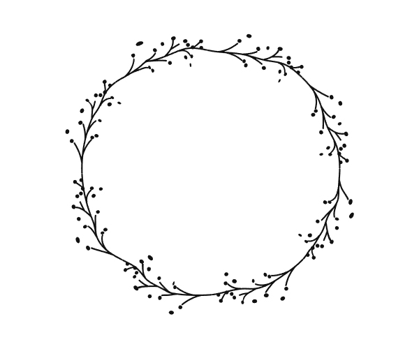
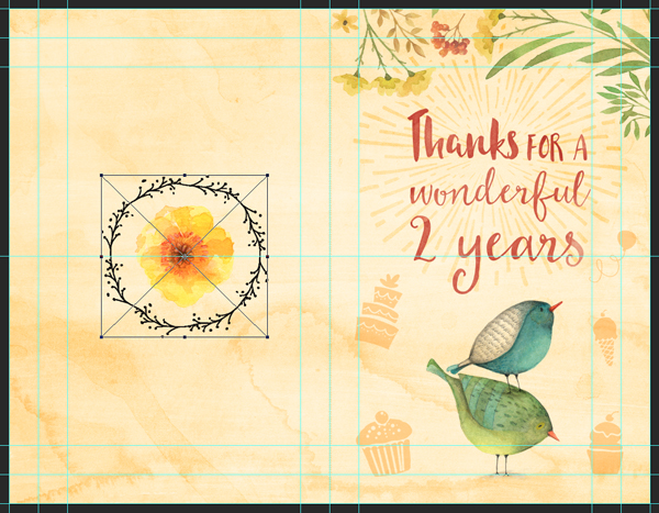
The wreath should then be given the same layer style as the divider, except that the blending mode’s opacity should be 100% (instead of 75%).
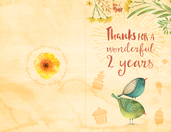
Next are the two champagne glasses.
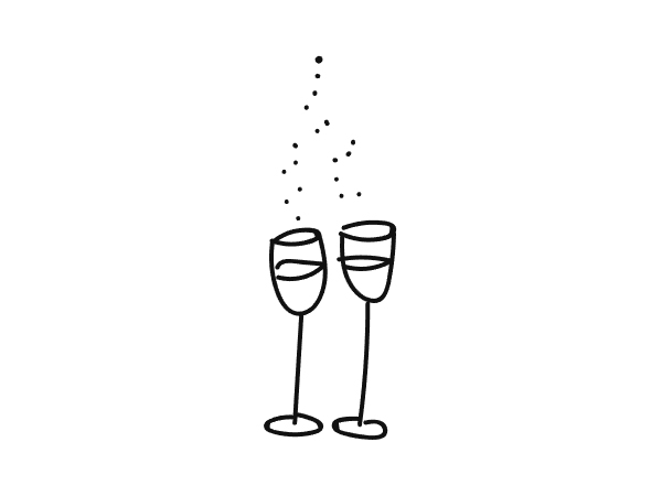
They are placed at X: 3.00″, and Y: 6.35″, rotated 6° counterclockwise, and scaled up to 115%.
Finally, let’s assign it the same layer style as the wreath.
Lastly, we need to add the Design Cuts URL to the bottom of the card. “WWW.DESIGNCUTS.COM” is set in BingoBongo, that’s 12 points tall, that’s colored in burnt red (#d96b52), and located at X: 3.00″, and Y: 7.77″.
We can now organize the layers a bit better.
STEP FOUR: OUTSIDE TEXTURES
It’s now time to add the last four textures needed for the piece’s cohesion.
The first texture is 2LO Daydreamer 20.jpg.
The texture should be centered on the canvas, and the texture distorted to fit the aspect ratio of the canvas.
Levels: 25, 1, 200.
Blending mode: soft light @ 75% opacity.

The following texture is 2LO Adornment 16.jpg.
It’s centered on the canvas, and left at full scale.
Levels: 35, .75, 175.

Blending mode: soft light @ 50% opacity.
The next to last global texture is brush-strokes-textures-volume-02-004-sbh, by The Shop.
It’s centered in the canvas, rotated 90° counterclockwise, and scaled down to 50%.
Levels: 35, .75, 175.
Blending mode: soft light @ 50% opacity.

Finally, the last global texture is offset-texture-and-image-mask-collection-PRINTING_PLATE_HALFTONE.png.

It’s centered in the canvas, rotated 90° counterclockwise, and scaled down to 75%.

After setting the layer’s fill to zero, we’ll give it a burnt red color overlay (#d96b52), set to color burn @ 30% opacity.
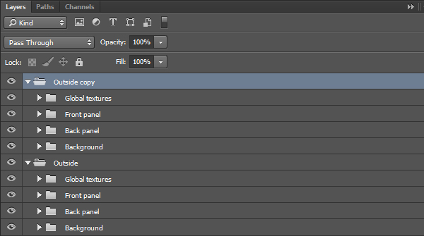
And our outside is completed! Let’s organize our layers.

Now, we also need to organize all these layers to accommodate putting the inside of the card together.
With that done, it’s time to move on to the next step!
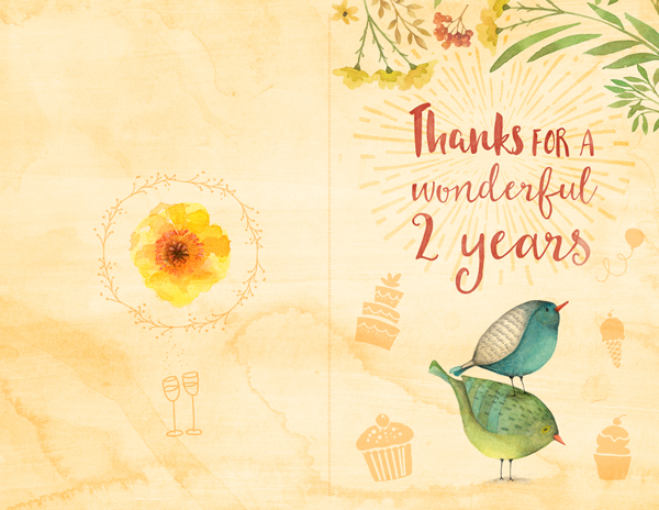
STEP FIVE: BUILDING THE INSIDE OF THE CARD
Duplicating the base
The inside of the card is an altered version of the outside. The background is “lighter” (the textures are less marked), and without the text.
Instead of going through the same process of setting up the background and global, we can simply duplicate the outside, and delete the redundant layers.
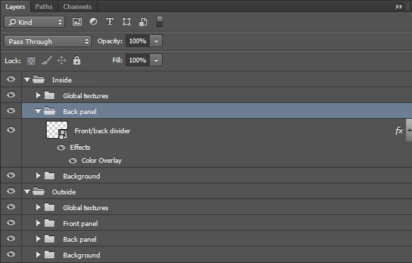

Adjustments
After duplicating the complete outside, deleting all the content but the divider, we can now adjust the textures opacities so the background isn’t as visually overbearing.
- Background
- vintage-paper-textures-volume-03-sbh-011 – soft light @ 75% opacity
- watercolor-washes-textures-volume-03-003-sbh – soft light @ 75% opacity
- brush-strokes-textures-volume-01-007-sbh – soft light @ 50% opacity
- design-spoon-watercolor-textures-13 – color burn @ 25% opacity
- Global textures
- 2LO Daydreamer 20 – soft light @ 65% opacity
- 2LO Adornment 16 – soft light @ 35% opacity
- brush-strokes-textures-volume-02-004-sbh – soft light @ 35% opacity
- offset-texture-and-image-mask-collection-PRINTING_PLATE_HALFTONE – color burn @ 15% opacity (through the color overlay)
The result is a softer background.

The content
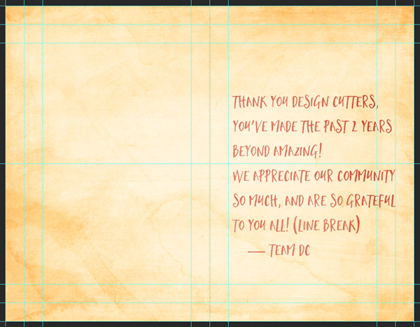
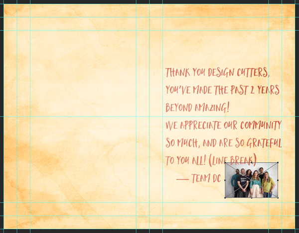
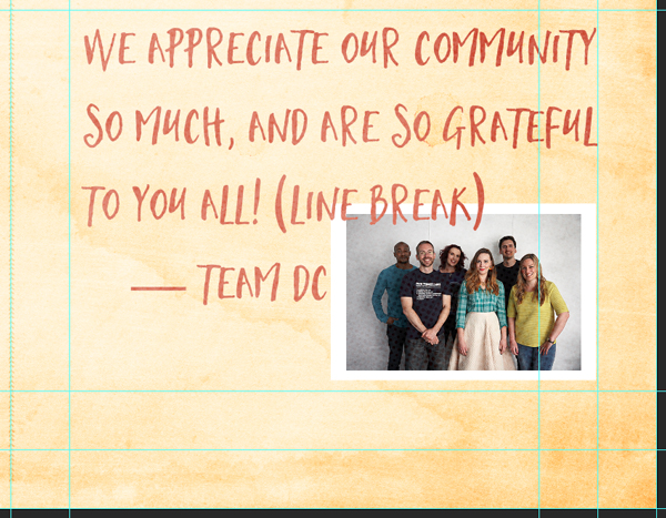
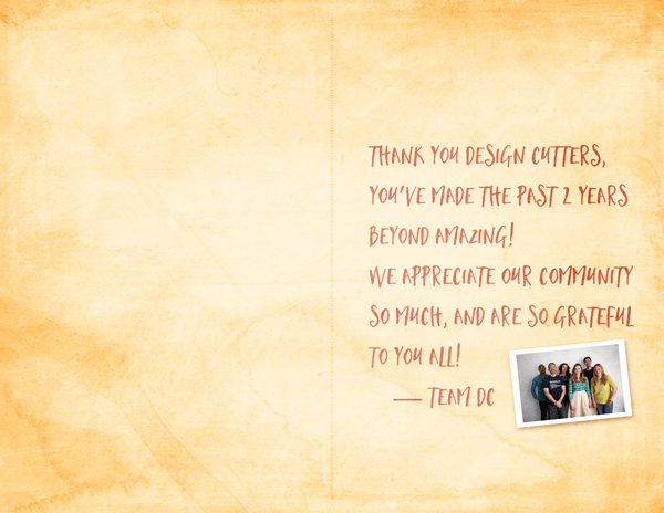
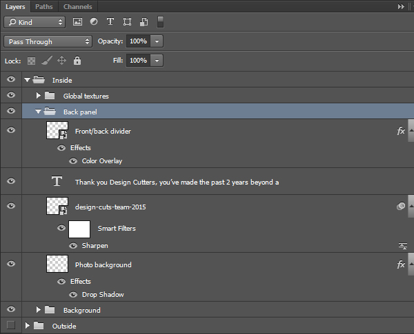
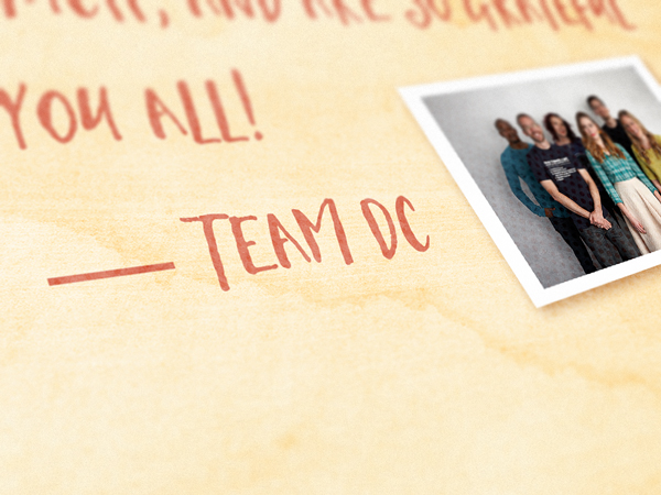
This is the spot for the message, and the Design Cuts team asked me to share this message with you guys:
“Thank you Design Cutters, you’ve made the past 2 years beyond amazing! We appreciate our community so much, and are so grateful to you all!
— Team DC”
On a personal note, it’s been almost two years and 46 tutorials that I (Simon) am writing for the DC community. Thank you so much for your invaluable support, comments, suggestions, kindness, and more. Here’s to another 46!
We are going to go over the type settings used to make the inside messaging consistent with the outside design, as well as a way to include a photo in the piece, as if the image had been tucked in the card.
Let’s start with the type. The text reads
“Thank you Design Cutters, you’ve made the past 2 years beyond amazing! (line break)
We appreciate our community so much, and are so grateful to you all! (line break)
— Team DC”
The text is set in Mustache, that is burnt red (#d96b52), 36 points tall, with a 48 points leading, and justified last left. The text block is located at X: 8.3″, and Y: 4.6″.
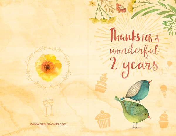
Next, we are going to out the photo in place (design-cuts-team-2015.jpg). It’s located at X: 9.35″, and Y: 6.65″, and scaled down to 30%. This makes it nest in the gap between the edge of the card, and the signature.
Behind the photo layer, we need to create a new layer, to create a background for the photo.
After loading the photo as a selection, we can extend it manually to create an edge. This area we’re creating is the one that will be filled, and create a Polaroid-style edge around the image.
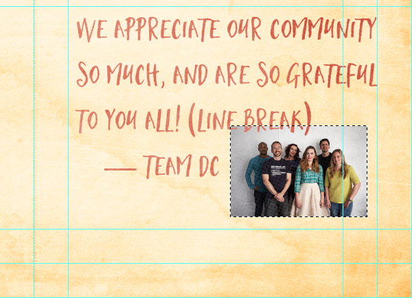
Once a suitable border has been established, we can fill the selection in white.
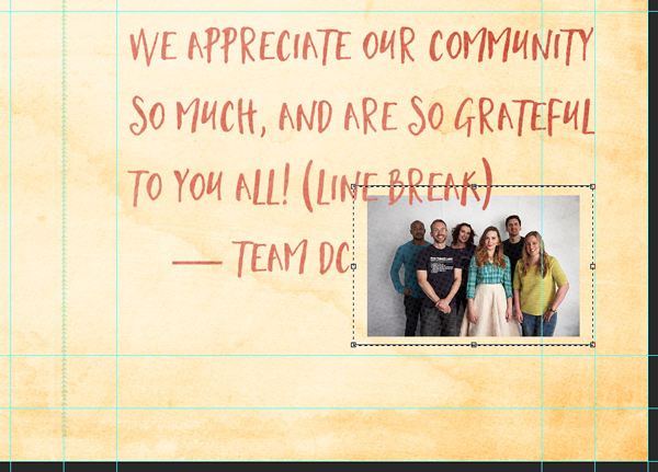
From there, we can select both the photo, and its background, rotate it counterclockwise of 6°, and scale it down to 85%.
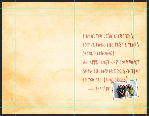
After erasing the extra “(line break)” mention, we can move the photo and its border up to X: 9.45″, and Y: 6.35″.
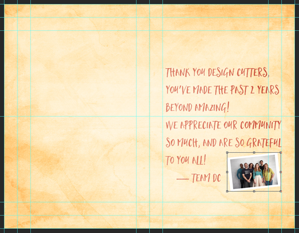
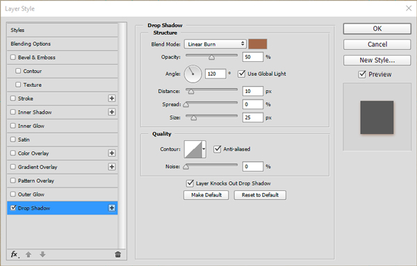
From there, we are going to be able to assign a drop shadow layer style to the photo background layer. It will simulate the photo being a loose “page” in the card.
And with that, all of our elements are in place. It’s time to organize the layers.
And our little card is done!

WRAPPING THINGS UP
We’re done! Phew, that was a long one. I hope that you enjoyed it, and that your outcome matches the goals you had at the beginning.

Did I leave anything unclear? Any suggestions? Don’t hesitate to reach out in the comments below! The Design Geeks and myself will be happy to help out.
We’d love to see your tutorial outcomes! Please share them with us on the Design Cuts Facebook page. We’ll share the best ones with the whole Design Cuts community.

If you are interested in the 19 Design Cuts bundles being re-run as part of our anniversary, then be sure to check out our 2nd Birthday Multi Deal Fest, where you can grab them for the next few days only.
Join once more with me, wishing the Design Geeks a happy anniversary, and many more!
And that’s it for today. Until next time, cheers!
Thank you so much. Great tutorial! Happy 2nd Birthday to you all.
Thank you for your kind words, Ali!
Great tutorial!!! I love watercolor effect on my projects!! this is very useful!! thank you so much!! (and also happy 2nd birthday!!! :D)
Thank you Melissa! Don’t hesitate to share what you do with your new tips and tricks!
You guys are amazing…Congrats on 2 years!
Cheers!
I’ll admit to not always wanting to emulate the finished product so much as I want to see what new little trick you’ve illustrated on layering different elements :D My inner design geek is a happy little geeky girl :D
Congrats on two years to you all – you’re the only site I turn to for design resource bundles anymore. You guys rock! :D
“I’ll admit to not always wanting to emulate the finished product so much as I want to see what new little trick you’ve illustrated on layering different elements”
Noooo! ;-) That’s cheating! Glad you liked the tricks though. Let me know if anything is unclear.
We shall strive to keep this site the best there is :-)
Happy Anniversary! Thank you for the great tutorial.
Cheers! And thank you for your kind words about the tutorial.