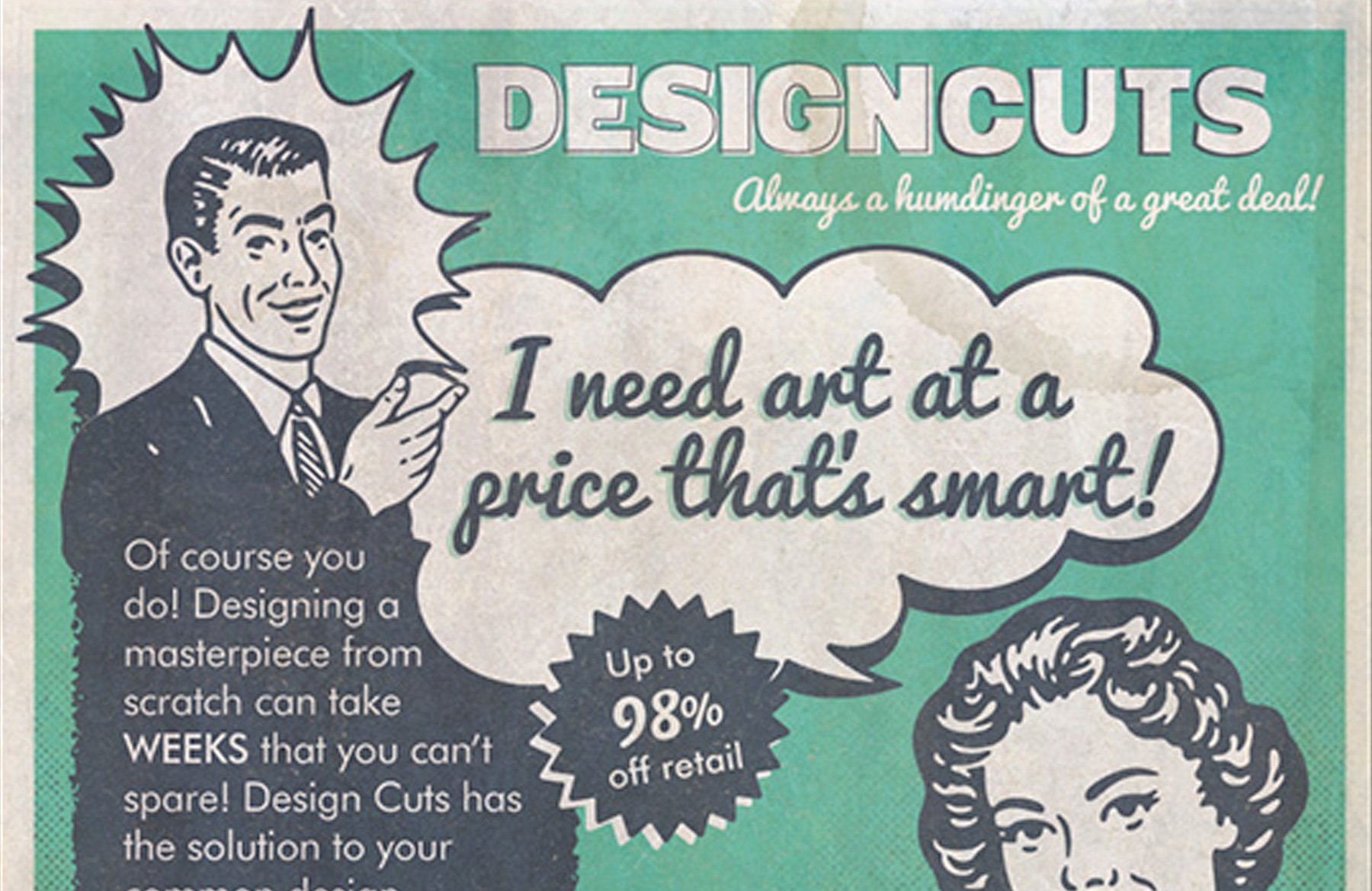
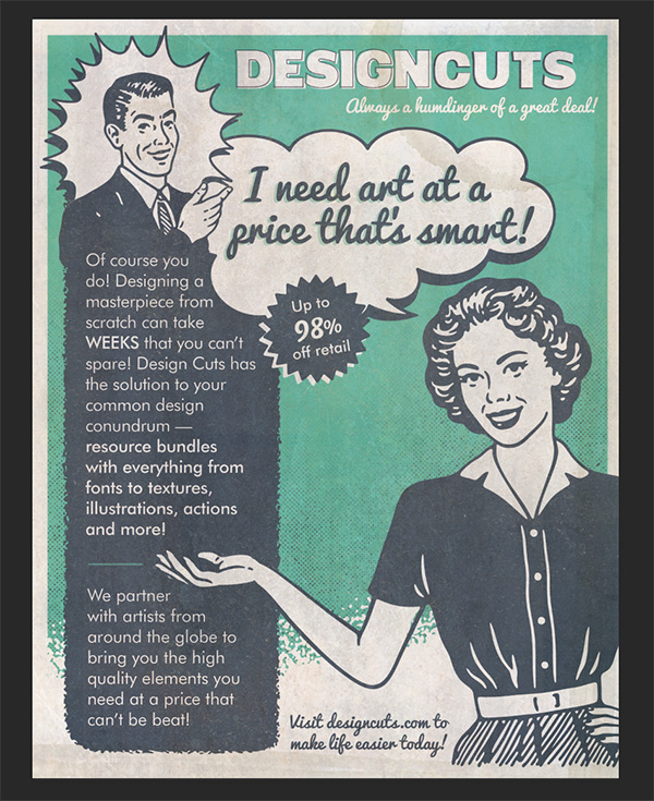
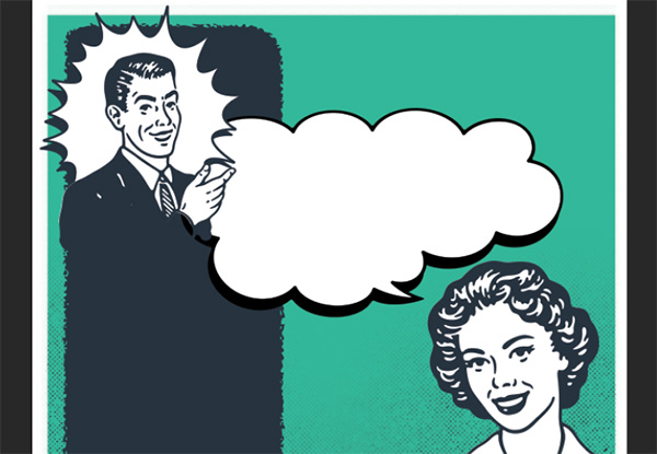
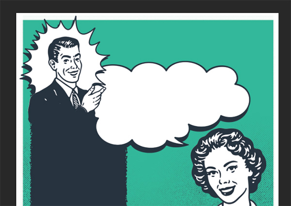
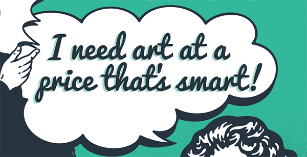
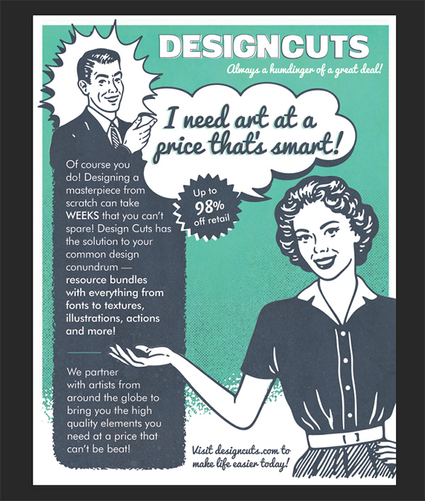
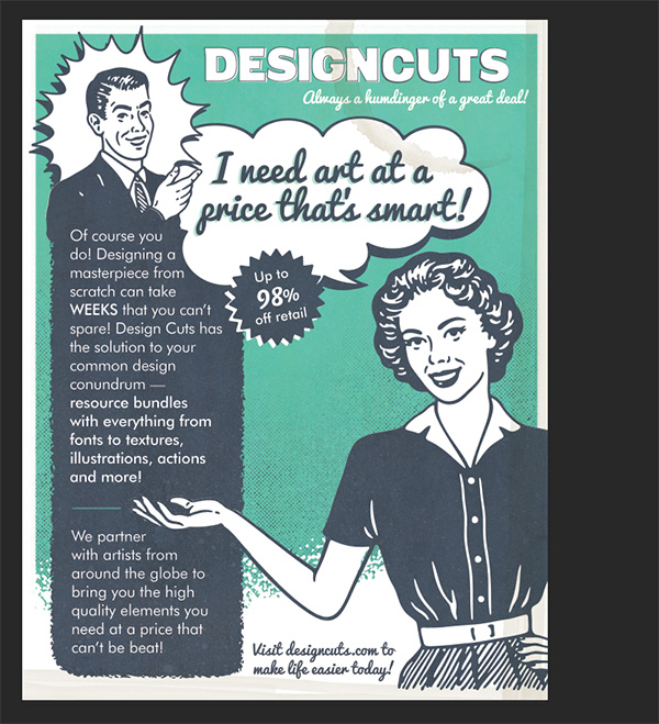
WHAT WE’RE CREATING:
Hello Design Cutters! Renee here with a Photoshop tutorial, as requested by our lovely community. We’re going to create a vintage ad promoting our favorite source of design obsession — Design Cuts! We’ll mix 1950’s style illustrations and shapes with retro fonts and textures to create a stylish advertisement that oozes with vintage appeal!
Follow along with this tutorial: Download the freebies
This week’s free pack includes beautiful 1950’s style advertising illustrations, a couple of Photoshop brushes and a few fantastic, grungy textures.
This freebie pack is just a small sampling of the amazing retro goods available in The Complete Vintage Designer’s Kit for just $29 (that’s 95% off). This bundle will help you nail an authentic vintage look with high quality retro style fonts, Photoshop actions, vector illustrations, textures and more!

RESOURCES
In addition to the freebie pack, you will need a few fun, vintage fonts. I’ve decided to use Digitalino for the vintage Design Cuts logo, Pacifico Script for headlines and Futura for body copy. All but Future are available for free and if you use Adobe Creative Cloud, there should be a Futura font available with TypeKit. If you’re looking for an alternative, stick with fonts developed before the mid 1950s to capture an authentic look. Futura, for example, was first designed in 1927!
We’ll also use two illustrations, Man 2 and Woman 4, from District 62 Studio that are part of the bundle, but not included in the freebie files.
Tom’s Note: In response to some helpful community comments, we wanted to clarify why these 2 illustrations could not be included in this freebie pack. The designer felt that due to them comprising a main part of their full priced pack, they weren’t comfortable including them in a freebie, which we totally respect and understand. As a help to the DC community, here are some links to alternative illustrations that can be used within your own design (or alternatively the illustrations shown in this tutorial are available in the main bundle, currently available for 95% off).
50s Style American Woman Winking
50s Style Guy with Cigarette Illustration
50s woman with worried face vector
Step 1:
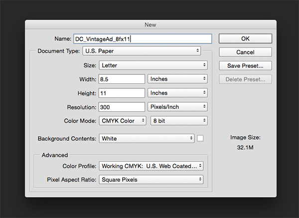
Open Photoshop and create a new file. We’ll use letter size—8.5” x 11”. Set your resolution to 300 ppi and Color Mode to CMYK.
Save your file.
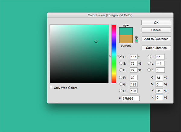
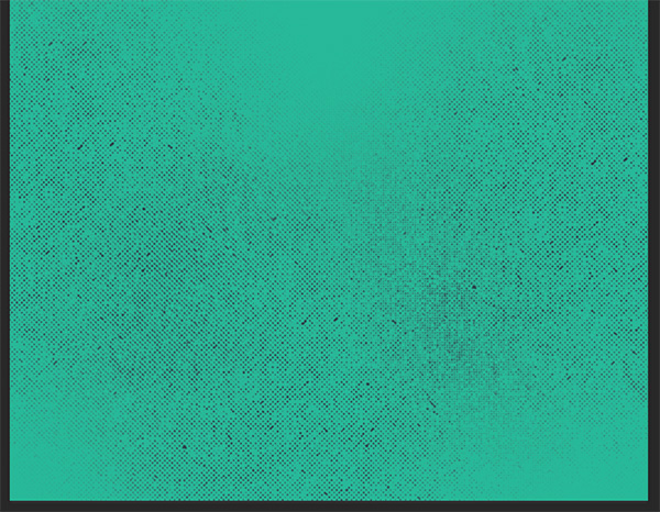
Let’s start by creating our background in Design Cuts teal. In your Layers palette, click on the new layer icon. Name this layer Solid Teal.
Click on your foreground color below your tools and in the pop-up, change the CMYK values to 73/0/52/0. Press option/alt + delete/backspace to fill the layer with the foreground color.
Now we’ll add a little halftone texture. Create a new layer by clicking on the New Layer icon and name it Halftone Pattern.
Click on your foreground color and this time, we’ll change it to dark blue using the CMYK values 75/68/67/90.
Open your Brush Presets palette (Window > Brush Presets). Click on the little arrow at the top right to open the flyout menu and choose Load Brushes. Navigate to the freebies folder and select VintageAd_BrushSamples.abr.
Now that we have our brushes loaded, select Atomic Halftone 7 with your Brush tool (b). We’ll click on our image 3 times – once on the bottom left, once in the bottom middle and once on the bottom right. The left and right sides should be a little higher than the middle.
Next, go to File > Place Linked and navigate to the freebies folder. Select Element 49. Use the corner handle while holding shift to enlarge the size of the element so it runs off the bottom and sides.
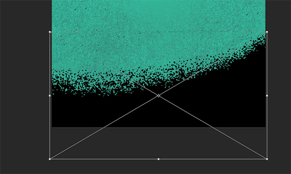
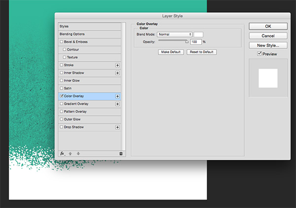
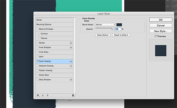
Next, we’ll change the color by clicking on the fx icon on the bottom of the Layers palette and choosing Color Overlay. In the pop-up dialog box, click on the color swatch to the right of the Blend Mode. When the Color Picker pops up, choose plain white (0/0/0/0) and click OK.
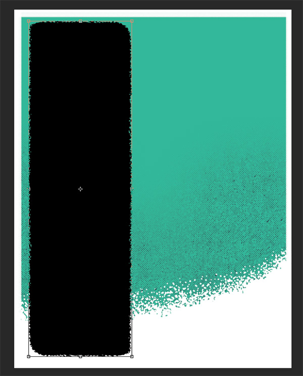
Finally for our background, we’ll add a frame. In your Layers palette, add a new layer and name it White Frame.
Select your Brush tool (b) and use the Watercolor Buildup brush. Increase the size to about 175 by pressing your right bracket (]) several times. Position your brush over the top left of the artboard. Click and drag to the right while holding down Shift to draw a straight line. I drew over mine a couple of times until I liked the width.
Repeat the same process on the left and right edges. A little irregularity is good for our vintage style, so don’t worry about getting them all exactly even.

With our background completed, we’ll do a bit of housekeeping to keep things organized. Select all 4 layers that we created (hold cmd/ctrl to select multiple layers) and press the Create a New Group icon at the bottom of the Layers palette. Name the group Background.
Step 2:
Now we’ll start on our content layout. Go to File > Place Linked and select Element 1 from the freebies folder. Rotate 90 degrees in either direction. Hover over the corner handle until the rounded double arrow icon pops up, then hold shift while rotating left or right with your mouse. Holding shift limits the rotation to 45 degree increments.
After rotating, use the corner handles (while holding shift to maintain aspect ratio) to enlarge the element to fit from top to bottom of the ad with a little breathing room.
Next, we’ll change the color to dark blue. With the element 1 layer selected, click on the fx icon on the bottom of the Layers palette and choose Color Overlay. In the pop-up dialog box, click on the color swatch to the right of the Blend Mode. When the Color Picker pops up, enter the values for our dark blue (75/68/67/90). Click OK.
I want to add a little talking head at the top of this rectangle, but I think he’ll look better in a little shape that contains him and gives him a background. So, place Element 31 from the freebies folder. Reduce the size to fit at the top left of the dark blue rectangle.
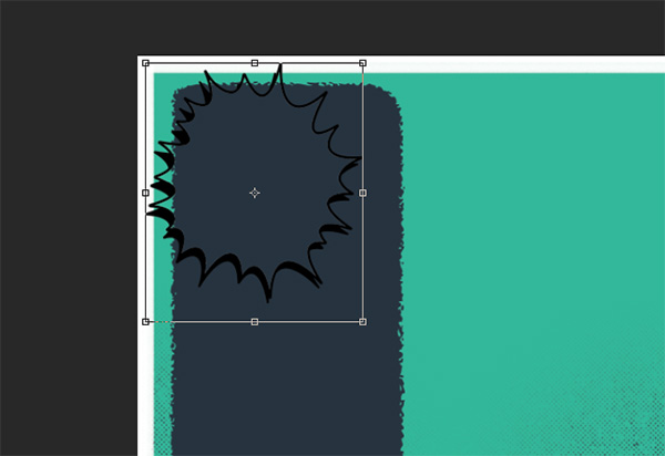
We’ll need a fill color to make it stand out. Select your Magic Wand tool (w) and click once in the empty area inside the starburst shape.
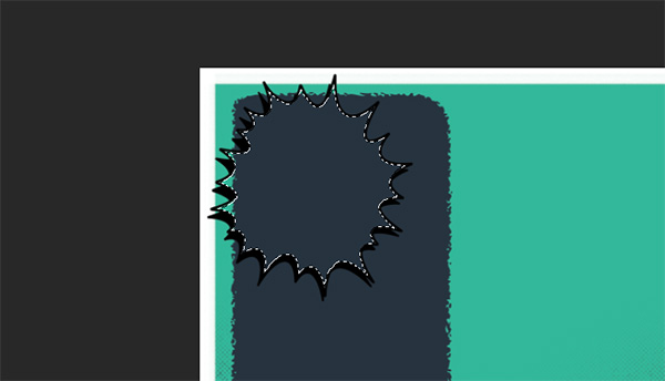
Create a new layer and name it White Starburst Fill. Press d to change your foreground color to black and background to white, then press x to toggle and bring white to the foreground. Press option + delete (or on a PC, alt + backspace) to fill with the foreground color. Drag this layer below the starburst.
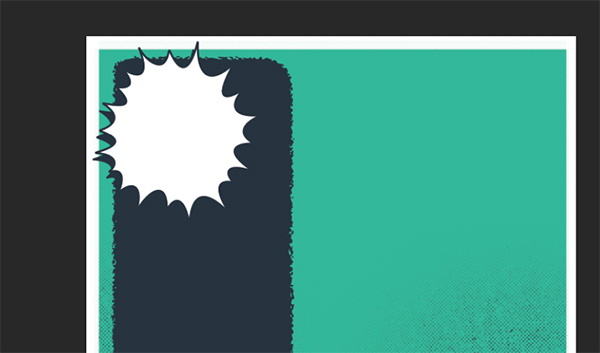
The last thing we’ll need to do with our starburst is to change the color overlay to dark blue. You can repeat the process we used earlier (using the fx icon) or you can hold option/alt while dragging the Color Overlay effect from the Element 1 layer in the Layers Palette to our new starburst layer.
Place Man 2 from the full bundle’s District 62 Studio folder. Position him to fit inside the starburst and give him a color overlay of dark blue.

He’s definitely blending into the background, so we’ll need to give him a fill. Unfortunately, we can’t use our magic wand on this one, so we’ll manually brush in color, but it will be pretty quick and easy with the big giant strokes on the illustration.
Create a new layer below Man 2 and name it Man Fill. Select your Brush tool (b) and choose the Hard Round brush. Use your bracket keys ([ and ]) to change brush size as needed on the fly.
Change your foreground color to white and start drawing in transparent areas of the man’s face and hands. It’s really easier than it sounds. The big fat edges on the drawing give you lots of wiggle room. If you overdraw anywhere, just follow up with your Eraser (e).
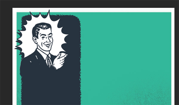
Select the last 4 layers (man 2, man fill, element 31 and white starburst fill). Click on the Create a New Group icon and name the new group Man.
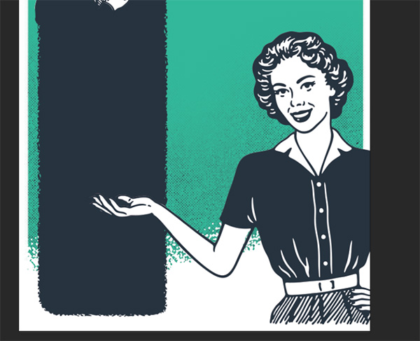
Next, place Woman 4, also from District 62 Studio in the full bundle. Reduce her size so she fits in the bottom right corner with her left hand cutting about halfway into the blue rectangle.

Create a new layer and drag it below Woman 4. Name it Woman Fill. Use a combination of the magic wand technique and manually brush technique to fill the inner areas with white. I was able to use the Magic Wand (w) to select and fill her face, collar and some clothing areas, but had to manually brush in her arm area.
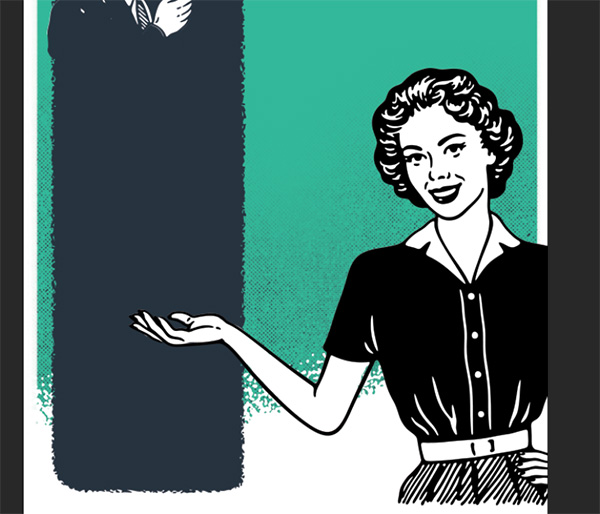
Now add a color overlay of the dark blue color to the Woman 4 layer. Add Woman 4 and Woman Fill to a new group and name it Woman.
Next, create a new group under the Man group. Place Element 18 from the freebies folder. Position it above and to the left of the woman, sized so that it just barely overlaps the rectangle and man.
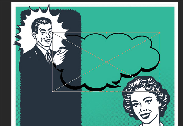
Use your Magic Wand (w) and click once in the middle of the transparent area of the bubble to select it. Create a new layer under Element 18 and name it White Bubble Fill. Press opt + delete (or alt + backspace) to fill with the foreground color of white.
Select the Element 18 layer and apply the blue Color Overlay effect by holding opt/alt and dragging the effect from another layer (like Woman 4).
Step 3:
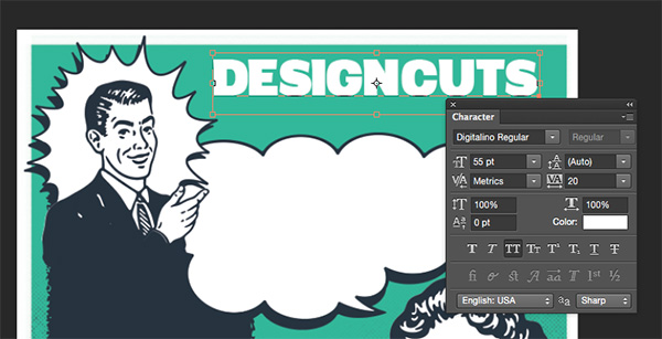
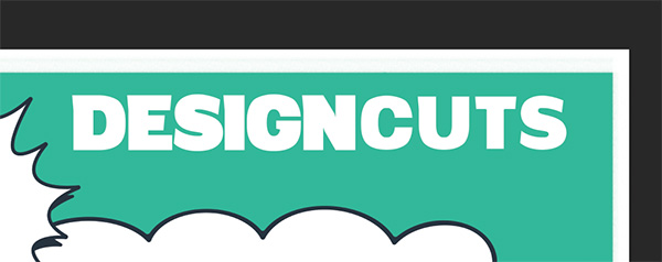
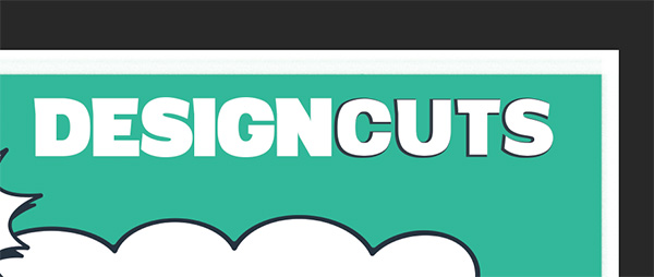
It’s time for some words! Let’s start with a vintage imagining of the Design Cuts logo. Create a new group above Woman and name it Logo Tagline. Select your Text tool (t) and type DESIGNCUTS in white Digitalino at 55 pt with a tracking width of 20. Position in the top right of the artboard.
In the Design Cuts logo, Cuts is always thinner, Digitalino doesn’t have a thinner style, so we’re going to fake it! With the DesignCuts layer selected, Click on the Add Layer Mask icon at the bottom of the Layers palette.
Hold cmd/ctrl and click once on the DesignCuts layer to create a selection around the words.

Go to Select > Modify > Contract. In the dialog box, enter an amount of 4 pixels and hit OK. Now we want to invert the selection, so go to Select > Inverse. Now we have the outer pixels of the letters of selected.

We’re in layer mask editing mode, so you’ll only have black and white for your color options. Anything white on the layer mask is visible. Select your Brush tool (b) and, still using the Hard Round brush, set your foreground to black (toggle between white and black by pressing x). Brush over the outer (selected) areas of “Cuts”. Make sure not to brush over any of “Design”. That gives us thinner text for Cuts!
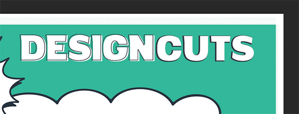
For a little more differentiation between the two parts of the name, I’ll use different ornamentation on each. Copy the DesignCuts text layer by clicking and holding down on the layer and dragging it to the New Layer icon at the bottom of the Layers palette.
Use your Text tool (t) to delete DESIGN, leaving only CUTS. Change you foreground color to dark blue and hit opt + shift + delete (or alt + shift + backspace on PC) to fill the letters with the foreground color. Drag the copied layer below the original and position so it just peeks out from behind on the bottom left.
Create a new layer in the Logo Tagline group and name it Design Outline. Cmd/ctrl click on the DesignCuts layer again to create a selection. Press opt/alt + delete/backspace to fill the selection with our foreground color (dark blue). Then go to Select > Modify > Contract. Enter 2 pixels and click OK. Now press delete/backspace to delete the inner color and leave us with an outline. Hit cmd/ctrl + d to deselect, then position the outline just off center from the original text.
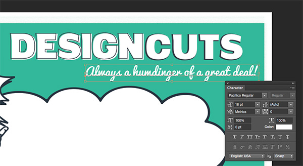
Lastly in this group, type “Always a humdinger of a great deal!” in white Pacifico Regular at 18 pt and position it below DesignCuts.
For our big speech bubble in the middle of the ad, we’ll type “I need art at a price that’s smart!” in dark blue Pacifico Regular at about 43 pt. I also adjusted the leading to about 44 to keep my lines nice and tight within the bubble.
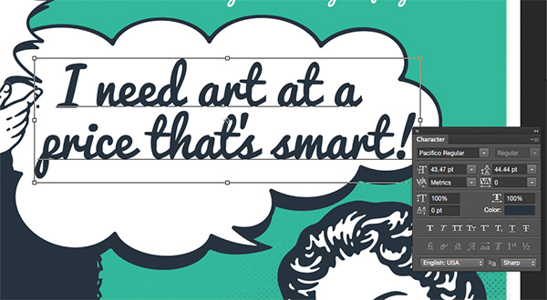
Copy this text layer by dragging it to the New Layer icon. Drag the copy below the original. Offset the position just slightly to the left and down, like a shadow. Change the color to teal by changing your foreground color to teal and pressing opt + shift + delete.
Create a new group and name it Starburst. Place Element 37 from the freebies folder. Reduce the size considerably so it fits just below our speech bubble.
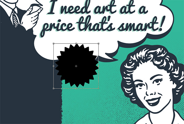
Add a dark blue color overlay effect.
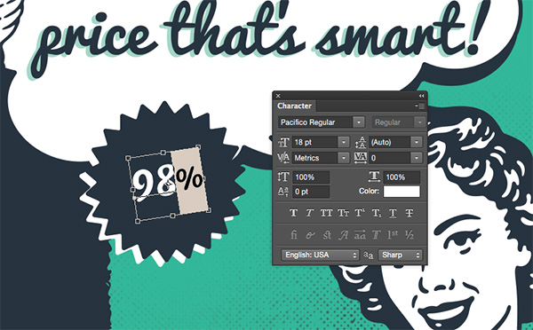
Duplicate the Element 37 layer. Double click on the Effects to bring up the dialog box. Click on the dark blue swatch and change it to white and click OK. Drag this layer below the original and offset to the left and just below. This gives us some separation from the background and helps define the shape.

Next, we’ll add “98%” in white 36 pt Pacifico Regular.

Select the percentage sign and reduce the size to 18 pt. Rotate the entire text box to the left (Edit > Free Transform and hover over the corner handle to access the rotation option) and position inside the starburst.
Duplicate the 98% layer. Use the Type tool to select the text and change it to “Up to” in Futura Medium or Book at about 16 pt and position it above 98%.
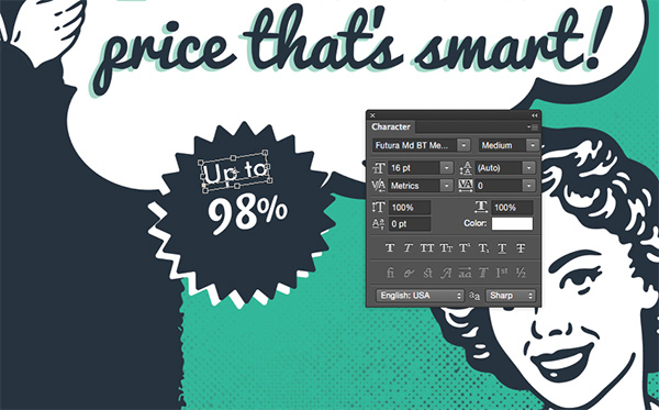
Now duplicate the “Up to” layer. Position the duplicated text below 98% and change it to say “off retail”.

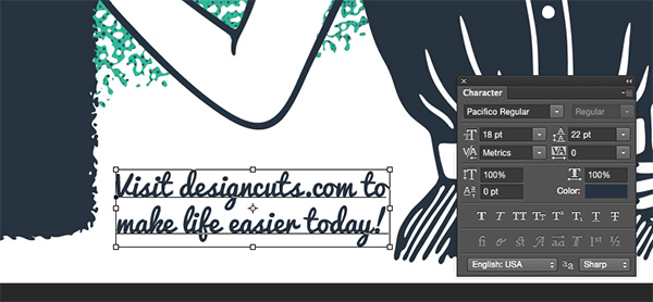
This next bit of copy will not go in a group. It would be the only thing in the group, so ti can hang out by itself on a layer. Grab your Type tool and type Visit designcuts.com to make life easier today!” in dark blue Pacifico Regular at 18 pt with 22 pt leading. Add a line break (press enter) after “to”. Position in the white space below the woman’s elbow.
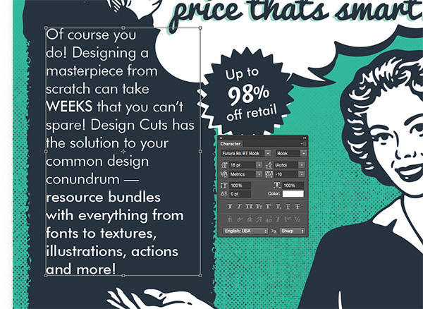
Create a new layer and name it Rectangle Copy. Use your Type tool to create a text box over the top of the dark blue rectangle by clicking and dragging to draw the text box.
Paste the following: Of course you do! Designing a masterpiece from scratch can take WEEKS that you can’t spare! Design Cuts has the solution to your common design conundrum — resource bundles with everything from fonts to textures, illustrations, actions and more!
Set the font to white Futura Book at 18 pt. I had to reduce the tracking to -10 to get a nice fit for the space. I used Futura Medium to accent important words and sections.
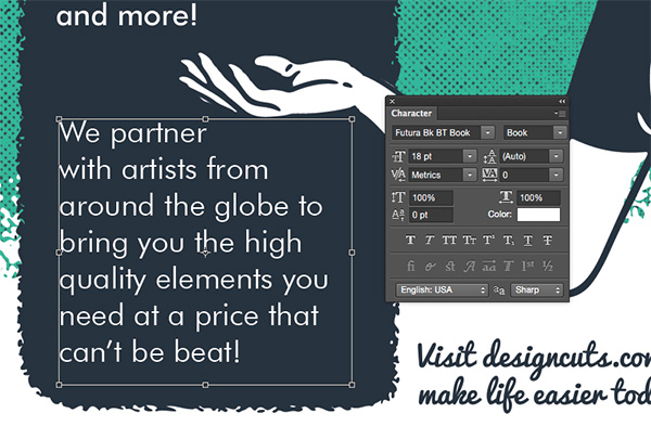
Create a second text box below the woman’s hand and type the following in the same white Futura Book at 18 pt: We partner with artists from around the globe to bring you the high quality elements you need at a price that can’t be beat!
Finally for this text section, let’s add a little divider between the two chunks of copy. Create a new layer and name it Teal Divider. Change your foreground color to teal and select your Brush tool (b). Using the Watercolor Buildup brush, click once between the copy, aligned with the left side, and hold shift while dragging to the right. If you draw the line a little too long, just use your Eraser (e) to shorten it.

Step 4:
Textures! The key here is too slowly build up many layers to give an authentic aged effect.
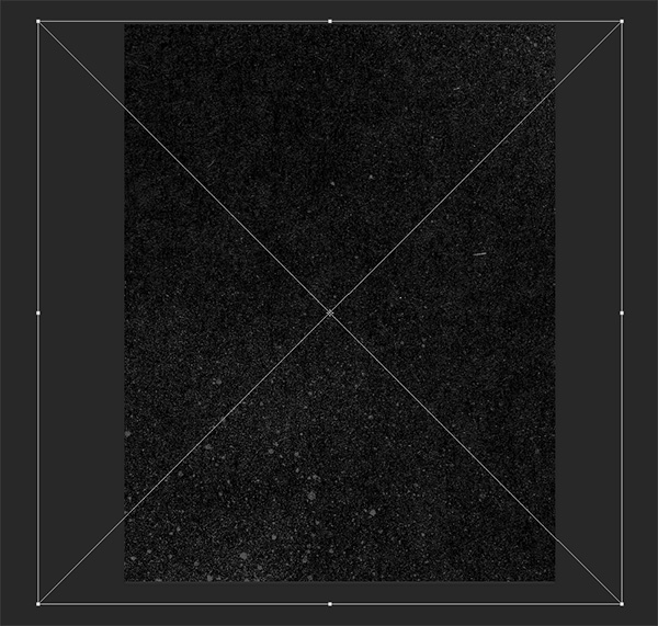
Create a new group and name it Texture. Place 2LO Fall Harvest 11 from the freebies folder and enlarge it to cover the entire artboard.

At the top of the Layers palette, change the Blend Mode to Overlay and the Opacity to 30%.

Next, place in dust1 from the freebies folder. Enlarge to cover the artboard.
Change the Blend Mode to Screen and reduce Opacity to about 50%.
Create a new layer and name it Coffee Stain. Set your foreground color to a nice old coffee color like 19/28/38/31. Select your Brush tool (b) and use Coffee Stain 1 that was loaded with the VintageAd_BrushSamples file earlier. Reduce the brush size by pressing the left bracket ([) several times and click once on the top right of the artboard to add a coffee stain.
At the top of the Layers palette, change the Blend Mode to Multiply and the opacity to 70%.
Create another new layer and name it Watercolor Wash. In your Brushes, change to the Watercolor Wash brush. Increase the size just a little bit by pressing the right bracket a couple of times. Still using the same muddy brown foreground color, draw a few lines across the bottom of the artboard. They don’t need to be perfectly straight – the rougher the better! Change the blend mode to Multiply.
Duplicate the Watercolor Wash layer. Rotate it 90 degrees and drag the handles out while holding shift to enlarge so it stretches from the top to the bottom of the right side of the artboard.
Create a new layer and name it Dust. Select your Brush tool and use the Dust 3 brush from the freebie file. Click here and there a few times. It’s not a real strict technique, just click a few times to get some dust coverage. Be careful not to go overboard though!

For the last step, duplicate the 2LO Fall Harvest 11 layer and drag the copy above the Dust layer we just made. Change the Blend Mode to Multiply and the Opacity to 20%.
Well Gee Whizz! We’re All Done!
We have a vintage ad that looks like we just found it in someone’s attic!
Remember that we’d love to see your designs on our Facebook page too.
Please leave a comment if you have any questions or suggestions. You guys are awesome and I hope you enjoyed this one!
You can still get the The Complete Vintage Designer’s Kit but remember, this bundle expires soon!
Cheers!

Hey folks, for what it’s worth, my two cents on the DC giving the assets for the tutorials. DC has to be the most generous and supportive site for designers on the internet that I have found, so I can’t for one moment complain. It’s only a tutorial, not client work, so heck whether I’m doing a tutorial here or from any other site, f need be, I’ll just download a comp image, watermarks and all to complete the lesson and learn the techniques It’s not going to be published anywhere and I’m not going to post it to my social media as it is not original work so I am not violating any copy rights. What I am concerned about is gaining mastery and being able to apply the techniques to real world design.
This is the first Tutorial that I’ve completely finished here (short attention span!). Following through it all is valuable. The ‘demonstrate – copy – do’ teaching model is effectively used.
The free resources (and tutorials) are most welcome. ‘Scrounging’ elsewhere for extra resources is also a learning experience.
Next step is to try the techniques on something new.
Much appreciated – thanks.
Hey Jon,
Thank you so much for your incredibly kind words! We’re so pleased to hear you enjoyed completing your first tutorial with us and it’s great to hear that you are enjoying your new freebie resources as well :)
Thanks again, Jon, and if you ever need any assistance with any of our other tutorial please do not hesitate to get in touch. I am always here and happy to lend a hand :)
It’s funny to read people complaining about free resources and free Photoshop training. (well not that funny) I found that living life with an outlook of gratefulness is a much more fulling way to go. Excellent tutorial. thanks for that freebies!!
Hey Christopher,
Thank you so much for your comment!
I am really pleased that you like the tutorial and I hope that you get loads of use out of the freebie too :)
Great Tutorial, thank you! ;)
Thank you so much for your kind words, Lelani! I am so pleased to hear you enjoyed this tutorial :)