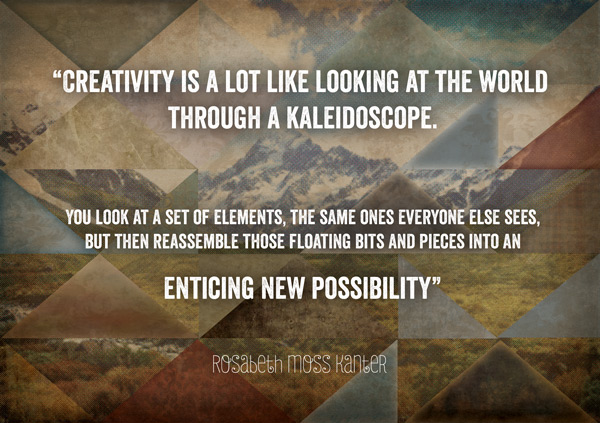
WHAT WE’RE CREATING:
Hello Design Cutters!
Jo here, with a tutorial that aims to get you really familiar with using textures in your design work.
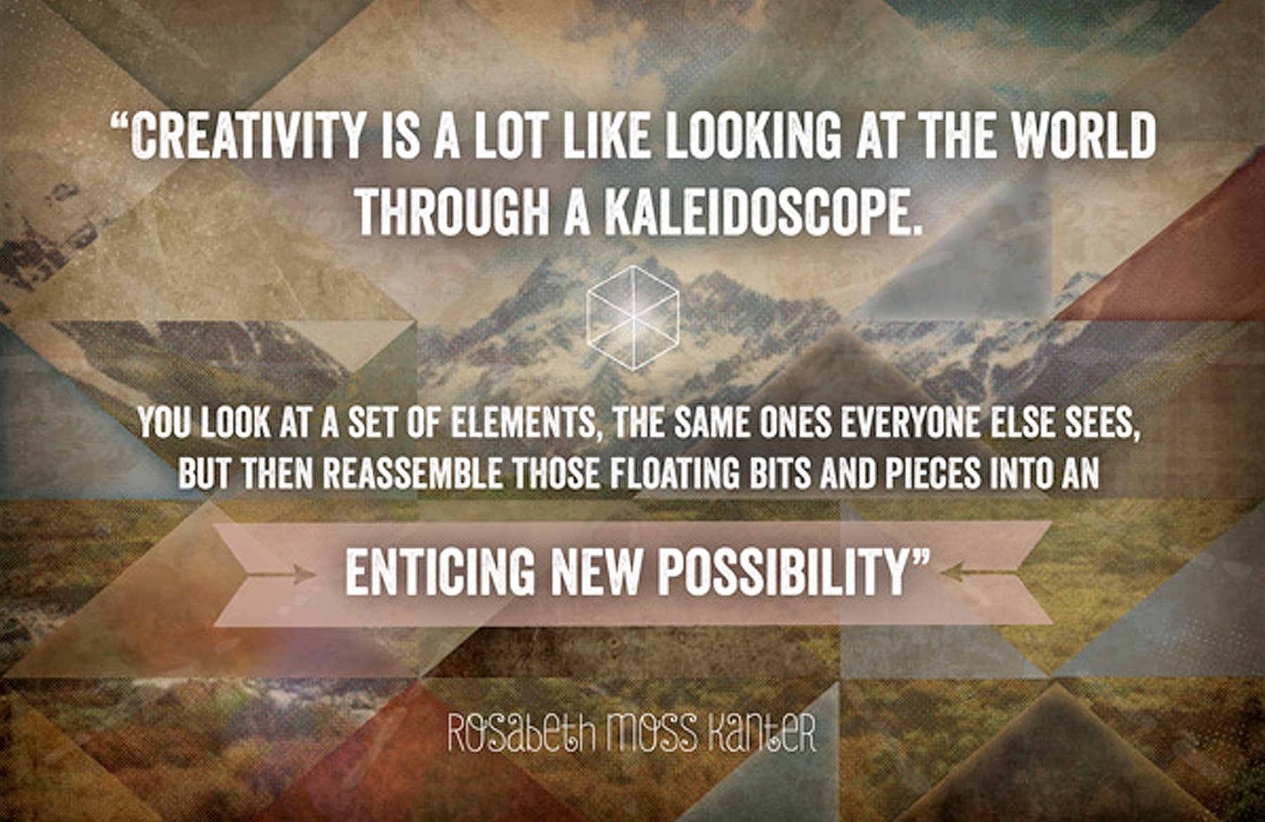
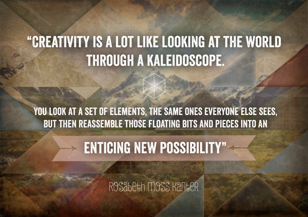
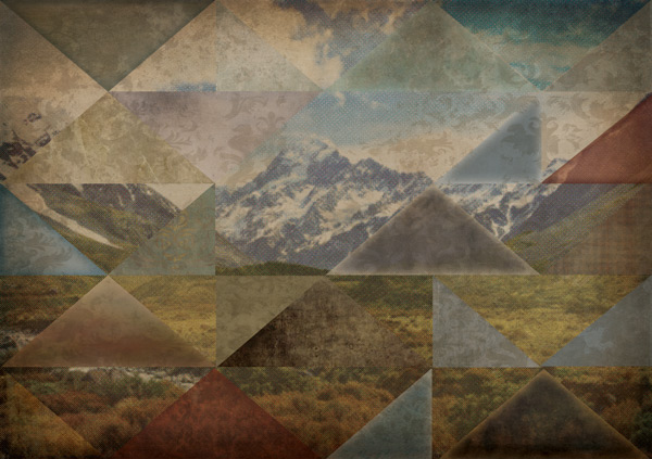
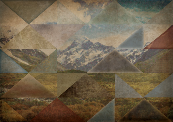
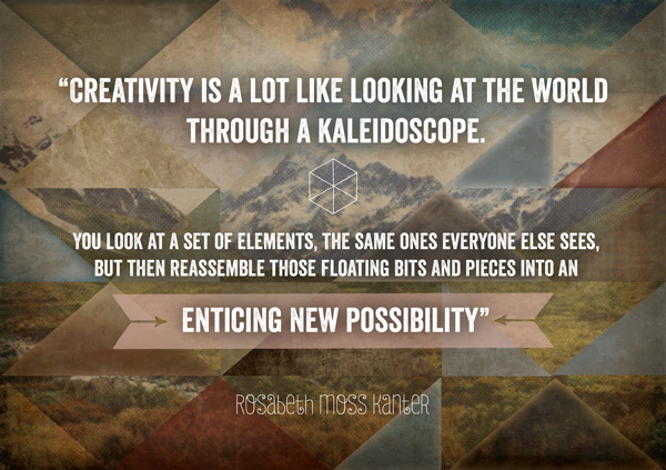
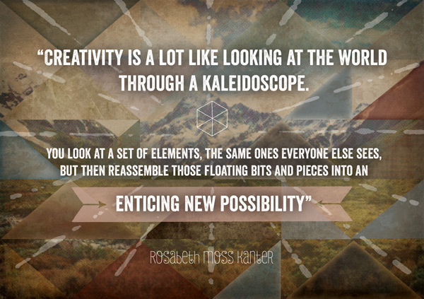
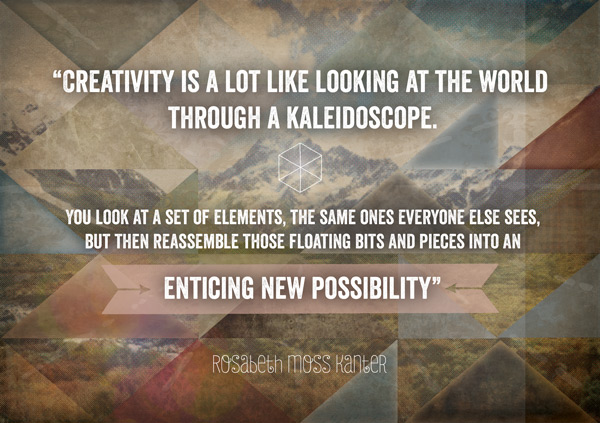
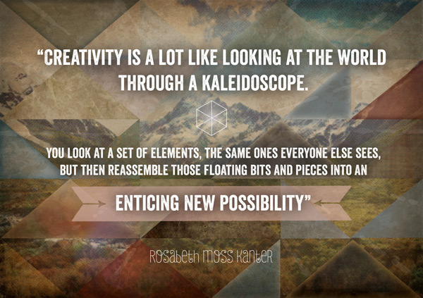
We’re using a ton of textures from the current deal to create this inspirational quote collage, juxtaposing natural imagery with strong, geometric shapes.
Many of you may be used to using the textures as overlays on your photos. In creating this piece, I want to try something a bit different and look at the textures as images in their own right, assessing the colours, patterns and details to see how they can fit into your work.
You’ll also get to download a pack of sample textures to try them out first hand before grabbing the main deal.
Ok, let’s get stuck in!
Follow along with this tutorial: Download the freebies
Today we have another great freebie for you to enjoy. Denise from 2 Lil Owls has kindly put together some texture samples as a freebie for the Design Cuts community. These textures are incredibly versatile and have potential for use in so many of your creative projects!
Remember, this freebie is just a tiny sample taken from this huge bundle: The 2 Lil Owls Creative Textures and Digital Papers at just $29 (91% Off).
There are hundreds of amazing resources in this collection, including soft bokehs, grungy vintage surfaces and hand-painted textures.
Enter your email below to download the 2 Lil Owls free sample pack, so you can follow along with this tutorial easily.
Step 1:
Open up a new 1748px height x 2480px width document in Photoshop.
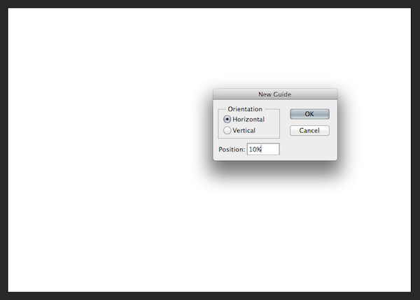
To help us postion the triangles, we’re going to set up some gridlines at set percentage intervals. You can do this by going to View > New Guide, select horizontal and set the position as 10%:
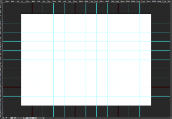
Repeat this process to set up the following guides:
Horizontal: 10%, 20%, 30%, 40%, 50%, 60%, 70%, 80% 90%
Vertical: 8.3%, 16.6%, 24.9%, 33.2%, 41.5%, 49.8%, 58.1%, 66.4%, 74.7%, 83%, 91.3%
Make sure you lock the guides in place (View > Lock Guides) as you don’t want to undo all that work! You now have a useful grid to refer back to during the design process.
Step 2:
Now let’s do something a bit more fun and set up the background.
We need to gather a couple of resources from online, so let’s get those downloaded and ready to use:
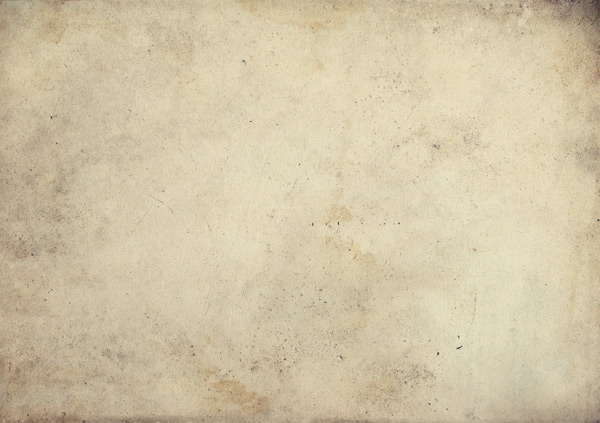
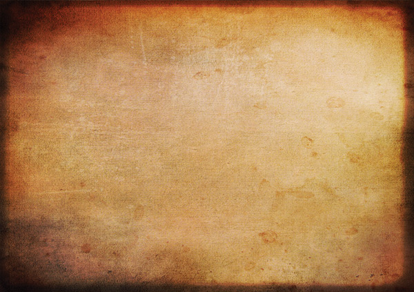
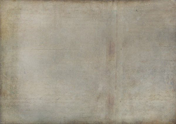
I’ve gone for texture 4, as we want something that’s not overly textured (as there’s plenty of that coming later) and gives us a warm, organic feeling base to work from.
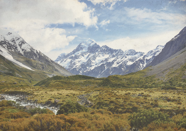
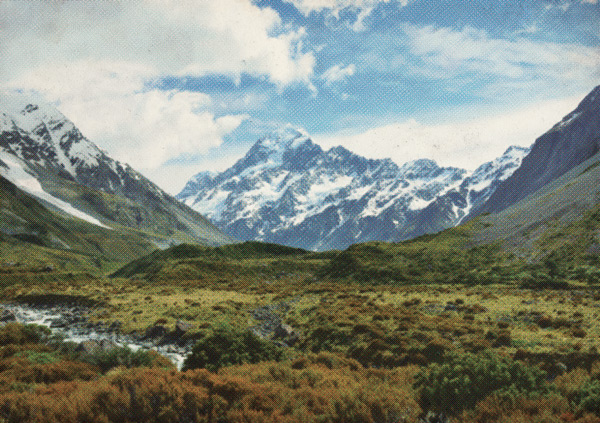
Mountain scene photograph by Kewl
This has got a nice range of contrasting colours and textures which’ll be great to work with when matching up textures from the current bundle.
Place the Old Paper 4 texture on to your canvas, scaling to fit, then reduce the Opacity to 80%:
Place the mountain scene photograph on to your canvas, scaling to fit. The proportions are slightly different, so I’ve let the right side of the image go over the canvas, as we have more interest on the left hand side with the river.
Once it’s in a position you’re happy with, reduce the Opacity to 67%:
Duplicate the layer and hide it temporarily whilst we work on the original photograph.
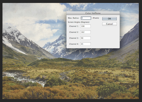
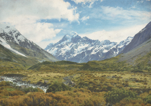
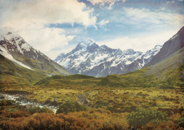
With the original photo layer active, go to Filter > Pixelate > Color Halftone. Set the Max Radius at 4, leaving the other settings as default:
The photo now looks like we’ve found it in a retro magazine – lovely!
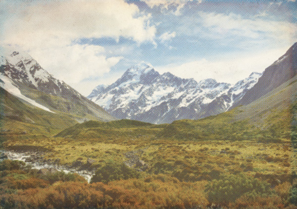
We want to bring back a little more of the detail though, so going to our duplicated layer, select Color Burn as the blend mode and reduce the Opacity to 40%:
It’s still a bit bright for a fully retro feel, so let’s tone down the saturation. Create a new Hue/Saturation adjustment layer and clip it directly to the layer we’re working on. You can do this by hovering your cursor between the two layers whilst holding down alt on your keyboard. The cursor should change to a square icon with a downward arrow, then click.
Note: We’ll be using this “clipping” technique *a lot* through the tutorial, so it’s worth remembering! It’s a great non-destructive approach that gives you a useful safety-net if, like me, you like to mess around experiment with adjustments ;)
We only need to change the Saturation level, reducing it to -75. This tones down the image a bit, but we still get some colour from the halftone layer:
Step 3:
Now we’ll take the first dip in to our awesome 2 Lil Owls Textures bundle!
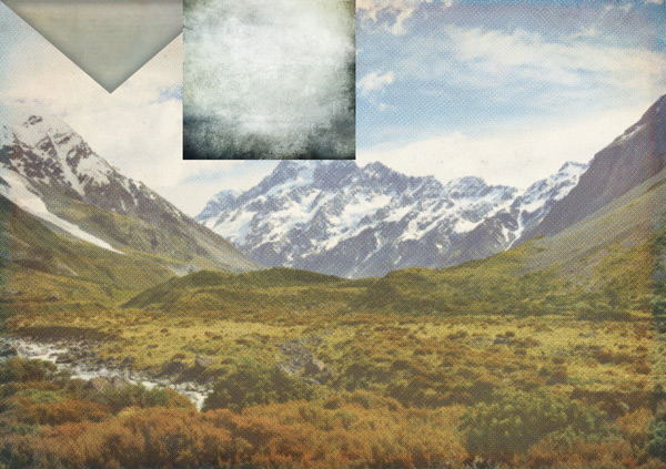
Go to 2-lil-owls-textures-papers-2 > Thru the glass > 2LO Thru the glass 6.jpg, placing and scaling the file to fit your canvas:
Change the blend mode to Soft Light and reduce the Opacity to 80%:
Next up, go to 2-lil-owls-textures-papers-2 > Sublime > 2LO Sublime 11.jpg again, placing and scaling to fit your canvas. The blues and copper tones in this are great retro colours, and reflect the similar tones in the original photograph:
As lovely as this texture is, we still want to see the image below so let’s change the blend mode to Screen and reduce the opacity to 30%:
We’ll round here by selecting all the layers we’ve created in this step and put them in to a group called ‘Mountains’ for easy access later.
Step 4:
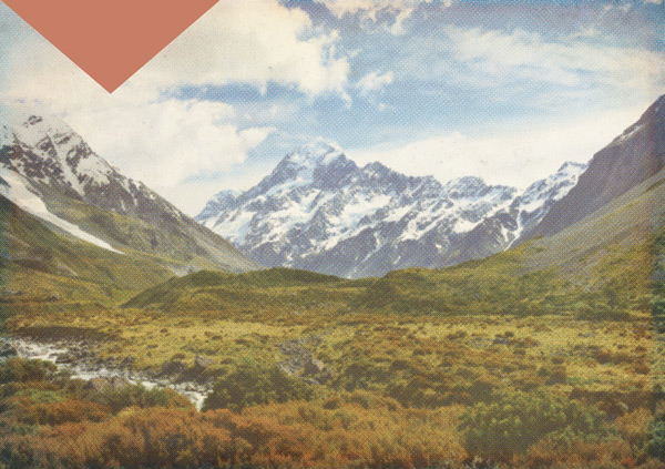
In this step, we’ll start creating the first triangle which will form a template for the rest. First, set the background to the following, dusky peach colour: #C77D66
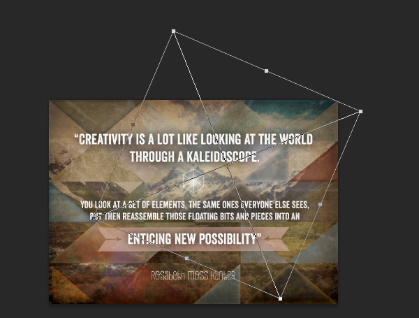
Bring the grid back up to help us draw a triangle using the Polygonal Lasso tool. Starting in the top left corner, create a triangle that’s two squares deep and four squares wide:
Hit command + delete (mac) or alt + backspace (windows) to fill the selection with our background colour:
Duplicate the layer and keep it at the top, with the visibility turned off. This allows us to find it easily to create further copies from.
For our current triangle, we want to change the base colour to #DFA571 using the Paint Bucket tool (most of the others use the original peachy colour, which is why we set that up for the ‘master’ triangle).
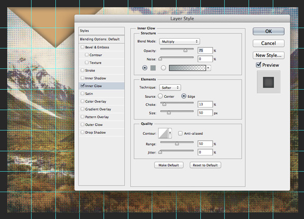
Double-click the layer to open the effects window and select Inner Glow with the following settings:
Inner Glow Settings:
Blend Mode: Multiply
Opacity: 75%
Noise: 0%
Colour: #949EA1
Technique: Softer
Source: Edge
Choke: 13%
Size: 50px
Range: 50%
Jitter: 50%
Do go ahead and experiment with the settings to get a feel for what each one does so you can get an effect you like. Once you’re happy with the result, reduce the layer Opacity to 80%.
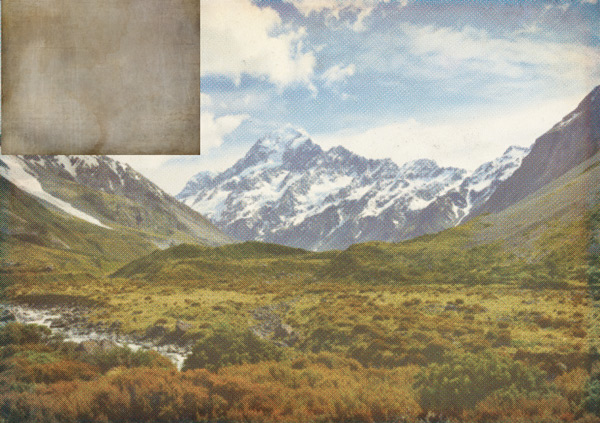
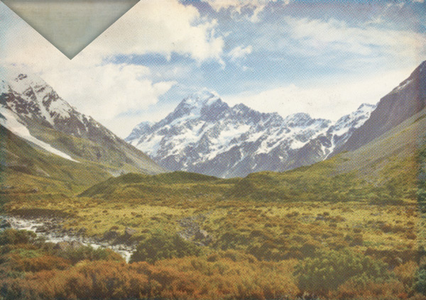
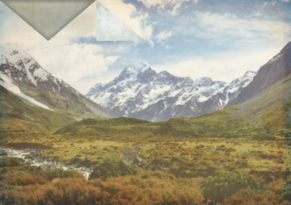
We’re now going to apply some textures to the triangle. We want the texture to blend well with the sky, so a soft, pale-ish blue texture would work best. I’ve gone for 2-lil-owls-textures-papers-2 > Sublime > 2LO Sublime 14.jpg as it also has some nice faded patches, which give it a cloud-like effect. Scale accordingly so that that the area of the texture you want use covers the triangle:
Clip the texture layer to the triangle layer directly below:
To build up the texture a bit more, let’s add another layer using 2-lil-owls-textures-papers-2 > Sublime > 2LO Sublime 5.jpg. Again, scale so you get the desired area of texture in the triangle:
Set the blend mode to Overlay and clip the layer to our previous texture directly below:
We now have the first of many texture-tastic triangles! To keep things easy to find, put the layers together in to a group called “Tri 1”. You can number the triangles in a way that makes most sense to you – I’m going from left-to-right, top-to-bottom.
Step 5:
Bring the grid back up again and on a new layer, use the same approach as before (with the Polygonal lasso tool) to draw a smaller, right-angled triangle two squares down and two squares across. Use #8Da0B0 as the fill colour:
As before, duplicate the layer and keep it hidden at the top so we can use it as an easy to find ‘master version’ to create copies from.
For this portion, we want a texture that’s pale but still has some grainy texture to it – similar to a cloud! Have a look through your files to see what feels best for you. I’ve gone for 2-lil-owls-textures-papers-2 > Winter Storms > 2LO Winter Storms 7.jpg, keeping the darker areas outside of the triangle, as I only want to use the lighter, central part of the texture:
Clip the layer to the triangle and place the two layers we’ve just created in to a group called “Tri 2”. It’s worth getting in to the habit of grouping your layers, as it’ll make it much easier to navigate should you want to make any adjustments later on!
Step 6:
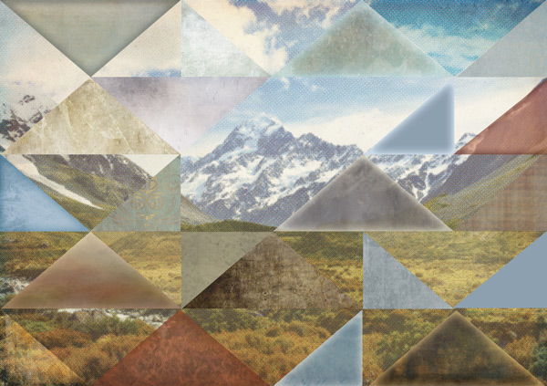
From here, the steps are essentially the same to create the rest of the triangle textures and involve some playing around with scale, various blend modes, opacity levels, hue/saturation adjustment layers and inner glow effects.
Adding an image of each step for each triangle would likely cause some severe scroll-fatigue, plus we want you to dive in and have some quality time getting familiar with and playing around with your textures for yourselves :)
I’ll provide an overview of the textures and effects used for each triangle (numbered below) and any notes as to why that texture was selected. That way you can hopefully recreate any effects you particularly like as well as experimenting and adapting them to your own creative preferences .
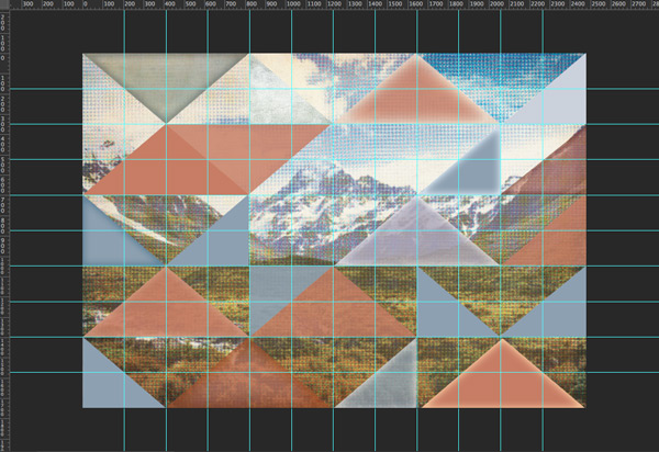
Tip: before adding any textures, create the duplicates of the two different triangle shapes which we saved at the top of our layers panel to decide on the composition of where you’d like your textured elements to be. Use the grid to help position everything:
Here’s a quick reference for the triangle positions:
Triangle 3
Opacity: 80%
Inner Glow Settings:
Blend Mode: Screen
Opacity: 75%
Noise: 0%
Colour: #78CDD3
Technique: Softer
Source: Edge
Choke: 0%
Size: 90px
Range: 50%
Jitter: 50%
2-lil-owls-textures-papers-2 > Vintage Papers > 2LO Vintage Papers 7.jpg
2-lil-owls-textures-papers-2 > The Grey Collection > 2LO The Grey Collection 3.jpg
Blend Mode: Soft Light
Triangle 4
Color Fill: #568DC2
Blend Mode: Color Burn
Opacity: 70%
Triangle 5
Color Fill: #CBD1DC
Opacity: 80%
2-lil-owls-textures-papers-1 > Chic Papers > 2LO Chic Papers 3.jpg
Blend Mode: Multiply
Opacity: 60%
Triangle 6
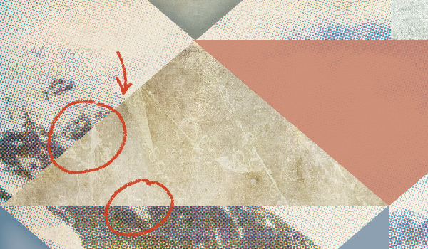
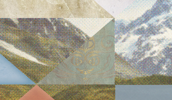
2-lil-owls-textures-papers-1 > Cracked > 2LO Cracked 11.jpg
Note: The Cracked textures work particularly well with the snow-capped mountains, as you can see below how the lines mimic those that occur on the mountains. This is a great example of how to really showcase the textures in their own right, whilst still fitting with the background – which is ultimately the effect we’re going for :)
Triangle 7
Opacity: 80%
2-lil-owls-textures-papers-bonus-packs > Delicate Paints > 2LO Delicate Paints 7.jpg
Hue/Saturation Adjustment layer
Colourize: Unselected
Hue: -180
Saturation: -45
Lightness: +55
Triangle 8
Inner Glow Settings:
Blend Mode: Screen
Opacity: 75%
Noise: 0%
Colour: #9AC1DA
Technique: Softer
Source: Edge
Choke: 0%
Size: 50px
Range: 50%
Jitter: 0%
Triangle 9
Opacity: 50%
Inner Glow Settings:
Blend Mode: Multiply
Opacity: 75%
Noise: 0%
Colour: #531612
Technique: Softer
Source: Edge
Choke: 0%
Size: 40px
Range: 50%
Jitter: 0%
2-lil-owls-textures-papers-2 > Sublime > 2LO Sublime 4.jpg
Blend Mode: Soft Light
Triangle 10
Inner Glow Settings:
Blend Mode: Multiply
Opacity: 75%
Noise: 0%
Colour: #9BBED4
Technique: Softer
Source: Edge
Choke: 0%
Size: 50px
Range: 50%
Jitter: 0%
2-lil-owls-textures-papers-1 > Cracked > 2LO Cracked 7.jpg
Blend Mode: Soft Light
Triangle 11
2-lil-owls-textures-papers-bonus-packs > Shabby Papers > 2LO Shabby Papers 6.jpg
Note: Here we’ve picked out the golden/green and blue colours that are present where the mountains meet the grass. The swirling textures are a nice, abstract way of representing the way the grass and rocks gradually disperse and meet. Using one of the more patterned textures also helps to create a ‘hand crafted’ feel, adding to the collaged effect.
Triangle 12
Fill Colour: ABA6B9
Opacity: 80%
Inner Glow Settings:
Blend Mode: Screen
Opacity: 75%
Noise: 0%
Colour: #FAF7C2
Technique: Softer
Source: Edge
Choke: 0%
Size: 50px
Range: 50%
Jitter: 0%
2-lil-owls-textures-papers-2 > Relic > 2LO Relic 6.jpg
Blend Mode: Multiply
Opacity: 76%
Triangle 13
Opacity: 80%
(The right half of the triangle is off the edge of the canvas)
2-lil-owls-textures-papers-bonus-packs > Shabby Papers > 2LO Shabby Papers 20.jpg
Triangle 14
Opacity: 90%
2-lil-owls-textures-papers-1 > Effervescent > 2LO Effervescent 5.jpg
Hue/Saturation Adjustment layer
Colourize: Unselected
Hue: +30
Saturation: +20
Lightness: 0
Note: We went for the softer textures in the Effervescent pack here to reflect the feel of softer, flowing water to go over the stream in the image.
Triangle 15
Opacity: 90%
2-lil-owls-textures-papers-2 > Opulent Papers > 2LO Opulent Papers 2.jpg
Hue/Saturation Adjustment layer
Colourize: Selected
Hue: 56
Saturation: 15
Lightness: -45
Triangle 16
Opacity: 80%
2-lil-owls-textures-papers-1 > Grandeur > 2LO Grandeur 3.jpg
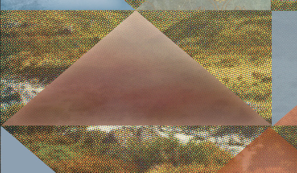
Note: Here, we’ve gone for a heavily textured piece to mimic the lumpy, uneven texture of the ground whilst also matching up the darker and lighter sides on the original photo:
Triangle 17
2-lil-owls-textures-papers-2 > Vintage Papers > 2LO Vintage Papers 9.jpg
Hue/Saturation Adjustment layer
Colourize: Selected
Hue: 165
Saturation: 5
Lightness: -20
Triangle 18
Just as it is :)
Triangle 19
2-lil-owls-textures-papers-1 > Grandeur > 2LO Grandeur 6.jpg
Hue/Saturation Adjustment layer
Colourize: Selected
Hue: 26
Saturation: 30
Lightness: 0
Group Blend Mode: Overlay
Triangle 20
Opacity: 70%
2-lil-owls-textures-papers-2 > Vintage Papers > 2LO Vintage Papers 14.jpg
Inner Glow Settings:
Blend Mode: Multiply
Opacity: 75%
Noise: 0%
Colour: #B86E29
Technique: Softer
Source: Edge
Choke: 0%
Size: 100px
Range: 50%
Jitter: 0%
Triangle 21
Opacity: 80%
Inner Glow Settings:
Blend Mode: Screen
Opacity: 75%
Noise: 0%
Colour: #BAD1ED
Technique: Softer
Source: Edge
Choke: 0%
Size: 50px
Range: 50%
Jitter: 0%
2-lil-owls-textures-papers-2 > Sublime > 2LO Sublime 7.jpg
Blend Mode: Color Burn
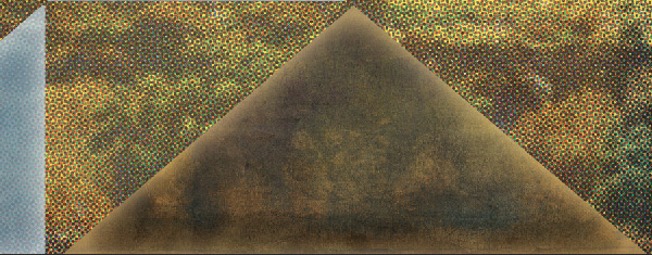
Note: We’re bringing in some of the pale blue colours to reflect the top half of the image. This helps to create some balance, and add to the fragmented, abstract feel of the image – as if different parts of the image have been cut out and moved around a bit.
Triangle 22
Inner Glow Settings:
Blend Mode: Screen
Opacity: 75%
Noise: 0%
Colour: #B79156
Technique: Softer
Source: Edge
Choke: 0%
Size: 50px
Range: 50%
Jitter: 0%
2-lil-owls-textures-papers-2 > Sublime > 2LO Sublime 7.jpg
Duplicate: 2-lil-owls-textures-papers-2 > Sublime > 2LO Sublime 7.jpg
Blend Mode: Multiply
Opacity: 70%
Note: The Sublime textures are some of my favourites in this bundle. You can see below how perfectly this one matches the patterns and tones in the surrounding photograph:
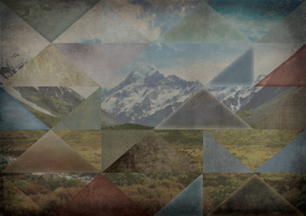
Great stuff! You should now have a rather nice abstract image which we’re going to build even more texture upon. Now might be a good time to take a brief screen-break so you’re feeling refreshed for the next step :)
Step 7:
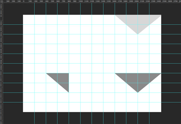
Before we move on to the next step, let’s add a bit more contrast to some of the areas where the photograph shows through.
Going back to your ‘Mountains’ group, apply a layer mask to the photograph with the halftone filter applied. Hold down ‘alt’ on your keyboard and click on the layer mask to see the mask in your document window.
Bring the grid back up and use this to redraw some of the triangles using the Polygon Lasso Tool. We don’t want to completely mask out this layer, so use some grey tones to fill the selections. I’ve used #898989 as the darker grey and #D7D7D7 as the lighter grey:
Click on the visibility column to go back to your main image:
Step 8:
We’re going to use even more textures on top of this to add further depth to the image. Go to 2-lil-owls-textures-papers-2 > Sublime > 2LO Sublime 21.jpg, placing and scaling on to your canvas:
Change the blend mode to Linear Burn and reduce the Opacity to 30%:
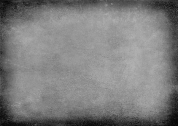
Then, go to 2-lil-owls-textures-papers-2 > The Grey Collection > 2LO The Grey Collection 30.jpg, placing and scaling to fit your canvas:
Change the blend mode to Multiply and reduce the Opacity to 70%:
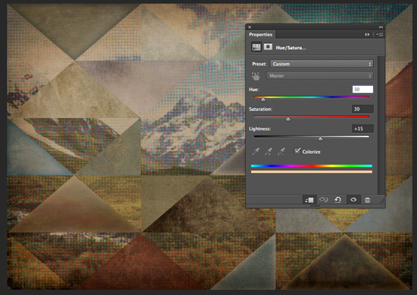
The darker shade is nice, but a bit, er, grey. Let’s brighten it up by adding a Hue/Saturation Adjustment Layer:
Hue/Saturation Settings:
Colourize: Selected
Hue: 30
Saturation: 30
Lightness: +15
Changing it to a yellower shade brings back the faded, retro warmth to the image whilst keeping the overall tone slightly darker. This’ll help make the lighter elements we’re about to add pop out more:
Step 9:
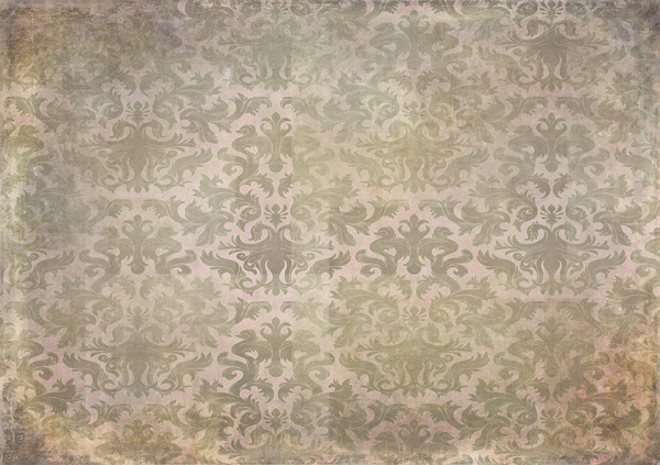
We’re going to use 2-lil-owls-textures-papers-2 > Vintage Papers > 2LO Vintage Papers 14.jpg to create a selective texture mask. First, copy and paste the file on to your canvas:
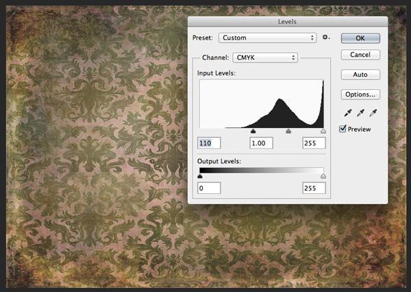
Duplicate the layer and rasterize it. Then go to Image > Adjustments > Levels and bring the shadows up to around 110 to increase the contrast:
Select the Magic Wand Tool and set the tolerance to around 30%. Then click anywhere on the lighter, pink background.
What we’re trying to do here is isolate some of the pattern to add extra detail to our image. It doesn’t have to be too neat, and you can hold down the shift key on your keyboard to select multiple areas.
Once you’re happy with your selection, go to Select > Inverse (shift + command + I for mac, shift + alt + I for windows)
With the selection still highlighted, activate the original layer below and create a layer mask. Hide the layer we took the selection from to see the masking effect:
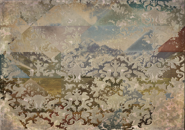
Now we’ve seen the effect, let’s tone it down a bit to work with the image. We’ll change the blend mode to Multiply and reduce the Opacity to 30%:
The subtle, continuous pattern over the top helps the eye ‘flow’ over the image a bit more by softening the effect of the fragmentation.
Finally, we’ll add a softer, sepia tint to the pattern to complete this step. Create a new Hue/Saturation layer and clip it to the pattern with the layer mask applied:
Hue/Saturation Settings:
Colourize: Selected
Hue: 33
Saturation: 30
Lightness: +25
Step 10:
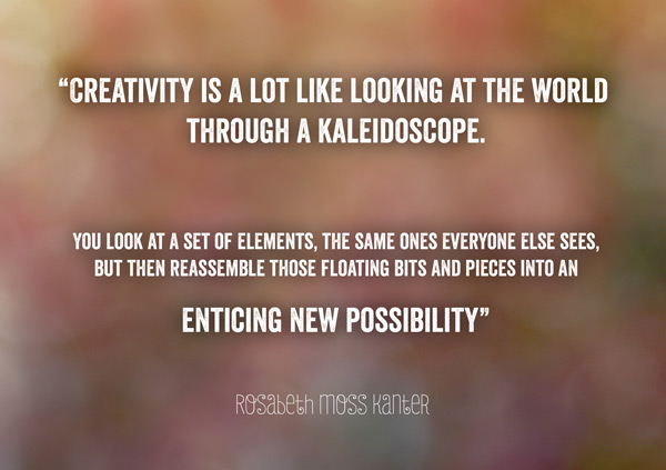
Time to add our inspirational quote! We’ll be adding some more layers that work around the text, so let’s get this in place first as a guide.
Whilst researching some quotes on creativity, I came across this by Rosabeth Moss Kanter:
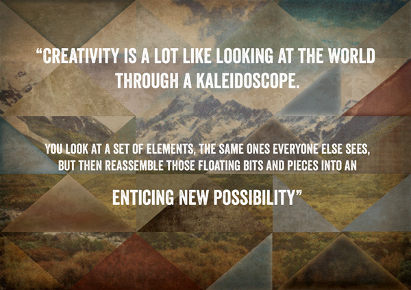
“Creativity is a lot like looking at the world through a kaleidoscope. You look at a set of elements, the same ones everyone else sees, but then reassemble those floating bits and pieces into an enticing new possibility.”
The idea of a kaleidoscope (thanks, spellcheck!) and reassembling elements in to something new and enticing works really well with our image. Plus it’s a lovely sentiment :)
Copy and paste the quote on to your canvas and select a font of your choice. I’ve gone for a personal favourite, Veneer by Yellow Design Studio (premium). The bold, simple style works well with the strong geometric shapes whilst the subtle worn texture also fits with the retro, aged feel of the image.
Format the quote so it looks similar to the image below:
You can pick out the parts of the quote that stand out most for you by making them bigger. Leave some space around the text as in the image, as we’ll be adding some images in there.
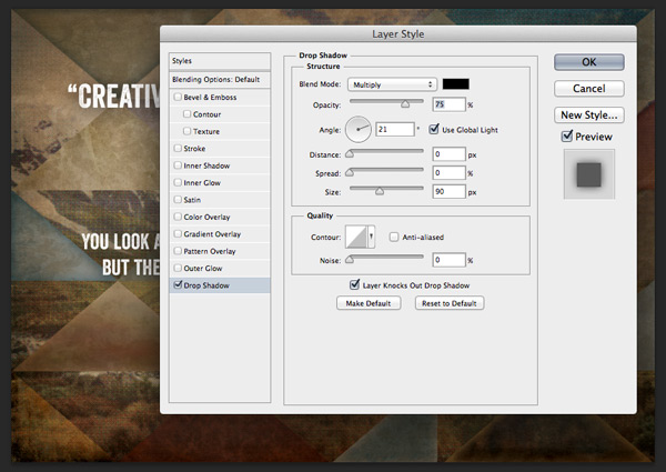
The text looks a bit flat as it is, so we’ll help make it stand out from the backgrund by adding a simple drop shadow:
Drop Shadow Settings:
Blend Mode: Multiply
Color: #000000
Opacity: 75%
Angle: 21
Distance: 0
Spread: 0
Size: 90
To finish of the quote, we’ll give credit to ‘Rosabeth Moss Kanter’ below the main text in a contrasting font. I’ve used Julieta Pro Gota (premium) as it has a nice hand-drawn feel, but has a similar condensed shape to the main text.
If the font is on the thin side, like this one, you may need to duplicate the layer to help it stand out from the background:
Step 11:
We’ll add a some more graphical elements around the text to help make it stand out and not get lost in the background.
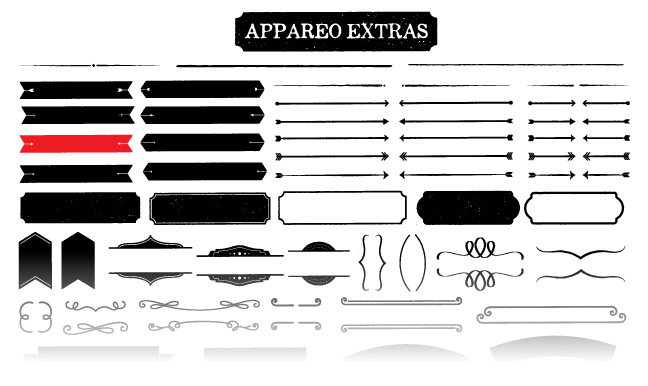
From the Freebies area of the site, download the Appareo Extras Freebie Pack by Kimmy Design.
Open the Aperacium_Extras.ai file and select the following banner:
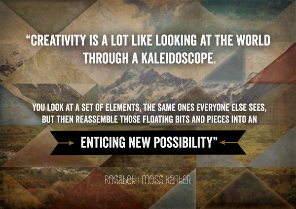
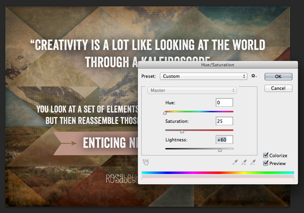
Copy and paste it on to your photoshop canvas behind your text, scaling so it contains the text nicely and align to center. Next, rasterize it so we can edit the hue/saturation directly.
Hue/Saturation Settings:
Colourize: Selected
Hue: 0
Saturation: 25
Lightness: +60
Reduce the Opacity to 70%:
Duplicate the layer and change the blend mode to Soft Light:
Step 12:
From the Freebies area of the site, download the Ghostly Pixels Vector Sample Pack.
Go to Individual-Assets > PNG-Format > Polygon-02-byGhostlyPixels.png and paste on to your canvas.
Change the blend mode to Screen and scale down so that it fits nicely between the text. Duplicate the layer to help it stand out a bit more:
From the same folder, go to Individual-Assets > PNG-Format > Sunburst-08-byGhostlyPixels.png and paste it on to your canvas, scaling to fit. Move it up slightly so the central pace surrounds our polygon shape and change the blend mode to Screen:
Reduce the opacity to 28% for a subtler effect:
Step 13:
Next, we’re going to brighten up the image by adding a lens flare.
Download Lens Flare from CGArena
Paste on to a new layer on your canvas below the text and graphics we created previously. Scale and rotate so it’s a similar size to below, and place so that the point of origin comes from the centre of our polygon shape:
Set the blend mode to Screen and Opacity to 60%:
As this bleaches out some of our image, we’ll fix it by adding a clipped Levels Adjustment layer and bringing the shadows up to 90:
Place the layers we’ve just created into a group called ‘Lens Flare’ and duplicate.
From the duplicate group, scale and rotate the lens flare image so that it goes in the opposite direction, making sure the point of origin is still the centre of the polygon:
Reduce the opacity to 40%, and we have a nice jewel-like glow to our image:
Step 14:
We’ll use another of 2 Lil Owls textures to add a warm vignette to the image. Go to 2-lil-owls-textures-papers-1 > Effervescent > 2LO Effervescent 9.jpg, pasting and scaling to fit your canvas:
Change the blend mode to Multiply and reduce the opacity to 50%. Then, add a layer mask and using a big, soft brush, loosely mask out a vignette effect:
Step 15:
For the final step, we’re going to finish off by adding some scuff marks.
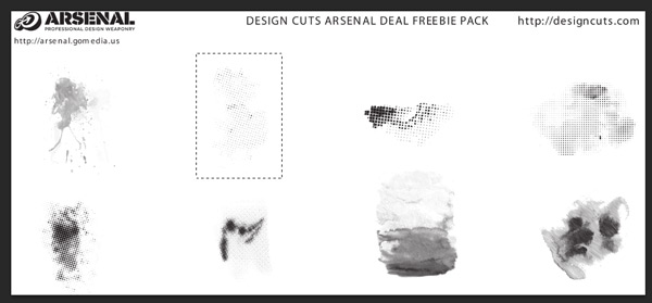
From the Freebie section, download the Go Media Halftone Vectors and open up the .psd file.
Select the following image, cutting and pasting on to your working canvas:
Place in the upper-left corner changing the blend mode to Screen and opacity to 90%:
Duplicate the layer, and move it towards the bottom right corner to complete the image.
And we’re done!
I hope you enjoyed completing this tutorial and are left feeling creatively inspired to go and do some amazing things with your new textures!
If you’ve got any comments or questions, do leave them below and I’ll keep an eye out. Also, feel free to get in touch @rockportraits
Remember to share your designs on the Facebook page as we’d love to see how you reassemble these bits and pieces in to your own creation :)
Hopefully this tutorial showed you just some of the many ways you can use our current texture bundle. With hundreds of stunning hi-res textures which can be used to create thousands of effects, you can still get this bundle for a whopping 93% off this week. Grab it below, while you still can:






















Wow! This was an amazing tutorial on layers and textures! Thanks for taking the time to explain this in detail.
We are so pleased to hear that you found this one useful :) We hope it comes in handy for your future work!
WoW! This is a great tutorial. I don’t think I’ve seen so many textures used on just one image before. I thought it was a bit much at the beginning but it all seemed to gell together at the end. I guess that’s the object of the game :)
Haha definitely Sarah. It turned out amazingly in the end. Jo really did a great job at putting this tutorial together.