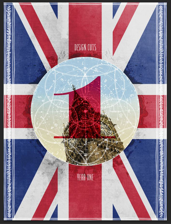
WHAT WE’RE CREATING:
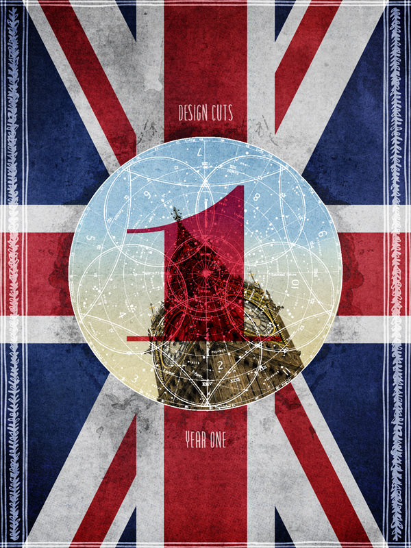
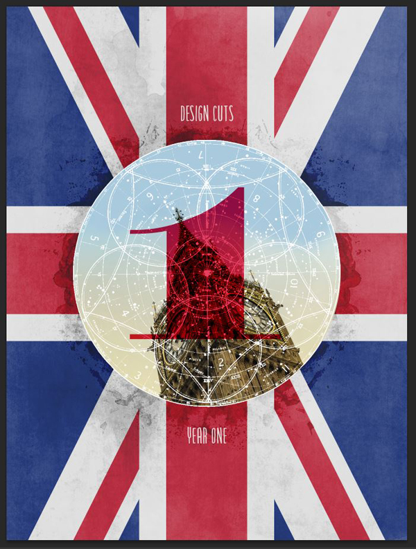
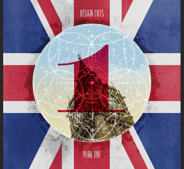
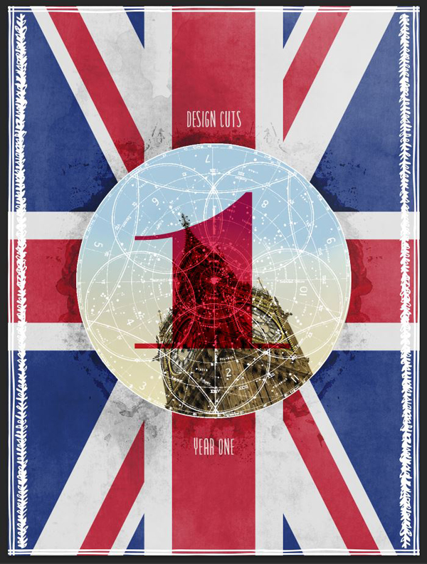
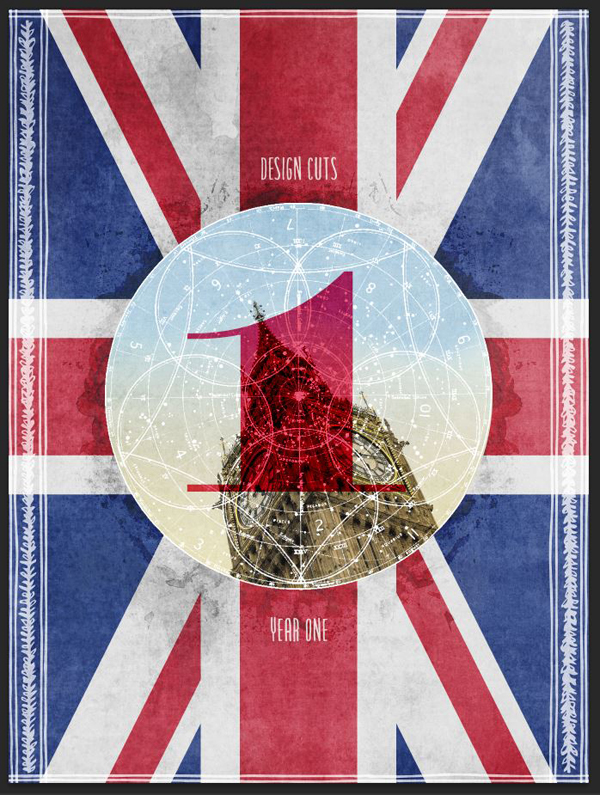
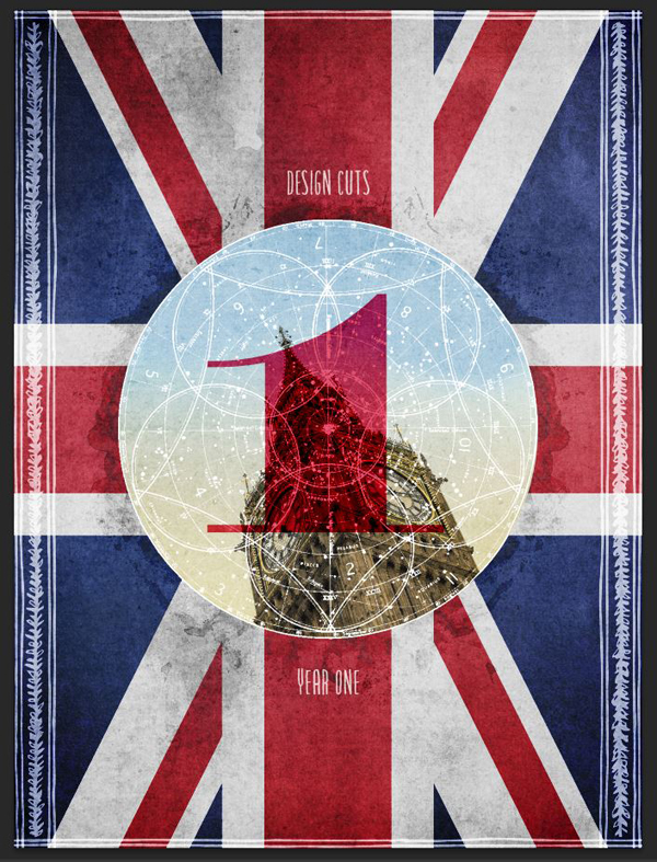
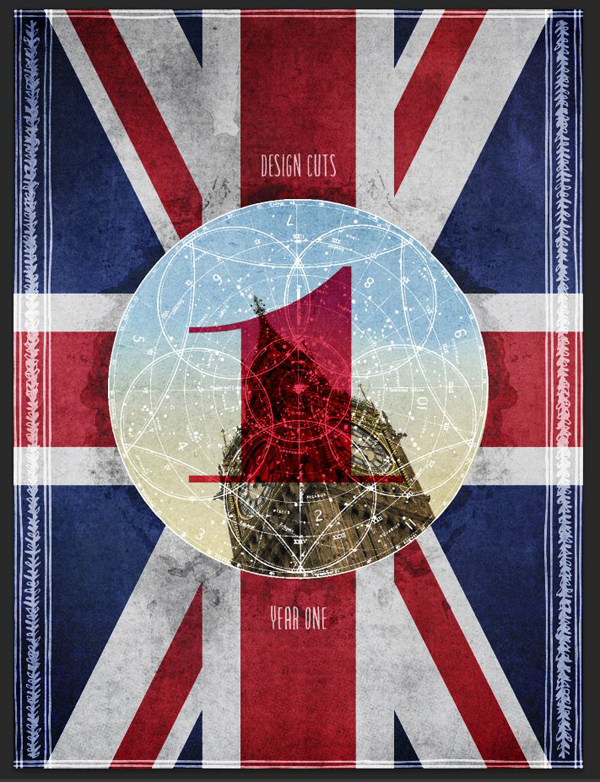
Hello everybody! Simon here. In order to properly celebrate Design Cuts’ first birthday, what’s better than an anniversary poster?
The 22 deals that are part of the birthday craziness include thousands of design elements to choose from. We ought to be able to create something fun, impactful, and visually pleasant by hand-picking an harmonious selection out of the bunch.
So, what’s the plan? We’ll use textures, vector elements, and typefaces to craft a British-themed commemorative poster. We have to celebrate the roots of Tom, Darren, Tina, and Steph somehow, right? I mean, the British accent makes everything better anyway: better detectives (Sherlock), better secret agents (007), and now, better design resources.
The tutorial will walk you through the various steps I took to assemble the various resources into a visually coherent ensemble. With that in mind, let’s get to it, shall we?
STEP 0: CONCEPT AND ASSETS
When it comes to celebrate British-ness, there are well known cues we can use:
- The Union Jack
- Earl Gray tea
- Big Ben
While I love Earl Gray, I sadly can’t make it part of the tutorial, so we’ll have to pass on this one. Should you need your fix, have a cup at hand to sip on while you go through the steps. We can certainly leverage the Union Jack, and Big Ben, as visual cues though.
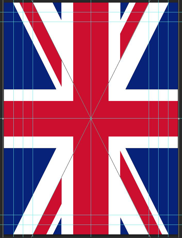
Finding a proper Union Jack resources proved to be more complicated than I thought. I’ve learned that there’s a proper way to orient it, too.
So I created my own set of files for it, which you can download here. It includes an Illustrator file, EPS version, as well as a high resolution PNG version. The PNG is high resolution enough to use without quality loss in our case, but I’d advise to stick to the vector versions.
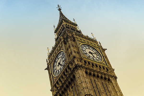
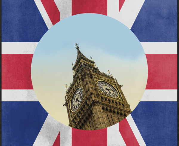
We’ll use the Union Jack as our backdrop, and Big Ben as our main iconography. Talking of Big Ben, here’s the image we’ll be using. It was taken by Norbert Reimer, on September 23rd, 2014, and is shared under a CC BY-SA 2.0 license.
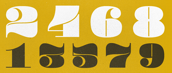
The next external asset we’ll need is Lost Type Co-op’s Pompadour number set. These were designed by Andy Mangold, and they are gorgeous.
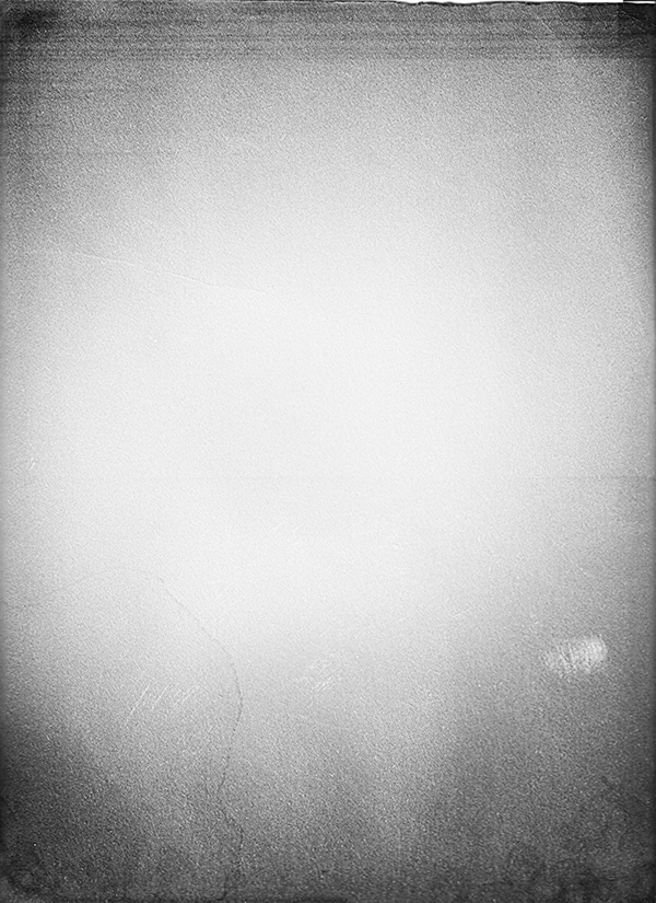
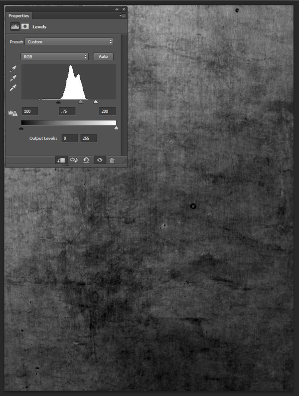
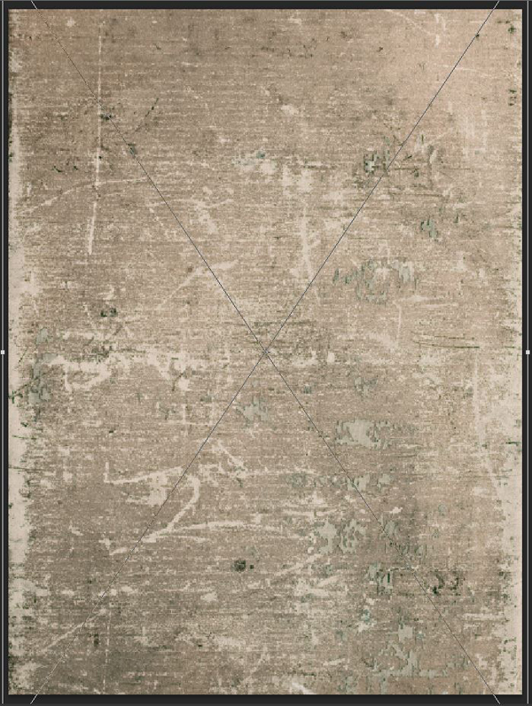
Finally, we’ll need to have this amazing photocopy texture at hand towards the end. It’ll help us to add grain, and an organic vignette to the piece.
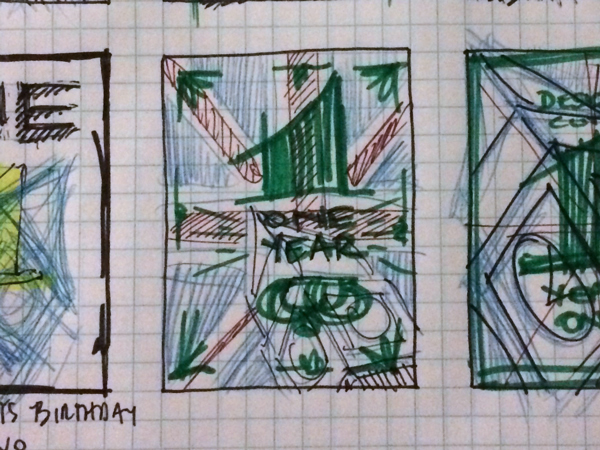
Here’s my original sketch for the composition. You’ll see that we’ll stray away from it, but not by much.
Most of the other assets are included in the 22 deals that are still available for a few days, at their highly discounted price. I’ll make sure to indicate from which deal each of the asset comes from.
Quick note: in this tutorial, the term “clipping” or “clipped layer” is used a few times. This means that the layer is only visible/applies to the layer directly below it. You can very quickly do this by holding ‘Alt’ down on your keyboard and clicking between the two layers. Photoshop secrets created an animated gif demonstration.
Now that all of this is at hand, let’s get to it, shall we?
STEP : DOCUMENT SETUP
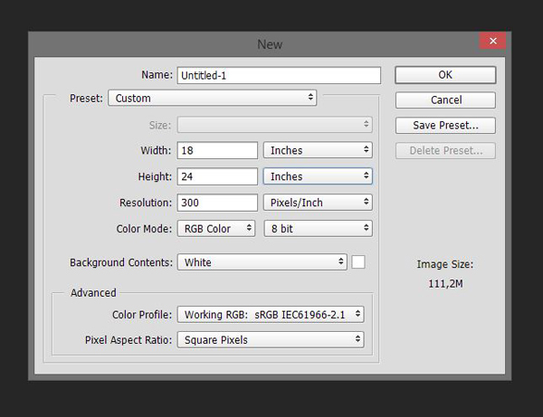
Our canvas is an 18″x24″ document, at 300 dpi.
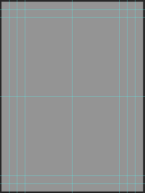
It features a few strategically placed guides. Vertically: 1″, 2″, 3″, 9″, 15″, 16″, and 17″. Horizontally: 1″; 2″, 12″, 22″, and 23″.
STEP 2: THE BACKGROUND
As mentioned earlier, the Union Jack will be our background. But due to the intensity of some of the textures we’ll be using, we can’t simply put it at the bottom of our document, and start overlaying elements on it. The resulting colors would be too intense. To alleviate that issue, we’ll start by filling our background with 50% gray (#959595).
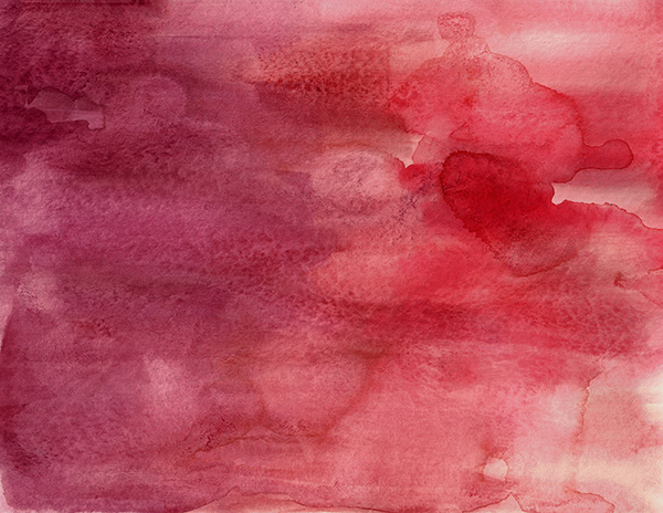
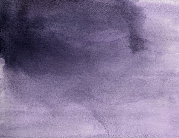
Next, we’ll be leveraging some of Make Media Co.’s watercolor textures. They were included in The Massive Patterns, Textures and Backgrounds Bundle. These textures will allow us to create a staining effect.
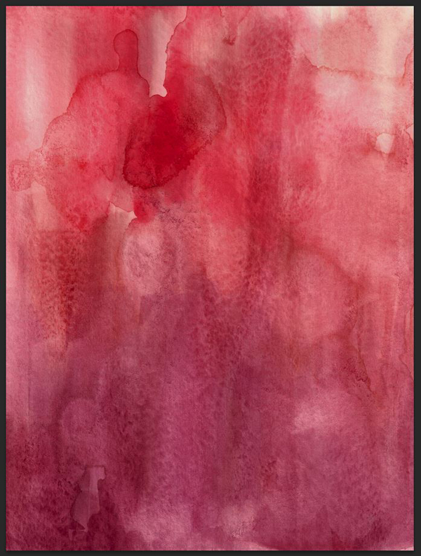
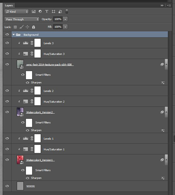
Start with Watercolor4_Version1.jpg.
Place it in your document. I rotated the texture counterclockwise at 90°, scaled it so it covers the whole canvas.
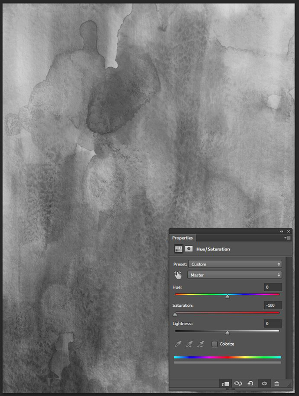
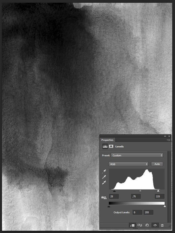
Sharpen the texture (Filter > Sharpen > Sharpen), and desaturate it using a clipped hue/saturation adjustment layer.
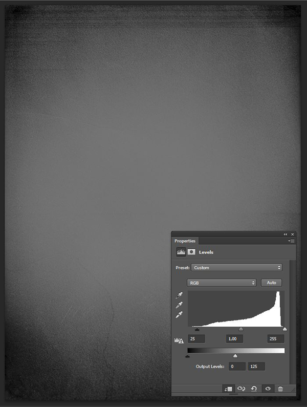
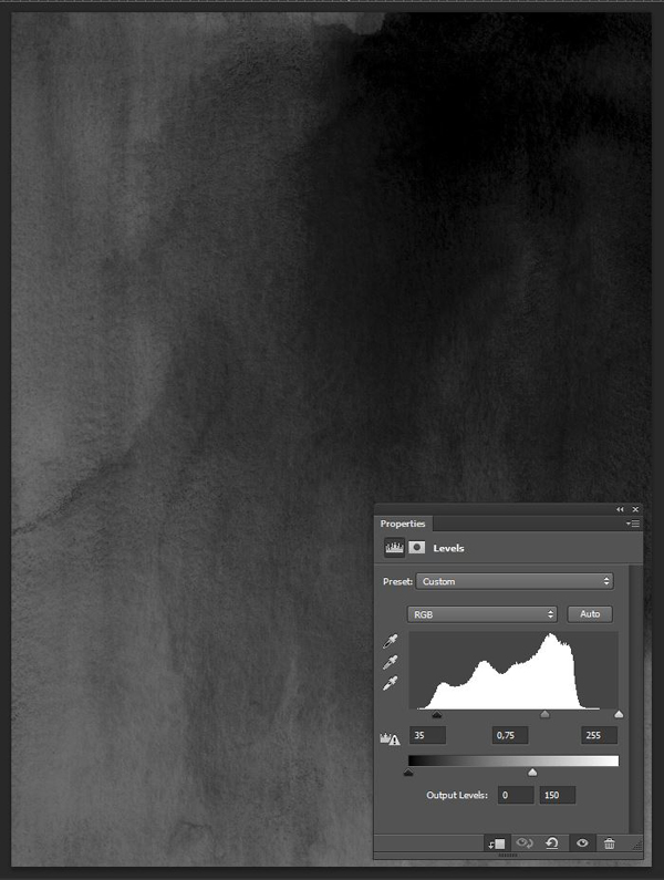
Use a clipped levels adjustment layer to make its various artifacts more visible.
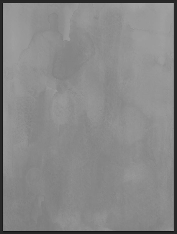
Finally, change its blending mode to Soft light @ 35% opacity.
Quick note: this texture manipulation process is the one we’ll use throughout the tutorial. I’m expecting you to follow that routine when working with textures. It allows us to stick to a non-destructive workflow, which I’ve explained in great length in this past tutorial. The “sharpen / desaturate / tweak with levels / adjust the blending mode” is one of the best ways to work with textures that I know of.
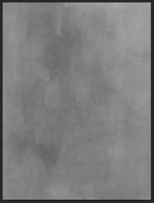
Our next texture is from the same pack, it’s Watercolor6_Version2.jpg. I had to rotate and flip the texture on itself in order to get the staining where I want it to be (top left corner).
Blending mode: Soft light @ 35% opacity.
The next texture is from The Shop’s WMC Fest 5 texture pack, also included in the same bundle.
The file is wmc-fest-2014-texture-pack-sbh-008.jpg.
Blending mode: Soft light @ 35% opacity.
From there, it’s time for a bit of layer house-keeping.
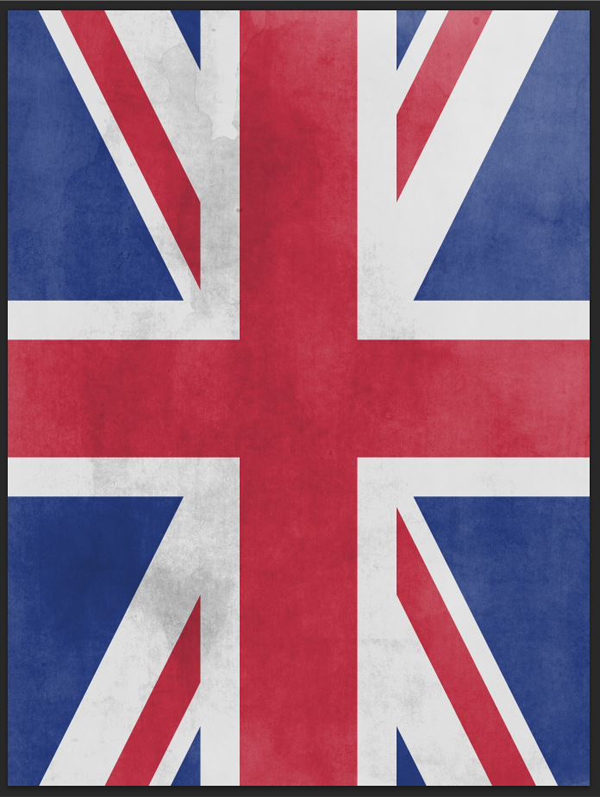
Time to add the Union Jack in place. Center it in your document, and make sure it covers the whole canvas.
Blending mode: Overlay @ 75% opacity.
Here’s what our layer stack looks like now.
STEP 3: BIG BEN
Now that our backdrop is ready, it’s time to include Big Ben into the mix. Remember to grab the highest resolution version of the image on Flickr.
Start by placing the image at the center of our document.
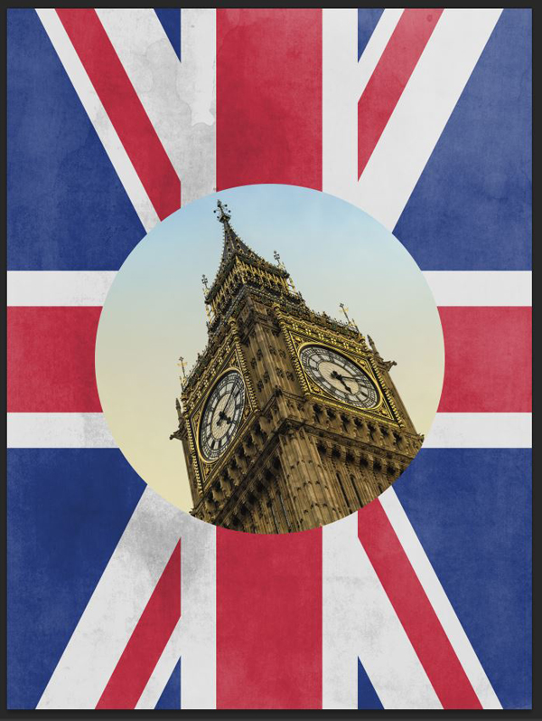
The most inner vertical guides (3″ and 15″) are the markers of the width of the circular selection we’re about to make. Use the elliptical version of the marquee tool (M) to create a centered selection around Big Ben.
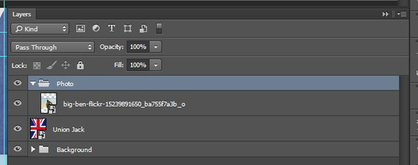
Give it its own layer group.
With the selection still active, attach a layer mask to the photos layer group (Layer > Layer Mask > Reveal selection). This will use the active selection as the visible portion of the mayer mask.
Proceed to unlink the layer mask and the layer group (click on the chain link between the two). This will allow us to edit one independently of the other.
My issue is that Big Ben is too imposing. We’re going to scale it down. Note that we still want it to be centered in the composition though. I’m roughly aligning the top of Big Ben’s spire to the top of the Union Jack’s middle white line.
We now have a gap in our circular selection.
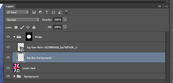
The process to fill it is simple. Let’s start by creating a new layer behind the photo.
Sample the color of the top pixels in Big Ben’s photo. This results in a light blue color, #aacbde.
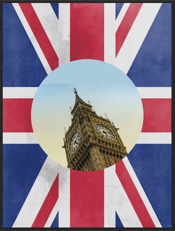
Paint on the layer we created earlier with this color, until the circle is complete again. I’m using a rather big brush (500 pixels).
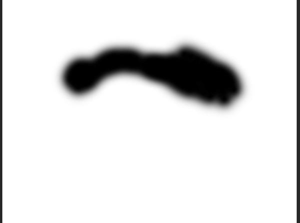
The junction between the image and its background isn’t flawless. To improve this, add a layer mask to Big Ben’s photo, and use a smaller, very soft brush to paint a gradual transition between the two.
Here’s what the layer mask looks like. I’ve used a 500 pixels wide brush, with its hardness turned down to 0%.
Here’s a look at the layer structure.
And here’s a look at how much I’ve painted. You can go as far as filling the whole circular selection.
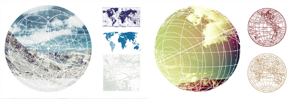
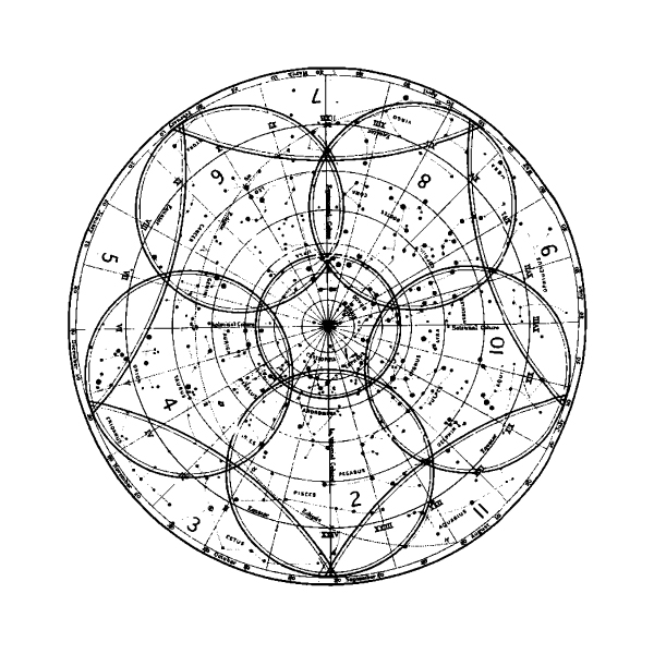
Next, we’re going to track down one of Offset Designs’ vintage map vectors. It’s from the Ultimate Vintage and Retro Design Bundle.
The one we’re interested in is 03.eps.
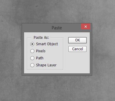
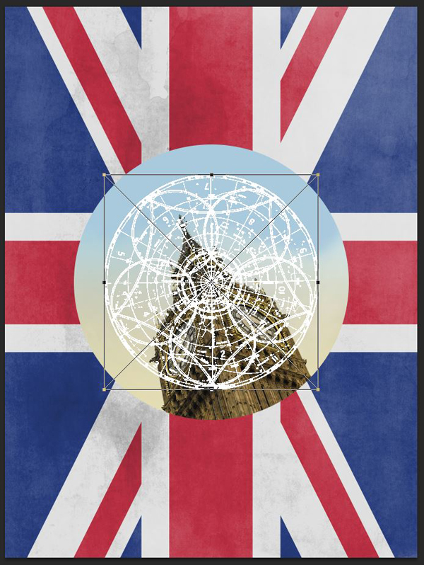
After changing its color to white in Illustrator, let’s paste it in our Photoshop document.
Make it align with the circular selection around Big Ben.
Let’s organize things better.
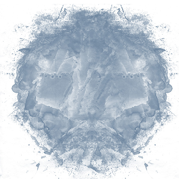
We have to add one more element to our Big Ben “badge.” We’re going to leverage one of 2 Lil’ Owls’ watercolor element from the Beautiful, Rare Library of Authentic Vintage Design Treasures.
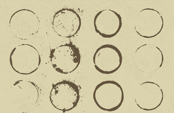
If you don’t have access to these, you could leverage one of Ghostly Pixels’ ink circles from the Ultimate Creative Vector Elements Collection.
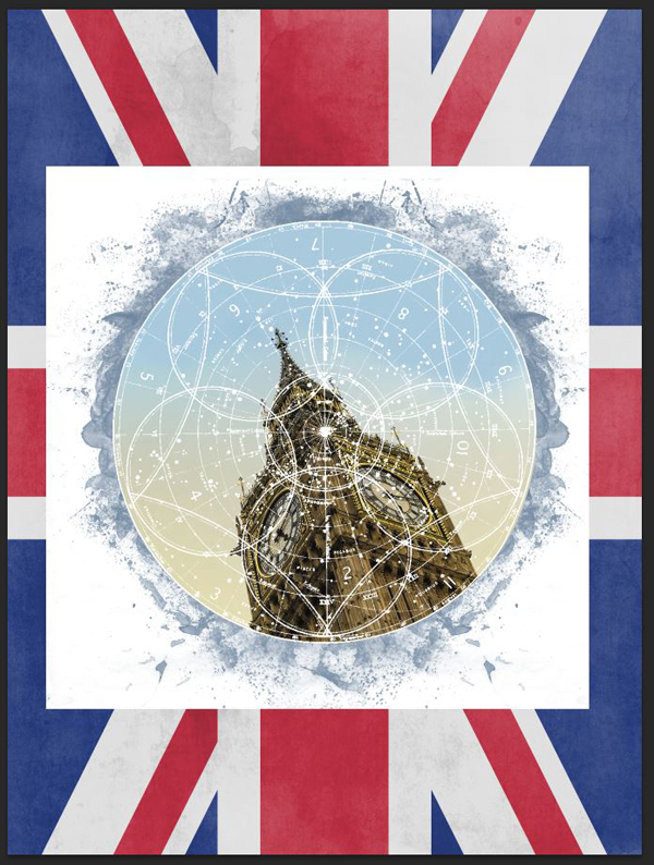
The trick is to place the watercolor element behind the Photo layer group. Size it so it creates a grunge border that extends slightly beyond the edge of the badge. Note that it won’t be aligned with the center of our canvas.
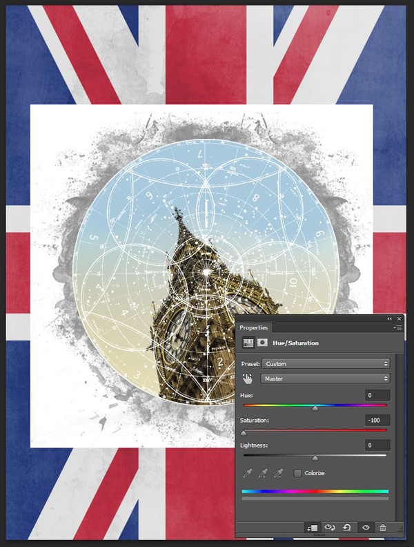
One you’ve placed it, scaled it, and sharpened it to taste, desaturate it.
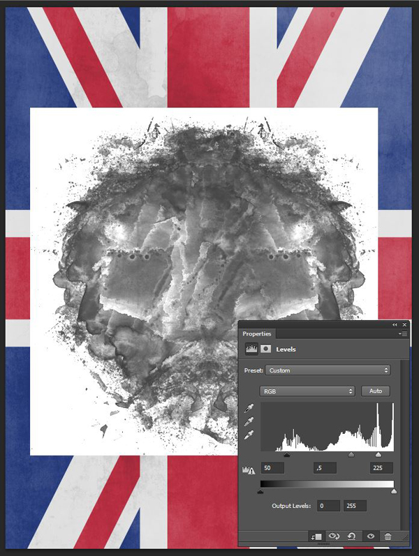
Proceed to tweak its intensity with a levels adjustment layer.
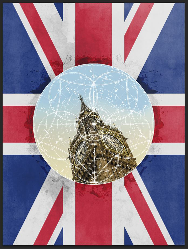
Finally, change its opacity to Color burn @ 50% opacity.
Feel free to adjust the element’s place in the composition further if needed. I lowered mine a quarter of an inch or so.
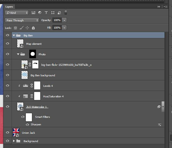
Here’s a look at our layer stack so far.
STEP 4: TYPE ELEMENTS
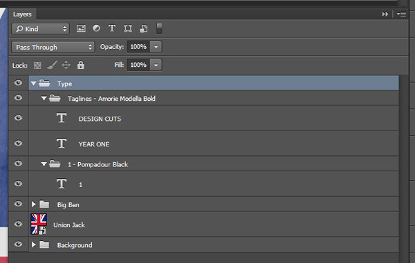
It’s time to add some type in the mix. There are only three elements: the number 1, set in Pompadour, Design Cuts, and Year one. The last two are set in Amorie Modella Bold, from the Monster Creative Font Bundle.
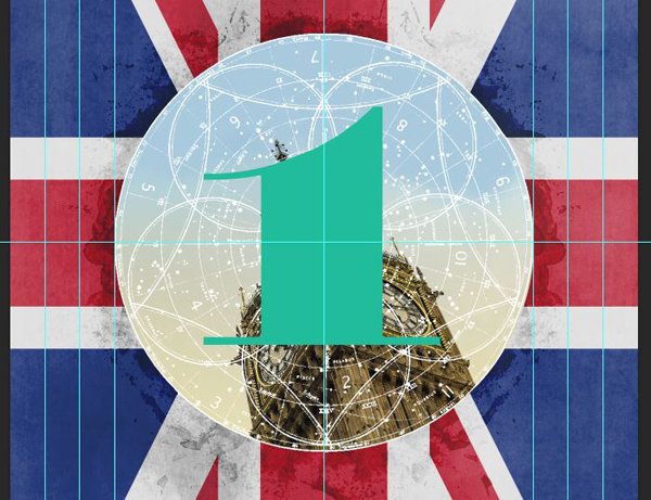
Let’s start with the 1. Write the number 1, in Pompadour Black. The type is set at 804 points tall, and I’m using the Design Cut green as my character color (#1abc9c). Center visually the one on the center of the map element.
I really wanted to be able to use Design Cuts’ colors in the piece, but the green clashes too much with the Union Jack colors. Change the number’s blending mode to Substract @ 100% opacity to get back to a fitting, and vibrant, translucent red.
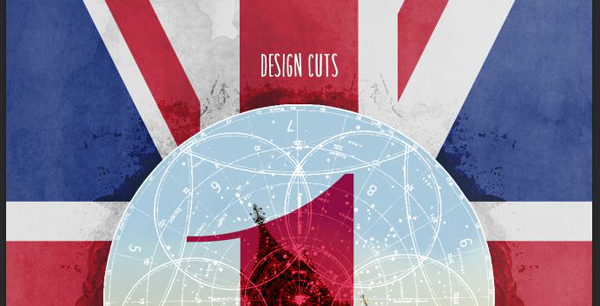
Next is the “Design Cuts” line. It’s placed at slightly above 0.5″ of the badge’s top. It’s set in Amorie Modella Bold, at 72 points tall. The type’s color is white.
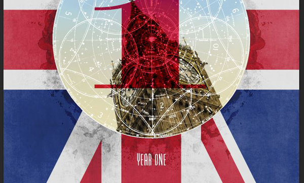
The “Year one” mention is placed below the circle, with identical settings.
The result is neat, but what I’d call the tagline is visually too present in the composition.
For more subtlety, change both type elements’ blending mode to Screen @ 75% opacity.
Feel free to visually tweak the placement of the tagline.
Finally, here are our organized layers, before moving on to the next steps.
STEP 5: FRAME
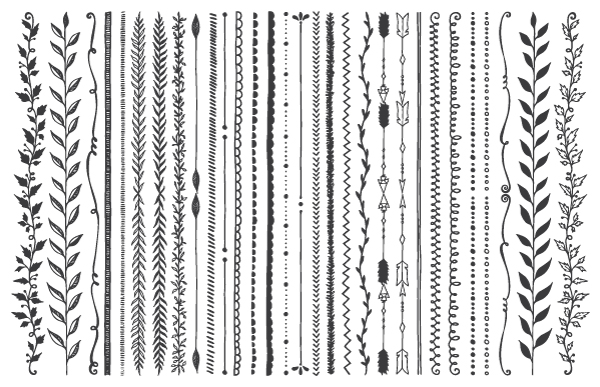
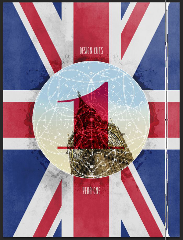
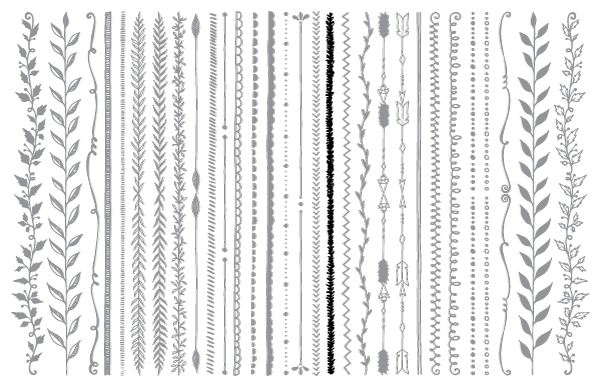
We’re going to add a frame to our piece. We’ll be using elements from the All Inclusive Design Bundle for that. More precisely, from Make Media Co.’s Borders, Corners & Frames Super Kit. Locate CreativeMarket_HDDesignSuperkit_Borders.ai.
First, we’ll use the double line to create an outer frame (in black).
Change its color to white, and paste it into our composition. I’ve sized so it is slightly taller than the poster (25″ or so).
Place the frame element close to the left edge of your composition. Use smart guides for help (View > Show > Smart guides).
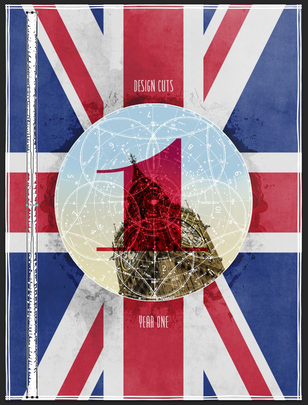
Duplicate the element, and create your right side frame. I’d strongly suggest to flip the element vertically or horizontally, or to rotate it 180°, in order to make things look more organic.
Duplicate, rotate, and space the elements again to create the top and bottom frame elements.
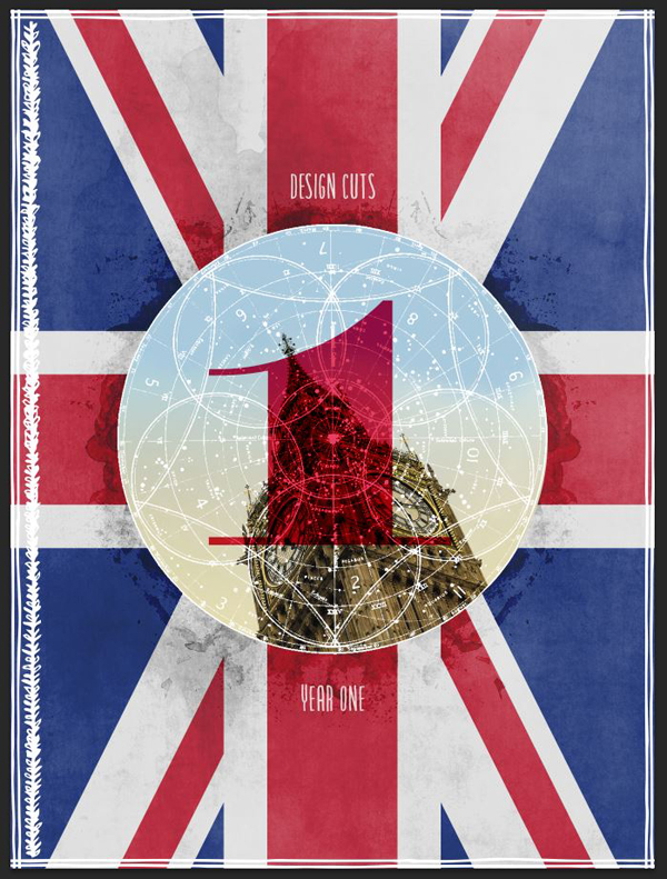
This is nice, but could use an additional element to give it more weight. We’re going to use this organic, leaf-like element from the same border pack.
Change its color to white as well, and place it in our document.
Size it so it fits within the outer linear frame, and place it closely to it, but without touching it.
Duplicate the element, flip it, and place it on the right side as well.
To visually “close” things off, we’ll be duplicating the left and right linear frame elements to create an inner frame of sorts. Adjust spacing as needed.
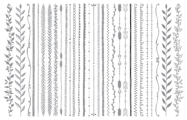
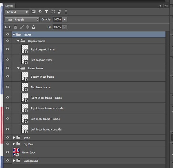
The frame definitely adds to our composition, but like the tagline type before, it’s too intense. Change the blending mode of all frame elements to Screen @ 75% opacity.
Finally, it’s time to organize all these vector elements properly.
STEP 6: GLOBAL TEXTURE WORK
It’s now time to add more textures to the piece. By being applied to the overall piece, they will tie everything together visually.
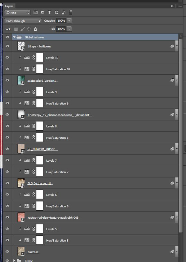
The process we’ll follow with each textures is the same than for the background: place / sharpen / desaturate / levels / blending mode change.
Let’s start with suitcase.jpg, from Summit Avenue’s vintage textures and overlays pack. You’ll find it in the Massive Patterns, Textures and Backgrounds Bundle.
Place it so it covers the whole canvas.
Blending mode: Soft light @ 25% opacity.
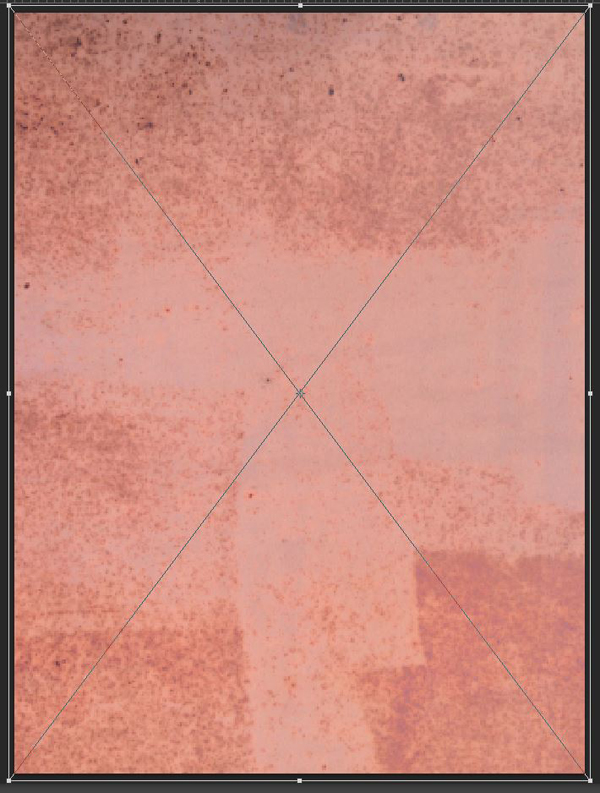
The next texture is from The Shop’s rusted red door texture pack. You’ll find it in the Massive Patterns, Textures and Backgrounds Bundle as well. The texture of interest to us is rusted-red-door-texture-pack-sbh-009.jpg.
Cover the whole canvas with it.
Blending mode: Soft light @ 35% opacity.
The next texture comes from 2 Lil’ Owls distressed texture pack. It was part of the 2 Lil Owls Ultimate Texture Collection. The texture that’s of interest to us is 2LO Distressed 11.jpg.
Place it and distort it so it covers the whole canvas. Make sure that the dark spot at the bottom of the texture are at the top of our composition.
Blending mode: Soft light @ 25% opacity.
The following texture is from the Beautiful, Rare Library of Authentic Vintage Design Treasures bundle. It’s called po_20140901_204532.jpg, and is from Magic Tees’s Postage texture pack 1. The texture features a nice “speckltone” paper effect.
Blending mode: Soft light @ 50% opacity.
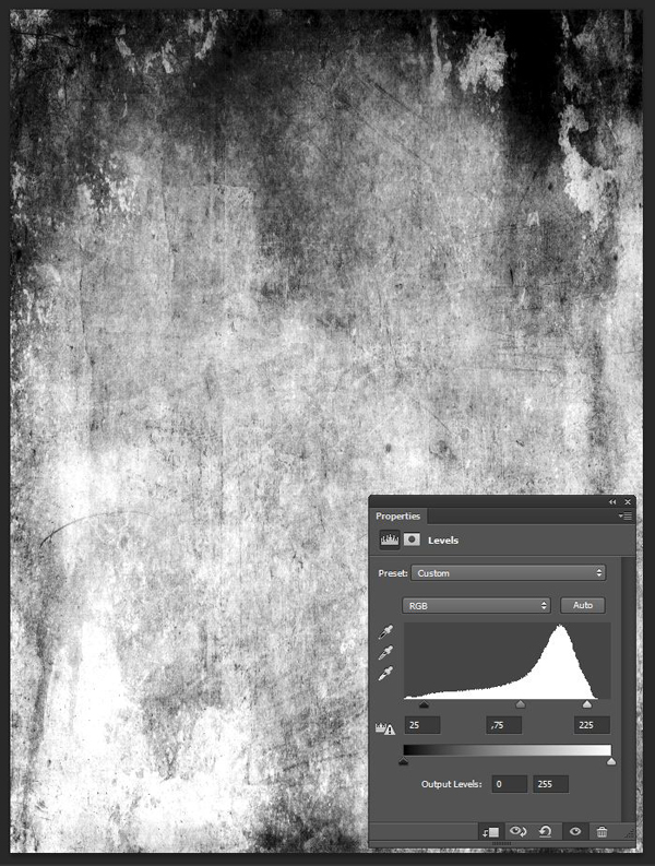
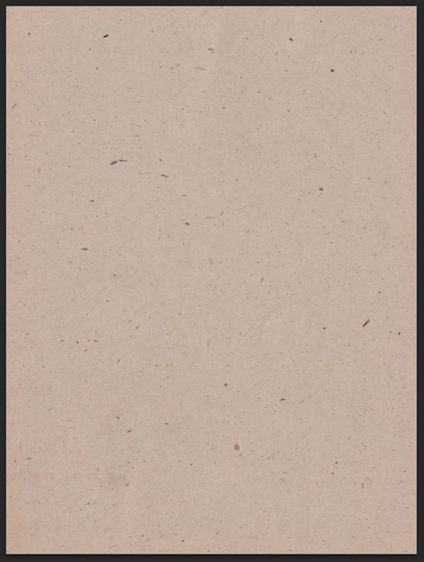
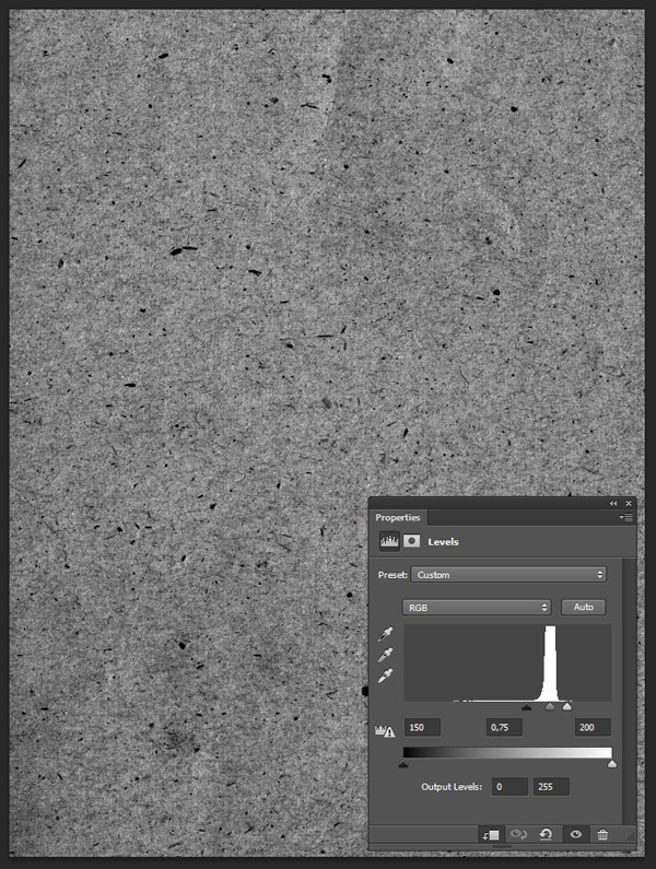
Next up is that photocopy/vignette texture I mentioned in the external asset list at the beginning.
In a similar fashion as to that distressed texture from 2 Lil’ Owls, place it so it covers the whole canvas, regardless of maintaining proportions.
Blending mode: Overlay @ 100% opacity.
The next to last texture is Watercolor6_Version1.jpg, from Make Media Co.’s watercolor texture pack (The Massive Patterns, Textures and Backgrounds Bundle).
Blending mode: Soft light @ 50% opacity.
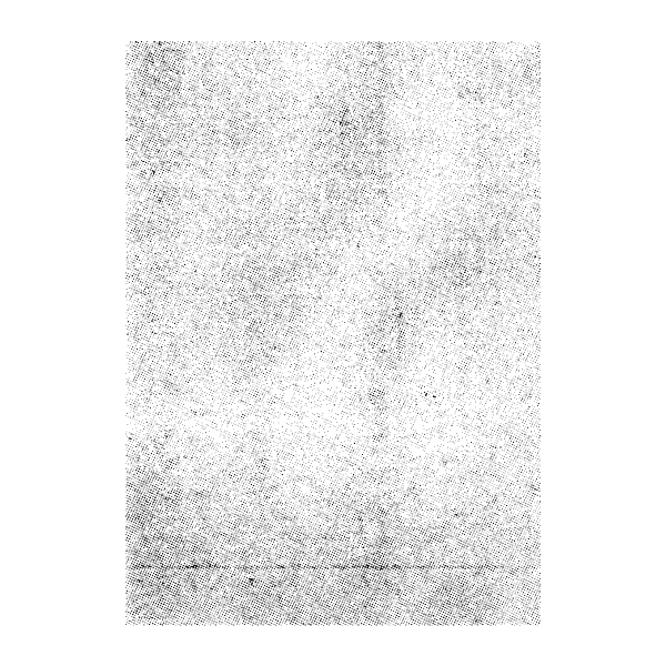
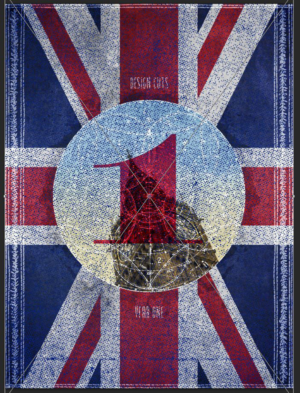
Last but not least, we’re going to add a subtle halftone effect to this. The vector halftone texture we’re about to use comes to us through the Ultimate Vintage and Retro Design Bundle, thanks to Offset Design (18.eps).
Change its color to the blue of the Union Jack (#00247d), and paste it in the canvas. Cover everything.
Change the blending mode to Soft light @ 50% opacity for some subtle halftone goodness.
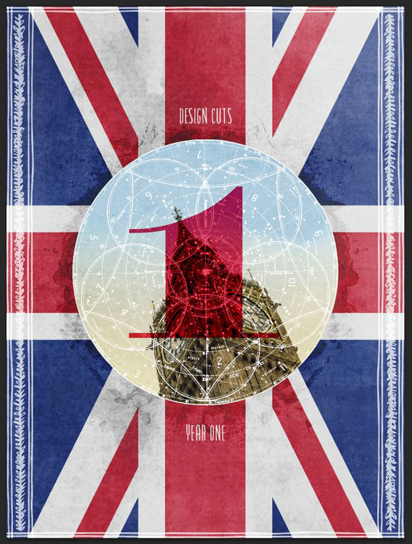
Finally, organize ’em layers.
WRAPPING UP
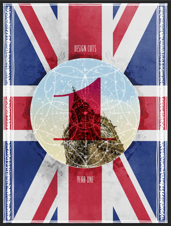
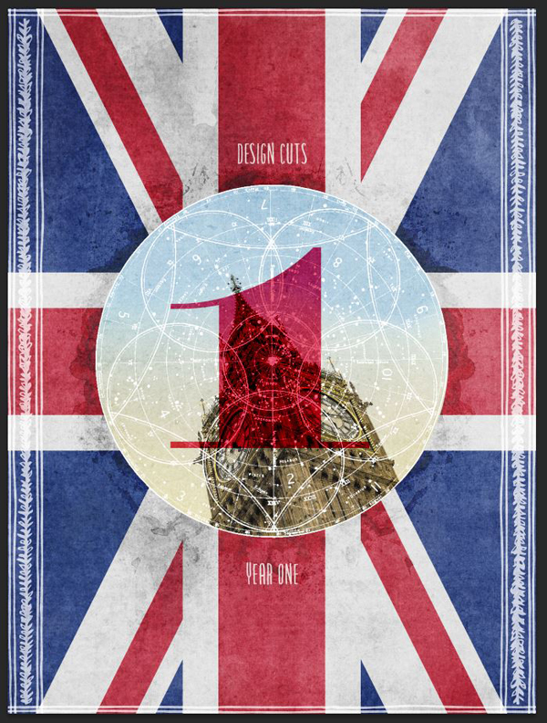
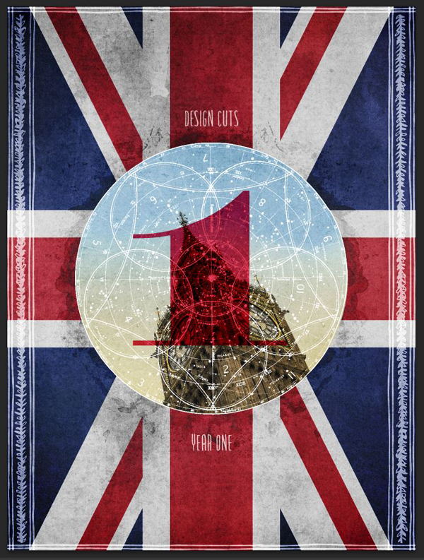
Well, we’re done! Ain’t it a beauty?
If you enjoyed this tutorial, and are interested in the host of Design Cuts bundles being re-run as part of our anniversary, then be sure to check out our Birthday Celebration Event, where you can grab 22 of our most popular deals, for the next few days only.
Join once more with me, wishing the Design Cuts crew a happy anniversary, and many more! I hope that you had as much fun following through the tutorial as I had writing it.
If you have any questions, don’t hesitate to comment below. You can also tweet to @designcutsdeals, or to me directly @simonhartmann.
We’d love to see your tutorial outcomes! Share them with us on the Design Cuts Facebook page.
And that’s it for today. Until next time, cheers!































I love that you put 2 tutorial tabs on here. I am a Photoshop Elements 10 user, looking forward to upgrading to PS CS someday soon. Every tutorial gives me an extra experience of learning something new. Thank you for that.
Happy Birthday and many more! I look forward to being a new, regular customer. Your things are amazing!
You’re very welcome, Carol. I’m glad to hear you’re enjoying the tutorials.
Changing to Photoshop CS, or CC is going to be so awesome. You can do so much more with it, and a lot of the processes are much easier too. I’m sure you’ll love it. :)
Great tutorial thank you
Thank you for your kind words. Don’t hesitate to reach out if you have any questions.