Hello all! Simon here. Well guys, Design Cuts has done it once again. They have assembled an amazing collection of typefaces. After carefully looking through the bundle, I spotted two different tendencies. One is the grungy/hipstery/hand-made vibe, the other one is more on the cute, poppy, and upbeat side of things.
As you might have seen from some of my previous tutorials, the cute, poppy, and upbeat side of things isn’t necessarily my forte. So our piece will be more on the grungy side.
As for our creation in particular, as you might have guessed it, we’ll be working on a beer label.
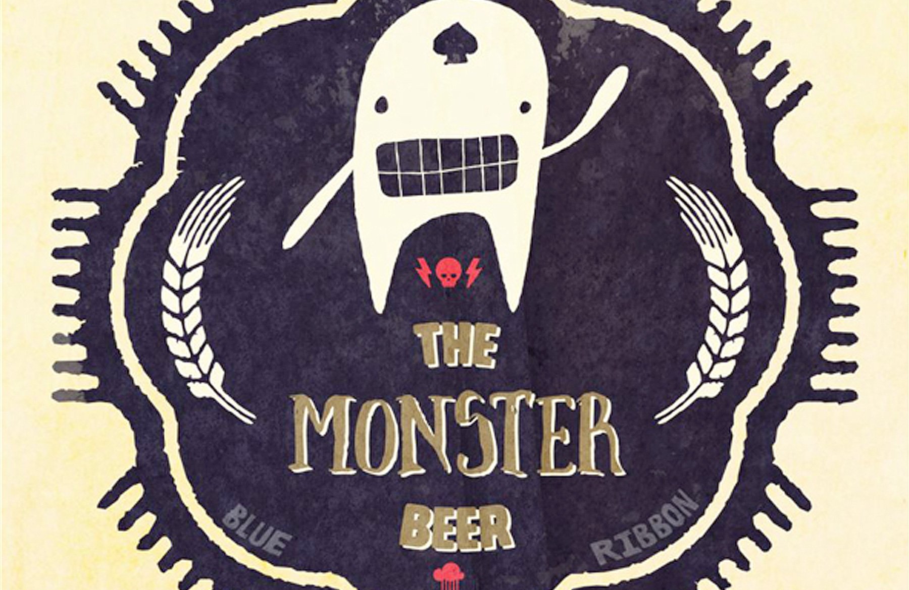
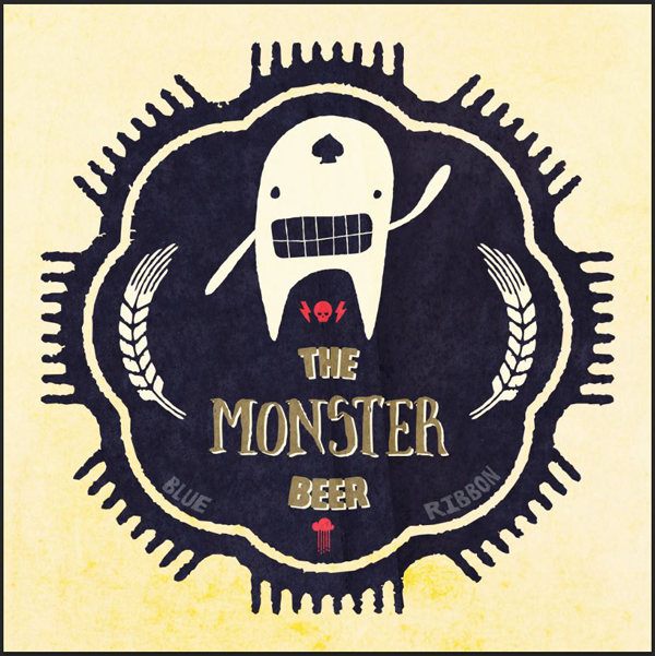
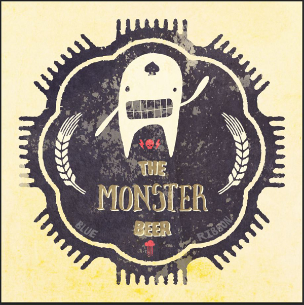
WHAT WE’RE CREATING:
THE CONTEXT FOR OUR PIECE
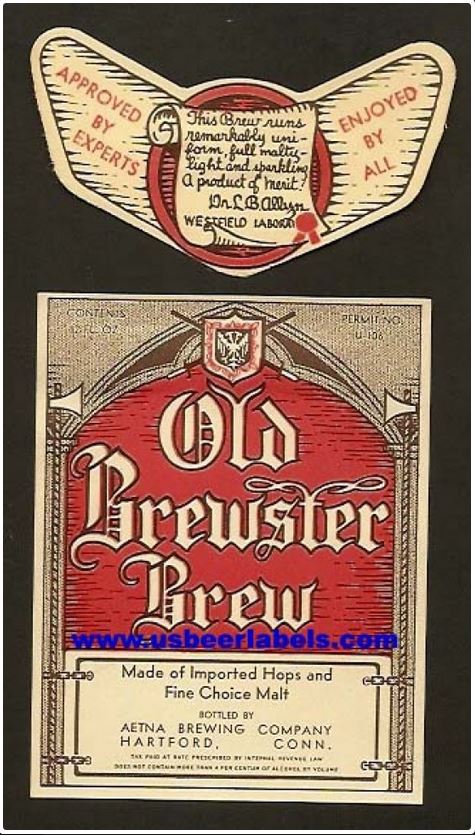
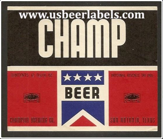
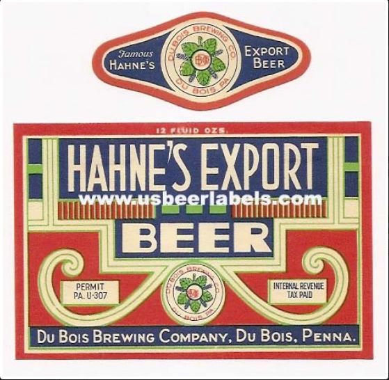
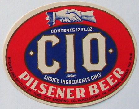
Thanks to the #badgehunting craze, I’ve been reminded that old beer labels are awesome. After a little bit of research, I came across some cool nuggets.
From there, it was obvious that I was going to have to create a beer label design, even a fictional one, with all that inspiration at hand.
I decided that we would leverage the sweet badges, shields, and icons found in Eveleth’s extras.
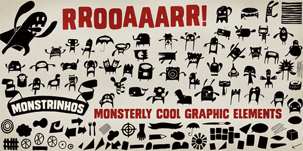
For our mascot, the Monstrinhos typeface will be perfect.
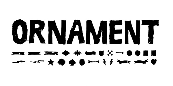
Finally, Ruba’s ornaments will help us to bring the finishing touches to our label.
Most of our work will happen in Illustrator, as it will be the best tool to manipulate the various type elements, transform them into pure vector elements, alter them, etc. We will quickly use Photoshop at the end of the tutorial for a bit of texture exploration though. I’ll show you how you can leverage some of the paper textures released by Design Cuts on Creative Market to age the design.
With all of that in mind, pop open a cold one (or grab a cup of Earl Grey if alcholic beverages aren’t your thing, that’s cool too), put some music on, and let’s get rolling.
STEP 1: FILE SETUP
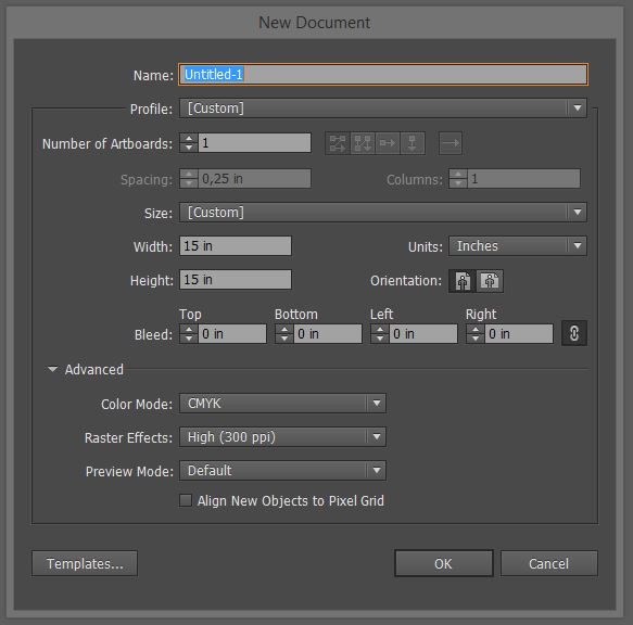
Like I said earlier, we’ll be working mostly in Illustrator. Create a new document. I’m using a 15″x15″ canvas in CMYK. Note that size doesn’t matter too much, since we’re working in vector.
STEP 2: THE BADGE
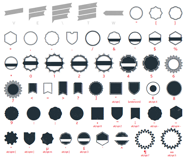
Eveleth is a brilliant type family. Its shapes “weight” features a sweet collection of shields and badges.
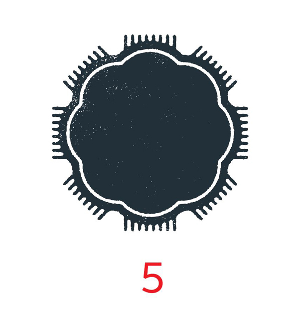
The one we’ll be using is this one. You can get it through the glyph panel (see this short intro to the glyph panel for more information), or by creating a new text object set in Eveleth Shapes and by pressing 5 on your keyboard. Easy as pie.
The next step, which we’ll follow for most of the elements we’ll grab from the typefaces today, will consist in removing the grunge speckles on the badge. As a designer, I like to have control over how much grunge is applied to my design elements. Type elements that are pre-grunged out don’t allow that. That being said, I still like the rough, “ink bleed” style lines of the badge, so I’ll keep these.
The process to “degrunge” the element is simple:
- Transform the type element to outlines (so it’s a pure vector object)
- Ungroup the object if necessary, and release the compound path
- Recolor the released compound path elements appropriately
- Merge everything back together
- Delete the color we added back in step 3 so that we have a one color element that isn’t grunged out anymore
To change your type object to a vector element, use Right click menu > Create outlines.
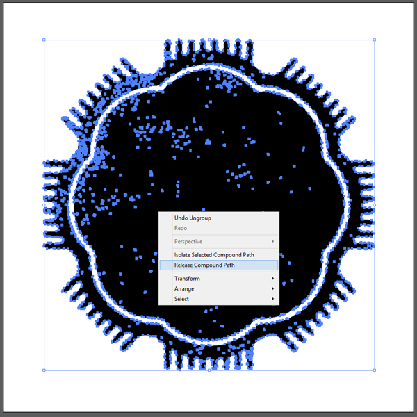
Ungroup the object (SHIFT+CTRL/CMD+G), and release the compound path (Right click menu > Release compound path).
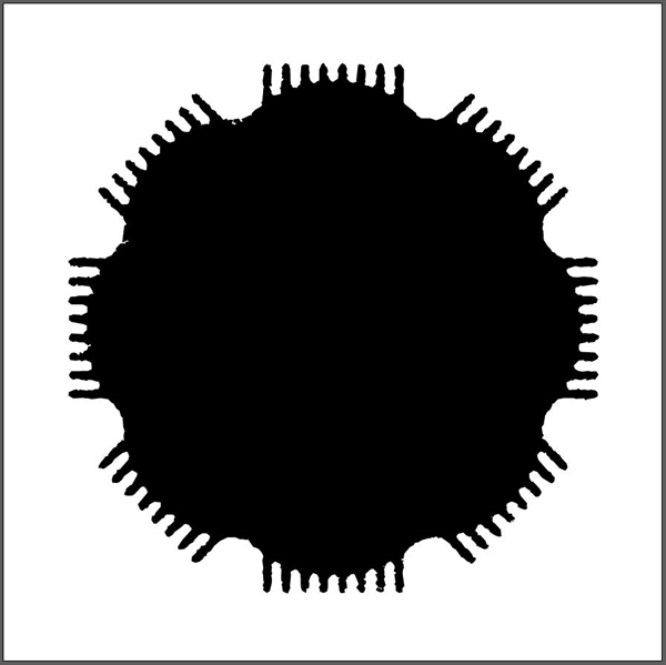
The result is this all black shape.
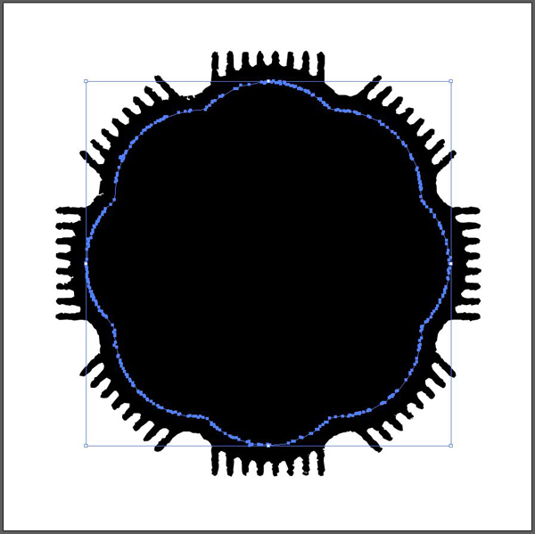
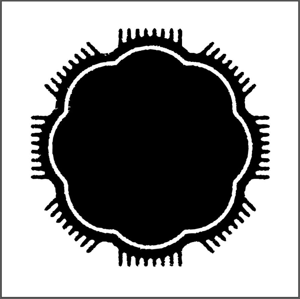
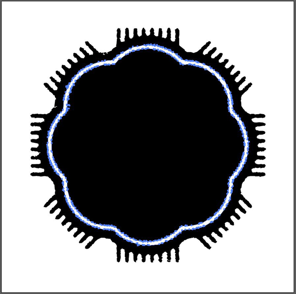
Hover the badge, until you find the shape corresponding to the white inner rim. Fill it in white.
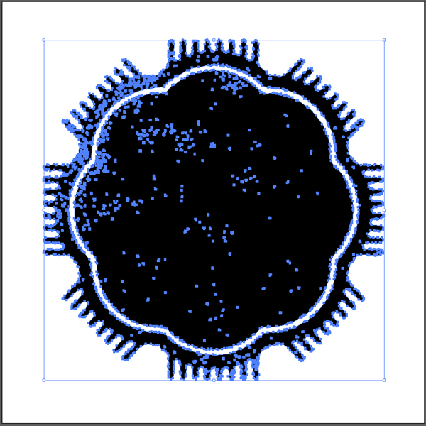
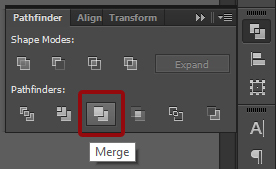
Next, use the Pathfinder (SHIFT+CTRL/CMD+F9) to merge everything together. Start by selecting everything. Note the speckles of grunge that turned to black when the compiund path was released.
Merge.
And here we have our clean badge.
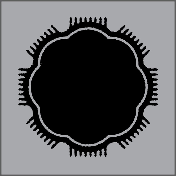
Lastly, use your direct selection tool (A) to select the white inner rim, and delete it. This will replace the white with a transparent shape, getting us back to a one color object.
Here is our badge, shown with a gray background to demonstrate transparency.
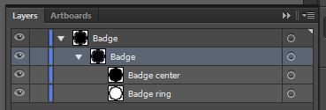
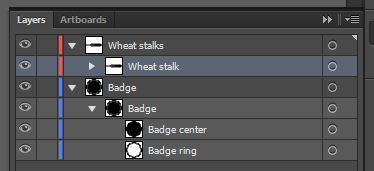
Now can also be the time to organize your layers.
STEP 3: THE WHEAT STALKS
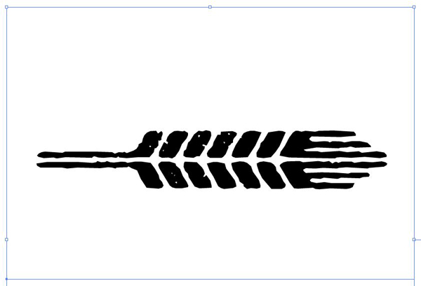
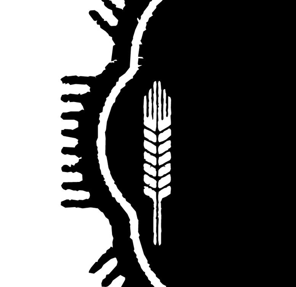
Not that many beer labels skip on the wheat stalks. Luckily for us, Eveleth Shapes has a few for our consideration. We’ll use the one that’s available under the letter “t.” I’d rather use the straight version than the pre-curved one, so we can give it our own curvature.
Start by giving that single wheat streak the same clean-up treatment than the badge. We want to remove as much pre-made grunge as possible.
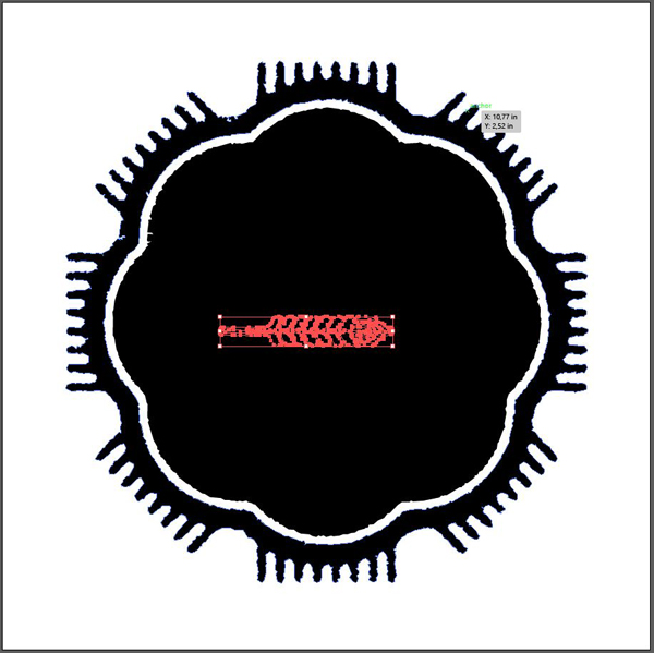
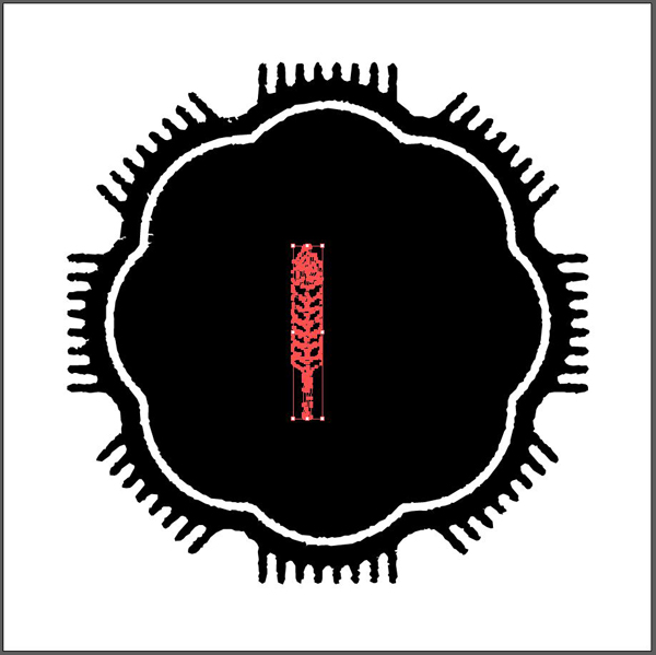
From there, make sure it’s above the badge, turn it 90° counter-clockwise, and change its color to white.
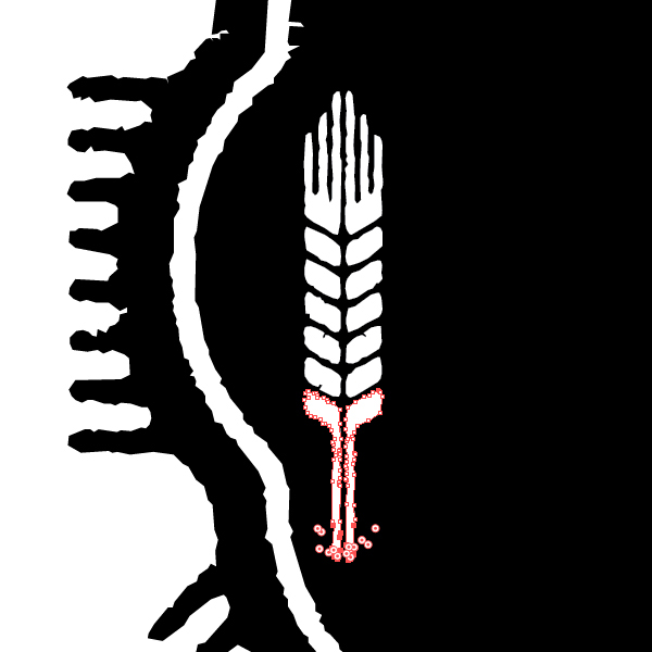
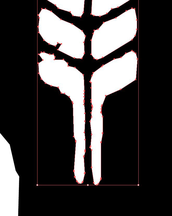
Next, we’re going to slightly reduce the size of the stem. These are very long, and given the end goal (to make the stalk fit within the center bulge of the badge), they will be an issue. Simply use your direct selection tool (A) to select the points of the bottom extremities of the stem, and slide things up a bit. I reduced mine by about ⅔.
As you can see, the result might be these jagged and ugly lines. There’s a fix for that.
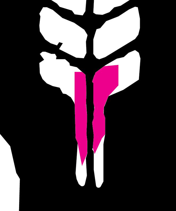
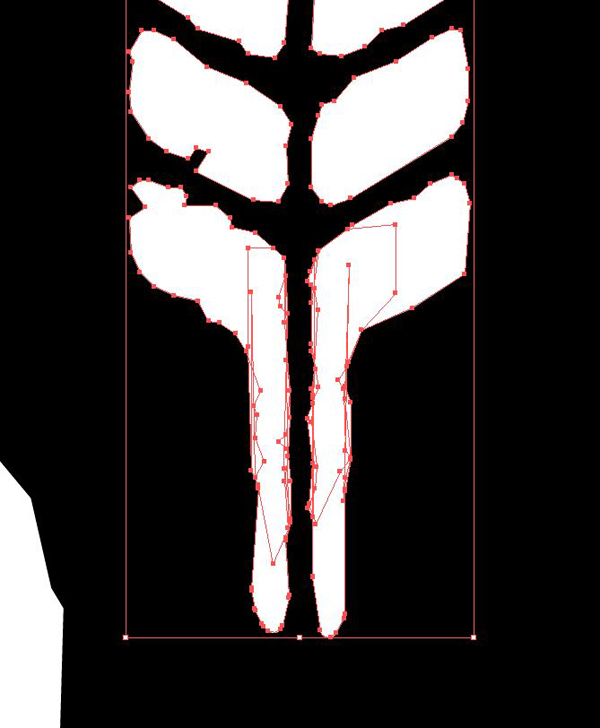
Simply draw some white shapes with the pen tool over the holes, and merge them with the stalk. I colored the shapes I created in magenta, so you can see them.
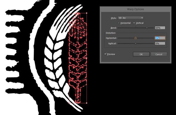
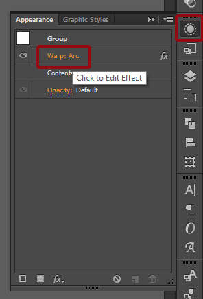
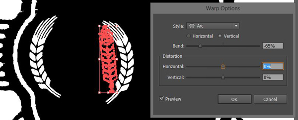
Now that that’s done, we can finally give its curve. We’ll use Effect > Warp > Arc to do so. We’ll use a vertical arc, with a value of 65%. Note that you might have to adapt your values depending of your object’s size.
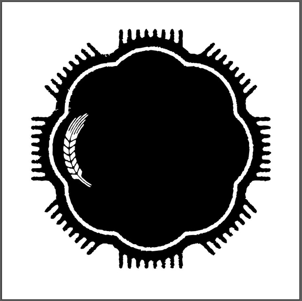
Move the stalk slightly to the right for a better spacing with the edge of the badge.
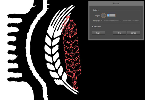
With the warp complete, the stalk fits well, but we could still tweak it a bit. First, we’ll rotate the stalk of 6°. Your rotate tool can be accessed through the R key.
Finally, I’m just going to size it down a hair, so it fits even better.
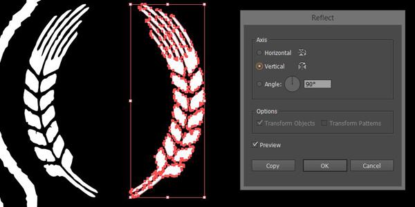
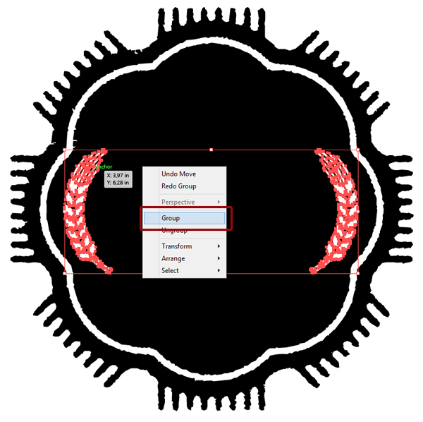
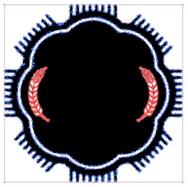
Once you’re happy with the transformation, we’ll create its twin brother that will ornate the right hand side of the badge. Rather than go through the same process again, we’ll expand the first wheat stalk (which will apply its transformation for good), copy it, and flip the copy vertically to get our second.
Expand appearance can be found through the Object > Expand appearance menu.
The Reflect panel can be accessed through Right click menu > Transform > Reflect.
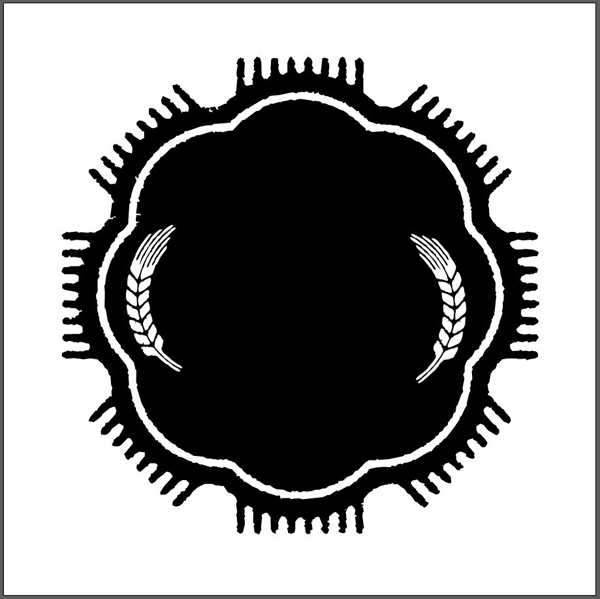
Here’s a global view once both have been placed.
Once done, to accurately center the pair of wheat stalks within the badge, you can:
- Group them together
- Select the stalks and the badge
- Use the Horizontal align center alignment functionality
- Center everything back in your canvas
- Ungroup the wheat stalks
STEP 4: THE MONSTER
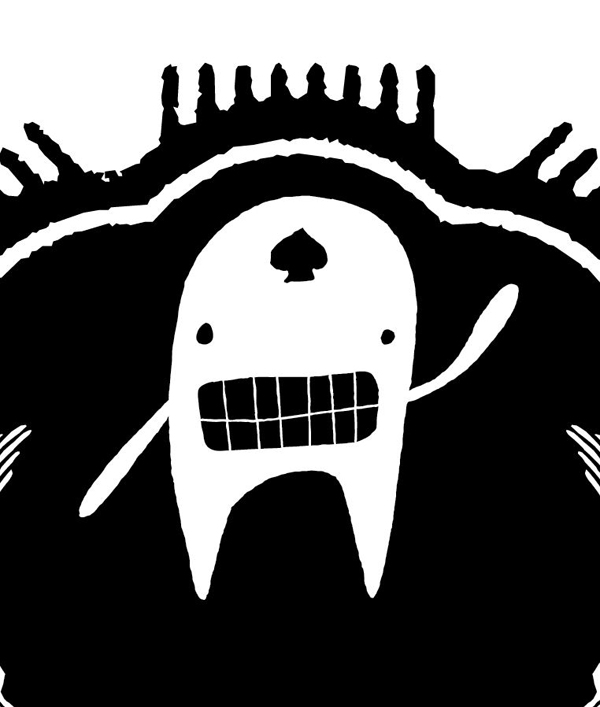
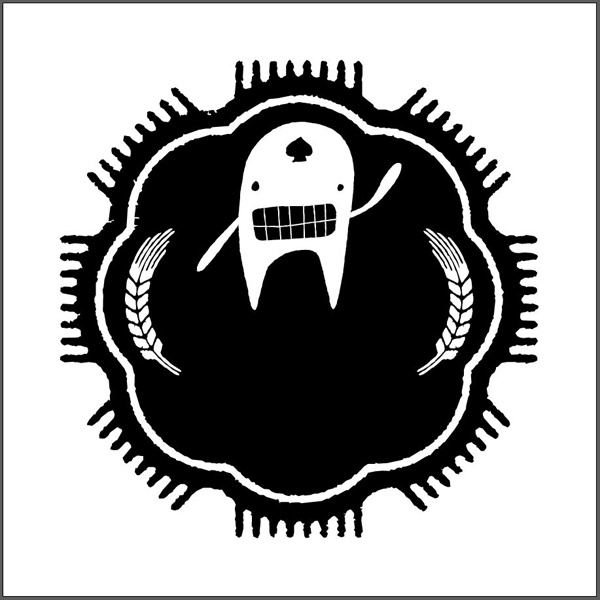
Our beer will be called the monster beer. Let’s add the monster that’s hidden under the letter “A” of the Monstrinhos typeface.
Make sure to change it to outline, switch its color to white, and place it at the top of the badge. He should cover slightly above ⅓ of the badge.
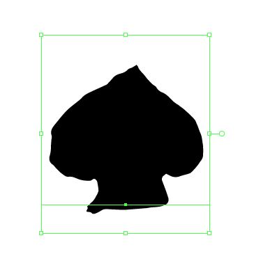
Next, grab the spade that’s part of the Ruba ornaments typeface (“s“), and add it to the monster’s forehead. You should also consider changing the type to outlines.
Here’s a look at the layer organization so far.
STEP 5: THE BEER NAME
It’s finally time to make use of the letter forms of some of the typefaces in the current font deal.
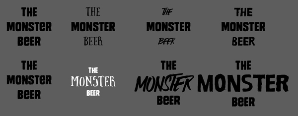
I went through quite a few options when creating it.
My favorite combo is Monstro solid and Brave. I’m using Brave as my primary typeface, as it has sends off a slightly “creepy movie” type of vibe. Monstro is a nice, bold, and utilitarian serif, that perfectly fits for the little additional words.
Brave is sized at 72 points, while Monstro solid is sized at 36 points. I’ve tweaked the line spacing so it looks consistent between the three text lines. Oh, and the kerning is set to Optical.
Once you’re happy with the line spacing and kerning, create outlines from your type object.
Once that’s done, ungroup and regroup the words separately from each other. Then, apply a very subtle Arc warp effect to “The” and “Beer.” I’m using 10% and -10%.
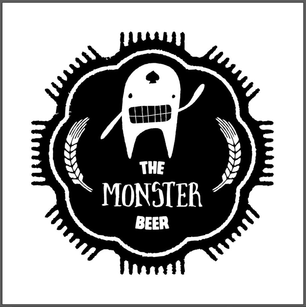
Once you’re happy with the type, it’s time to add it to the badge. I decided to manually center it between our monster’s legs and the two wheat stalks. You could also use the Horizontal align center functionality we’ve used earlier.
STEP 6: ADDITIONAL WRITTEN MENTIONS
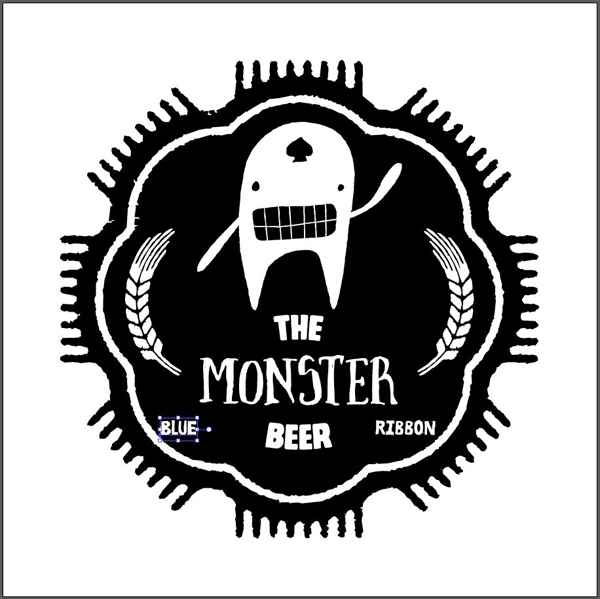
Besides the title, we’ll add the “Blue Ribbon” mention to the label. Wikipedia tells us that “the blue ribbon is a symbol of high quality. The association comes from The Blue Riband, a prize awarded for the fastest crossing of the Atlantic Ocean by passenger liners and, prior to that from Cordon Bleu, which referred to the blue ribbon worn by a particular order of knights. The spelling blue riband is still encountered in most English-speaking countries, but in the United States, the term was altered to blue ribbon, and ribbons of this color came to be awarded for first place in certain athletic or other competitive endeavours (such as county and state fairs).”
We’re going to leverage the Ruba regular typeface for this.
We’ll lodge the two words in the curve below the one assigned to the wheat stalks. That way, they’ll contribute to the visual balance of the label.
Start by writing both words in their spot, in white.
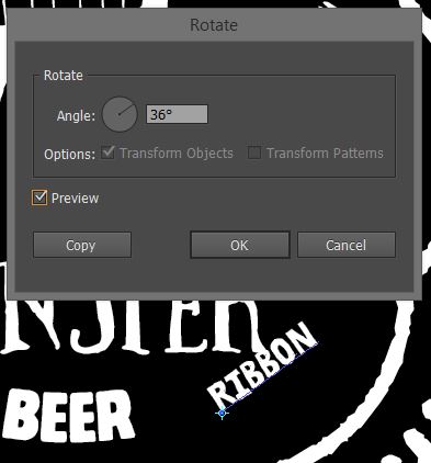
Next, give each word a 36° rotation.
The result is neat, but can still be improved.
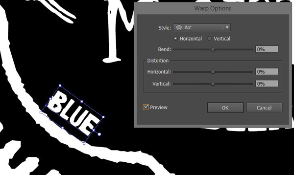
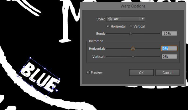
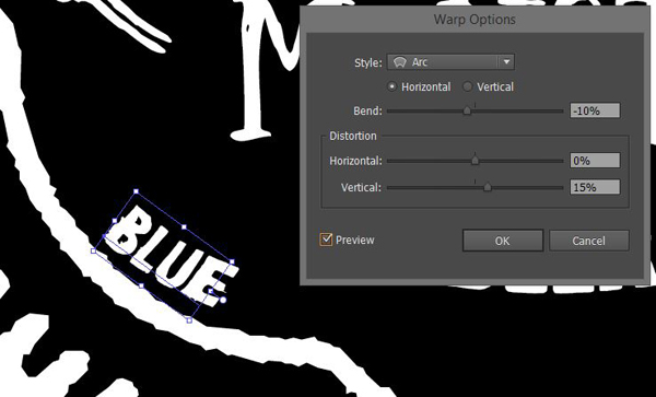
We’re going to leverage the Arc warp effect to make the type objects follow the badge’s curve more. The only twist is that we’ll also use its Vertical and Horizontal distortion settings to make the short words fit better.
No effect
Regular arc effect
With vertical distortion enabled
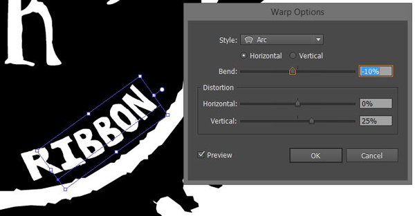
The values for the word Ribbon are slightly different, to accommodate the longer word:
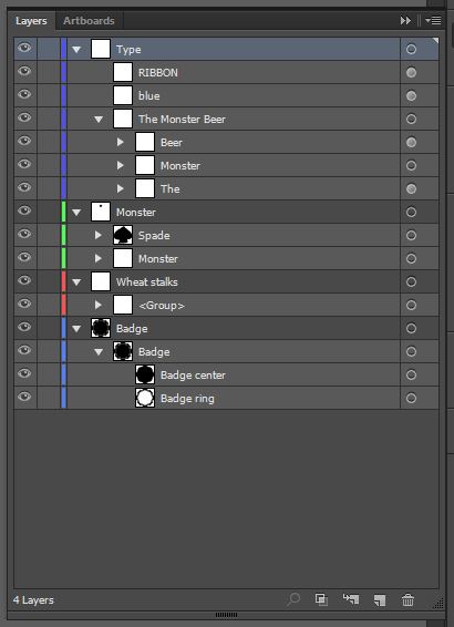
And here’s my obligatory layer palette shot:
STEP 7: FINAL VECTOR SMALL ELEMENTS
We’re almost done constructing our label. I just want to add a few little elements to tie everything together.
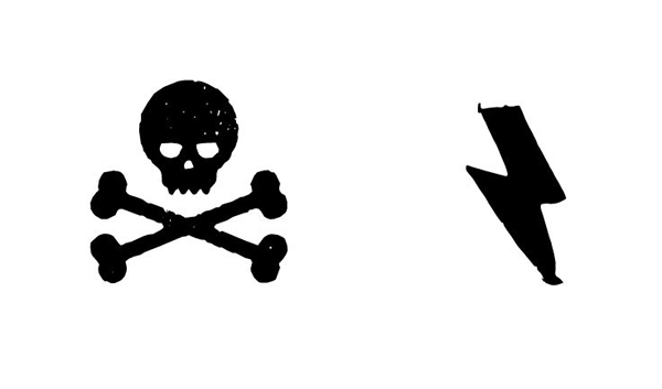
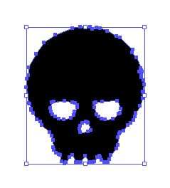
Eveleth icons has a great little skull available under the number 5, and Ruba ornaments a cool lightning bolt under “V.”
We’re going to create a secondary little badge with these elements. First, isolate the skull itself from the crossed bones. You can also clean up the grunge speckles, like we’ve done before.
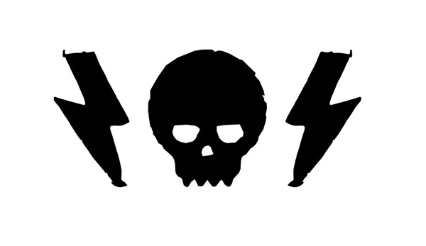
Once you have the skull all prepped, simply place in the middle of a pair of the lightning bolts, and you’ll be good to go.
We’re going to place this little guy between our monster’s legs, right above the beer name.
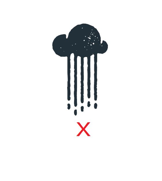
Finally, I’m also going to add this fantastic little rainy cloud icon from Eveleth icons below the word “Beer.” It can be obtained through the letter “x.”
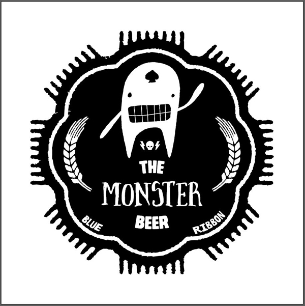
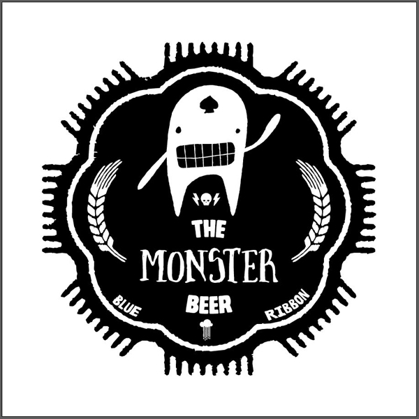
Our main label is complete!
STEP 8: SECONDARY LABEL AND BOTTLE CAP GOODNESS
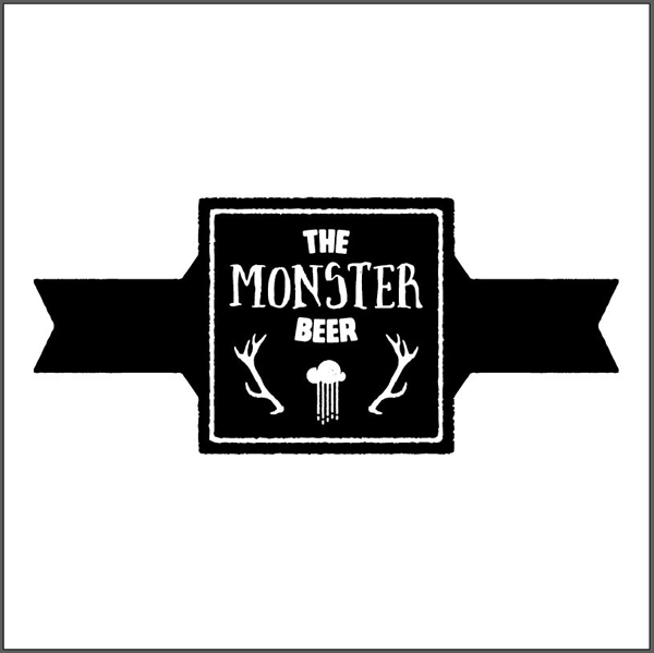
Yep, we aren’t over this one yet. Most beer bottles will feature a smaller, secondary label on their neck.
I used the same techniques than above to create my secondary label and bottle cap art: icon tracking, shape selecting, etc.
Here are the various shapes I’ve used in its composition:
The base square comes from Eveleth shapes, as does the base shape for its sides. The square’s grunge effect has been removed, while the side shapes’ hasn’t.
These side shapes are simply the same “x” speech bubble, mirrored, horizontally flipped, and juxtaposed.
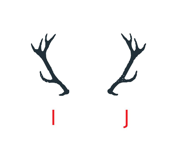
The elk stags come from Eveleth icons.
Finally, the type and rainy cloud come from the main label.
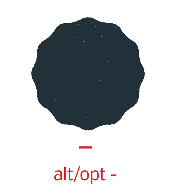
For the bottle cap, I’m using the same base shape from Eveleth shapes.
I’ve removed the grunge speckles. I then used Object > Path > Offset path to create the concentric, smaller copy of the shape, removed its fill, and gave it a white stroke. This gives us an effect consistent with the one seen on the main badge and on the secondary label.
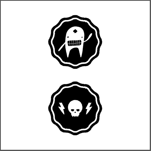
After that, the monster, and the skull with bolts mini-badge were grabbed from the main label.
STEP 9: LET’S TALK COLORS
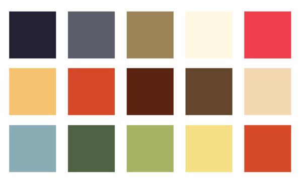
A quick look at my previous reference material, as well as a quick stop by Colourlovers, gave me three palettes to work from.
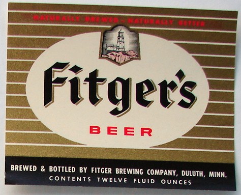
My favorite is the first one. It’s actually been inspired by this label from Fitzger’s beer:
The original label used a light background, with dark type. Let’s see if we can emulate that.
While the result is decent, we designed in the opposite manner (dark background, light elements). Switching that during the coloring process makes us loose most of the contrast we managed to create during the creation of the label.
Let’s try to stay true to the original intent.
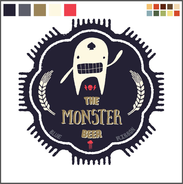
In this attempt, I’m using the dark blue as my primary color. The gold color is a perfect contrast to that. It serves to highlight the name. The secondary blue helps to strengthen the content hierarchy, by visually pushing the secondary type to the background. One of the issues I have is that the spade looks off, and the red seems like an afterthought.
I’m happier with this version: more red makes it seem more deliberate. Switching the spade to the dark blue makes it the proper visual weight. Switching the wheat stalks to the light yellow makes them less present. They are ornemental after all, and not the focal point of the design.
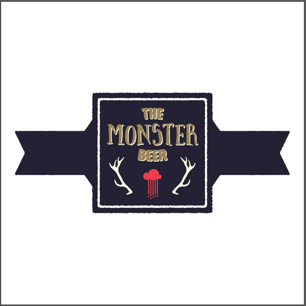
Applying the same logic, here’s what our secondary elements could look like.
STEP 10: JUST A BIT OF TEXTURES
As I said in the beginning, Design Cuts released their first Creative Market product: a set of a 100 grungy paper and card textures.
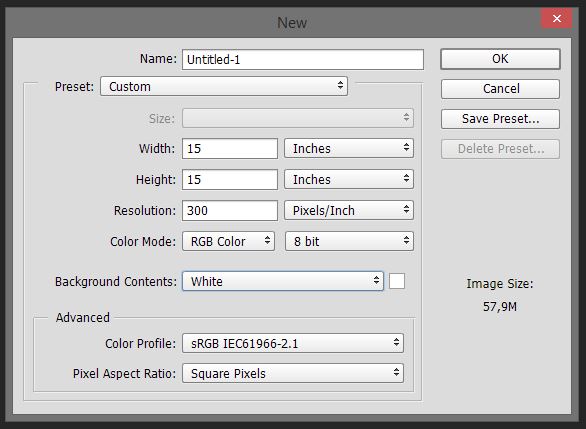
We’ll be using a few of these textures to see what the label could look like printed on paper. I’m working in a Photoshop document with the same specs as our Illustrator one.
Let’s start by creating a textured background for our piece. I’m using my bright yellow as my background color.
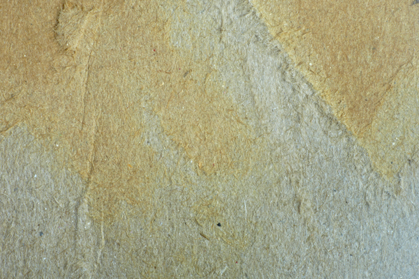
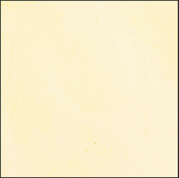
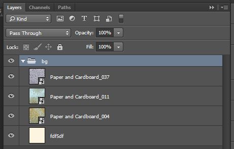
Let’s add Paper and Cardboard_004.jpg over our background layer, and switch its blending mode to Color burn @ 50% opacity.
We’ll just need a hair more paper grain in our background to make it present enough. Place Paper and Cardboard_011.jpg in your design, with its blending mode set to Color burn @ 75% opacity.
To soften the background just a little bit, let’s add Paper and Cardboard_037.jpg, set on Soft light @ 50% opacity.
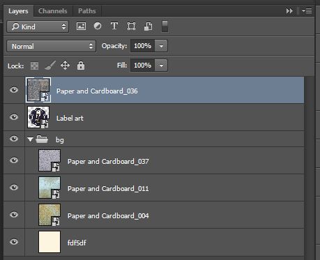
Don’t forget to organize your layers.
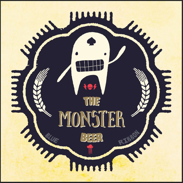
Next, place your main label art in your document, as a smart object.
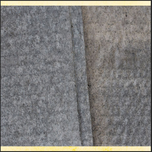
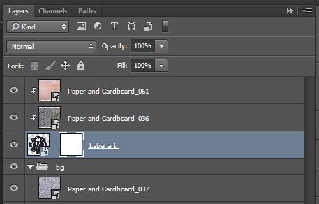
We’ll be adding a bit of paper grain to the label only. Start by placing Paper and Cardboard_036 in your document, above your label.
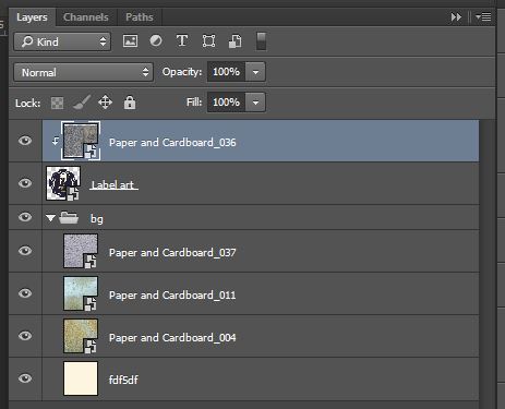
Next, clip it to your label layer (CTRL/CMD+ALT/OPTION+G), so it won’t affect or show on the background.
Then, change its blending mode to Soft light @ 75% opacity.
Next up is Paper and Cardboard_061. Clip it as well to the label.
Switch its blending mode to Soft light @ 25% opacity.
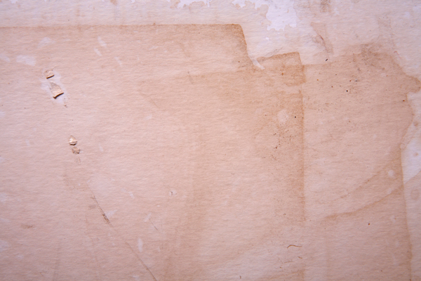
The texturing of the piece is complete. Now, we’ll use a texture to age the label design. We’ll be using Paper and Cardboard_040.jpg. Start by opening it up in Photoshop, then copy its content.
Head back to your label file, and add a layer mask to the label layer. Make sure both aren’t linked, so we may modify them independently from one another.
Proceed to ALT/OPTION+CLICK the thumbnail of the layer mask you just created, and paste your texture in the layer mask.
Resize so the texture covers most of the canvas.
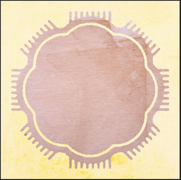
From there, click on the label layer’s thumbnail to see the art again. Admire the result of your aging work.
The result is a bit too strong.
We’ll fix it by going back to the layer mask, and using Levels (CTRL/CMD+L). Levels allow you to tweak an image by acting on its dark, medium, and bright tones. Since layer masks are limited to grayscale, they’re the perfect tool to tweak the texture that’s in there.
In our case, the result was too strong because the texture had some rather dark spots. So I’m using the levels to create a much lighter, soft-contrasted version of the texture.
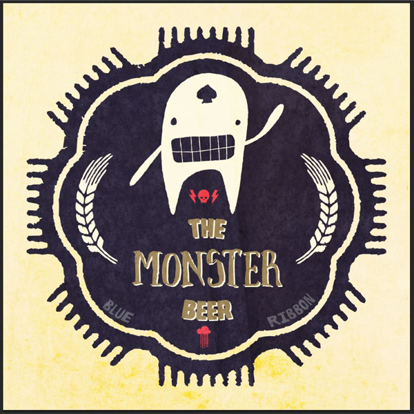
The result is much more subtle and acceptable.
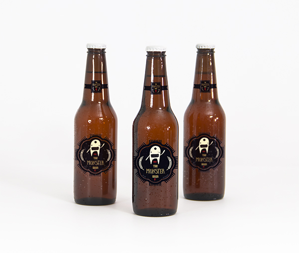
And we’re done! Let’s see what this would look like on a bottle:
FINAL THOUGHTS
I hope you had as much going through the tutorial as I had writing it. Don’t hesitate to share your outcomes on the Design Cuts Facebook page. If you have any questions please let us know in the comments below, or ask me directly on twitter: @simonhartmann.
Remember, there’s only a few days left to get the Massive Artistic Font Bundle for just $29, so if you don’t want to miss out, we recommend checking it out now. It’s been getting some incredible feedback from the DC community, and you guys have been loving the 14 font families available.
Massive Artistic Font Bundle (Including Web Fonts + Extended License) – 93% Off



































Thanks for another great tutorial, Simon!
Glad to hear you’re enjoying the tutorial. If you decide to try it out, please do send us your outcome. :)
Thank you for you kind words!