In this tutorial, I will be showing you how to design a retro album cover straight out of the 70’s! To create our album cover we will be using The Beardy typeface from Aiyari which is just one of several beautiful fonts that you will find in The Amazing Designer’s Creative Collection. Along with these great fonts, you will also find various brushes, textures, lettering kits and watercolour collections from some of the top creators in the industry today. If you’re all ready for a blast from the past then fire up Photoshop and let’s get started!
HAVE YOU SEEN OUR YOUTUBE CHANNEL?
Watch the video tutorial below and subscribe to our YouTube channel for regular updates direct to your inbox.
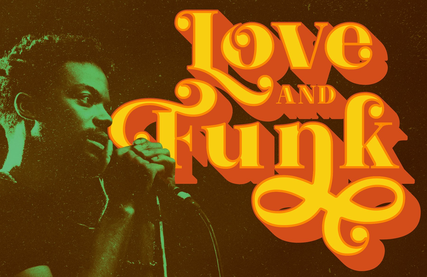
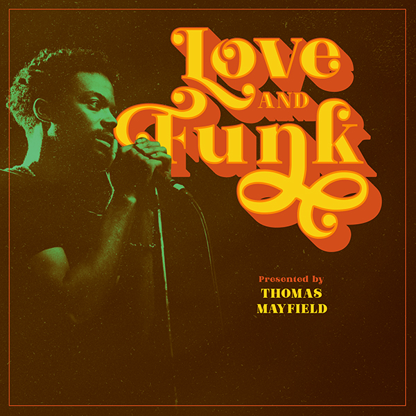
Here’s a look at what we’ll be creating:
Step 1: Love And Funk Album Cover
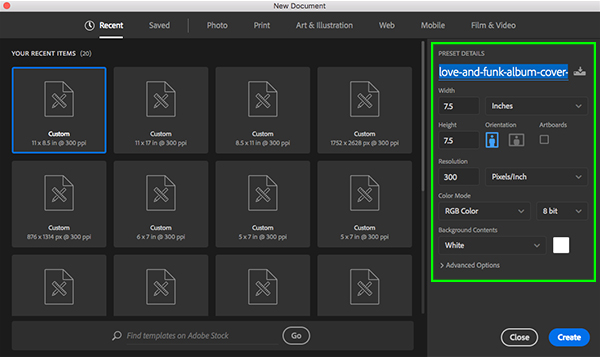
Begin by opening Adobe Photoshop and create a New Document that is ‘7.5’ inches wide by ‘7.5’ inches tall with an RGB Color Mode and a Resolution of 300 ppi. Let’s also take a moment to name our file – here I will name my file ‘love-and-funk-album-cover-design’ but feel free to call it anything you would like. Once you have set that up, go ahead and click on the ‘Create’ button at the bottom right of the dialog box to make your document.
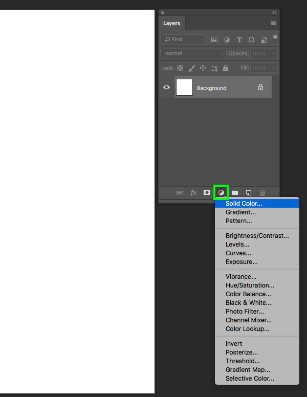
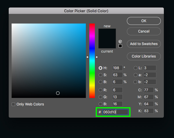
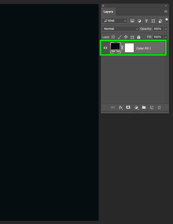
You will now have a single ‘Background’ layer with a small lock icon next to it in the Layers Palette. Let’s go ahead and click on the Adjustment Layer icon from the bottom of the Layers Palette and then choose ‘Solid Color’ from the menu that appears.
For the fill color, enter the hex value ‘#060D10’ and then press ‘Return’ on the keyboard or click ‘OK’ to proceed.
After adding the Adjustment Layer let’s go ahead and drag the original ‘Background’ layer to the trash since we no longer need it.
Step 2: Lead Singer
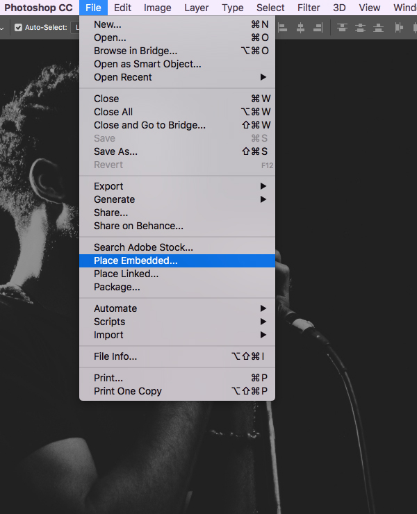
Next, go to the File menu and choose ‘Place Embedded…’ from the drop-down that appears.
Navigate to the folder or location where you’ve downloaded the image of the lead singer which you can download here from Unsplash. Once you’ve located the image, choose ‘Place’ from the lower right corner to bring it into your document.
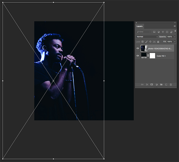
After importing the image, scale it up by dragging outwards from any of the four corners while holding the Alt/Option+Shift keys and then position it on the left side of the canvas as shown here:
Step 3: Adjustment Layers
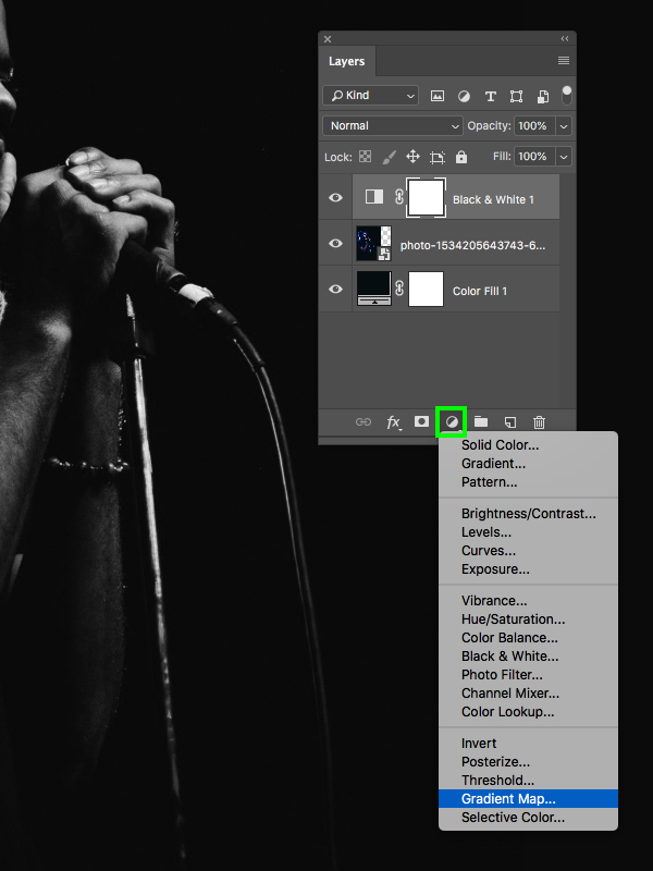
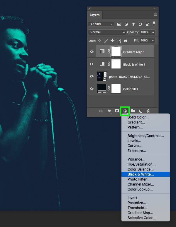
After sizing and positioning the image of the singer, select the Adjustment Layer icon from the bottom of the Layers Palette and then choose ‘Black & White…’ from the menu.
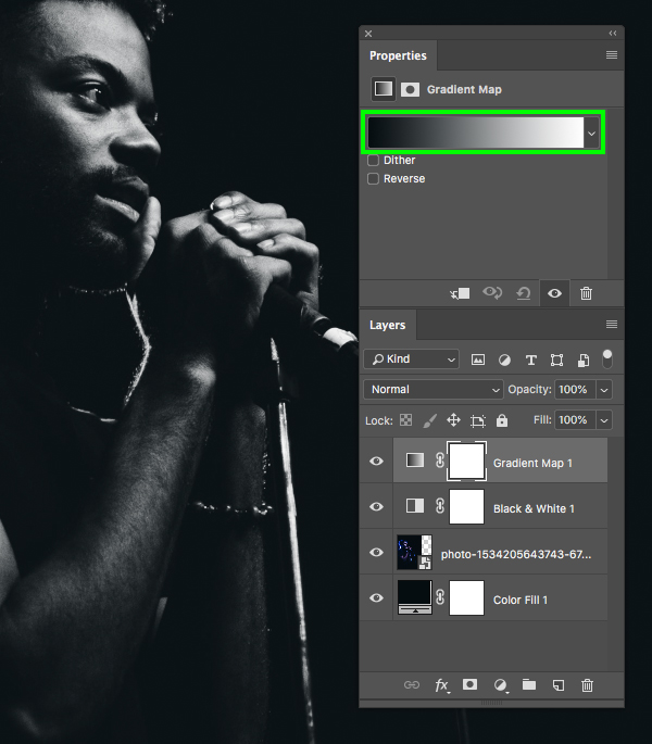
Return to the Adjustment Layer icon again and this time choose ‘Gradient Map…’ from the list to add it to the top of your Layers Palette.
In the Properties section we will now click on the gradient strip to modify the colours.
Step 4: Modifying The Gradient Map
Once the Gradient Editor appears, click on the lower left square and then on the ‘Color’ swatch to change the first colour. You should now see the ‘Color Picker’ where we can enter the hex value ‘#141D35’ and then press ‘OK’.
Now click on the small square at the bottom right of the Gradient Editor and then click on the ‘Color’ swatch again. This time, enter the hex value ’00FFD8′ and then press ‘OK’ or hit ‘Return’ on the keyboard twice to apply the changes and close out of the Gradient Editor.
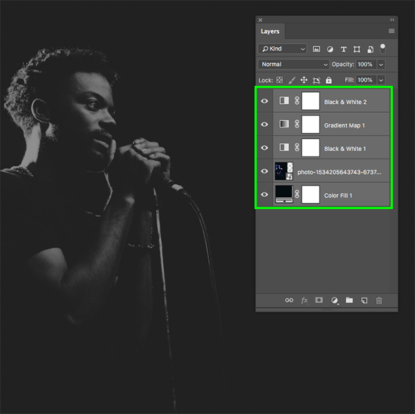
Return to the Adjustment Layer icon and add another ‘Black & White…’ adjustment to the top of the stack.
Step 5: Singer Group
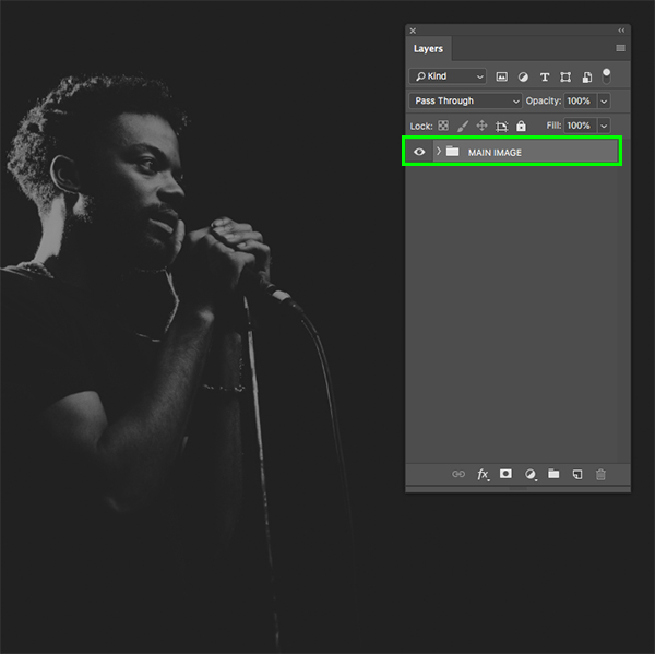
Select the top layer in your Layers Palette, hold the Shift key, and then select the very bottom ‘Color Fill 1’ Adjustment Layer to select all of the layers together.
With all of your layers still selected, press Command/Ctrl+G to place them into a folder and then double click on the ‘Group 1’ text and rename the folder ‘MAIN IMAGE’ as shown in the image below:
Step 6: Gritty Textures
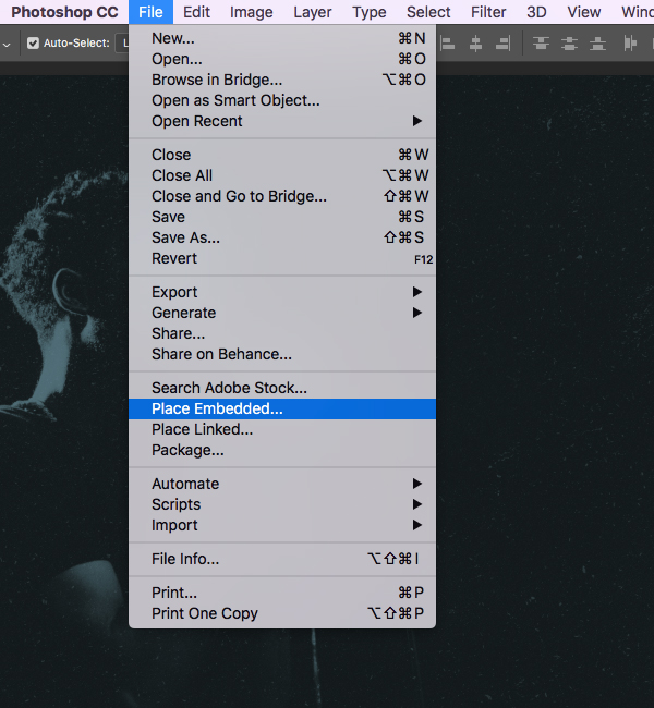
Next we will need to download some free textures. Grab the first pack from GraphicsFuel here and then the second texture pack from Graphic Burger here so we have some nice dust and scratch textures to work with. After downloading both packs, go to the File menu and choose ‘Place Embedded…’ as shown below:
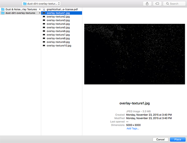
Navigate to the GraphicsFuel texture pack and select the first texture – ‘overlay-texture1.jpg’ and then choose ‘Place’ from the bottom right-hand corner to import the texture into your document.
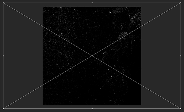
Hold the Alt/Option+Shift keys and scale the texture up from the center until it fills the entire canvas and then press ‘Return’ to apply the transformation.
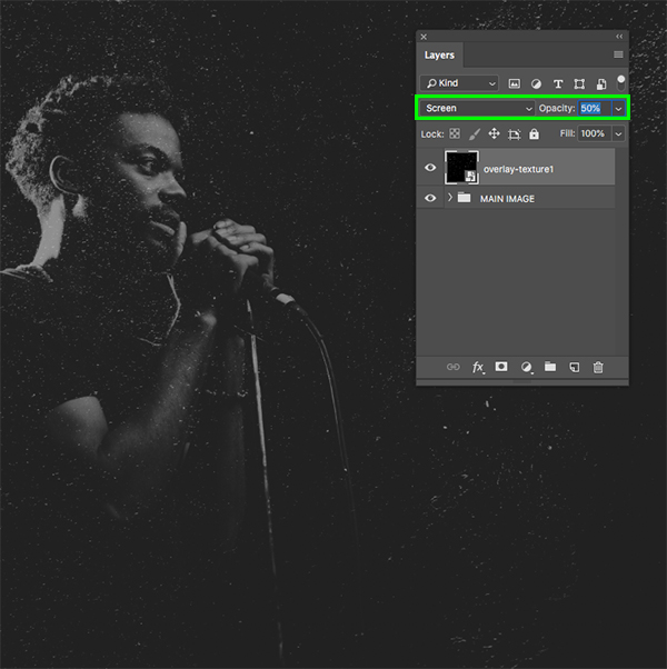
Change the Blend Mode of the texture from ‘Normal’ to ‘Screen’ and then press ‘5’ on the keyboard to lower the opacity to ‘50%’.
Step 7: Texture Adjustment
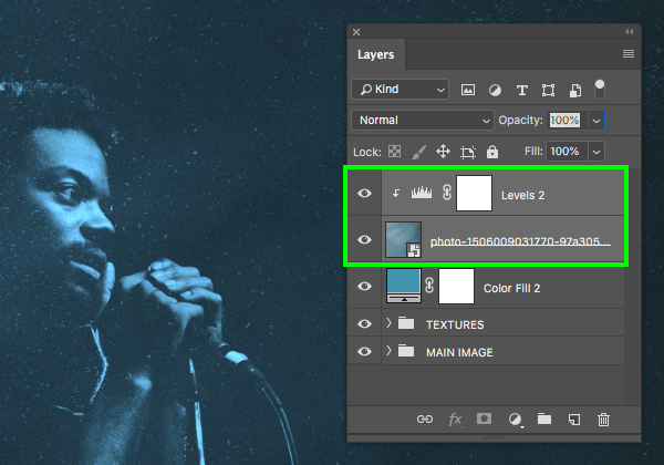
With the texture layer selected, hold the Alt/Option key and click on the Adjustment Layer icon at the bottom of the Layers Palette. From here, choose ‘Levels…’ from the list.
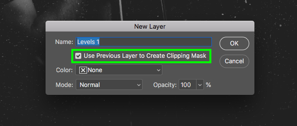
When prompted with the ‘New Layer’ dialog box, check off the ‘Use Previous Layer to Create Clipping Mask’ option and then press ‘OK’ to continue.
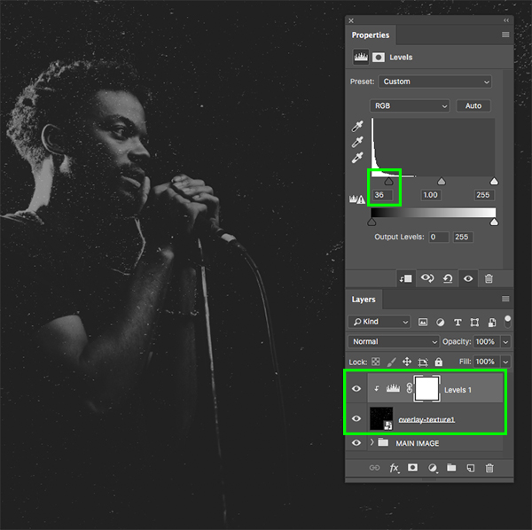
In the Properties panel, move the left slider in towards the center until it’s set to ’36’ to add some contrast to the texture. The Levels Adjustment Layer should also have a Clipping Mask applied to it that will ensure the adjustment only affects the layer directly below it, which is what we want!
Step 8: More Scratch
Return to the File menu and choose ‘Place Embedded…’ once again.
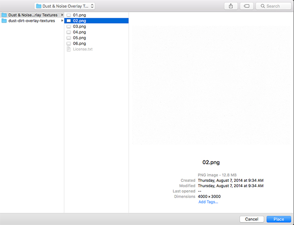
This time let’s navigate to the Graphic Burger textures and select ’02.png’ before choosing ‘Place’ from the lower right corner.
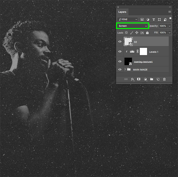
Once the texture is brought into your document, scale it up by dragging outwards from any four corners of the bounding box while holding the Alt/Option+Shift keys until the texture fills the canvas, and then press ‘Return’ to apply the transformation. After that, change the Blend Mode of the layer to ‘Screen’ to allow the image to show through.
Step 9: Curves Adjustment
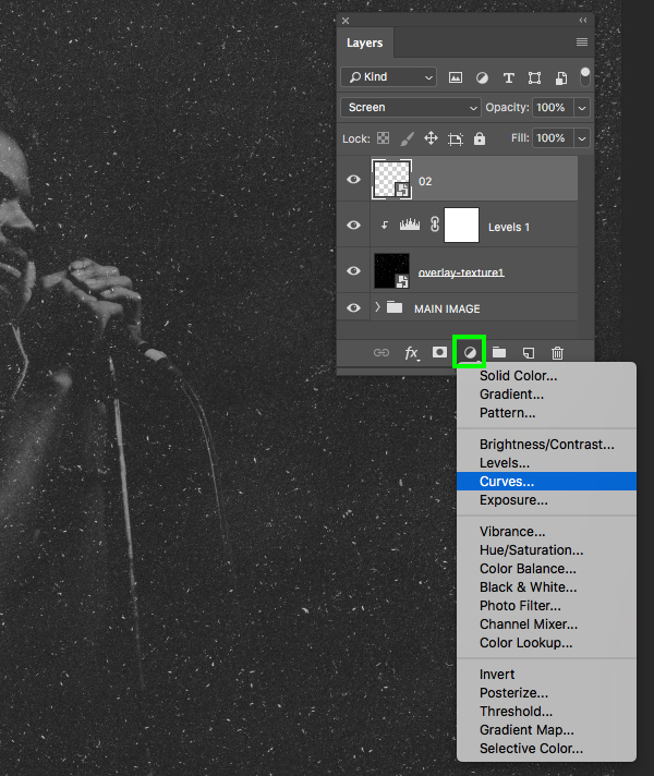
With the top texture Smart Object layer selected, hold the Alt/Option key and click on the Adjustment Layer icon at the bottom of the Layers Palette before choosing ‘Curves…’ from the drop-down menu.
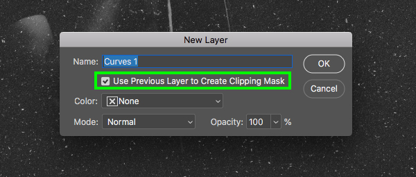
When prompted with the next panel, check off the ‘Use Previous Layer to Create Clipping Mask’ option once again.
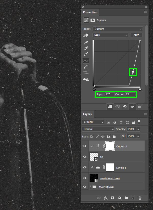
In the Properties panel, click to make a point in the center of the grid and then move it over to the far right and down so that the ‘Input’ is set to ‘217’ and the ‘Output’ is set to ’79’.
Step 10: Texture Folder
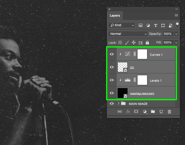
Select the top Curves Adjustment Layer, hold the Shift key, and then select the ‘overlay-texture1’ layer so both textures and Adjustment Layers are selected at the same time.
Press Command/Ctrl+G to place the textures into a new folder and then double-click the folder name in the Layers Palette and change it to ‘TEXTURES’. After that, press the number ‘4’ on the keyboard to reduce the opacity of the folder to ‘40%’ as shown here:
Step 11: Color Wash
Make sure that the ‘TEXTURES’ folder is selected and then click on the Adjustment Layer icon at the bottom of the Layers Palette and choose ‘Solid Color…’ from the list.
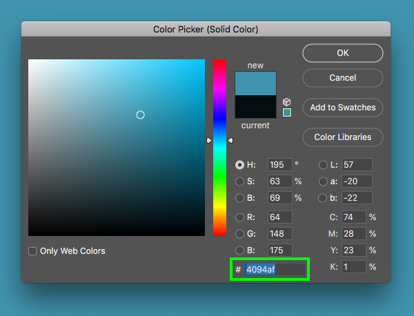
For the fill colour enter the hex value ‘#4094AF’ and then press ‘Return’ or click ‘OK’ to proceed.
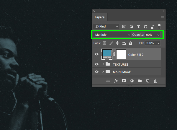
After adding the solid colour to the top of the Layers Palette, change the Blend Mode from ‘Normal’ to ‘Multiply’ and then reduce the opacity of the Adjustment Layer to ‘60%’ by pressing the number ‘6’ on the keyboard.
Step 12: Smoke
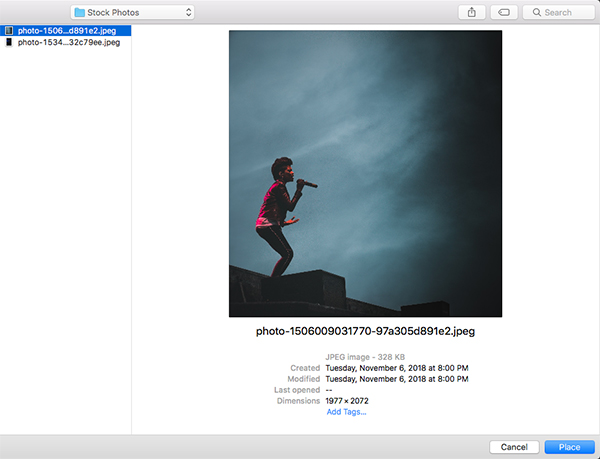
Next, download this second free stock image from Unsplash and save it with your other files. Once you have done that, come back to Photoshop and go to the File menu before choosing ‘Place Embedded…’ from the menu once again.
Navigate to the image of the singer with the smoky background and then choose ‘Place’ to import it as a Smart Object.
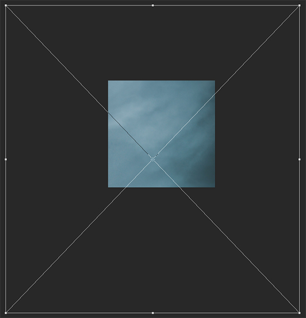
After importing the image, scale it up by dragging outwards while holding Alt/Option+Shift and crop an interesting area of just the smoke before pressing ‘Return’ to apply the transformation once you are happy with the crop.
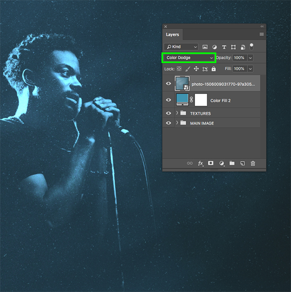
Once you are happy with the size and position of the smoke, change the Blend Mode of the layer from ‘Normal’ to ‘Color Dodge’ as shown below:
Step 13: Smoke Adjustment
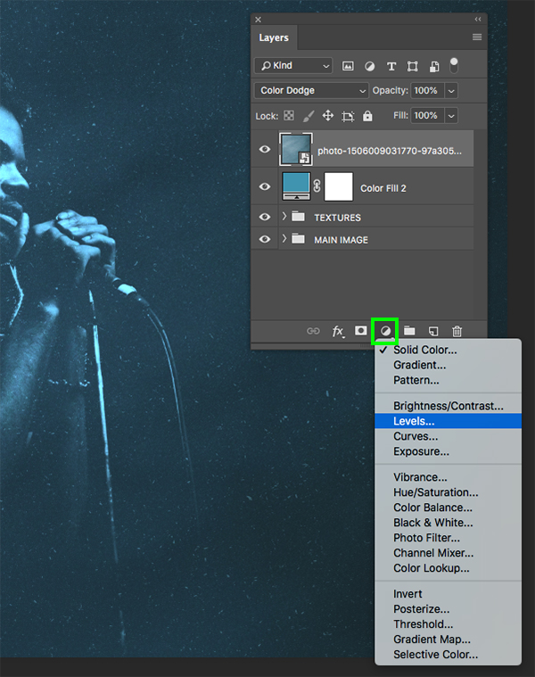
With the smoke layer selected, hold the Alt/Option key and click on the Adjustment Layer icon at the bottom of the Layers Palette before choosing ‘Levels…’ from the list.
When the pop up menu appears, check off the ‘Use Previous Layer to Create Clipping Mask’ option and then click ‘OK’ or press ‘Return’ on the keyboard to continue.
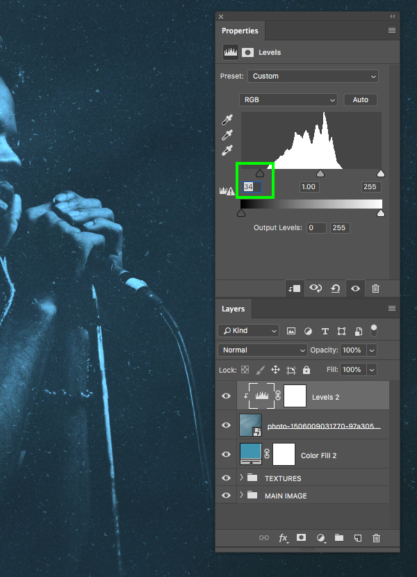
In the Properties panel, move the left slider in towards the center until it’s set to ’34’ as shown here:
Step 14: Smoke Group
Select the top Levels Adjustment Layer, and then hold the Shift key and select the Smart Object layer below so both layers are selected together.
Press Command/Ctrl+G to place the layers into a new folder and then double-click the ‘Group 1’ text to rename the folder ‘SMOKE’.
Step 15: Custom Gradient Map
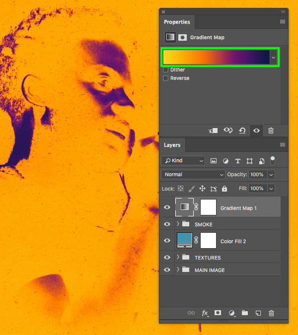
Make sure that the top ‘SMOKE’ folder is selected and then click on the Adjustment Layer icon at the bottom of the Layers Palette and choose ‘Gradient Map…’ from the list.
In the Properties panel, click on the colour strip to bring up the panel where we can modify the colours.
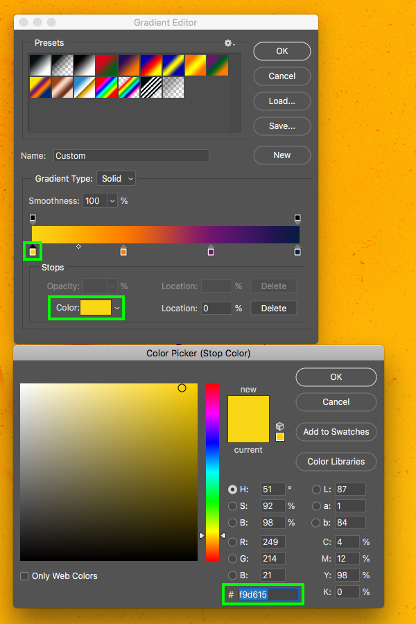
Click on the far left of the strip in the Gradient Editor and add a bright yellow colour such as ‘#F9D615’ to the colours.
Click along the bottom of the colour strip in the Gradient Editor to add a second colour with a ‘Location’ of ‘34%’ and then enter the hex value ‘#FD7C00’ to add a nice vibrant orange to the gradient.
Add a third colour with a ‘Location’ of ‘67%’ and use the hex value ‘#6F156C’ and then click ‘OK’ once again to add this colour to the gradient.
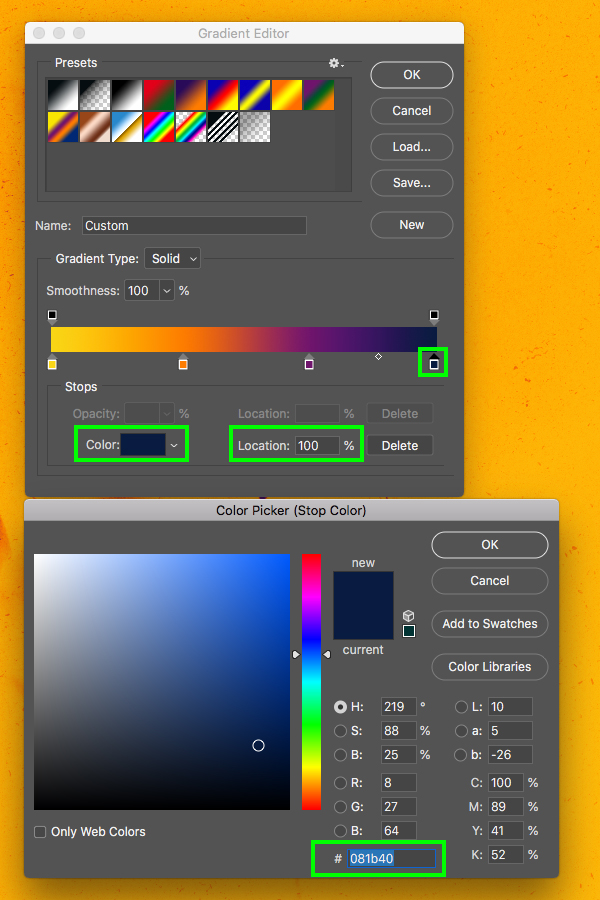
Click along the bottom of the Gradient Editor and add a fourth colour to the far right. This time, enter the hex value ‘#081B40’ to finish off the gradient with a dark, rich blue colour and then press ‘OK’ to apply the changes and close out of both panels.
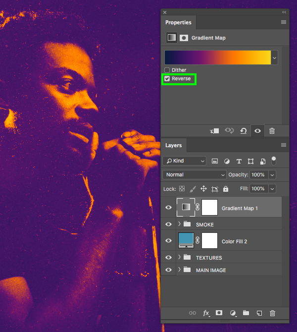
Now that we’ve added our four colours to the Gradient Map Adjustment Layer, return to the Properties panel and check off the box that says ‘Reverse’ to invert the order of the colours as shown below:
Step 16: Hue Adjustment
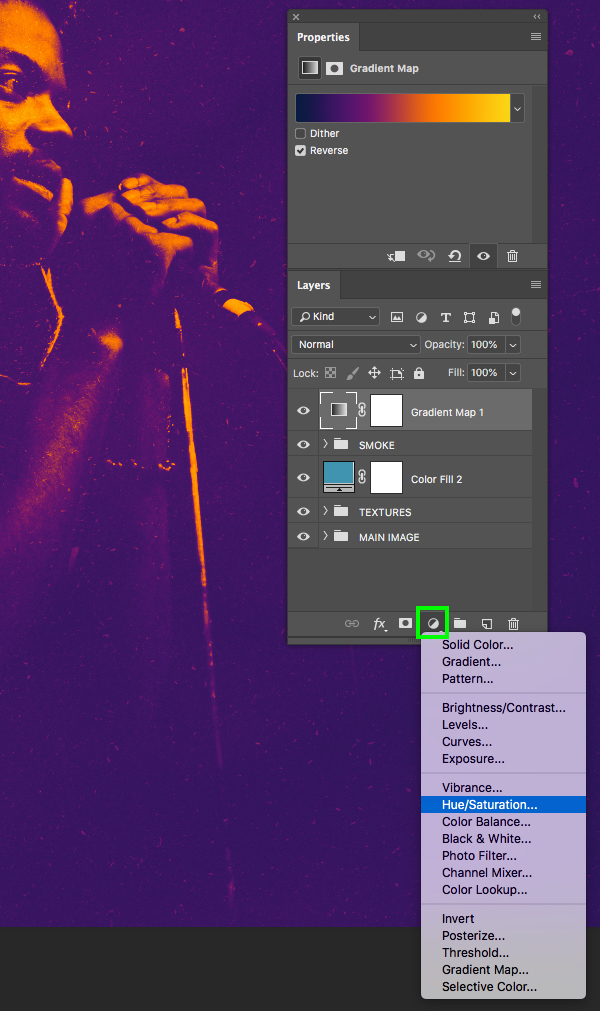
Click the Adjustment Layer icon again and choose ‘Hue/Saturation…’ from the list.
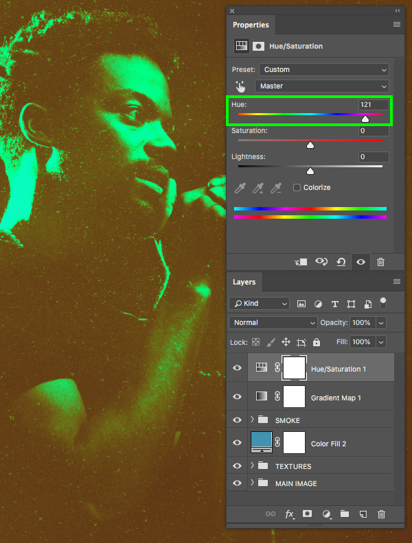
In the Properties panel let’s increase the ‘Hue’ slider to ‘121’ to change the colours.
Step 17: Fill Adjustment
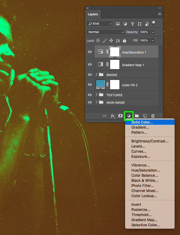
Click the Adjustment Layer icon again and this time choose the ‘Solid Color…’ option.
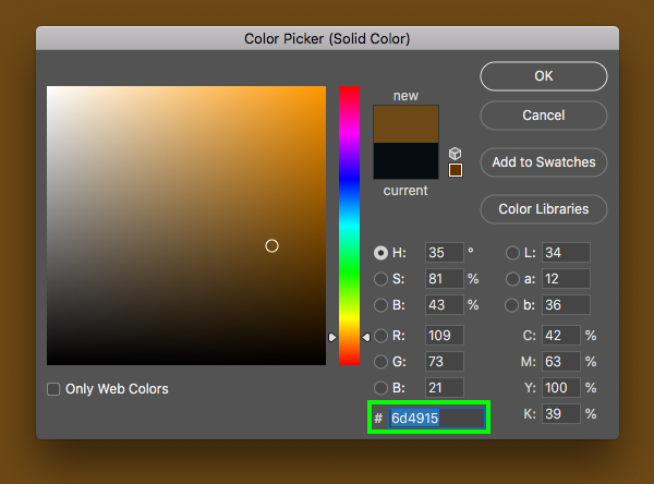
Enter the hex value ‘6D4915’ and then press ‘OK’ to continue.
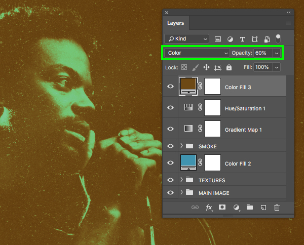
After applying the solid colour, change the Blend Mode of the layer from ‘Normal’ to ‘Color’ and then reduce the opacity of the layer to ‘60%’ by pressing the number ‘6’ on the keyboard.
Step 18: Adding Contrast
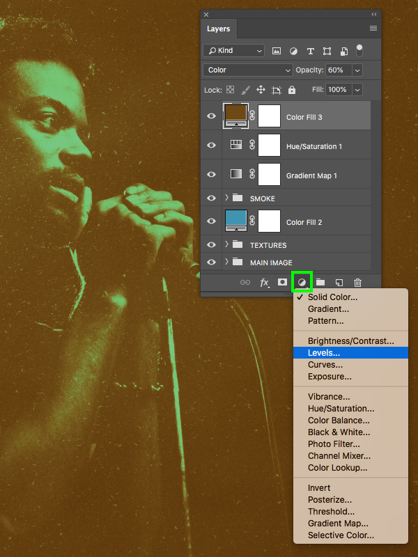
Make sure that the top Adjustment Layer is selected in your Layers Palette and then click on the Adjustment Layer icon at the bottom. From the list that appears we now want to choose ‘Levels…’ to add it to the top of all of our layers.
In the Properties panel, move the left slider in towards the center until it’s set to ’22’ as shown here:
Step 19: Adjustment Layers Group
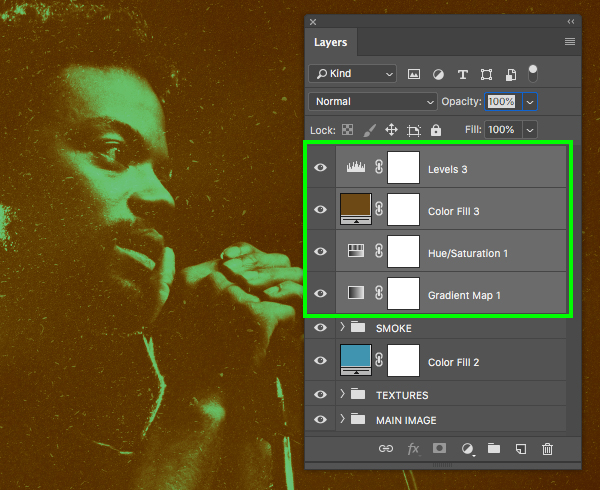
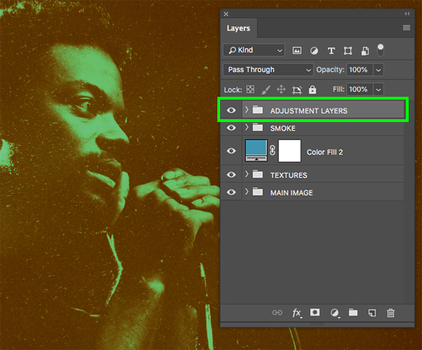
The four Adjustment Layers that we’ve added in the last few steps will affect the entire image as none of them should have any Clipping Masks on them. Select the very top Levels Adjustment Layer, then hold the Shift key and select the Gradient Map Adjustment Layer so all four of the Adjustment Layers are selected together like this:
With your four Adjustment Layers still selected, press Command/Ctrl+G to put them into a new folder and double-click the ‘Group 1’ text and rename the folder ‘ADJUSTMENT LAYERS’ as shown in the image below:
Step 20: Love And Funk
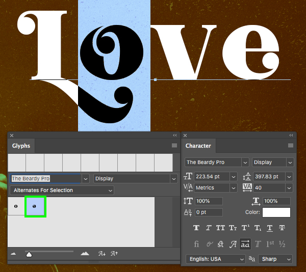
Create a new layer and then switch to your Type Tool (T) and type out the word ‘Love’ in upper and lowercase. Open up the Character Panel from the Window menu and we can now adjust a few settings. Here I am using ‘The Beardy Pro’ typeface in the ‘Display’ style, but if you don’t have access to this font you can use Funkies Font which is free typeface from DaFont.com. Once you’ve selected your font, let’s use the Character Panel to make the size of the text ‘223.5’ and then set the ‘Tracking’ to ’40’ as shown below:
Open the ‘Glyphs’ panel from the Window menu and then use the Type Tool (T) to highlight the uppercase ‘L’ and then you can choose one of the alternates from the Glyphs panel. Here I will be selecting the middle alternate as it has a nice swirl on the bottom.
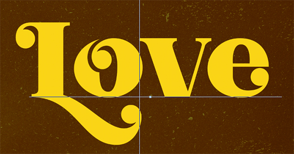
Highlight the lowercase ‘o’ and choose the alternate for that character next.
Highlight all of the text and then click on the ‘Color’ swatch and change the fill colour to ‘#F9D615’.
Let’s also manually adjust the kerning a bit by moving our cursor in between two characters and then pressing Alt/Option and the left arrow to remove some of the space between each of the letters until it looks nice and even.
Step 21: Second Line
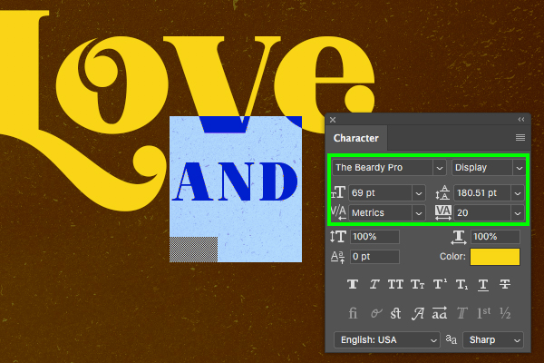
Add another new layer and type out the word ‘AND’ using the same typeface with the regular characters – no alternates necessary. Let’s adjust the size to be about ’69 pt’ and then use a ‘Tracking’ setting of ’20’ and the same golden yellow fill colour. Here we want to place the text just below the ‘V’ in ‘Love’ as shown below:
Step 22: Funky Town
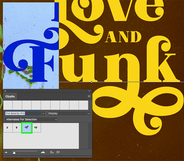
Add a third text layer and type out the word ‘Funk’ with the same settings we used for ‘Love’. Let’s use the Glyphs to once again choose a few alternates for the ‘F’ as shown here:
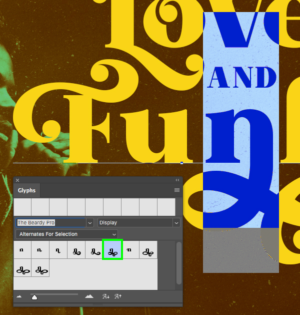
Moving on let’s select an alternate for the ‘n’ as shown here:
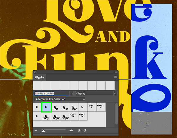
Lastly, let’s select an alternate for the ‘k’ at the end of ‘Funk’ as shown here:
Step 23: Smart Text
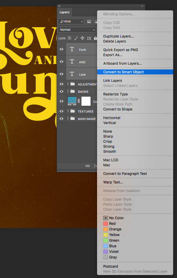
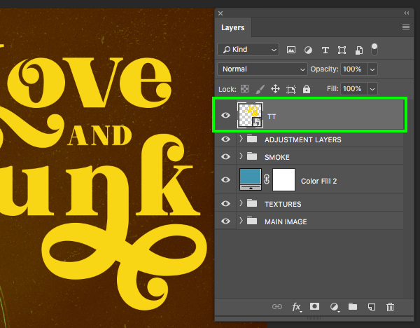
Once you’ve created your three lines of text, select the top layer, hold the Shift key, and then select the third layer so all three layers are selected together. After that, hold the Control key and click on any of the three layers to reveal a menu where we want to choose ‘Convert to Smart Object’ as shown in the image below:
Rename the Smart Object layer ‘TT’.
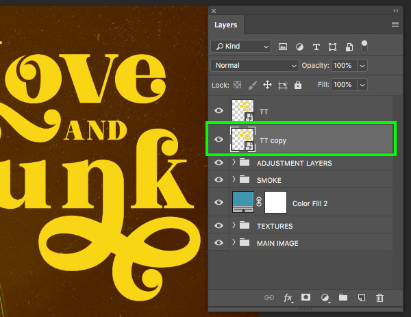
Next, select the ‘TT’ Smart Object layer, press Command/Ctrl+J to duplicate it, and then press Command/Ctrl and the left bracket key to move this layer below the original ‘TT’ layer.
Step 24: Taking Action
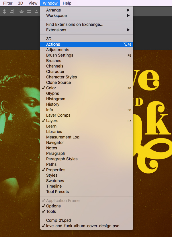
Go to the Window menu and choose ‘Actions’ from the dropdown menu.
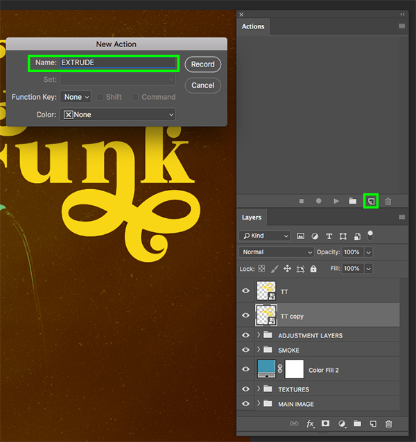
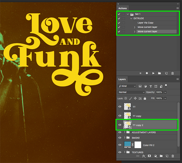
After opening the Actions window, click on the ‘New Action’ icon from the lower right of the panel. Once you’ve done that you will be asked to name your action so let’s just call it ‘EXTRUDE’. After you’ve given the action a name, hit the ‘Record’ button.
Now that we’ve started recording we can create our very basic Photoshop action. This isn’t recording in real time so there’s no need to rush! Let’ start by selecting the ‘TT copy’ layer and then pressing Command/Ctrl+J to duplicate it. After that, press Command/Ctrl and the left bracket to move this new copy below the previous copy. After that, press the down arrow once, and then the right arrow once. After you’ve done that, click on the stop button to stop recording. You have now made your own reusable Photoshop action!
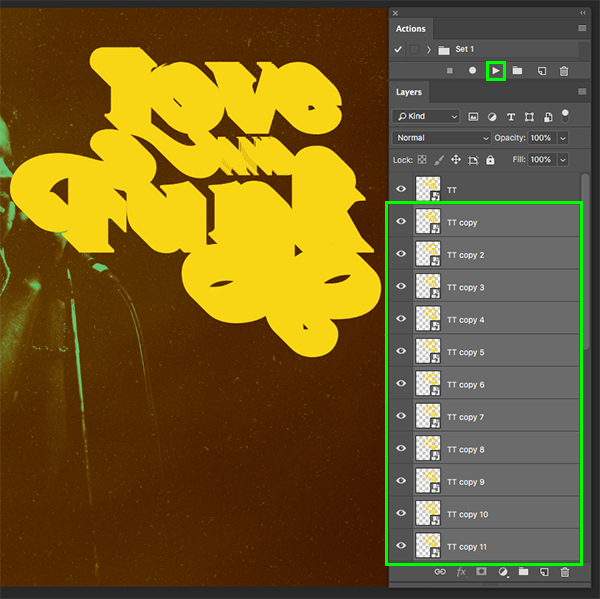
What we’re going to do from here is select the ‘TT copy 2’ layer and then simply press the play button in the Action panel about 20-25 times. Doing this will repeat the action and create an extrusion effect that will give our text a seamless long shadow. Once you have created all of your copies, select the top copy just below the main ‘TT’ Smart Object layer, hold the Shift key, and then select the bottom copy so they are all selected together.
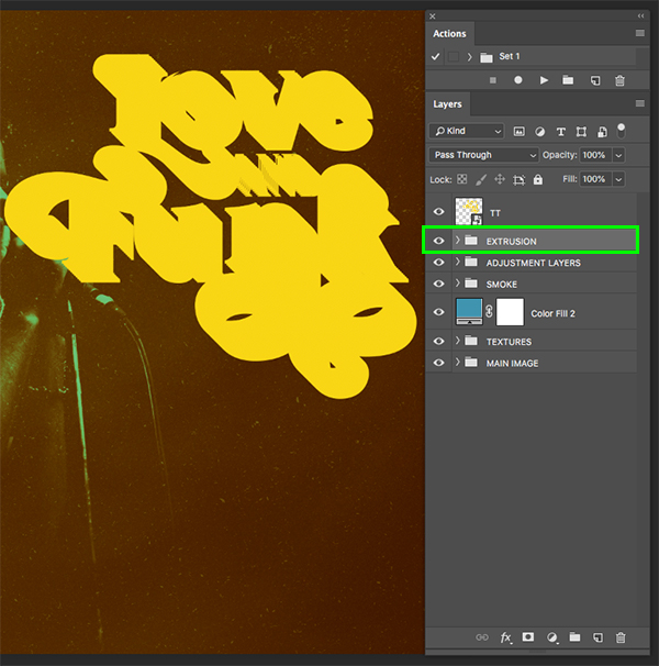
With all of the Smart Object layers selected (except for the main TT layer) press Command/Ctrl+G to put them into a new folder and then double click the ‘Group 1’ text to rename the folder ‘EXTRUSION’ as shown below:
Step 25: Extrusion Colors
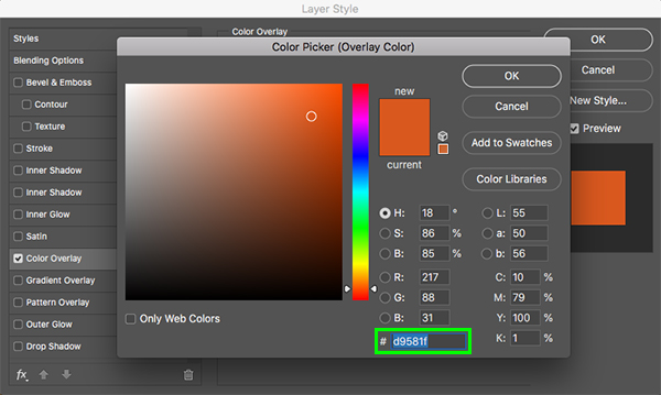
Next, double click on the ‘EXTRUSION’ folder to open the Layer Style window and check off the ‘Color Overlay’ option.
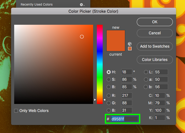
Enter the hex value ‘#D9581F’ and then press ‘OK’ to continue.
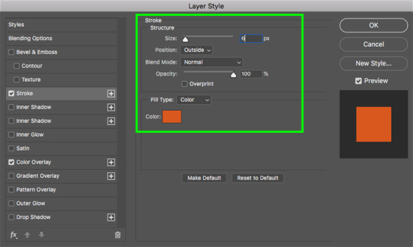
Next, check off the ‘Stroke’ option and add a ‘6 px’ stroke set to a ‘Position’ of ‘Outside’ using the same fill colour as the Color Overlay – ‘#D9581F’. Once you’ve added that, click ‘OK’ to close out and apply the changes.
Step 26: Extra Outline
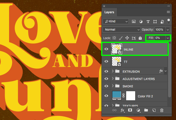
Select the main ‘TT’ Smart Object layer and duplicate it by pressing Command/Ctrl+J on the keyboard. Turn the ‘Fill’ of this layer to ‘0%’ and then rename the layer ‘INLINE’ as shown below:
Double click on the ‘INLINE’ Smart Object to open the Layer Style window and then check off the ‘Stroke’ option once again. This time let’s make the ‘Size’ about ’10 px’ and then change the ‘Position’ to ‘Inside’. From here, click on the ‘Color’ box to change the fill.
For the fill color, enter the hex value ‘#FD9400’ and then press ‘OK’ twice to apply the changes and close out of both dialog boxes.
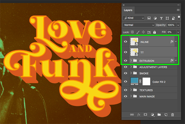
Next, select the top ‘INLINE’ layer and then hold the Shift key and select the ‘EXTRUSION’ group folder so all of the text layers are selected together.
With the layers still selected, press Command/Ctrl+G to put them into a new folder and rename it ‘TT’ for ‘Title Treatment’ as shown here:
Step 27: Adding Depth
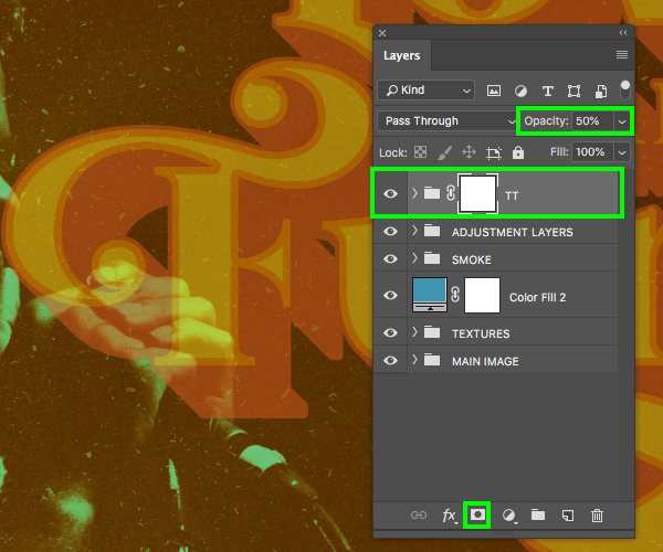
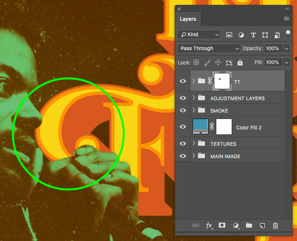
Select the newly created ‘TT’ folder and then press ‘5’ to reduce the opacity to ‘50%’ before clicking on the ‘Add Layer Mask’ icon from the bottom of the Layers Palette.
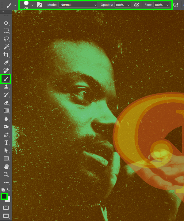
Press ‘B’ on the keyboard to switch over to your Brush Tool and then make sure you have a solid black foreground color selected with a hard round brush at 100% opacity as shown here:
With the opacity lowered we should be able to see the areas we want to brush over to allow the singers face and hand to come in front. Brush over these areas carefully with your brush using the Layer Mask and then once you have finished, bring the opacity of the folder back to to ‘100%’. You should now have something like this:
Step 28: Additional Text
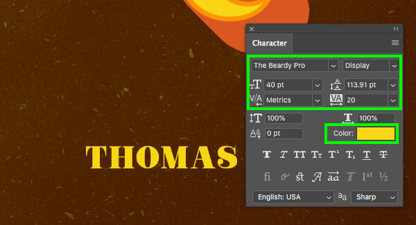
Add a new layer and use the Type Tool (T) once again to type out the name ‘THOMAS’ in all caps. Here I am using the same typeface from earlier with the golden yellow fill color. Use the Character panel to change the size of the text to ’40’ as shown here:
Press Command/Ctrl+J to duplicate the layer and then move it down below the previous text layer. Use the Type Tool (T) to click inside and change the text to read ‘MAYFIELD’ in all caps once again using the same settings as before.
Add a third line of text above the name and type out the words ‘Presented by’ in upper and lower case. Here let’s click on the ‘Color’ swatch and then use the eyedropper to sample some of the orange color from the ‘EXTRUSION’ in our main title.
Step 29: Adding The Border
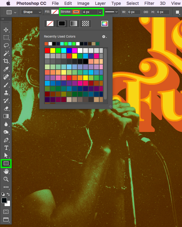
Press ‘U’ on the keyboard and then check along the top toolbar to make sure that we have ‘None’ for the ‘Fill’ color and then add a ‘Stroke’ of ‘4 px’. From here, click on the outline box and then click on the rainbow colored icon in the upper right of the color panel.
For the stroke color, let’s enter a hex value of ‘#D9581F’ and then click ‘OK’ to proceed.
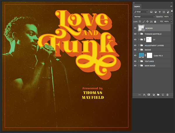
Click and drag from the top left corner to the lower right corner while holding the Shift key to create an orange border around the whole image as shown here:
Step 30: Global Adjustments
With the top ‘BORDER’ layer selected, click on the Adjustment Layer icon and then choose ‘Curves…’ to add a new Adjustment Layer above all of the other layers.
In the Properties panel, click in the center of the grid to add a point and then drag it slightly down and to the right so that the ‘Input’ is set to ‘140’ and the ‘Output’ is set to ‘115’ to add some more contrast overall.
Step 31: Final Group
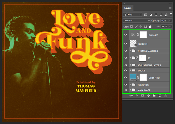
Select the very top Curves Adjustment Layer and then hold the Shift key and select the ‘MAIN IMAGE’ folder at the very bottom of the Layers Palette to select all of your layers and folders together.
With everything still selected, press Command/Ctrl+G to put everything into one main folder and double click the folder name to change it to ‘ARTWORK’.
We have now completed our ‘Love And Funk’ album cover design! To create our design we’ve used a beautiful retro font and combined it with our own Photoshop Action along with various textures and stock imagery. I hope that you have enjoyed this tutorial and hopefully learned some new techniques along the way. With so many great elements to choose from, this bundle is sure to help you step up your designs and take your work to the next level. I can’t wait to see what you guys do with it!
Remember that whether it’s your outcome for this tutorial or something new you’ve made, we’d love to see your designs on our Facebook page.
Please leave a comment if you have any questions or suggestions. I always look forward to hearing from you!
There’s still time to check out The Amazing Designer’s Creative Collection with a huge variety of assets and carefully crafted high quality items all for an unbeatable price of $29!



























thank you an awesome demo.
Hey Fifi,
We’re so glad to hear that you are enjoying our demos. Happy Designing!
Super cool tutorial! Look forward to giving it a try!
Yay we’re really happy that you love it Michelle :).
Great, thanks for that.
We hope that you found this tutorial super useful Ulrike!
I really liked the text treatment. The whole tutorial was good. I think I still have some albums with cover styles like this. I preferred to have my base colour purple rather than green but it was easy to adjust the settings for that. The texture files worked really well to make the graphic look like an authentic old album cover. Nice job Eric!
Hey Jeanne,
Thank you so much for taking the time to comment and we’re so happy to hear that you found this tutorial really fun to create an authentic looking album cover- we hope that yu have picked up some great new tip s and tricks :)
That’s great Jeanne! I love retro album covers like this and the typefaces with gritty textures just seemed like the perfect opportunity to try and recreate something just like that. I’m really glad you enjoyed it and found it easy to adjust some of the settings to customize it to your taste!
Thanks for coming back to Jeanne Eric, and for another super tutorial :)
Thank you! Looking forward to doing this!
Yay we’re so happy to hear that you are looking forward to working through this tutorial and hope that you have great fun taking it for a spin!