In this tutorial I will be showing you how to create a clean and elegant watercolor wedding invitation in Photoshop. To do this we will be using some beautiful watercolor floral illustrations, a few nice looking typefaces, and some decorative design elements to add a bit of sophistication and charm. After designing our invite we will build a wedding themed scene using elements from one of the mockups from the Design Cuts Marketplace to push the idea even further by presenting it in the best possible way. If you are all ready to begin then open up Photoshop and let’s get started!
HAVE YOU SEEN OUR YOUTUBE CHANNEL?
Watch the video tutorial below and subscribe to our YouTube channel for regular updates direct to your inbox.
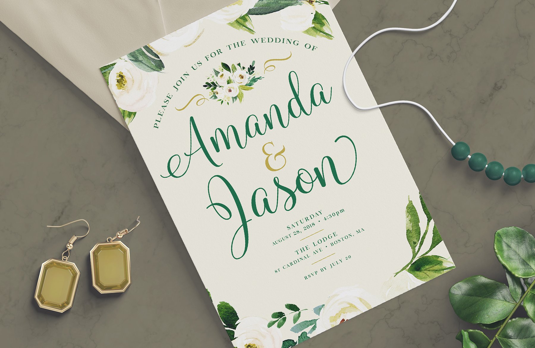
Here’s a look at what we’ll be creating:
Follow along with this tutorial: Download the freebie files
This freebie pack is just a small sample of what you can expect to find in The ‘Create and Make’ Design Bundle for just $29 (that’s 99% off). With this new design bundle you can equip yourself with the best tools available, featuring best-selling fonts, brushes, custom shapes, watercolor elements and illustrations!
Step 1: Wedding Invitation Design
Let’s start by setting up a new document in Photoshop. We will make our document ‘5’ inches wide by ‘7’ inches tall with a ‘Resolution’ of ‘300’, and leave the ‘Color Mode’ set to ‘RGB’ although if we were creating real invitations we would want to be working in CMYK. Now we will go ahead and give our document a name – here I am using ‘wedding-invitation-design’ but feel free to use a naming convention that works for you. Once you have set everything up, click on the ‘Create’ button in the lower right corner of the dialog box to make your new document.
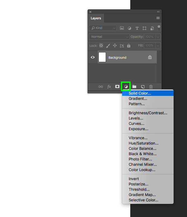
Once you’ve created your document you should now see a blank canvas and have a single ‘Background’ layer in your Layers Palette. The first thing we are going to do is click on the Adjustment Layer icon at the bottom of the Layers Palette and then choose ‘Solid Color…’ from the menu as shown here:
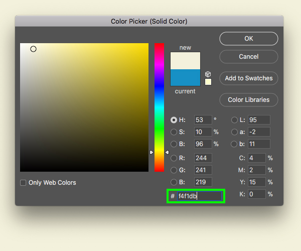
When the ‘Color Picker’ pops up, enter the hex value ‘#F4F1DB’ which is a nice cream color. After that, press ‘Return’ or click ‘OK’ to apply the changes.
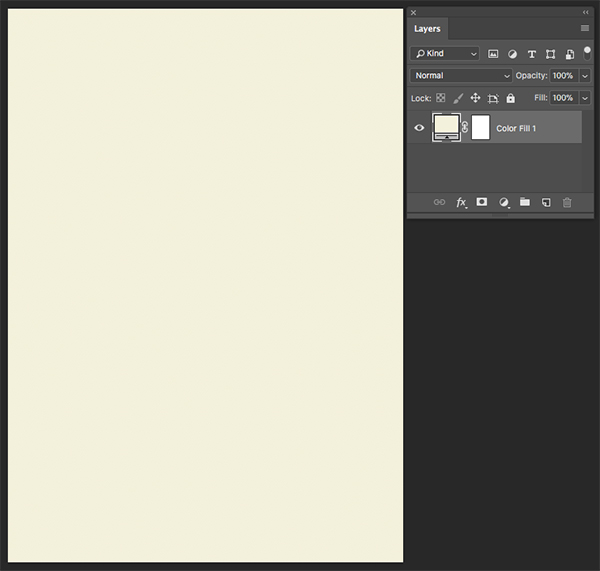
Now we can grab our ‘Background’ layer and just delete it or drag it to the trash so we are left with our Solid Color Adjustment Layer.
Step 2: Floral Wreath
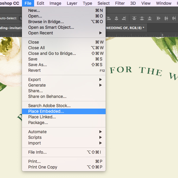
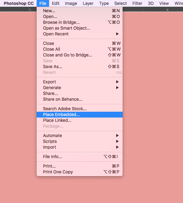
Next we will bring in our first freebie – a beautiful watercolor illustration from Graphic Box. To do this let’s go to the File menu and choose ‘Place Embedded…’ as shown here:
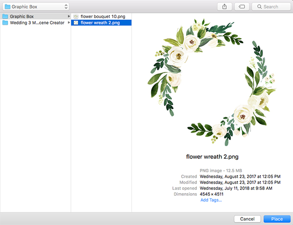
Navigate to ‘flower wreath 2.png’ in the freebies folder for the tutorial and then choose ‘Place’ from the bottom right to place the image in Photoshop.
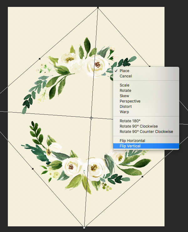
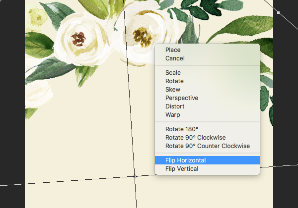
Once the watercolor wreath appears in Photoshop you should have a bounding box around the image. Also, notice that the layer is automatically imported as a Smart Object with the file name already in place in the Layers Palette. What we want to do from here is rotate the wreath so that it’s upright by moving your cursor over any of the four corners of the bounding box and rotating it. After that, hold the Control key and click on the image to reveal a dropdown menu where we will select the option that says ‘Flip Vertical’ as shown in the image below:
After flipping the image vertically, hold the Control key and click one more time to get the same menu, and this time we will choose the ‘Flip Horizontal’ option.
Step 3: Flower Mask
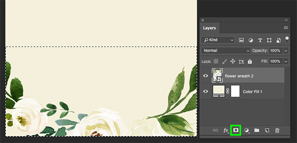
After rotating and flipping the flower wreath, let’s scale it up a bit by dragging outwards from any of the four corners of the bounding box while holding Alt/Option+Shift on the keyboard to scale the illustration up from the center. What we want to do is position the wreath so that there is a nice arc along the bottom of the design. Once you have placed the flower wreath, press ‘Return’ on the keyboard to apply the transformation. Next, press ‘M’ on the keyboard to switch to the Rectangular Marquee Tool, and then click and drag a rectangle around the bottom of your document to select the bottom portion of the wreath. From here, with the selection still active, click on the ‘Add Layer Mask’ icon found at the bottom of the Layers Palette.
Your document should now look like this:
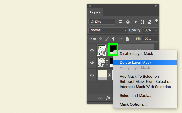
Next, select the masked flower wreath layer and press Command/Ctrl+J to duplicate the layer. After that, hold the Control key and click on the mask that is attached to the layer and then choose the ‘Delete Layer Mask’ option shown here:
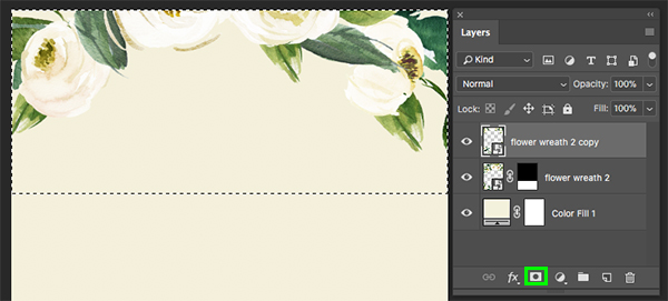
Now we will work on positioning the top portion of the wreath along the top of our design so that it creates another nice arc. You may want to rotate the wreath a bit more but once you are happy with the positioning we will once again use the Rectangular Marquee Tool (M) to click and drag around the top portion of the document and then add a new layer mask.
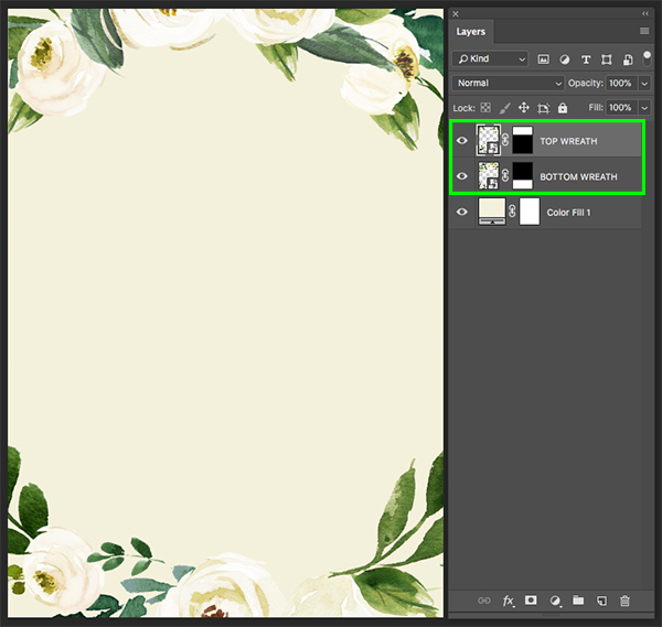
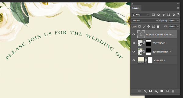
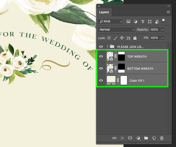
You should now have one instance of the floral wreath at the top, and another one at the bottom. Here I have renamed each of the two layers to help differentiate between the two and keep things organized. Your document should now look something like this:
Step 4: Arc Type
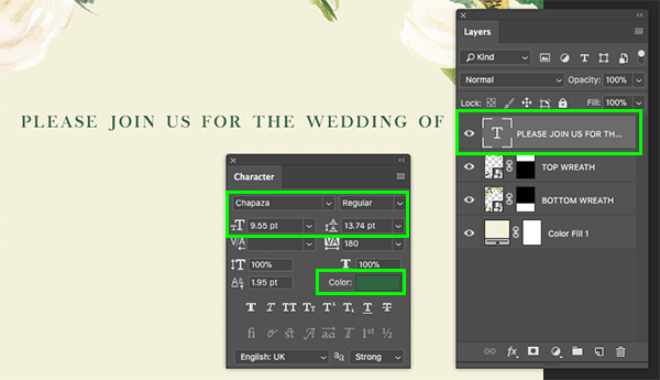
Create a new layer and then press ’T’ on the keyboard to switch to your Type Tool. Make sure you have your Character Panel handy by going to the Window menu and choosing ‘Character’ from the dropdown menu. After that, click your cursor towards the top portion of the image and type out ‘PLEASE JOIN US FOR THE WEDDING OF’. Click inside of the text box a few times to highlight the line of text and then refer over to your Character Panel. For the typeface here we will be using a typeface called Chapaza which you can download for free from DaFont.com. Let’s also make a few other adjustments in the Character Panel by setting the size of our type to ‘9.55 pt’ and set the tracking to ‘180’ as shown here:
While still working in the Character Panel let’s click on the color swatch and change the fill color of our text to ‘#316443’ as shown here:
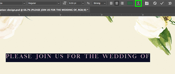
Click inside of the text box two or three times with the Type Tool (T) to highlight the line of copy. From here, go to the top toolbar and click on the warped ’T’ icon to create warped text.
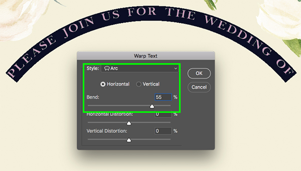
When the dialog box appears let’s change the ‘Style’ to ‘Arc’ and then make sure we have the ‘Horizontal’ radio button selected. After that, change the ‘Bend’ amount to about ’55%’ and then press ‘Return’ or click ‘OK’ to apply the changes.
Your text should now look like this:
Step 5: Flower Bouquet
Return to the File menu and choose ‘Place Embedded…’ once again.
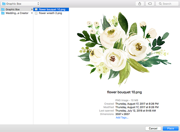
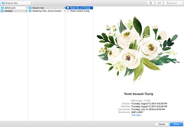
Navigate to the ‘flower bouquet 10.png’ file from Graphic Box in the freebies folder. After selecting the file you can either double click or simply select ‘Place’ from the lower right corner.
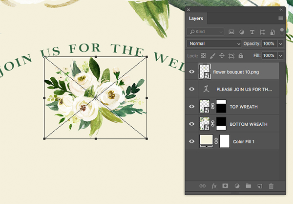
After importing the bouquet illustration, hold Alt/Option+Shift on the keyboard and drag inwards from any of the four corners of the bounding box to scale it down proportionally from the center until it fits nicely below our warped text as shown here:
Step 6: Decorative Flourishes
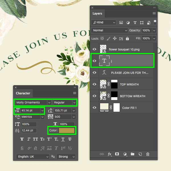
Create a new layer just below the flower bouquet layer and then press ’T’ to switch back to the Type Tool. Next, type out a lowercase ‘j’ using the ‘Molly Ornaments’ typeface. This is one of the many beautiful resources you can access in our The ‘Create and Make’ Design Bundle. If you don’t have access to this collection, please feel free to use any vector ornament or font that you may have with these types of flourishes. Here I will be making the ornament about ’41.42 pt’ size and then after changing the size we will click on the color swatch to adjust the color.
For the ornament fill color, use the hex value ‘#B19A48’ and then press ‘OK’ to apply the changes.
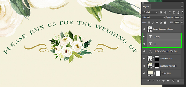
Next, select the text layer and press Command/Ctrl+J to duplicate it. From there, press Command/Ctrl+T to initiate a Free Transform and then hold the Control key and click on the layer. When the dropdown menu appears, select the ‘Flip Horizontal’ option as shown here:
After flipping the type layer, hold the Shift key and tap the right arrow to move it to the opposite side of the bouquet. At this point the arched type on top was looking a little too crammed in the space, so I’ve moved it up a few clicks while holding the Shift key. The top of your image should now look like this:
Step 7: Bouquet Group
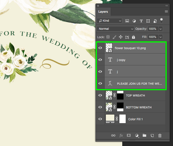
Now that we’ve added a few layers let’s group some things together to keep our file organized. First, select the top layer in your Layers Palette – this should be the ‘flower bouquet 10.png’ Smart Object layer, and then hold the Shift key and select the ‘PLEASE JOIN US…’ text so all of the layers are selected at the same time.
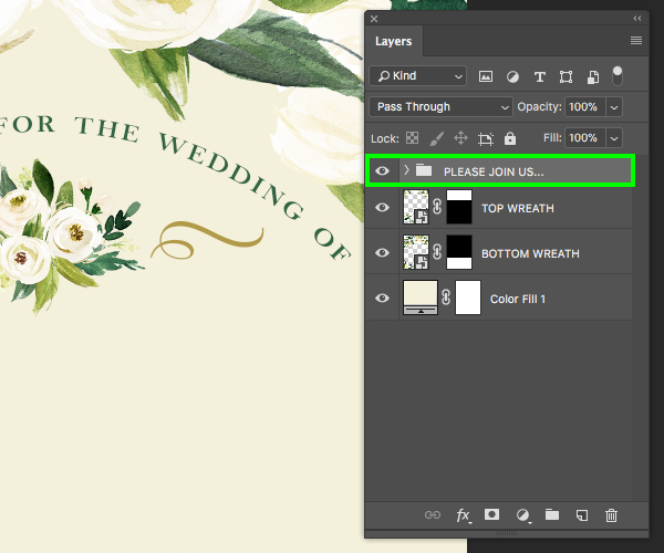
With the layers still selected, press Command/Ctrl+G to put the layers into a new folder and then double click on the ‘Group 1’ text in the Layers Palette and rename it ‘PLEASE JOIN US…’ as shown here:
Step 8: Background Group
Next, select the ’TOP WREATH’ layer, hold the Shift key, and then click on the Solid Color Adjustment Layer.
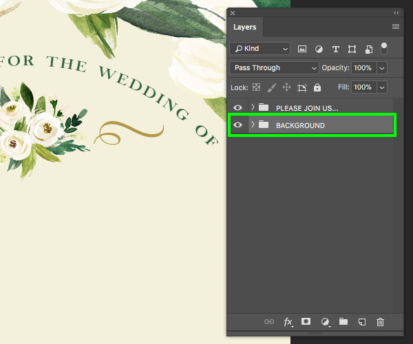
With the layers still selected, press Command/Ctrl+G to put the layers into a new folder and then double click on the ‘Group 1’ text and rename it ‘BACKGROUND’ like this:
Step 9: Cursive Names
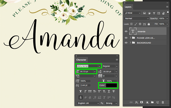
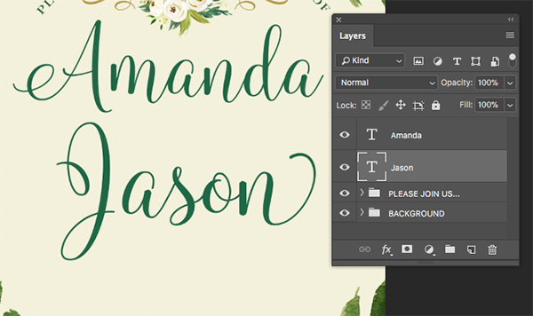
Create a new layer and use your Type Tool (T) to type out ‘Amanda’ using the ‘Molly Script’ typeface, from The ‘Create and Make’ Design Bundle, with a ’91.73 pt’ size. If you don’t have access to this collection, you can use any of the alternative free fonts we’ve found on DaFont, which will allow you to follow along with the tutorial and get a similar outcome. The first free typeface is called Delight Script from DaFont.com. You can also check out Madelina, Noelan or even Stellanova will work nicely. After placing your script font, click on the color swatch in the Character Panel.
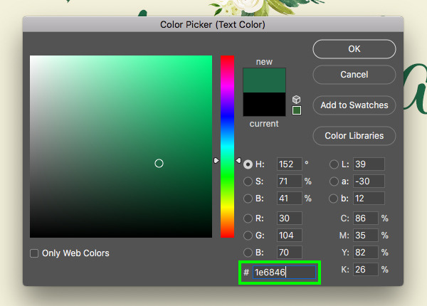
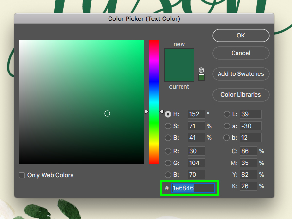
Change the fill color to the hex value ‘#1E6846’ and then click ‘OK’ to apply the changes.
After modifying the text, select the layer and press Command/Ctrl+J and move the layer down. Use the Type Tool (T) to change the text to read ‘Jason’ with the same font, size, and color.
Step 10: Ampersand
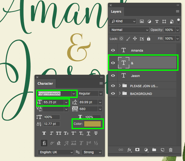
Create another new layer and type out an ampersand – ‘&’ and for this we will be using another free typeface called Foglihten No06 which is another nice typeface from DaFont.com. Once you’ve created the ampersand, move it between the two names and use the Character Panel to change the size of the type to ’65.25 pt’, and then select the color swatch to modify the fill color.
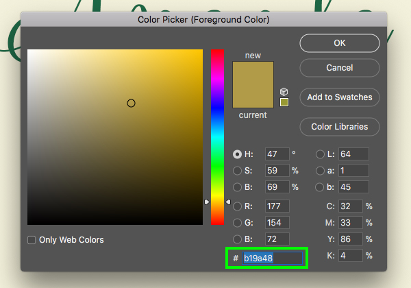
Change the fill color to the hex value ‘#B19A48’ and then click ‘OK’ to apply the changes.
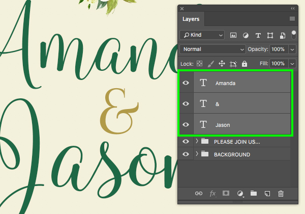
Next, select the top text layer, hold the Shift key, and then select the ‘Jason’ layer so these three layers are selected all together:
After selecting your layers, press Command/Ctrl+G to place them into a new folder and then double click on the ‘Group 1’ text and rename the folder ‘AMANDA & JASON’ as shown below:
Step 11: Save the Date
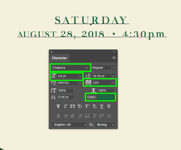
Create a new layer and then use your Type Tool (T) to type out ‘SATURDAY’ using the free Chapaza typeface from earlier on in the tutorial. Make the text about ‘8.03 pt’ size with a tracking setting of ‘260’.
Click on the color swatch box and change the text color to ‘#1E6846’ as shown here:
Press ‘Return’ to make a second line in the text box and type out ‘AUGUST 28, 2018 • 4:30pm’ using the same font, but this time change the size to ‘7.8 pt’ size as shown here:
Select your text layer and press Command/Ctrl+J to duplicate it. Hold the Shift key and press the down arrow to move the copy down with a bit of space between this copy and the original. Replace the first line of text here with the words ‘THE LODGE’ and then replace the second line with the address ’87 CARDINAL AVE • BOSTON, MA’ like this:
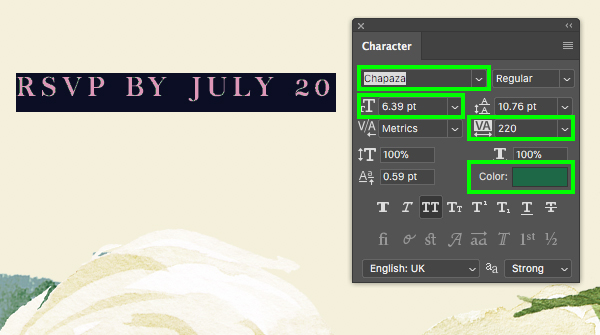
Create one more copy of the text and move it down. Change the text to ‘RSVP BY JULY 20’ and then make the type ‘6.39 pt’ as shown below:
Step 12: Gold Divider
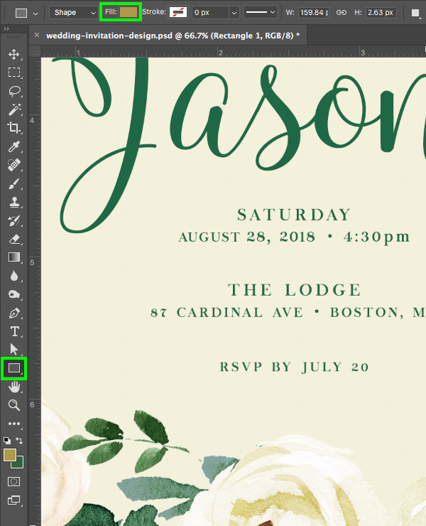
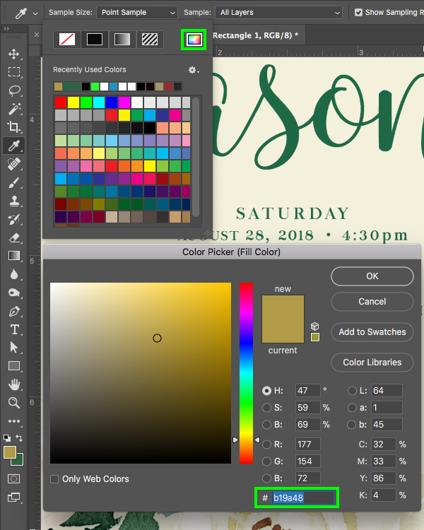
Press ‘U’ on the keyboard to switch to the Rectangle Tool and then click on the ‘Fill’ color in the top toolbar highlighted in the top of the image here:
After clicking on the ‘Fill’ there will be a dropdown menu with color swatches. Let’s click on the rainbow colored icon in the upper right, and then in the Color Picker change the fill color to ‘#B19A48’ and then press ‘OK’ to apply the color change.
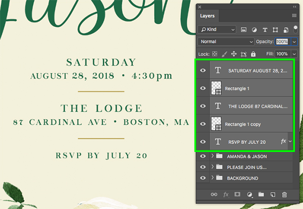
Click and drag out a short, thin, golden rectangle between each of the blocks of text. After placing the two dividers, select the top ‘SATURDAY’ text block in the Layers Palette, hold the Shift key, and then select the bottom ‘RSVP’ text layer.
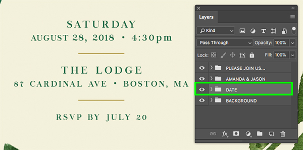
With all of the date layers selected, press Command/Ctrl+G to put them into a new folder and then double click the ‘Group 1’ text and rename the folder ‘DATE’ as shown in the image below:
Step 13: Main Artwork Folder
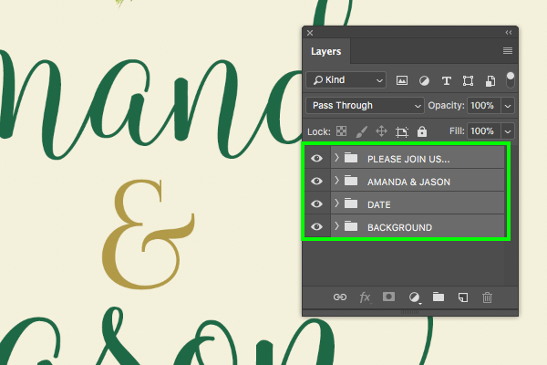
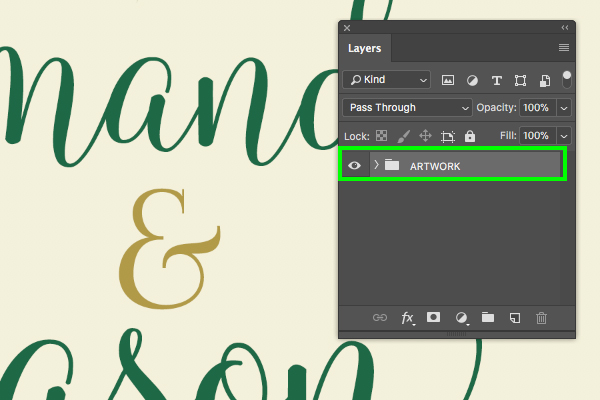
Select the top folder in the Layers Palette, hold the Shift key, and then select the bottom folder.
Press Command/Ctrl+G once again (alternatively you can click on the folder icon at the bottom of the Layers Palette) to put all of the folders into one main folder. From here, double click on the folder name in the Layers Palette and rename it ‘ARTWORK’.
Step 14: Levels Adjustment
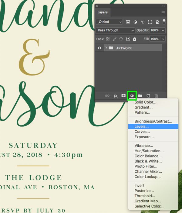
Click on the Adjustment Layer icon at the bottom of the palette and choose ‘Levels…’ from the list that appears.
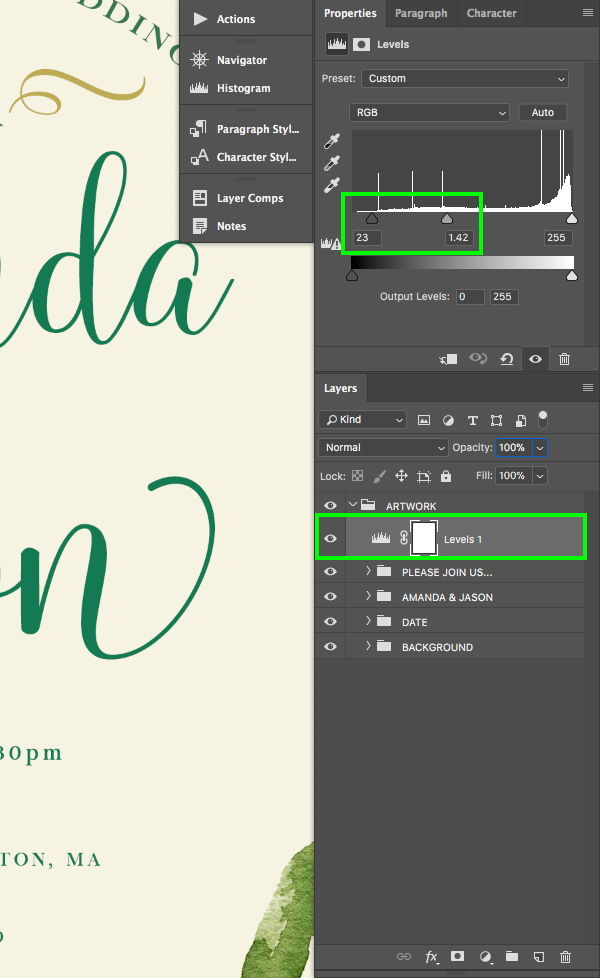
Place the Levels Adjustment Layer inside of the ‘ARTWORK’ folder above all of the subfolders inside. From here, go to the properties for the Adjustment Layer and move the left, gray slider in towards the center until it’s set to ’23’ and move the middle slider towards the left until it’s set to ‘1.42’. This will give our overall design a nice pop of contrast and brighten up the colors just a touch before we move on to the mockup section.
Step 15: Setting the Stage
Let’s start building our scene by first going to File and choosing ‘New…’ from the menu. Give your new document a name – here I am using ‘wedding-invitation-mockup’. Make this new document ‘2400 px’ wide by ‘2000 px’ tall with a ‘Resolution’ of ‘300’ and the ‘Color Mode’ set to ‘RGB’ and then click ‘Create’ from the lower right as shown here:
You should now have your new file with a single ‘Background’ layer like this:
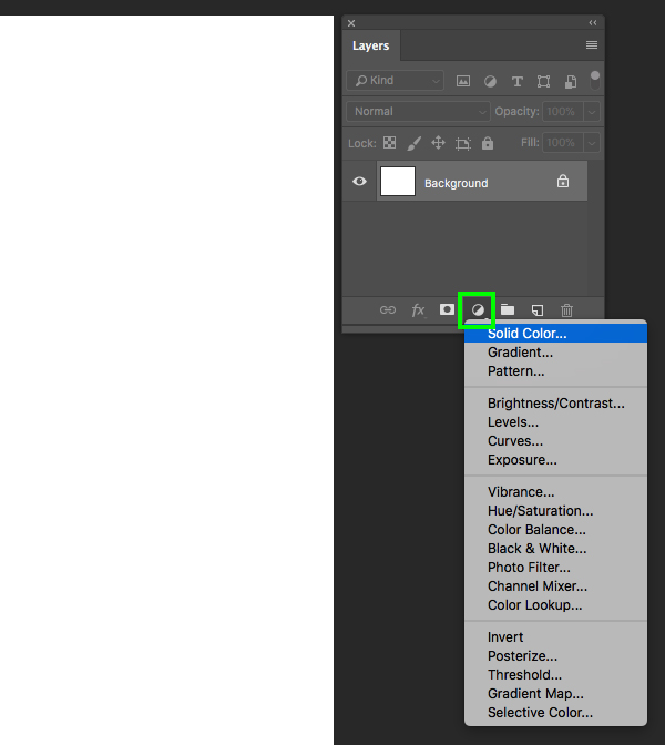
Click on the Adjustment Layer icon and choose ‘Solid Color…’ from the top of the list.
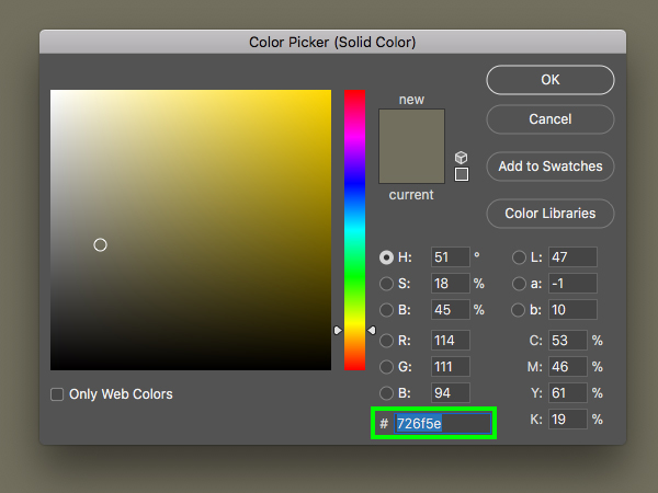
For the fill color use the hex value ‘#726F5E’ and then click ‘OK’ to apply the changes.
After changing the color of the Solid Color Adjustment Layer, drag the ‘Background’ layer to the trash.
Step 16: Marble Texture
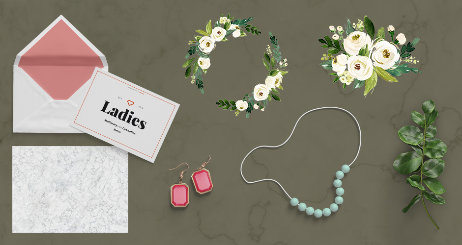
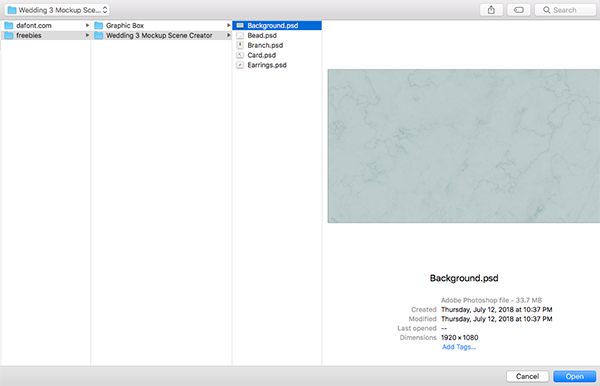
Go to the File menu once again and this time choose ‘Open…’ from the list. Navigate to the ‘Background.psd’ file from the freebies folder – this is from one of the beautiful mockups from the Wedding 3 Mockup Scene Creator by L Store. Once you’ve navigated to the file, click ‘Open’ to open it up in Photoshop.
Click and drag the ‘Background’ folder into your new document as shown here:
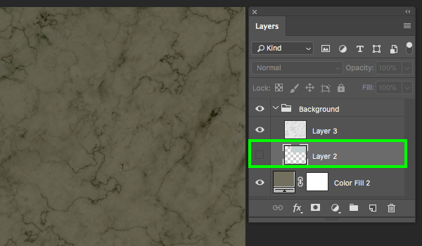
Once you’ve dragged the folder into your working document you will notice that there are two layers inside. Let’s click on the small arrow next to the ‘Background’ folder and delete ‘Layer 2’ as shown here:
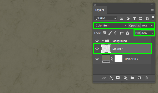
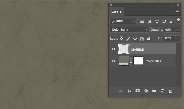
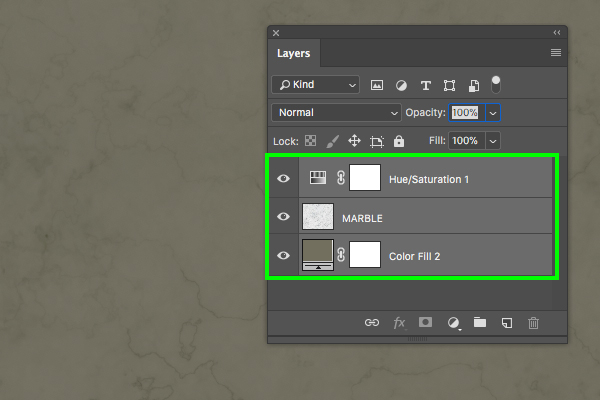
Rename the light layer that remains ‘MARBLE’ and then change the Blend Mode to ‘Color Burn’ with an opacity of ’40%’ and a fill of ’82%’.
We can now drag this layer outside of the ‘Background’ folder and we are left with the texture layer and our Solid Color Adjustment Layer.
Step 17: Hue/Saturation Adjustment
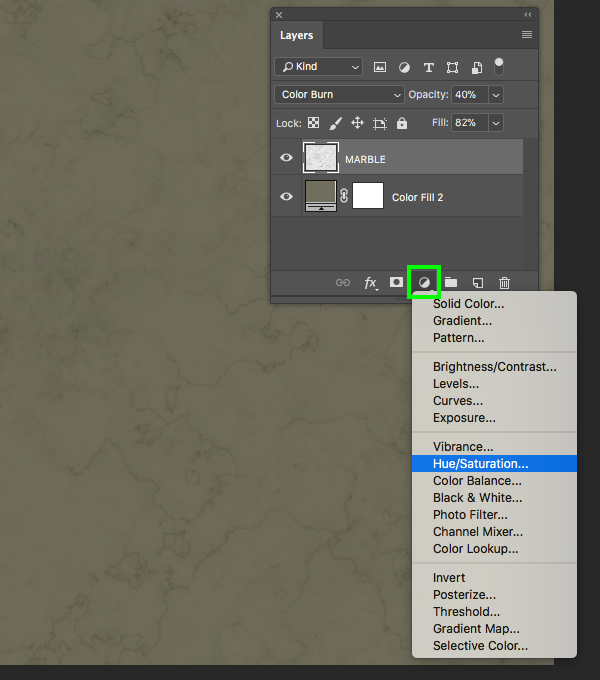
Make sure you have your marble texture layer selected and then click on the Adjustment Layer icon at the bottom of the Layers Palette and choose ‘Hue/Saturation…’ from the menu.
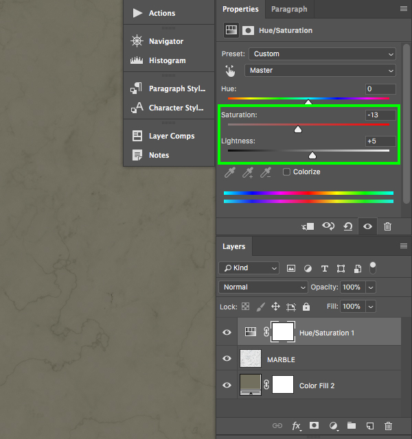
In the properties panel change the ‘Saturation’ to ‘-13’ and the ‘Lightness’ to ‘+5’ as shown in the image below:
Step 18: New Background Group
Next, select the top Hue/Saturation Adjustment Layer, hold the Shift key, and then click on the Solid Color Adjustment Layer so all three layers are selected simultaneously.
While the layers are still selected, press Command/Ctrl+G to put them into a new folder and then double click on the ‘Group 1’ text and rename the folder ‘BACKGROUND’.
Step 19: Card Mockup
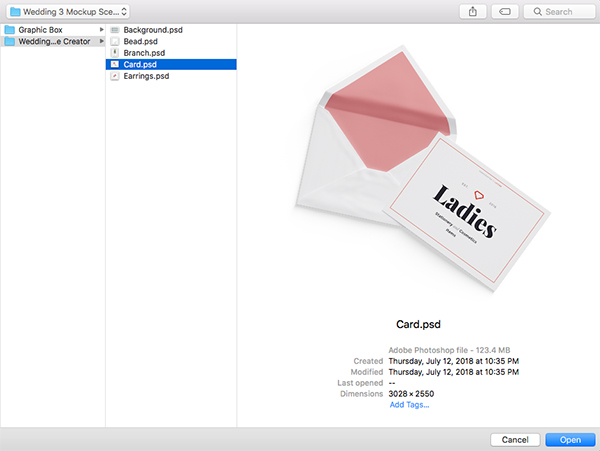
Return to the File menu and choose ‘Open…’ before navigating to the ‘Card.psd’ file in the freebies folder for this tutorial. Once you’ve found the file, choose ‘Open’ from the lower right.
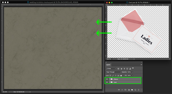
Once you’ve opened up the card, you will notice that there are two group folders inside. Select the top folder, hold the Shift key, and then select the bottom folder. From here, click and drag both folders over into your working document.
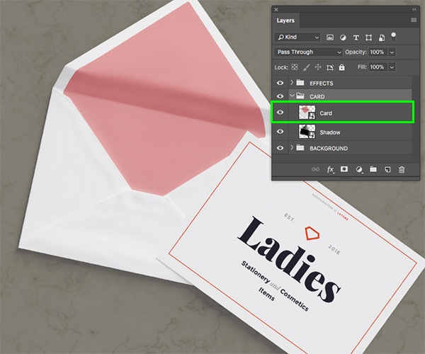
After bringing both folders into the file, expand the contents of the ‘CARD’ folder and double click on the ‘Card’ Smart Object layer inside.
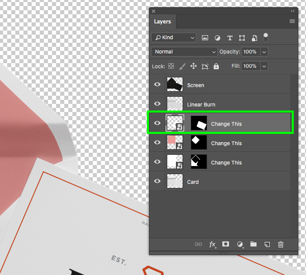
Inside of this file there will be several layers, but the one we are going to deal with first is the third Smart Object from the top. Let’s go ahead and double click on this layer highlighted in the image below:
Now we are inside of the card design itself, and you should be seeing something like this:
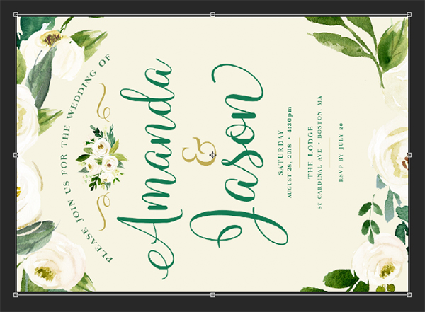
This is where we are going to drag and drop our invitation design. Here I have dragged in a hi-res JPG, but you could also use a flattened Photoshop file, just make sure you don’t accidentally save over your layered file! Once you drop the flat invite into this document, press Command/Ctrl+T to do a Free Transform, hold the Control key, click on the invite, and then choose ‘Rotate 90º Counter Clockwise’ as shown here:
After rotating the card, drag inwards from any of the four corners of the bounding box while holding Alt/Option+Shift to scale it down proportionally from the center until it fits nicely in the document. After you have scaled and positioned the invite, press ‘Return’ on the keyboard to apply the changes, followed by Command/Ctrl+S to save the Smart Object file, and then Command/Ctrl+W to close out of the tab.
Step 20: Envelope Design
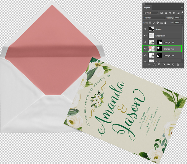
You should now be in the card Smart Object file with the transparent background. Let’s now double click on the Smart Object directly below the card (the layer that contains the pink part of the envelope).
You will now be inside of this Smart Object that contains only a solid pink layer. From here, go to the File menu and choose ‘Place Embedded…’ from the list.
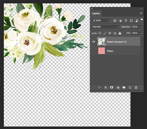
Navigate to the ‘flower bouquet 10.png’ file that we used earlier on from the freebies folder and then choose ‘Place’ to import the file.
Scale and position the bouquet Smart Object in the upper left corner, and turn off the visibility of the solid pink ‘Effect’ layer.
Step 21: Bouquet Pattern
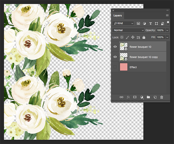
Select the bouquet layer and duplicate it by pressing Command/Ctrl+J. Move this copy down one spot in the layers so that it is below the original. After that, hold the Shift key and select both bouquet Smart Objects.
With both Smart Object layers still selected, press Command/Ctrl+J to duplicate both layers and then move these two copies to the bottom of the layer stack as shown here:
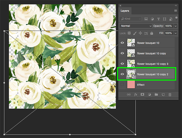
Select the third copy, press Command/Ctrl+T and then scale it up by dragging outwards from any of the four corners of the bounding box while holding Alt/Option+Shift. Position the illustration in the background so that it fills in any large gaps where we see the transparent background and once you are happy with the size and positioning press ‘Return’ on the keyboard to apply the changes.
Next, select the bottom copy and do the same thing that we did in the previous step. Once you’ve scaled and positioned this layer, apply the changes, save the document, and close out of the window to return to the main card mockup Smart Object file.
Step 22: Envelope Color
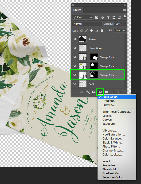
Hold the Alt/Option key and click on the Smart Object layer just above the ‘Card’ layer and then choose ‘Solid Color…’ from the list.
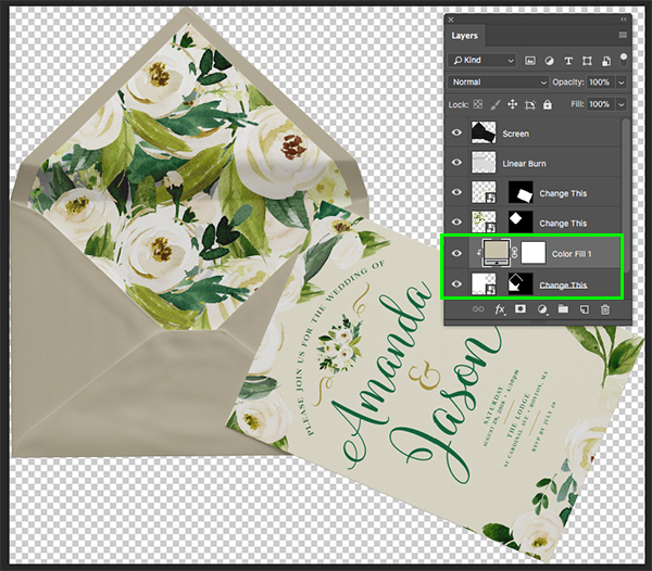
When prompted with the ‘New Layer’ dialog box, check off the option that says ‘Use Previous Layer to Create Clipping Mask’ and then click ‘OK’ to continue.
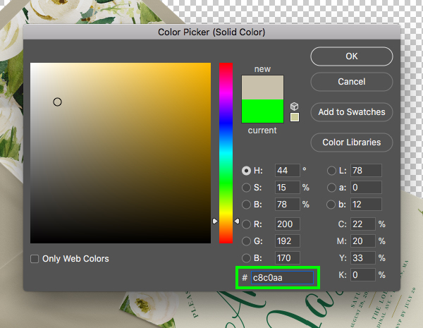
For the fill color, let’s use the hex value ‘#C8C0AA’ and then press ‘Return’ or click ‘OK’ to apply the changes.
You should now have a tan colored envelope where the Solid Color Adjustment Layer is clipped to the Smart Object below. Once you’ve done this, press Command/Ctrl+S to save the file, and then once that is finished press Command/Ctrl+W to close out of the tab and return to your main mockup.
Step 23: Positioning the Invite
Now that we are back in our main mockup, select the ‘CARD’ folder and press Command/Ctrl+T to initiate a Free Transform.
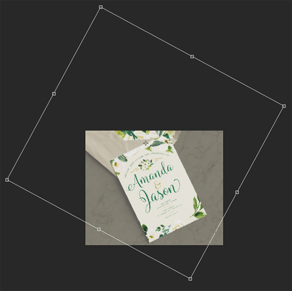
From here we are going to rotate the card and the envelope together and scale it up by dragging outwards while holding the Alt/Option+Shift keys. Use the image below as a guide for the size and placement of your invite. When your mockup looks like this, press ‘Return’ to apply the transformation changes.
Step 24: Quick Fix
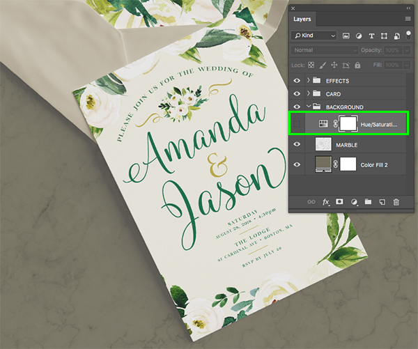
Since we now have an ‘EFFECTS’ folder at the top of our Layers Palette, I noticed that the background color has changed a bit. Before moving on I am going to go inside of the ‘BACKGROUND’ folder and turn off the Hue/Saturation Adjustment Layer that we added earlier. Turning this layer off will restore a bit of the saturation and color to the background, but you can always come back to this later and use it to modify the background color however you like.
Step 25: Earrings
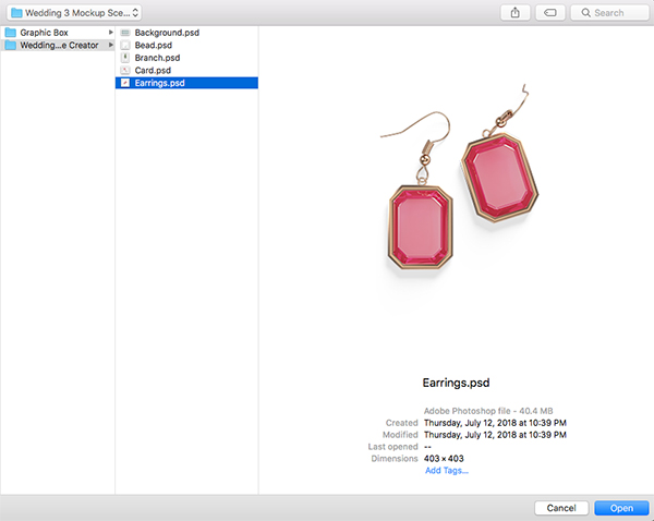
Go to the File menu and choose ‘Open…’ before navigating to the ‘Earrings.psd’ file which we then want to open in Photoshop.
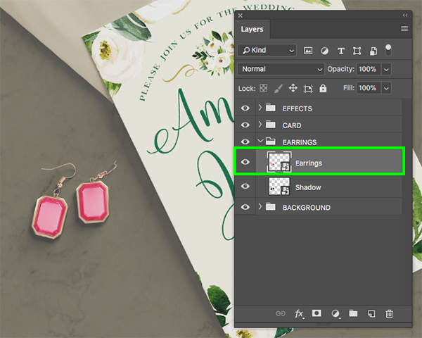
Drag and drop the ‘Earrings’ folder into your main document and scale them up and rotate them a bit using the Free Transform command. Position them to the left of the main invite, and after that, expand the contents of the folder to reveal the Smart Objects inside. Let’s go ahead and double click on the main ‘Earrings’ Smart Object to open it inside a new tab.
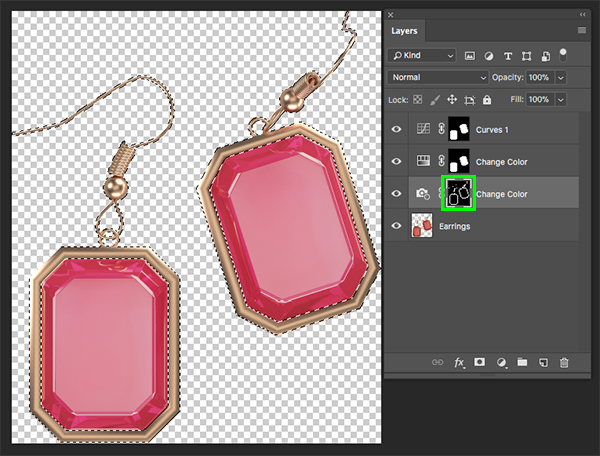
Once you are inside of the file, hold the Command/Ctrl key and click on the thumbnail icon of the Photo Filter Adjustment Layer highlighted in the image below:
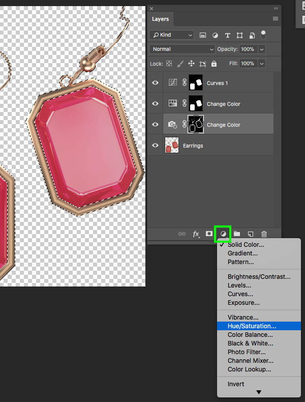
You should now have an active selection around the gold portion of the earrings. From here, click on the Adjustment Layer icon at the bottom of the Layers Palette and choose ‘Hue/Saturation…’ from the menu.
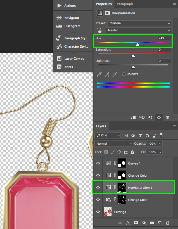
After adding the Adjustment Layer, go to the properties and move the ‘Hue’ slider to ‘+13’ to make it more of a gold color as opposed to a rose gold.
Next, select the Hue/Saturation Adjustment Layer that controls the color of the main stones in the earrings. Here we will move the ‘Hue’ slider to ‘+45’, the ‘Saturation’ slider to ‘-14’, and make the ‘Lightness’ about ‘-22’ as shown below:
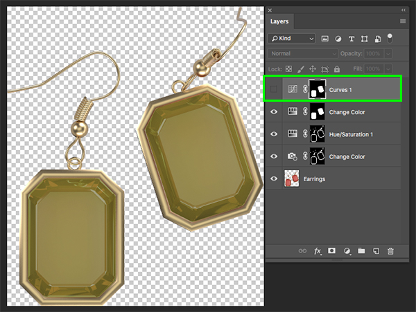
The last modification we need to make here is to turn off the visibility of the Curves Adjustment Layer at the top of the Layers Palette. Once you’ve done that, save the file and close out of the window to return to the main mockup.
Your mockup should now look something like this where the color of the stones in the earrings will closely match the gold accents of the invitation design.
Step 26: Adding the Branch
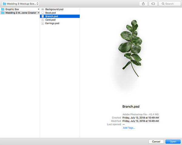
Go to the File menu and choose ‘Open…’ before navigating to the ‘Branch.psd’ file which we then want to open in Photoshop.
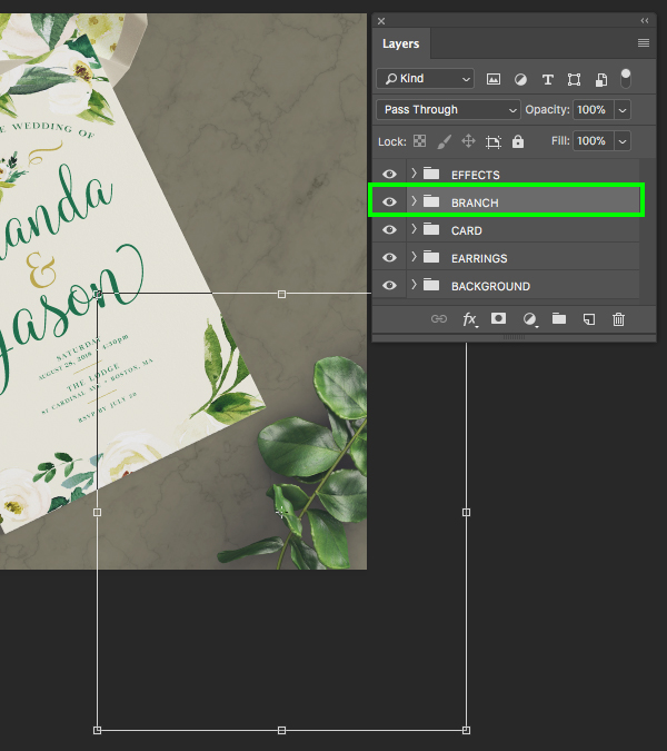
Drag and drop the ‘Branch’ folder into your main document, place it above the ‘CARD’ folder, and then use the Free Transform (Command/Ctrl+T) to scale the whole branch folder up and rotate it before placing it in the lower right corner of the mockup. You may need to move the card folder up a bit to allow some room for the branch, but your image should now look like this:
Step 27: Adding the Beads
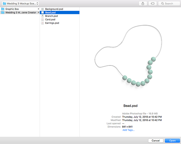
Go to the File menu and choose ‘Open…’ before navigating to the ‘Bead.psd’ file from the freebies folder. After you locate the file, choose ‘Open’ from the lower right to open it up in Photoshop.
Scale and position the beads so the string overlaps the invitation and so that it is mostly cropped out on the right side. Once the size and position looks similar to the image below, expand the folder and double click on the first Smart Object inside.
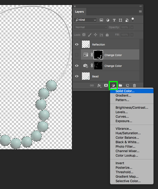
Once inside the Smart Object, turn off the visibility of the Hue/Saturation Adjustment Layer. We can still use the mask of this layer to create a selection, so to do that let’s click on the layer thumbnail icon while holding the Command/Ctrl key.
With the selection still active, click the Adjustment Layer icon at the bottom of the Layers Palette and choose ‘Solid Color…’ from the top of the list.
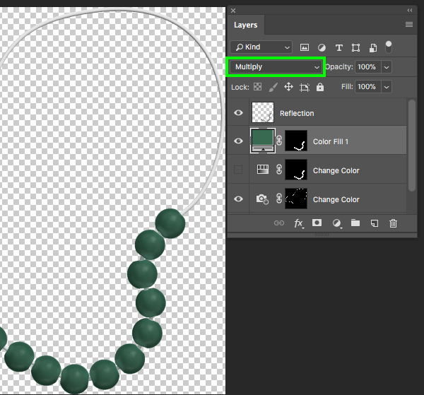
For the fill color, let’s use the hex value ‘#386A52’ and then press ‘OK’ to apply the changes.
Next, change the Blend Mode of the Solid Color Adjustment Layer to ‘Multiply’ and then save the file and close out of the tab to return to your main mockup.
Step 28: Final Adjustments
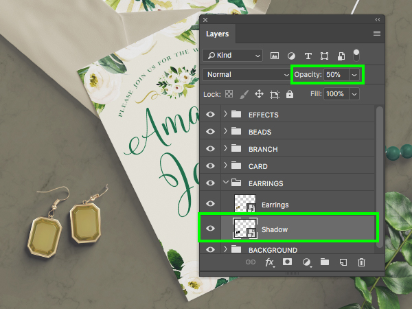
One last adjustment that we will make here is to scale the ‘EARRINGS’ folder up a bit. To do this simply use the Free Transform (Command/Ctrl+T) and drag outwards from the corner of the bounding box while holding Shift on the keyboard. Make the earrings just a bit larger and then go inside of the group folder and raise the opacity of the ‘Shadow’ layer to ’50%’ as shown here:
We have now completed our clean watercolor wedding invitation design and mockup! To create our invitation we have used two beautiful watercolor floral illustrations from Graphic Box along with a small handful of free typefaces. After that we applied our artwork to a realistic wedding scene mockup and brought in a few supporting elements to customize our scene and tie it all together. This is just a small sample of what The ‘Create and Make’ Design Bundle has in store! Top designers don’t settle for average quality tools and neither should you!
Remember that whether it’s your outcome for this tutorial or something new you’ve made, we’d love to see your designs on our Facebook page.
Please leave a comment if you have any questions or suggestions. I always look forward to hearing from you!
There’s still time to check out The ‘Create and Make’ Design Bundle providing you with a massive collection of high quality design elements and tools for an unbeatable price of $29!

























How do I press Return on the leyboard
Hey Rafiu, the Return key is also known as Enter, so I hope that this helps to unstick you :).
Sir , i am so grateful to you for such a nice tutorial. I like your tutorials so much. I love all designcuts team.
God bless you. Happy new year
Hey Watipu,
Thanks for leaving us a lovely comment!
I’m so pleased you found this tutorial useful and hope you can use all the tips and tricks in your designs. We are all feeling extremely lucky to have you in our community and we wish you a wonderful start to your new year :)
good design ever……….
We’re so glad you like it so thank you for the feedback :D
Very cool. Thanks for sharing this!
Yay we’re so glad that you think so Elron!
We hope that you pick up some great new tips and tricks in this tutorial :)
Great tutorial! If you were designing an invitation for print, would you make your file a little larger than 5×7 to allow for bleed? If so, does that apply to making any digital item – cards, printables, etc?
Hey Julie,
Thank you so much for reaching out to us and we are so glad to hear that you loved this tutorial.
We’re so sorry for any confusion caused, our tutorials are created as fun mock projects so there are certainly some aspects that if you were creating these for print, you might choose to do slightly differently. For example, where Eric has mentioned that whilst in the tutorial he suggested leaving the colour mode on RGB, if you were wanting to print then these you would definitely want to be working in CMYK.
So if you were wanting to print these designs you would certainly want to accommodate for bleeding to prevent any white borders. We would suggest that you add a standard additional 3mm to the height and width of your design to give you that space to be able to make a clean cut after printing. Usually if you were wanting to send something for print, you would want to export to software like Adobe Illustrator or InDesign first, and the great news is that in InDesign, you can set up a bleed border and crop marks to help.
If you do not work with either of these programs Julie, rest assured, we can certainly help find you an alternative way of going about this and I have popped you an email as well to help :)
Thanks for the quick reply and info!
Hey Julie, you are welcome and I am so glad that I could help :)