WHAT WE’RE CREATING:
A FEW THOUGHTS ABOUT MOCKUPS
Aloha, Design Cuts community! While I’m not in holiday in Hawaii, the heat and humidity in Cleveland, Ohio these days might be comparable to some tropical location. Minus the sun, swimming pool or sea, and enjoyability. Did I also mention that we don’t have AC in our apartment? Anyways.
Like many (if not all) of you, I’m very pleased with the content of Design Cuts’ current deal. Having a solid set of mockup tools and resources is becoming very important these days for us designers. This really affordable deal gets you for 25 Gbs of them. Yes, you read that right. 25 gigabytes.
Why are mockups so important? With the rising importance of (graphic) design in everyday life (mostly through technology), more and more people hear about it, and want to hire designers just like you for their projects. The downturn is that a lot of these clients don’t have the design education that we do, which is to only be expected. A lot of the stuff we do on a daily basis, on screens or on paper, is very abstract. We, as long-time designers, know what a finished product will look like through experience. This group of people have a hard time visualizing a flat digital file becoming a tri-fold brochure. And that’s perfectly okay! It’s our job to convey that to the client.
That’s where mockup tools come into play. They can be web apps, desktop apps, or stand alone PSD files with smart objects. The form doesn’t matter too much, as long as they’re easy to use for us, and display a convincing presentation of what the end product will look like for the client.
I mean, it’s so much more exciting for the client to be presented with an image simulating his new brand on a shirt or a screen, than a PNG file. Mockups give us and the client a glimpse at potential visual identity applications, which in turn make what we’re creating for them much more tangible. This tangibility will also help you to land more approvals.
In short: use mockups to help your clients visualize what you’re creating for them.
WHAT IS TODAY’S TUTORIAL ABOUT?
My goal is to help you figure out how to use your many new mockup templates. In order to do so, we’ll be creating a fake brand look, and applying it into some of the templates from the deal.
Over a year ago, the good people of Dribbble and Threadless organized a sweet little contest. The idea was to create a fake brand, and to apply it to the medium of apparel. That’s when I created Magnetic Fields, a (sadly) fictional manufacturer of cassette tapes.
What today’s tutorial will do will walk you through the creation of the mark, from concept to final vector elements, some collateral elements (business cards, letterhead), and then on how to get some nice mockups of them.
Ready? Then let’s get started.
STEP 0: CONCEPTUALIZATION
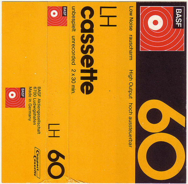
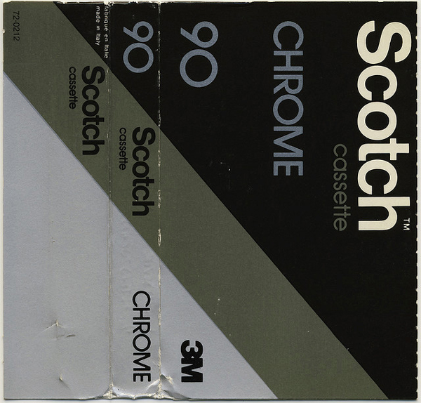
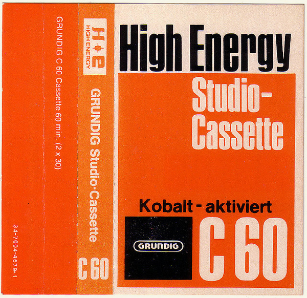
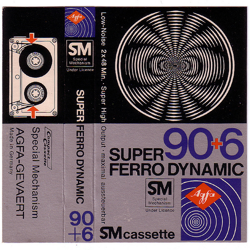
I didn’t start the contest knowing what I was going to do. I knew I wanted a slightly nostalgic theme, but that was it. Around the same time, I got to read this post on Wanken: Vintage Audio Cassette Inserts.
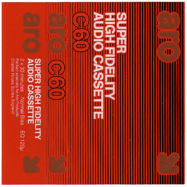
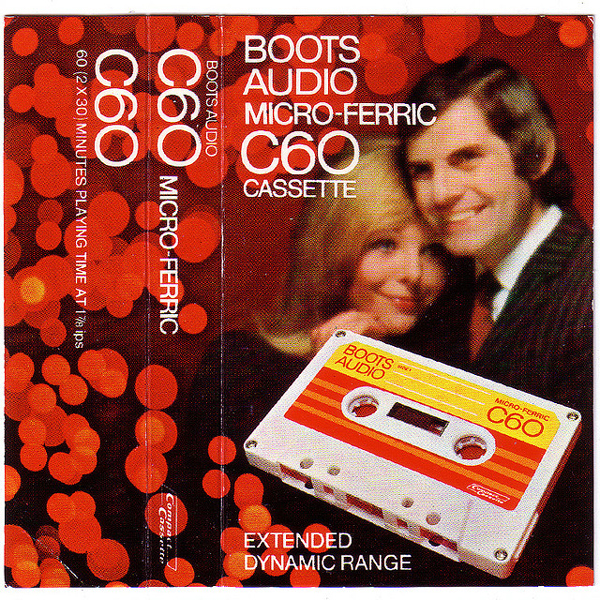
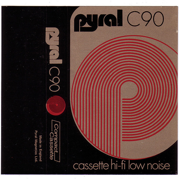
The subject of the post is the inserts you’d find in the box of blank tapes. I bought quite a few of these when I was younger, as this was before the days of computers having CD/DVD burners. Tapes were the only way I had to copy music, or to make mixtapes. Now that I had a bit more training in design, I started looking at these with a newfound appreciation. I mean, look at these beautiful compositions, mixing type, lines, shapes, etc:
And it didn’t stop there. The article was linking to a Flickr set full of them.
After spending the best part of my day looking at these, it became clear that a tape manufacturer was going to be my focus. I looked at the inserts again, analyzing their visual characteristics.
Some neat geometrical shapes (here a visual node to what a magnetic field looks like).
Line patterns.
In this specific case, some cheesy imagery overlaid with some clean, Swiss-like type.
More bold line patterns.
Dot patterns, condensed typefaces.
More line patterns (a visual node to the tape reel).
Some beautiful and functional type.
In short: strong, Swiss-like type, as well as line and dot patterns. Mentions like “low noise,” “ultra low noise,” and “high fidelity” were also repeated.
From there, I also researched the history of the cassette tape:
The Compact Cassette or Musicassette (MC), also commonly called cassette tape, audio cassette, or simply tape or cassette, is a magnetic tape recording format for audio recording and playback. Compact cassettes come in two forms, either already containing content as a pre-recorded cassette, or as fully recordable “blank” cassette. It was designed originally for dictation machines, but improvements in fidelity led the Compact Cassette to supplant the Stereo 8-track cartridge and reel-to-reel tape recording in most non-professional applications. Its uses ranged from portable audio to home recording to data storage for early microcomputers. Between the early 1970s and the late 1990s, the cassette was one of the two most common formats for prerecorded music, first alongside the LP record and later the compact disc.
Wikipedia also allowed me to find out when the tape as we know it first came out for the general public:
In 1962, Philips invented the Compact Cassette medium for audio storage, introducing it in Europe on 30 August 1963 (at the Berlin Radio Show), and in the United States (under the Norelco brand) in November 1964, with the trademark name Compact Cassette. The team at Philips was led by Lou Ottens in Hasselt, Belgium.
With all that visual and historical information at hand, my concept came together. I’d create a brand named Magnetic Fields (as the information is stored magnetically on the tape ribbon), that first released its products in 1964 (the date of the US market introduction).
Visually, I experimented with the codes we analyzed earlier in the various examples. Bold line patterns, and a halftone effect.
After a bit of reflection, I decided to go with the horizontal and increasingly heavier line pattern. Let me show you how I built it.
STEP 1: VECTOR EXECUTION
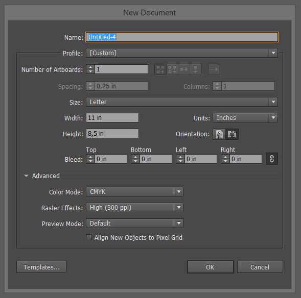
This is a simple vector construction. Open up Illustrator (you should pretty much always use a vector output capable software when creating identity elements), and create a new document. I’m using an 8.5″x11″, horizontal canvas.
Turn on the grid (View > Show grid) and the Snap to grid functionality (View > Snap to grid). Since the mark is very geometrical, this is going to help us going faster and to be more precise.
Let’s start with the line pattern itself. We’ll be leveraging the blend tool to get the stroke to gradually diminish thickness.
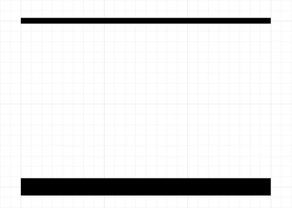
Start by drawing a first line with your pen tool. I’m placing it at the bottom of one of the squares of the grid. The line should be three grid squares long.
Then proceed to draw an identical line at the top edge of the second square above the first line.
From there, remove any fill colors, and give your bottom line a stroke of 15 points, and your top line a stroke of 5 points.
From there, let’s do some blend tool magic. If you’ve been following Design Cuts for a while, you might remember the “Create a Clean and Professional Poster Design” tutorial I wrote a while back. Back then, we leveraged the blend tool to create a repeating thick line motif with smooth color transitions. This time, we’ll use the tool to transition smoothly from thick to thin.
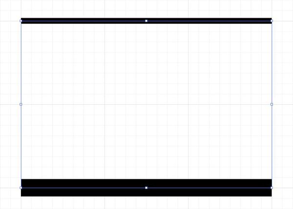
Start by selecting both of your lines.
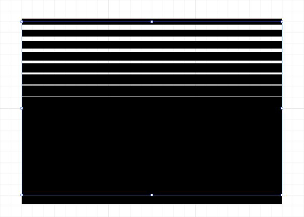
From there, create a blend between them. You can follow the Object > Blend > Make menu, or use the shortcut (ALT/OPTION+CTRL/CMD+B). The result can look weird, as it’ll pull the settings you’ve used the last time you used the tool.
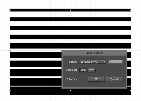
To adjust the visual to our liking, go to Object > Blend > Make > Blend options. This will allow you to control the blend settings. I’ve used the ones below to reach the desired effect.
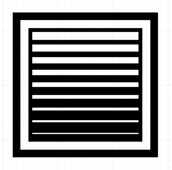
The spacing between my elements is of 8 steps. This creates a total of 10 lines. Since we have only horizontal lines, the orientation doesn’t matter too much.
From there, the last things to add are two square boxes. One will tightly enclose our newly created thick to thin line gradient, and the other will enclose the ensemble. We’ll also probably have to do a few minor adjustments to make the mark optically satisfying.
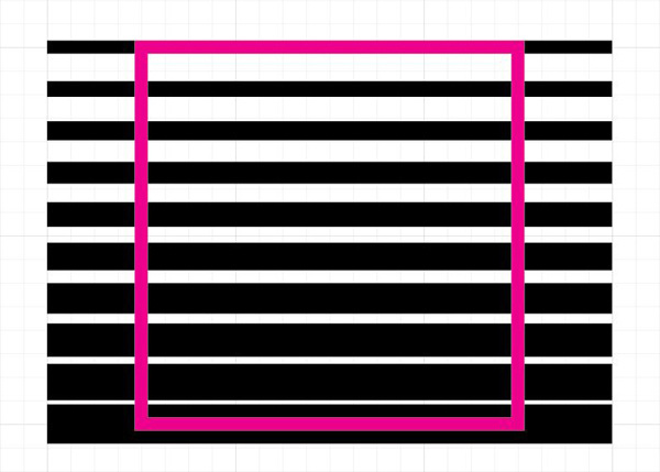
Let’s start with the smaller box. Draw a square that’s two by two grid squares. It should have a 5 points stroke, and no fill color. Place it centered horizontally and vertically over the gradient. Mine’s in bright magenta, so you can see it well.
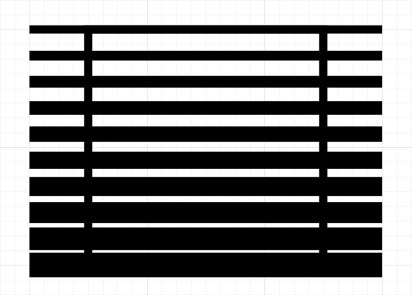
Once the placement is correct, turn the stroke to black.
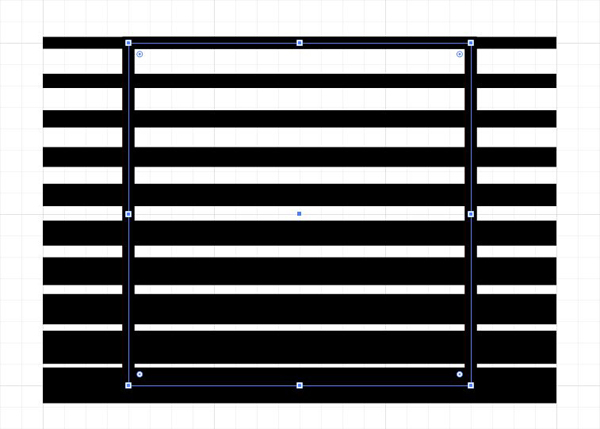
Duplicate the square (CTRL/CMD+C), and paste a copy in front (CTRL/CMD+F).
Select the bottom copy, and use it as a clipping mask for the line gradient. To do so, select both the box and the gradient, and go to Object > Clipping mask > Make.
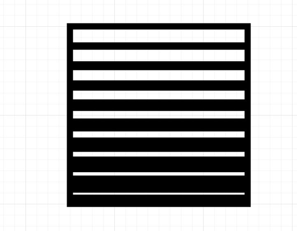
Now, we just need to add the bigger box around our ensemble. I drew a square that’s two small grid square bigger all around. It has a 10 points stroke.
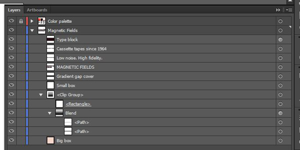
The various vector elements looks something like this. The blend is the gradient, contained within the clip group it creates with its square clipping mask.
STEP 2: VECTOR FINE TUNING
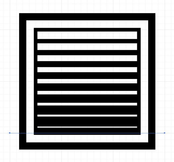
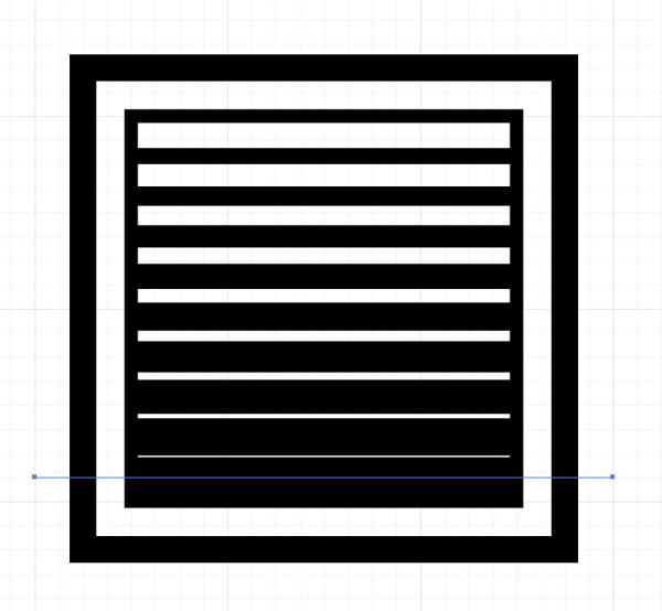
While we’re moving along quite nicely, the optical effect created by the gradient is slightly off. This is due to the fact that you can’t align the stroke of lines to the inside, and to how the small box cuts our thickest bottom line.
In order to fix this, we’ll move the most bottom line up a bit. Head to your layer palette, and select the bottom line of our blend.
Once it’s selected, use your direct selection tool to bring the line up one small grid square. The blend will automatically adjust the spacing of the lines.
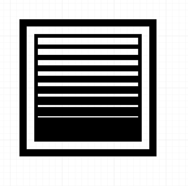
From there, the last visual adjustment we have to do is to cover the thinest white gap. There is no matching black line, which is why it feels optically “wrong” in our arrangement. Create a black rectangle above it, and you’ll be good to go.
We have our mark. Next, we need to think about type.
STEP 3: TYPEFACES
The visual mark is complete, we now need to add the company name and tagline next to it. I’m choosing to include the year in the tagline as a way to show a long company history, which is normally a quality insurance. So the copy to include is “Magnetic Fields – Low noise. High Fidelity. Since 1964.”
After looking again at our reference material, interplay between extra bold and extra thin sans-serif typefaces seems inevitable.
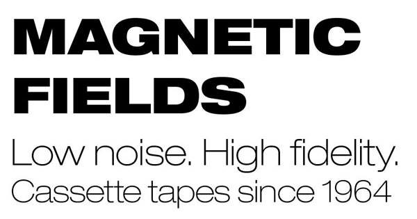
As a matter of fact, my first combo is between Helvetica Neue LT Std 93 Black Extended (for the Magnetic Fields part) and Helvetica Neue LT Std 33 Thin Extended (for the tagline elements).
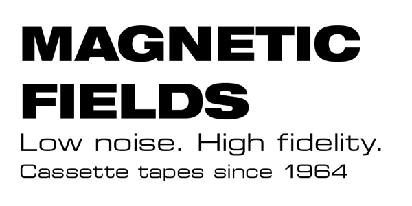
My second combo also uses Helvetica Neue LT Std 93 Black Extended for the Magnetic Fields part, but switches the tagline elements to Eurostile Extended, for its very technical/technological feel.
As a side note, the Eurostile family is often used in Sci-Fi movies and other space operas for vessel markings and other dashboards (see Typeset in the future, and its precursor).
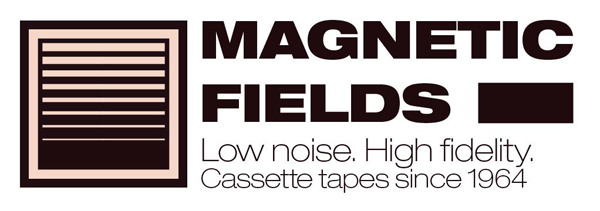
While both combos would be viable, I’m choosing to go with the dual Helvetica one. I like its lightness better. Let’s combine it with the mark.
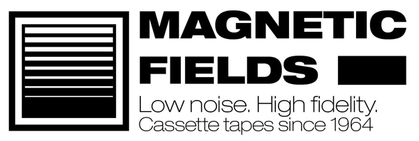
After a bit of spacing tweaks with the grid and snap to grid turned off, here’s my result.
And here are my type settings, from top to bottom. The size values are chosen mostly from the provided values, which technically should account for the values that would be available if we’d still have to set the type by hand. This avoids me to distort the type, which would be impossible if the letters were still metal or wooden blocks.
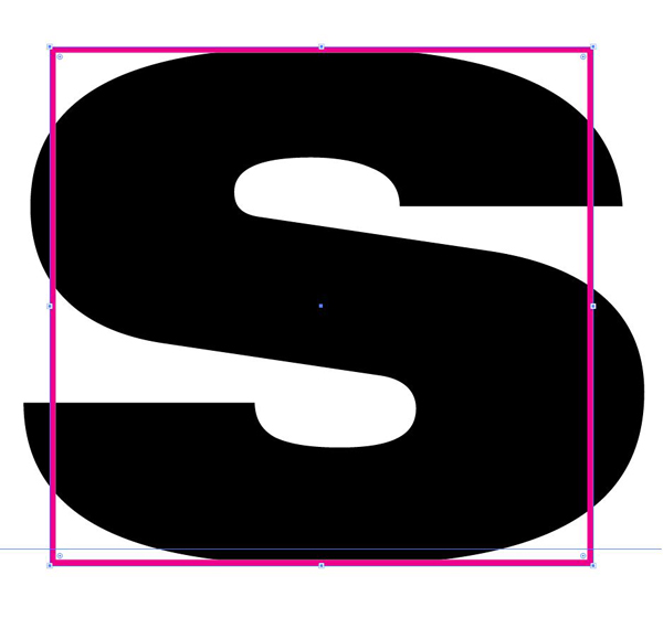
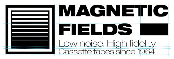
The last type tweak is the addition of a black rectangle to visually finish the “Fields” line, and to make the “Magnetic Fields” element look more like a full block. I’m using a rectangle as tall as my type. The tallest letter on the line is the “S,” so that’s what I use as my reference. Since this is Illustrator, don’t hesitate to zoom in at will to line things up precisely.
Using handmade guides can be very helpful. These are simply line with a dashed stroke.
And here we are with our final type arrangement. Time to go onto the next step.
STEP 4: COLORS!
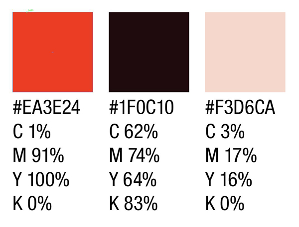
Now that we have a working logo, it’s time to add colors. After going back through the references, I sampled the following colors.
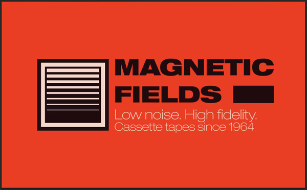
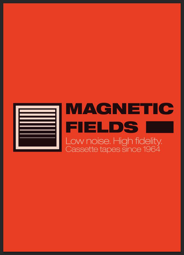
I’ll be using the burnt orange (#EA3E24) as my background color. The black in the logo will be the very dark warm gray (#1F0C10), and the white the very pale red (F3D6CA).
Start by switching the type to the dark warm gray (#1F0C10).
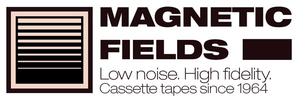
Next, let’s apply color to the outer box. The black stroke will be in dark gray, and the inside in the pale red (F3D6CA).
Now that we’re adding a fill to the box, you’ll need to place it below the blend element.
From there, it’s time to switch the reminding black elements to the dark gray.
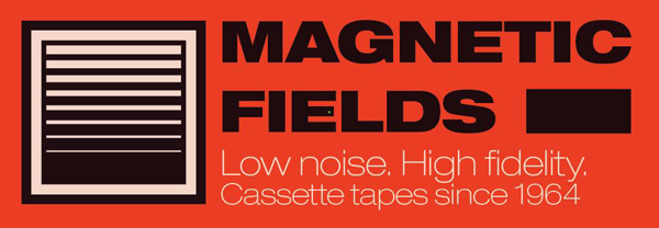
And to add an orange background behind everything to admire the result.
In order to make the visual hierarchy better, let’s switch the tagline elements’ color to our pale red ((F3D6CA).
And now that we have our final brand lockup, it’s time to see what it could look like in the real world.
STEP 5: BASIC MOCKUPS
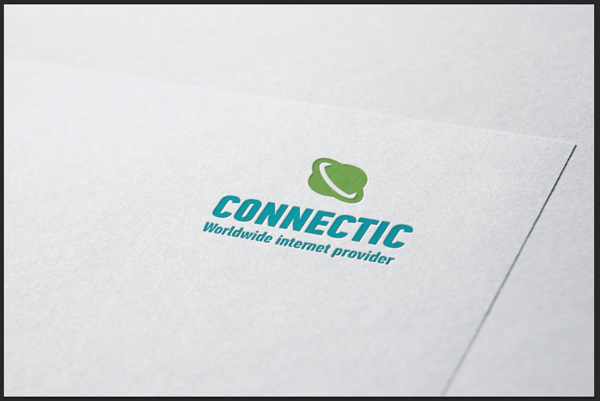
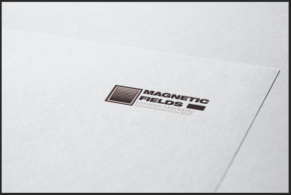
To understand the principle of many of these files, let’s start with something simple. Vandelay Design has a good set of logo mockup templates. They simulate the logo being printed or embossed on stationary.
Located marketing mockups\Logo mockups\4-colour.psd, and open it.
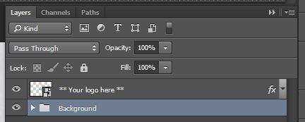
If you look at the layers, the palette is rather empty. The main point of interest is the smart object at the top of the layer stack.
Basically, the way this works is by substituting the content of the smart object by our own. Double-click on the smart object to edit it. This will open it.
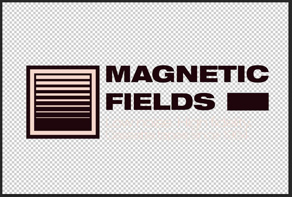
Erase the content of the smart object, then paste the Magnetic Field logo in there, but without its orange background. Make it roughly as wide as the demo content.
I strongly recommend you to paste the logo as a smart object. This way, it’ll retain its vector properties.
Once you’re satisfied with the placement and sizing of the logo, save the modifications (CTRL/CMD+S). From there, head back to the main file to see your logo displayed in all of its glory at the right angle, lighting, shading, etc.
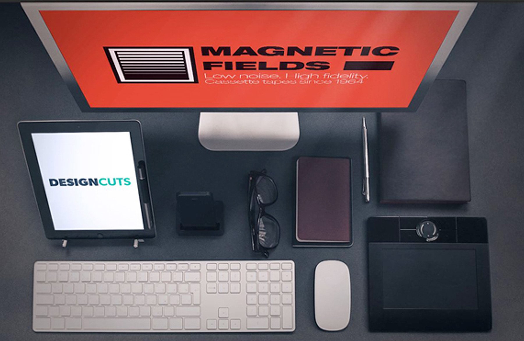
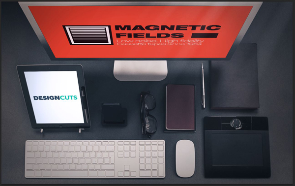
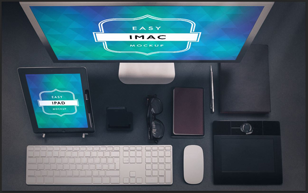
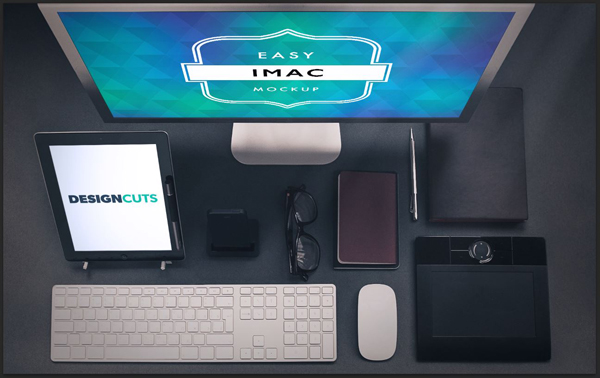
Let’s do another one. How about mocking up our new brand on an iPad or computer screen? Locate Caio Call’s Apple devices mockups (\5-Easy-Apple-Devices-Mockup-Package). The one I’m interested in is \5-Easy-Apple-Devices-Mockup-Package\Ipad_Monitor_Mockup (Bonus). Open the PSD file.
As you can see, this one features two mockup areas. The iPad screen, as well as the computer screen. I’ll be putting the Design Cuts logo on the iPad, and the Magnetic Fields logo on the computer screen.
If you look closely at the layer palette, you’ll see two smart objects: one for the iPad scren, and one for the computer screen. Let’s start with the iPad screen. Double click on it to open it.
The instructions left in the smart object’s layer palette are clear.
Let’s go ahead and place our logo, then fill the background layer in white.
Save, and head back to the main file to check on the result. It’s quite convincing!
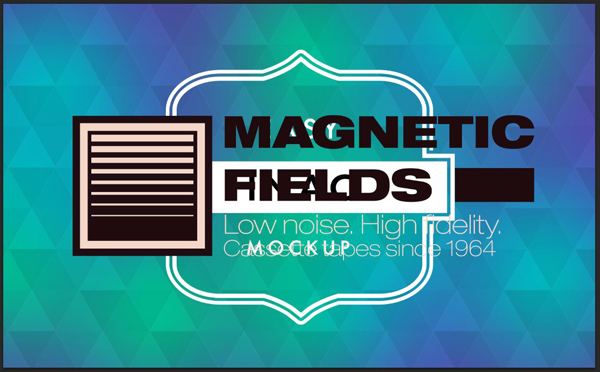
Repeat the process for the computer screen.
And boom.
I hope that these two examples showed you the excitement value that these mockups can have for the client. Seeing is often believing, and bringing context to an otherwise flat digital file really helps to imagine what things could be like.
STEP 6: COMPLEX MOCKUPS
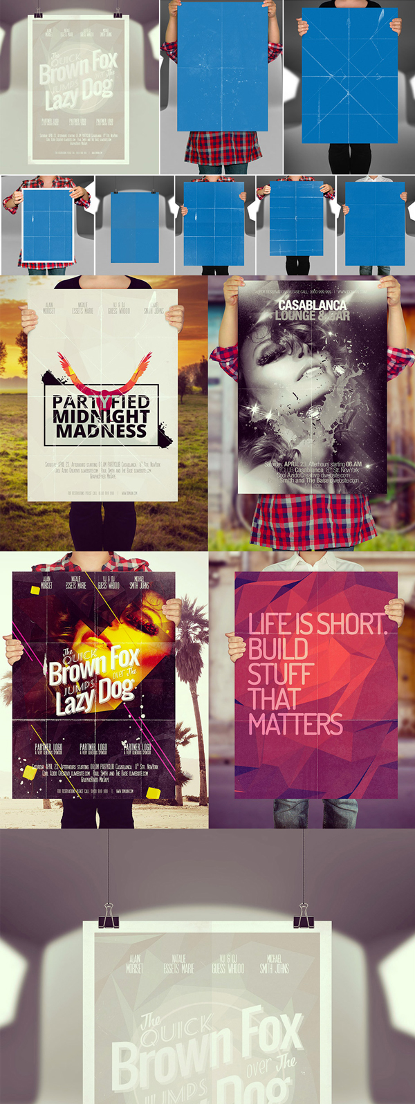
The last thing I want to cover is how mockups can be a tool for conception as well. Using some of the more advanced mockup files, you could quickly simulate concepts for collateral, straight in the mockup file. Once they look convincing, start emulating them in their definitive files.
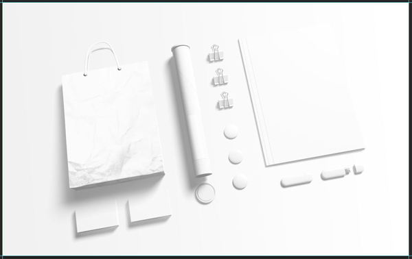
Let’s open \Branding-Identity-Mockup\branding-mockup\03.psd from Itembridge.
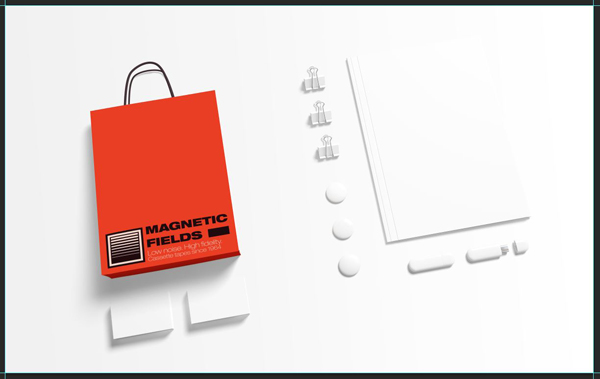
The layout is already more complex. It features a bag, cards, flashdrives, binder clips, etc. Each elements get their own layers.
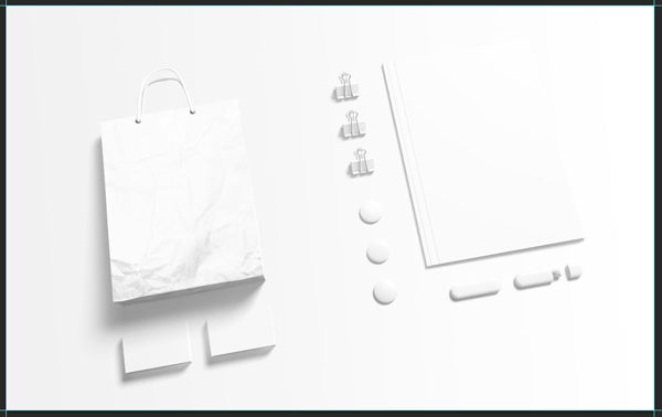
The amazing thing with Itembridge’s files is that you can turn stuff off if you don’t need it. For instance, I’ve never heard of tapes being shipped by tubes. So let’s turn the tube layers off.
And now we don’t have to worry about it anymore.
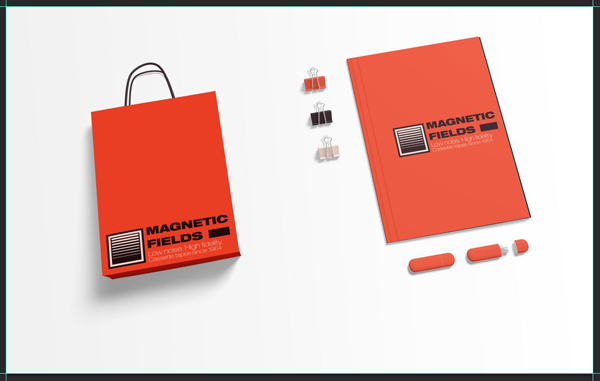
Now that the file has the elements we want to work on, let’s start. I’m opening the bag first. After tweaking the appropriate layers, here’s what I get.
I switched the handles to our dark gray (#1f0c10), added the logo and the orange background to the front, and changed the color of the sides to orange as well.
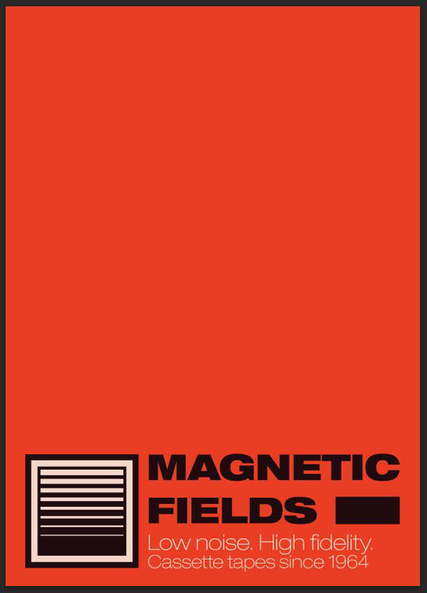
Let’s say that I’m not sure that the logo should be centered on the bag’s front. Let’s open the front back, and slide our logo towards the bottom.
From there, I simply have to save, and head back to the main file to have a look at what my change would look like. Fastest prototyping process ever.
Let me go ahead and add the design to a few more elements, and turn off some more. Some of the objects have specific layers for color changes (clips), some are handles via the smart objects.
Since I’ve turned off quite a few things, there are some weird gaps in my composition. Well, let’s rearrange the layout a bit to remove the white space. Simply select the layer groups, and move them around as needed.
This is simple as pie. In fact, once you’ve mastered the smart object concept, you’ll be able to use all of these at will. And if you look at the files provided with the mockup, you can also change the background color and/or texture, change the bag’s texture, add depth-of-field effects… These are powerful files.
CONCLUDING THOUGHTS
Once again, I hope that this short tutorial demonstrated how powerful and useful these mockups are. I also hope you had as much fun following along than I had writing the post.
If you have questions or concerns, don’t hesitate to get in touch! Use the comments below, the Design Cuts Facebook page, or tweet at us.
Remember, there’s only a few days left to grab the Ultimate Mockup Template Bundle for 93% Off, it’s expiring soon.
Until next time, cheers!































Hello
Is there any free assets for this tutorial, or somewhere I can buy them?
Best regards
Line
Hey Line,
Thanks for getting in touch, I can certainly help you with your query!
I am really sorry but I’m afraid that there are no free assets to go with this pack. This guide features mockup items that were included in our Ultimate Mockup Template Bundle which is now unfortunately expired.
I apologise for any inconvenience, I have sent you a quick email just to get some more information on what resources you are after and help point you in the right direction to purchase them separately.
I hope it helps, Line, and please don’t hesitate to contact me should you have any other questions. I’m always happy to help!
Excellent tuts and run down of the process and the mockups!
Thanks so much Sasha, I’m really glad that you found this lesson helpful :). We hope that you’re loving using your new mockups.
Thank you for your kind words!