
In this tutorial we will be creating a fun throwback concert poster design in Photoshop. To do this, we will be using some beautiful textures courtesy of Honnum Graphic Art from the all new Totally Vibrant Textures and Patterns Bundle. Finding the right textures and patterns for any project can be pivotal in helping bring a design to life, and we will see that in this lesson when we combine some of these elements with a few free stock photos to create our retro poster.
We will also be adding a fun 80’s title treatment to our poster using a couple of free typefaces and some useful Photoshop tricks. Even though we will only be using a small sample from the bundle, this all new collection boasts a massively set of resources to ensure you are covered for any possible design project you will take on. So, if you’re all ready to get started then fire up Photoshop and let’s get started!
HAVE YOU SEEN OUR YOUTUBE CHANNEL?
Watch the video tutorial below and subscribe to our YouTube channel for regular updates direct to your inbox.
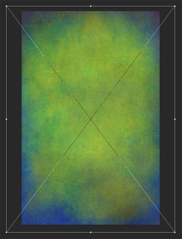
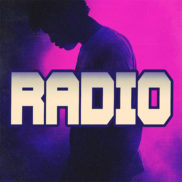
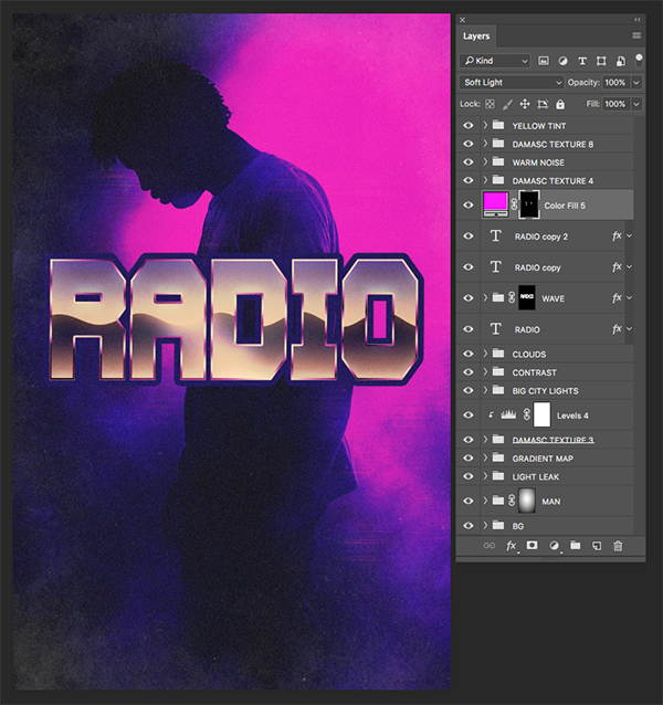
Here’s a look at what we’ll be creating:

Follow along with this tutorial: Download the freebie files
This freebie pack is just a small sample of what you can expect to find in the Totally Vibrant Textures and Patterns Bundle for just $29! As with all our bundles, these resources come with our extended license and at a staggering 99% off, for a limited time only!

Step 1: Radio Waves Retro Poster Design
To get started, create a new Photoshop document and make it ’11’ inches wide by ’17’ inches tall with a ‘Resolution’ of ‘300’ and a ‘Color Mode’ set to ‘RGB’. From there, give your file a name – here I will be using the name ‘radio-waves-retro-poster-design’ and then once you have that set up go ahead and click ‘Create’ from the bottom right corner.

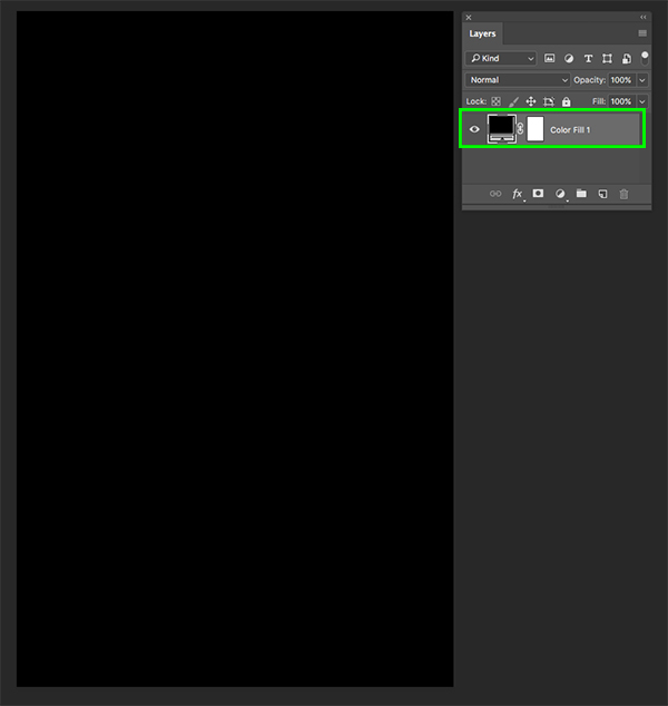
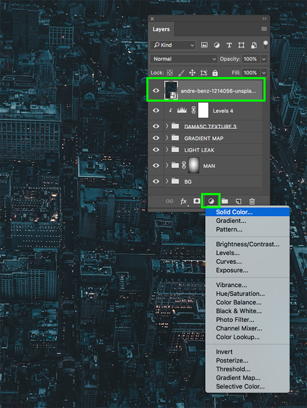
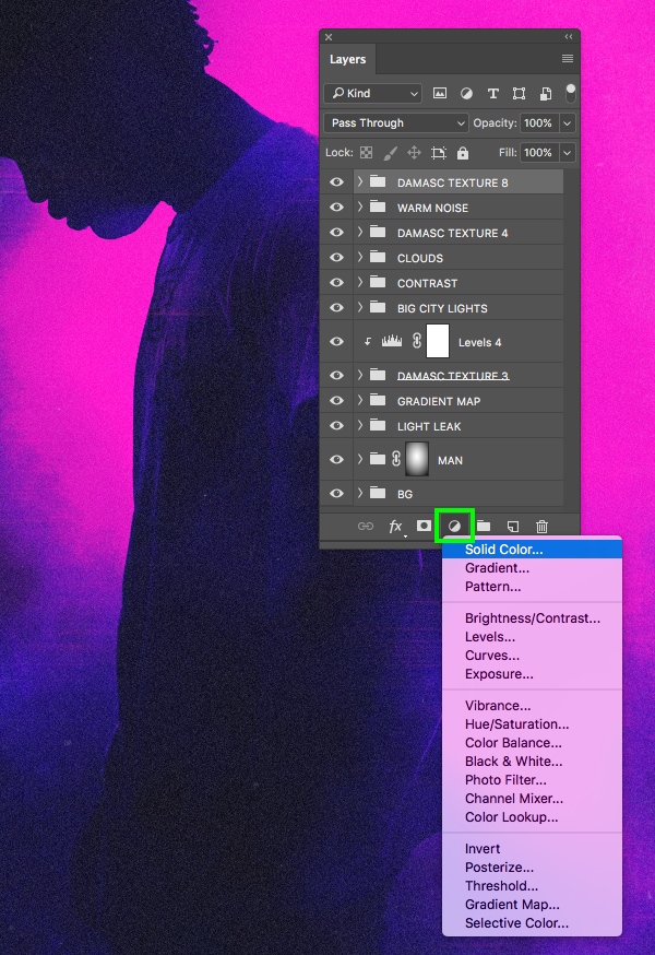
After creating your new document click on the Adjustment Layer icon at the bottom of the Layers Palette and then choose ‘Solid Color…’ from the dropdown that appears.
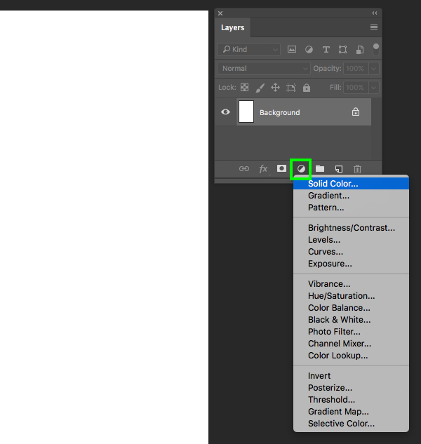
For the fill color enter ‘#000000’ for solid black and then press ‘Return’ or click ‘OK’ to apply the changes and continue.

Now that we have added a solid black Adjustment Layer, let’s drag the default ‘Background’ into the trash since we no longer need it.
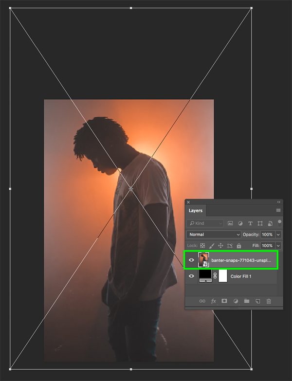
Step 2: Placing The Subject
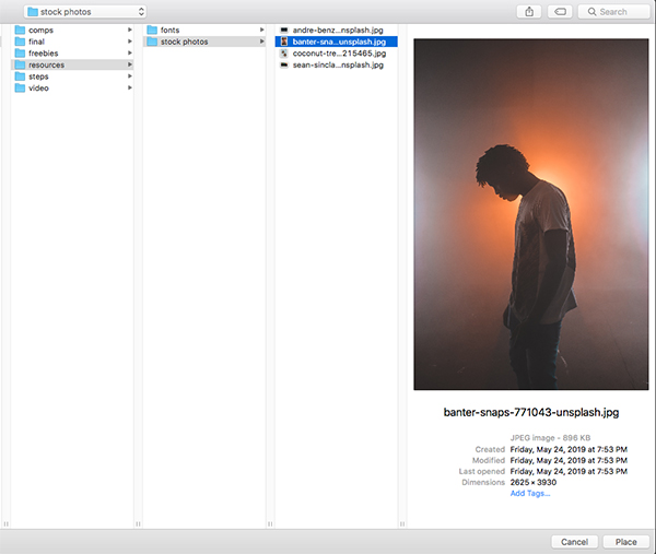
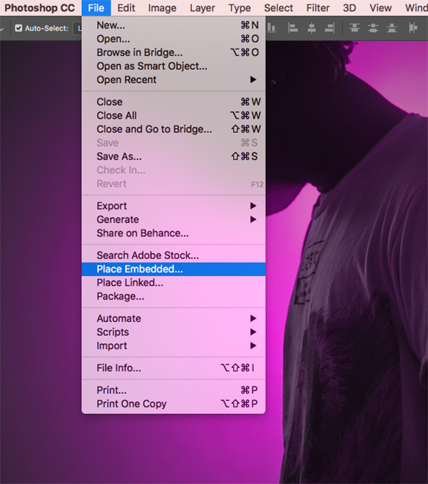
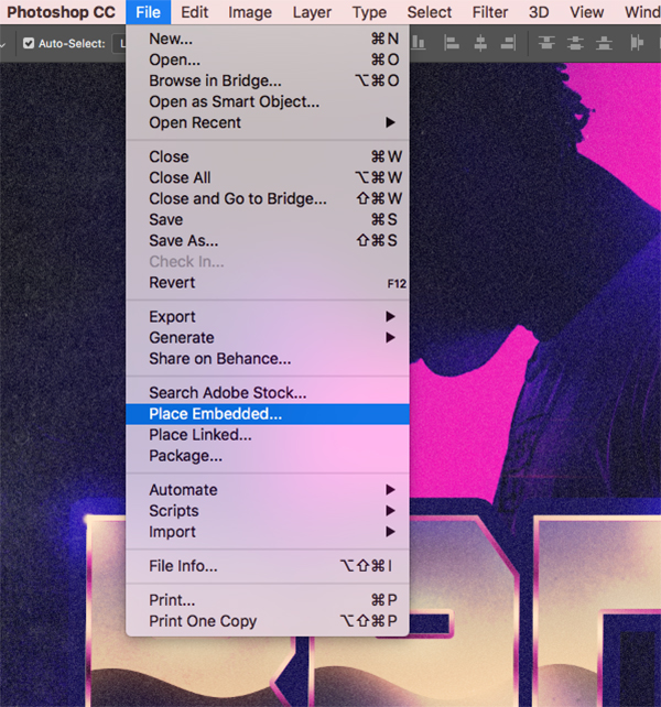
From here, let’s download the first free stock image of the main subject and then save it somewhere that is easy for you to navigate to. Once you have done that, return to Photoshop and go to the File menu before choosing ‘Place Embedded…’ from the menu.
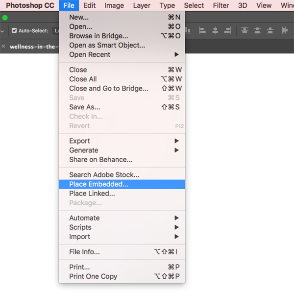
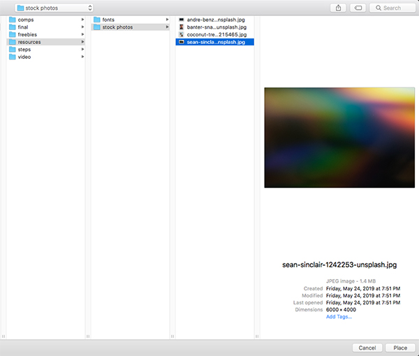
Navigate to the folder where you have saved your first stock photo and then choose ‘Place’ from the lower right corner. In this case, I have created a folder called ‘resources’ that contains the stock images and fonts, but your setup may look a bit different depending on how you want to create your folder structure.
After bringing in the first stock photo, press Command/Ctrl+T and then drag outwards from any of the four corners of the bounding box to scale it up proportionally from the center until it looks like the image shown below:
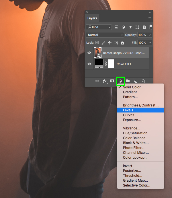
Step 3: Contrast Boost
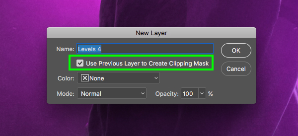
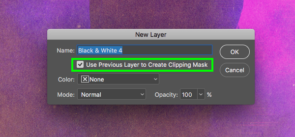
After adjusting and positioning our subject, make sure that the layer is still selected and then hold the Alt/Option key and click the Adjustment Layer icon at the bottom of the menu. From here, choose ‘Levels…’ from the menu that appears.
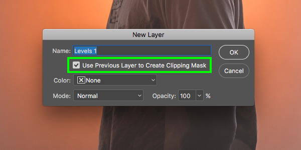
Check off the box that says ‘Use Previous Layer to Create Clipping Mask’ and then click ‘OK’ or press ‘Return’ on the keyboard to proceed.
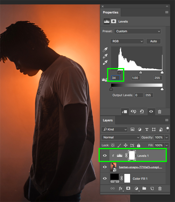
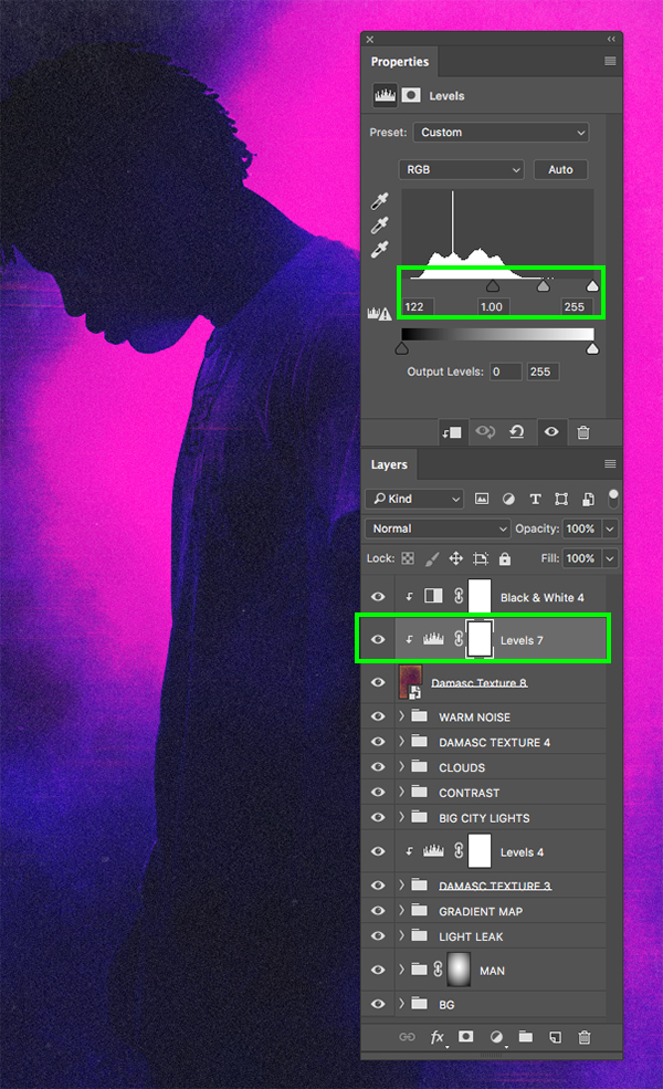
You should now have your Levels Adjustment Layer added with a Clipping Mask applied, ensuring that it will only affect the photo of the subject that it’s clipped to. From here, simply move the left gray slider in towards the center until it’s set to about ’34’ to boost the contrast as shown below:
Step 4: Setting The Tone
Select the Smart Object layer once again and then return to the Adjustment Layer icon at the bottom of the Layers Palette, this time choosing the ‘Hue/Saturation…’ option shown here:
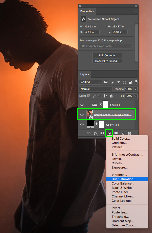
This time, the Adjustment Layer will automatically have a Clipping Mask applied to it, but we still need to move it up one spot above our Levels Adjustment. To do this, simply press the Command/Ctrl and the right bracket key on the keyboard. Your Hue/Saturation Adjustment Layer should now still have a Clipping Mask but be placed on top of the Levels Adjustment Layer. Once you have done that, go to the Properties and move the ‘Hue’ setting to ‘-75’ and the ‘Saturation’ to about ‘8’ in order to shift the color to more of a magenta while boosting the saturation a bit.

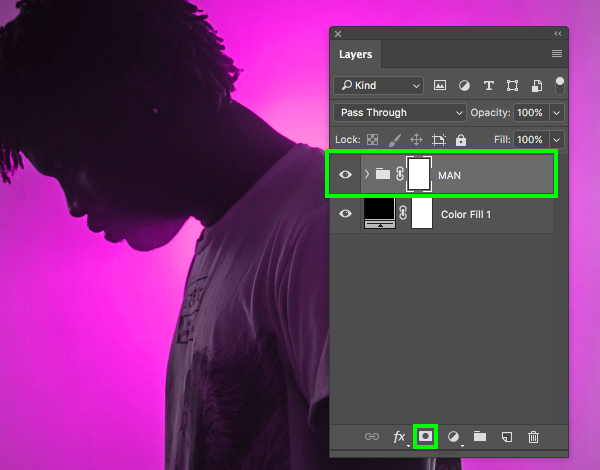
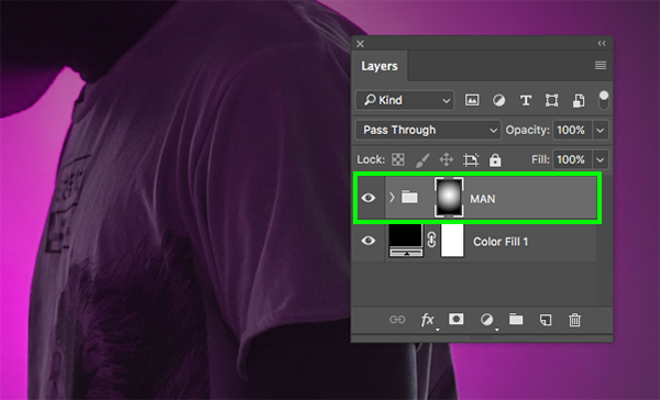
Step 5: Creating A Group
Now that we have our main image of the man with two Adjustment Layers set up, let’s select the top layer, hold the Shift key, and then select the photo of the man so all three layers are selected together.

With your layers still selected, press Command/Ctrl+G to place them into a group and then double click the ‘Group 1’ text to rename the folder ‘MAN’ or something similar. After renaming the folder, click the ‘Add layer mask’ icon from the bottom of the Layers Palette to add a mask to the whole folder.
Step 6: Group Mask
Press ‘D’ to reset your default colors and make sure you have a solid black foreground color selected. If you need to toggle between the foreground and background colors you can press ‘X’ until black is the foreground color as well. After that, press ‘G’ to switch to the Gradient Tool and select a black-to-transparent Radial Gradient and check off the ‘Reverse’ box. Your settings should look like the ones shown in the top toolbar here:
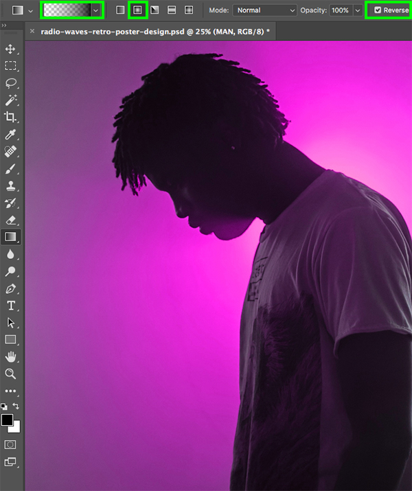
With our gradient set up and the mask selected, click and drag outwards from the center of the image and it will fade out the edges of the design so we see the solid black Adjustment Layer at the bottom. This looks pretty good but we will need to resize the mask a bit to show a little more of the image.
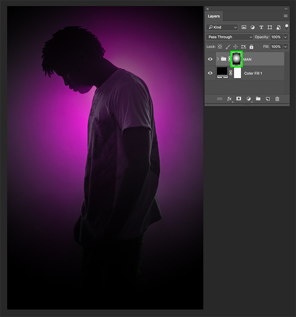
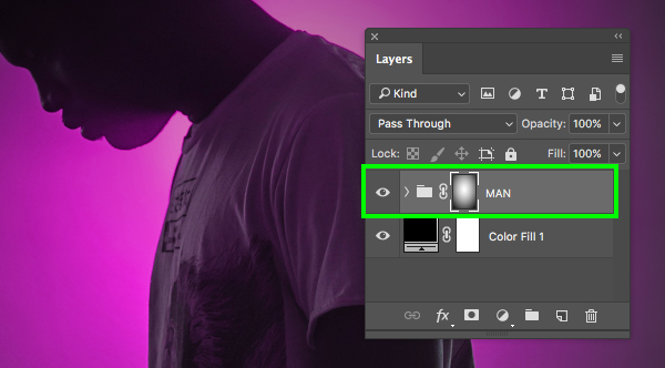
Click on the small link icon between the folder icon and the layer mask to unlink the mask from the group as shown here:
Next, select the mask only and press Command/Ctrl+T to do a Free Transform. From here, hold the Alt/Option key and drag the top middle handle upwards and it will extend the bottom one by the same amount. Continue dragging upwards to reveal more of the image of the man and this will essentially change the mask shape from a circle to more of an ellipse shape. Once you are happy with the way things are looking simply press ‘Return’ on the keyboard to apply the changes.

After you are finished modifying the mask, don’t forget to relink the layers by clicking in between the folder icon and the group mask to make sure that they stay connected.
Step 7: Keeping Things Together
Before moving on let’s quickly select our solid black Adjustment Layer at the bottom of the Layers Palette shown below:
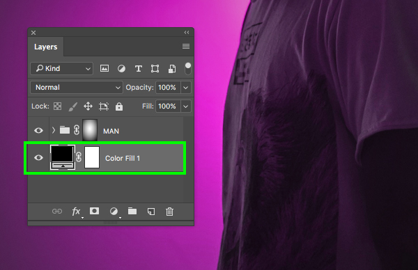
With the Adjustment Layer selected, press Command/Ctrl+G to place it into a new folder and double click the ‘Group 1’ text to rename it ‘BG’ to help keep things neat.
Step 8: Light Leak
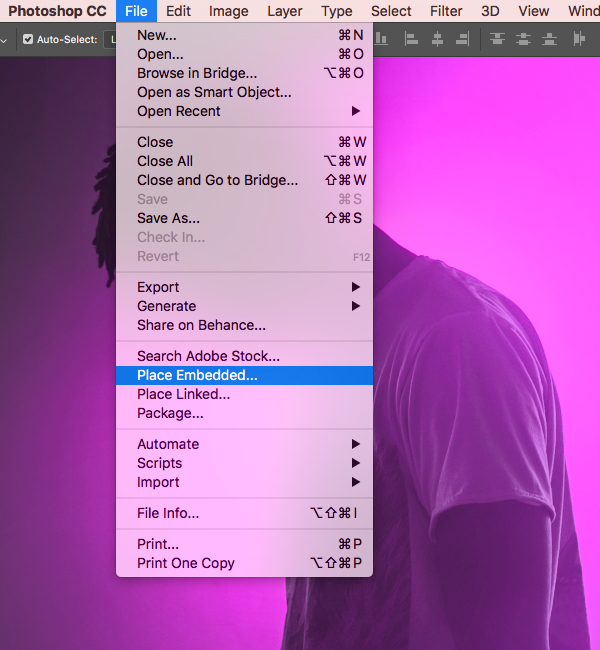
Let’s now download our next free stock image and save it in the same folder as our first image of the man. Once you have done that, return to Photoshop and go to the File menu before choosing ‘Place Embedded…’ from the list that appears.
Navigate to the folder where you have downloaded the new light leak stock photo and then choose ‘Place’ from the lower right corner.
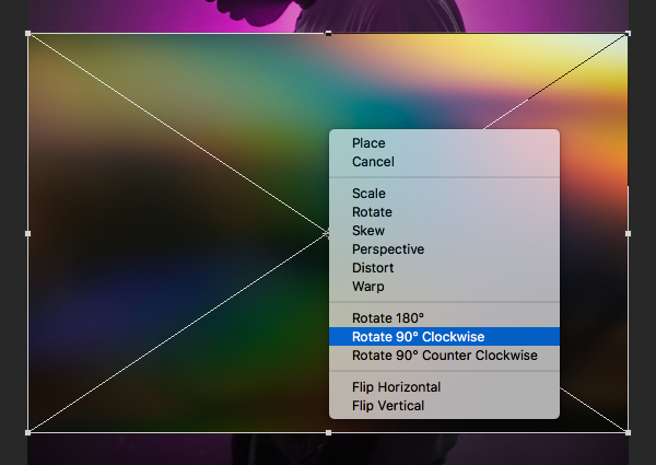
After bringing in the new stock image, hold the Control key and click on it and then choose ‘Rotate 90º Clockwise’.
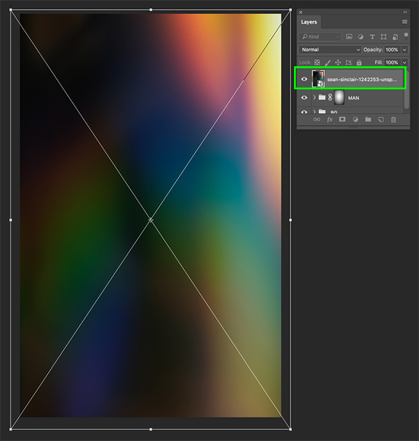
Hold the Control key and click once again, this time choosing the ‘Flip Vertical’ option.

Next, hold the Alt/Option+Shift keys and drag any of the four corners of the bounding box outwards to scale the image up proportionally from the center until it completely fills the canvas. Once you have done that, press ‘Return’ on the keyboard to apply the changes.
Now that we have scaled and rotated the image properly, let’s change the Blend Mode of the layer from ‘Normal’ to ‘Linear Dodge (Add)’ as shown here:
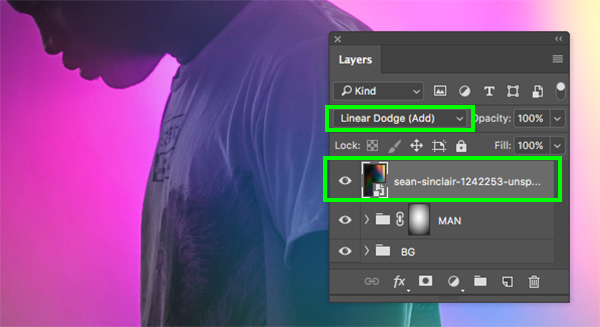
Step 9: Light Levels
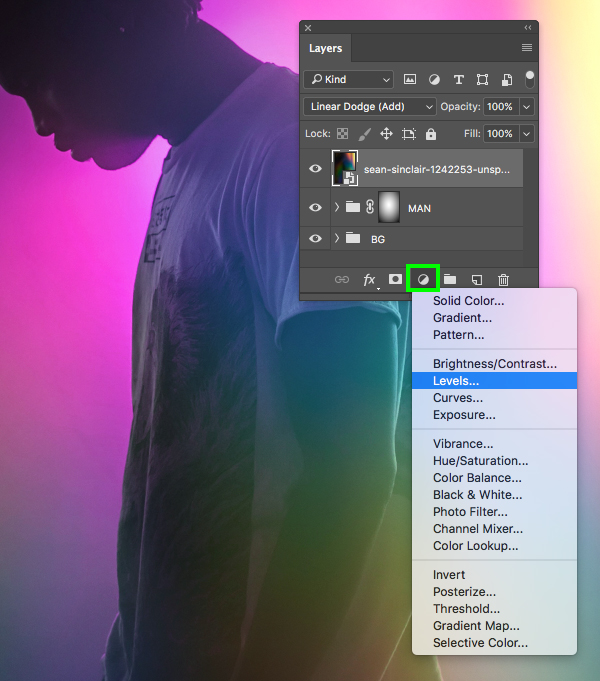
Select the light Smart Object layer and then hold the Alt/Option key and click on the Adjustment Layer icon at the bottom of the Layers Palette. From the list, let’s choose ‘Levels…’ as shown below:
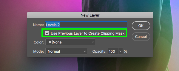
Check off the box that says ‘Use Previous Layer to Create Clipping Mask’ and then press ‘Return’ on the keyboard or click ‘OK’ to continue.
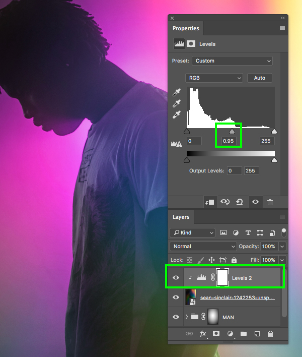
In the Properties panel, set the middle slider to ‘0.95’ just to shift the contrast a bit.
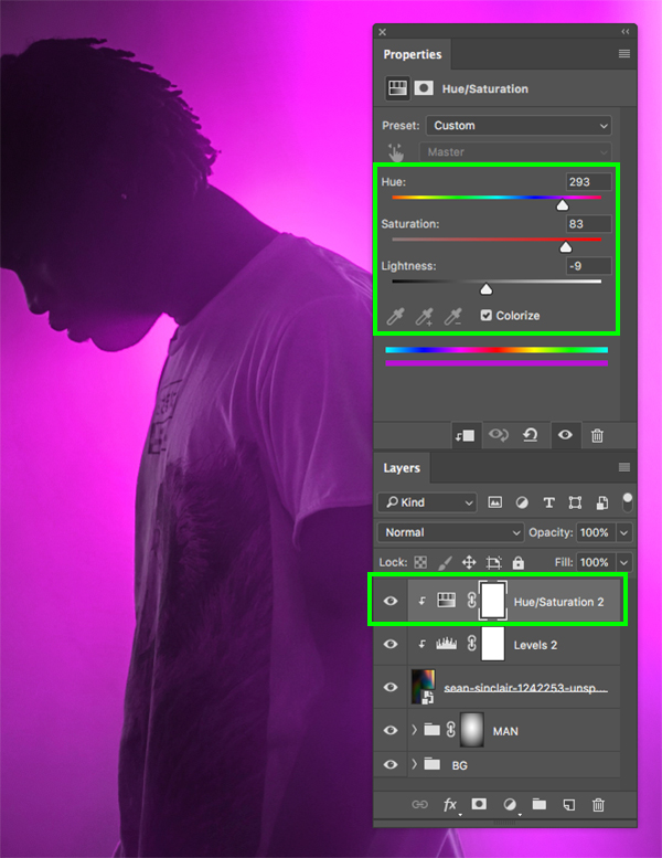
Step 10: Light Color
Select the light leak Smart Object layer and then click on the Adjustment Layer and then choose ‘Hue/Saturation…’ from the dropdown.

Let’s move the Hue/Saturation Adjustment Layer just above the previously created Levels Adjustment Layer by using the keyboard shortcut Command/Ctrl and the right bracket like we did earlier when we placed the Adjustment Layers on the image of the man. Once you have set the layers up, go to the Properties panel and check off the ‘Colorize’ box. From there, move the ‘Hue’ slider to about ‘293’ and then the ‘Saturation’ to ’83’ and change the ‘Lightness’ to ‘-9’ to shift the color of the light leak.
Step 11: Light Folder
Select the top Hue/Saturation Adjustment Layer, hold the Shift key, and then select the main light leak Smart Object layer so all three layers are selected at the same time.

With these three layers selected, press Command/Ctrl+G to place them into a new folder and double click the ‘Group 1’ text to rename the folder ‘LIGHT LEAK’ as shown here:

Step 12: Blurred Lights
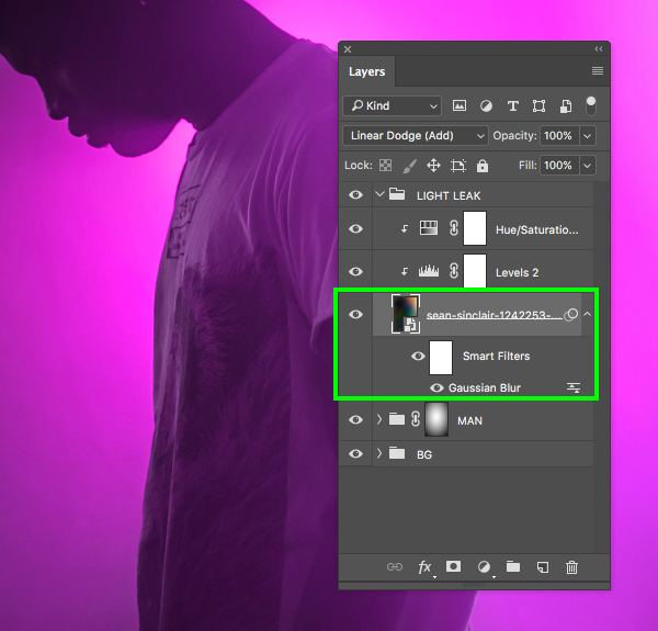
Click on the small arrow next to the ‘LIGHT LEAK’ folder to expand the contents and then select the main Smart Object of the lights inside.

From here, go to the Filter menu and choose ‘Blur > Gaussian Blur…’ from the dropdown.
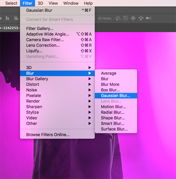
For the blur settings, enter a ‘Radius’ value of ‘342’ so that we can blur some of the edges and lines that are still visible and then click ‘OK’ to apply the changes and continue.
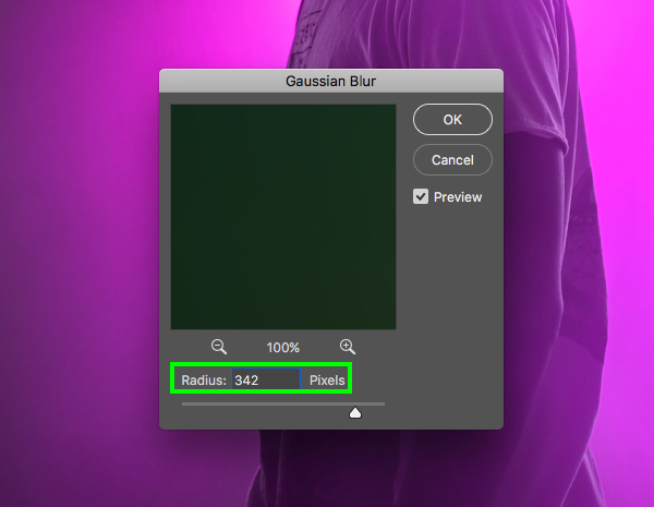
You should now see that you have a ‘Smart Filter’ applied just below the Smart Object for the Gaussian Blur. The great thing about using Smart Objects and Smart Filters is that you can always come back and double click on the filter if you want to change the settings, whereas if we were working with a raster layer we would be stuck with whatever settings we applied the first time.
Step 13: Gradient Map
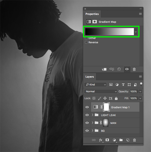
Next, click on the Adjustment Layer icon at the bottom of the Layers Palette and add the ‘Gradient Map…’ from the dropdown menu.
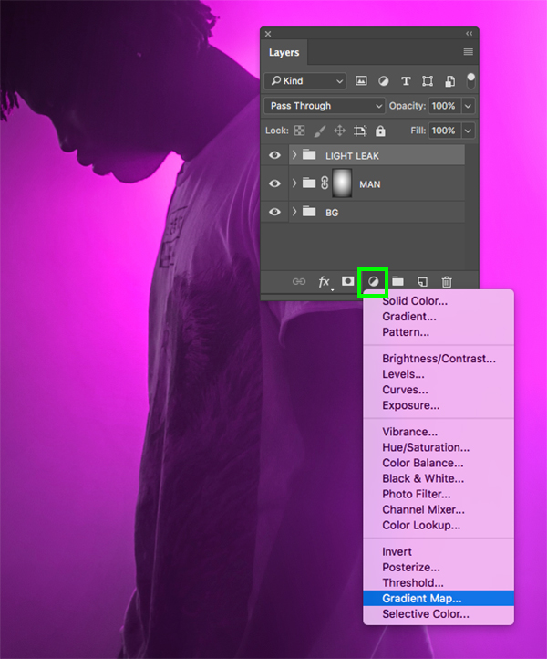
Click on the color strip in the Properties panel to modify the colors in the Gradient Map.
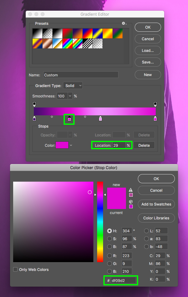
The first color all the way to the left side will be ‘#430E6C’.

Click along the gradient to add a second color and notice the ‘Location’ is set to ‘29%’. For the fill color let’s enter the hex value ‘#DF09D2’ and then click ‘OK’ to continue.
Click along the gradient to add a third color with a ‘Location’ of ‘55%’ and change the hex value to ‘#F190FF’ and then click ‘OK’ once again to continue.
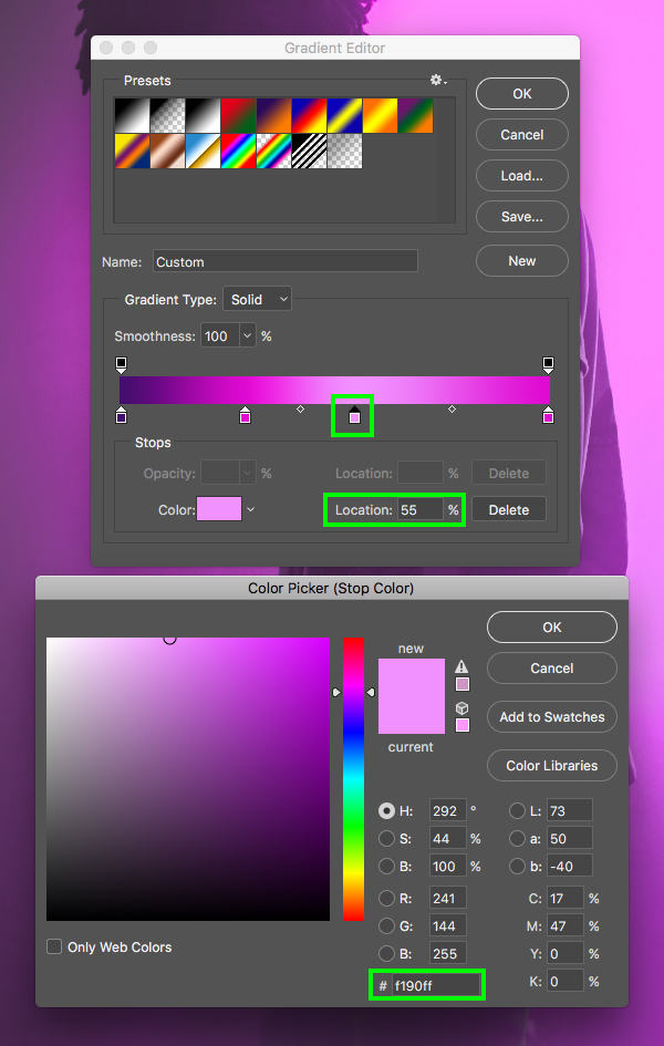
Now let’s edit the last color and change the value to ‘#DF09D2’ so that it will match our second color. After modifying these four values in the Gradient Editor, press ‘Return’ on the keyboard or click ‘OK’ to close out and apply the changes.

From here, change the Blend Mode of the Gradient Map Adjustment Layer from ‘Normal’ to ‘Luminosity’ and then drop down the opacity to about ‘40%’ to add a bit more of a foggy effect for atmosphere.
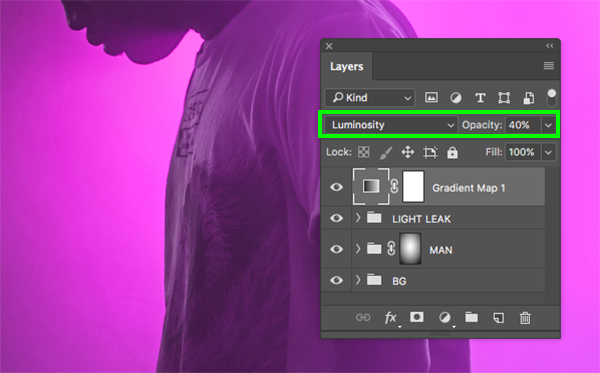
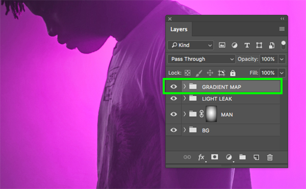
Lastly, select the Gradient Map Adjustment Layer, press Command/Ctrl+G to put it into a folder and double click the ‘Group 1’ text to rename the folder ‘GRADIENT MAP’ as shown below:
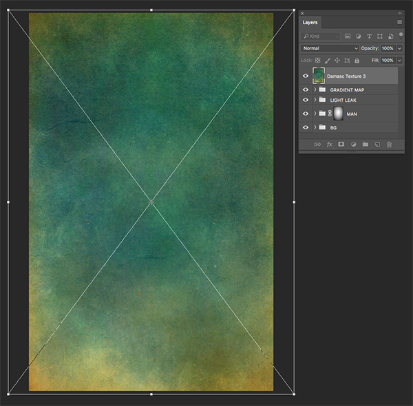
Step 14: Texture Overlay
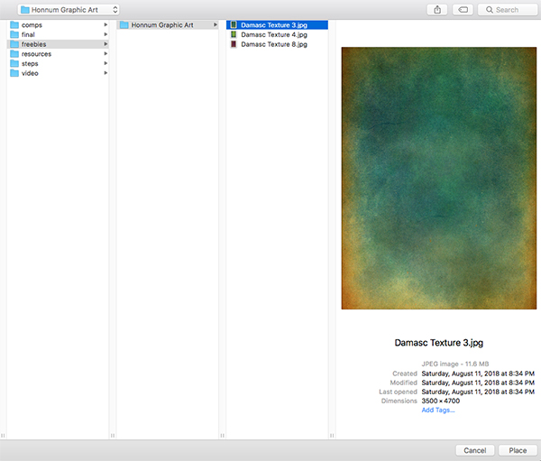
Go to the File menu and choose ‘Place Embedded…’ to bring in our next image.
Navigate to the freebies folder for the tutorial and then select the ‘Damasc Texture 3.jpg’ file and choose ‘Place’ to bring it into Photoshop as a Smart Object.
After bringing in the image, drag outwards while holding Alt/Option+Shift to scale it up proportionally from the center until it completely fills the canvas.
Step 15: Texture Contrast
With the new texture Smart Object layer selected, hold the Alt/Option key and click on the Adjustment Layer icon at the bottom of the Layers Palette before choosing ‘Levels…’ from the menu.
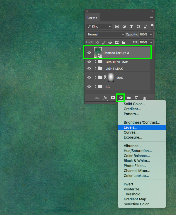
Check off the box that says ‘Use Previous Layer to Create Clipping Mask’ and then click ‘OK’ or press ‘Return’ on the keyboard to continue.

Next, in the Properties panel, move the left slider in towards the middle until it’s set to ’59’ and move the right slider in towards the middle until it’s set to ‘234’ as shown here:

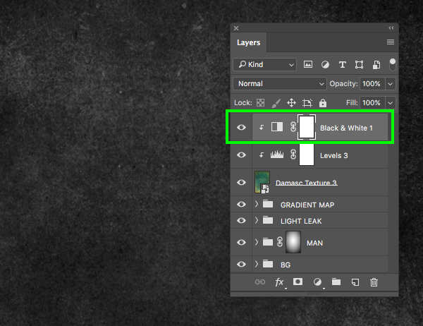
Step 16: Texture Desaturation
Since we already have a Levels Adjustment Layer with a Clipping Mask applied to it we can now just select our texture layer and add another Adjustment Layer that will automatically have a Clipping Mask. To do this, select your texture layer, click on the Adjustment Layer icon at the bottom, and then choose ‘Black & White…’ from the list that appears.

The Black & White Adjustment Layer will be added below the Levels Adjustment, but instead we want it to be on top. To shift the positioning of the layer select the Black & White Adjustment Layer and then use the keyboard shortcut Command/Ctrl and the right bracket to move it up one spot.
Now select the texture Smart Object layer and change the Blend Mode from ‘Normal’ to ‘Soft Light’ and reduce the opacity to about ‘60%’ by pressing the number ‘6’ on the keyboard. You should now have a nice subtle grunge texture effect that blends nicely with the image underneath.

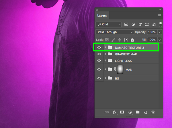
Step 17: Texture Group
From here let’s select the very top layer, which in this case is our ‘Black & White 1’ Adjustment Layer, and then hold the Shift key and select the ‘Damasc Texture 3’ Smart Object layer so all three of these layers are selected together.

With your layers still selected, press Command/Ctrl+G to place them into a new folder and double click the ‘Group 1’ text to rename the folder ‘DAMASC TEXTURE 3’ or feel free to use another descriptive name of your choice.
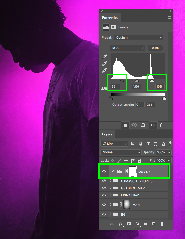
Step 18: Group Levels Adjustment
Now let’s select the main ‘DAMASC TEXTURE 3’ folder, and then hold the Alt/Option key and click on the Adjustment Layer icon at the bottom of the Layers Palette. From here we will add a ‘Levels…’ from the list that appears to apply an adjustment to the entire folder.

Once again check off the box that says ‘Use Previous Layer to Create Clipping Mask’ and then click ‘OK’ or press ‘Return’ on the keyboard to apply the changes and continue.
In the Properties panel let’s now move the left slider in towards the middle until it’s set to ’52’ and move the right slider in towards the middle until it’s set to ‘196’ as shown below:
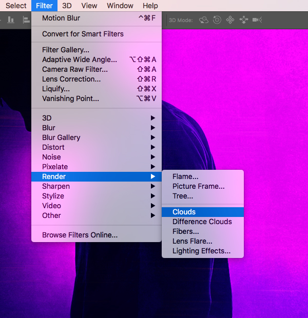
Step 19: Big City Lights
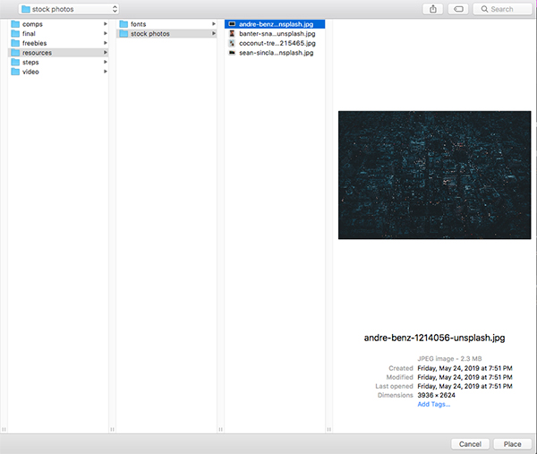
Next, download this aerial view of the city and save it with the other stock photos that we have used throughout the tutorial. Once you have done that, return to Photoshop and then go to the File menu and choose ‘Place Embedded…’ from the dropdown. Then, navigate to the folder where your image is saved and select the aerial shot before choosing ‘Place’ from the lower right hand corner of the window.
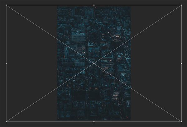
After bringing in the image, scale it up from the center by holding Alt/Option+Shift and dragging outwards from any of the four corners of the bounding box until the city image completely covers the height of the canvas as shown here:
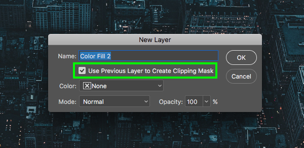
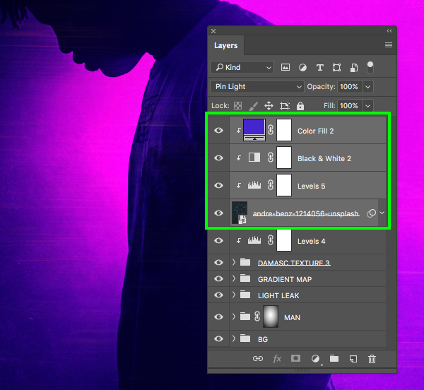
With the city Smart Object selected, hold the Alt/Option key and click the Adjustment Layer icon at the bottom before choosing ‘Solid Color…’ from the dropdown.
Check off the box that says ‘Use Previous Layer to Create Clipping Mask’ and then click ‘OK’ to continue.
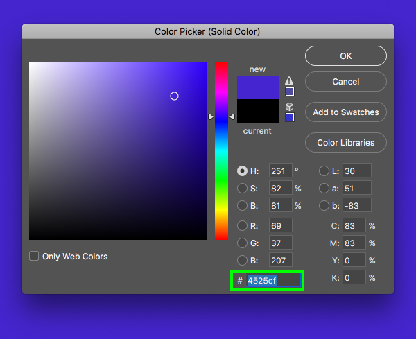
Enter the hex value ‘#4525CF’ and then press ‘Return’ or click ‘OK’ to apply the changes.
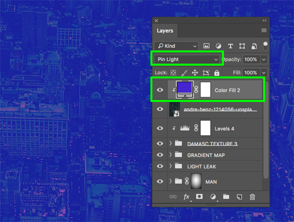
Change the Blend Mode of the newly added ‘Color Fill 2’ layer from ‘Normal’ to ‘Pin Light’.
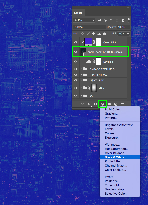
Step 20: Black & White
With the city Smart Object selected, return to the Adjustment Layer icon at the bottom of the Layers Palette and add a Black & White Adjustment Layer, leaving the Blend Mode set to ‘Normal’ to desaturate the image.
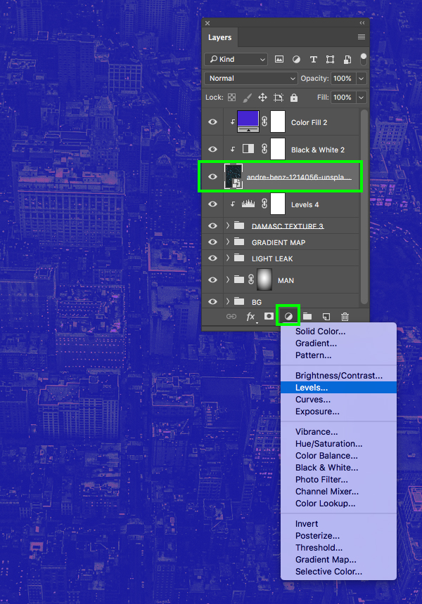
Step 21: Adjusting The Contrast
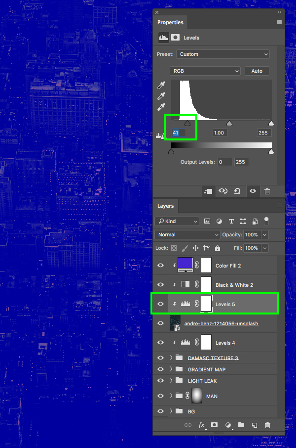
With the city Smart Object layer still selected, return to the Adjustment Layer icon and this time add a Levels Adjustment Layer.
The Levels Adjustment Layer will automatically be clipped to the city image so all we need to do here is move the left slider in towards the center until it’s set to ’41’ or so to increase the contrast.
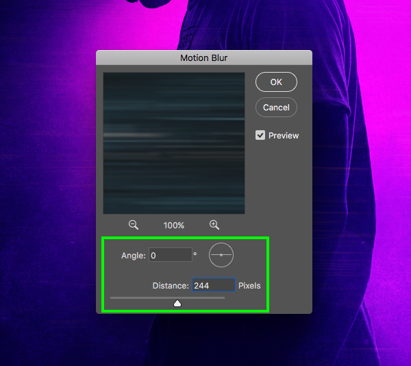
Step 22: Blending The City
With the city Smart Object layer selected in your Layers Palette, change the Blend Mode from ‘Normal’ to ‘Soft Light’ as shown here:

Next, go to the Filter menu and choose ‘Blur > Motion Blur…’ from the dropdown menu.
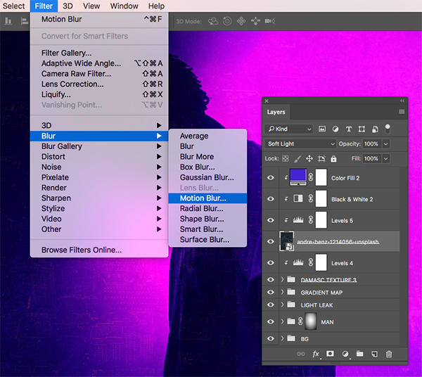
For the ‘Angle’ we can set it to ‘0’ and then for the ‘Distance’ let’s put in a value of ‘244’ and then press ‘OK’ to apply the effect and continue.
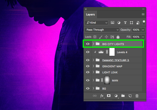
Step 23: Big City Folder
Select the top ‘Color Fill 2’ Adjustment Layer, then hold the Shift key and select the main city Smart Object so the top four layers are selected simultaneously.
With the layers still selected, press Command/Ctrl+G to place them into a new folder and double click the ‘Group 1’ text to rename the folder ‘BIG CITY LIGHTS’ or another descriptive name of your choosing.
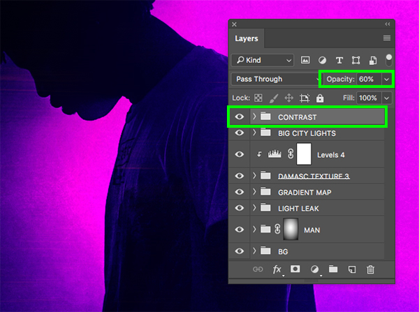
Step 24: Overall Contrast
Make sure that your top ‘BIG CITY LIGHTS’ folder is selected, and then go to the Adjustment Layer icon and add a ‘Curves…’ layer at the top of your Layers Palette. This Adjustment Layer does not need a Clipping Mask as we want it to affect all of the layers below. After adding the Curves Adjustment Layer, create a point in the center of the grid and move it down and to the right so that the ‘Input’ is set to ‘150’ and the ‘Output’ is set to ‘112’ as shown in the image below:

After that, let’s go ahead and add a ‘Levels…’ to the very top of the Layers Palette and then move the left slider in towards the center so that it’s set to ’15’ as shown here:

Now that we have added these two Adjustment Layers to the top of the Layers Palette, let’s select the first one, hold the Shift key, and select the second one below so they are both selected together.

Press Command/Ctrl+G to place both of these Adjustment Layers into a new folder and rename it ‘CONTRAST’ before reducing the opacity to about ‘60%’ by simply pressing the number ‘6’ on the keyboard when the folder is selected.
Step 25: Feeling Humid
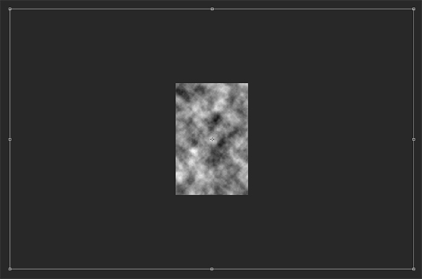
Let’s add a new layer to the top of our Layers Palette and rename it ‘CLOUDS’ as shown here:

Next, reset your default colors by pressing ‘D’ on the keyboard and then go to the Filter menu and choose ‘Render > Clouds’ from the menu to fill the new layer with black and white clouds.
Select the ‘CLOUDS’ layer and press Command/Ctrl+T to do a Free Transform, and then hold the Control key, click the layer, and choose ‘Rotate 90º Clockwise’ from the menu to rotate the clouds horizontally.

After rotating the clouds, hold the Alt/Option + Shift keys and drag outwards from any of the four corners of the bounding box to scale the clouds way up from the center until they are about the same size as the image below:
From here, change the Blend Mode of the layer to ‘Overlay’ and drop the opacity down to ‘70%’.

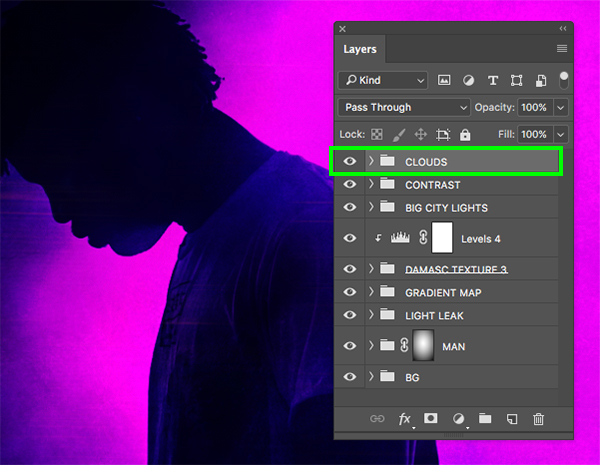
Now we will select the layer, press Command/Ctrl+G to put it into a folder and call it ‘CLOUDS’.
Step 26: Adding More Grunge
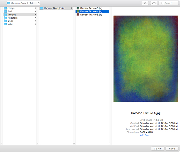
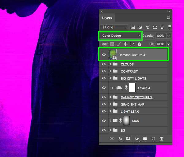
Return to the File menu and choose ‘Place Embedded…’ once again. This time we will navigate to the freebies and select the ‘Damasc Texture 4.jpg’ before clicking ‘Place’ from the lower right corner.
Hold the Alt/Option + Shift keys and drag outwards from any of the corners of the bounding box to scale the texture up so that it just extends beyond the live area of the document.
After resizing and placing the texture, change the Blend Mode of the layer to ‘Color Dodge’ as shown below:
Step 27: Texture Adjustments
Make sure that the top ‘Damasc Texture 4’ Smart Object layer is selected and then hold the Alt/Option key and click on the Adjustment Layer icon at the bottom of the Layers Palette before choosing ‘Black & White…’ from the menu.
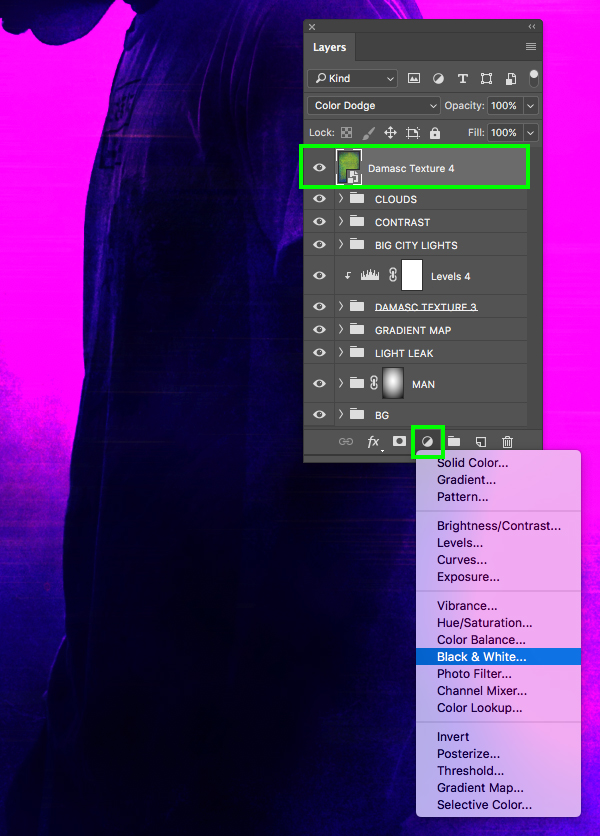
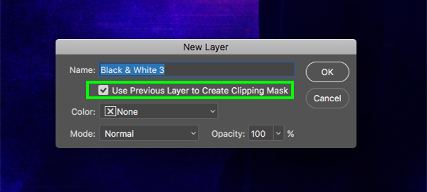
Check off the box that says ‘Use Previous Layer to Create Clipping Mask’ and then press ‘Return’ on the keyboard or click ‘OK’ to continue.
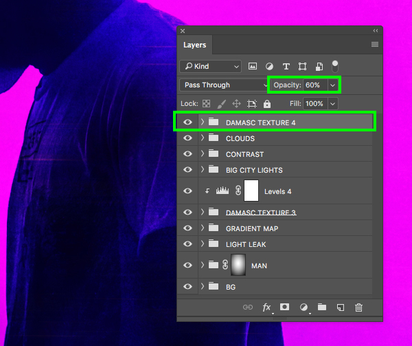
After adding the Black & White Adjustment Layer with a Clipping Mask, leave the Blend Mode set to ‘Normal’ and then put these two layers into a new folder called ‘DAMASC TEXTURE 4’ and reduce the opacity to about ‘60%’ to make it a bit more subtle.
Step 28: Warming Up The Image
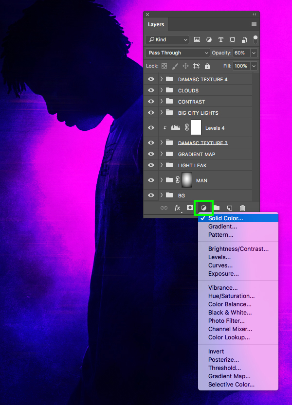
With the very top folder in the Layers Palette selected, return to the Adjustment Layer icon at the bottom and choose ‘Solid Color…’ from the menu.
For the fill color, enter the hex value ‘#FF7800’ and then press ‘OK’ to apply the changes and continue.

Next, change the Blend Mode of the ‘Color Fill 3’ layer to ‘Multiply’ and reduce the opacity to about ‘20%’ by pressing the number ‘2’ on the keyboard.

Step 29: Bring The Noise
Create a new layer at the top of your Layers Palette and fill it with solid black. After that, rename the layer ‘NOISE’ as shown here:

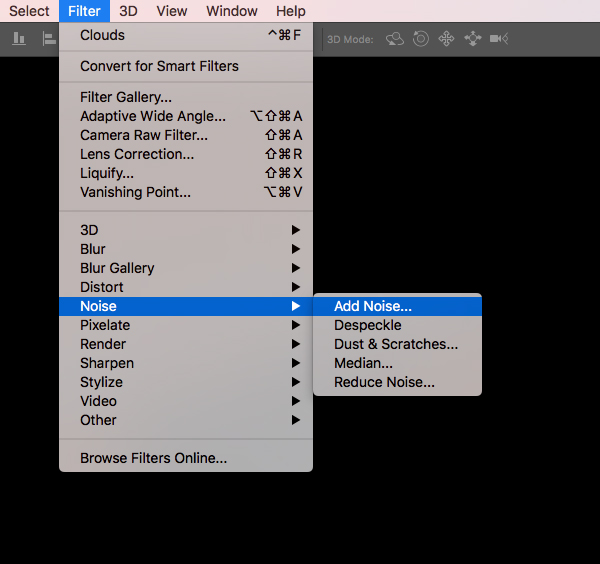
With the ‘NOISE’ layer selected, go to the Filter menu and choose ‘Noise > Add Noise…’ from the list.
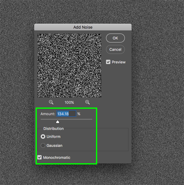
In the ‘Add Noise’ panel, make sure to check off ‘Uniform’ and ‘Monochromatic’ before setting the ‘Amount’ to about ‘134%’ and then click ‘OK’ to apply the effect.
After adding some noise and grain to the image, let’s change the Blend Mode of the layer to ‘Screen’ and drop the opacity down to about ‘30%’ by pressing ‘3’ on the keyboard. This will add a subtle but effective bit of grain to the overall image helping it feel a bit more vintage and retro.
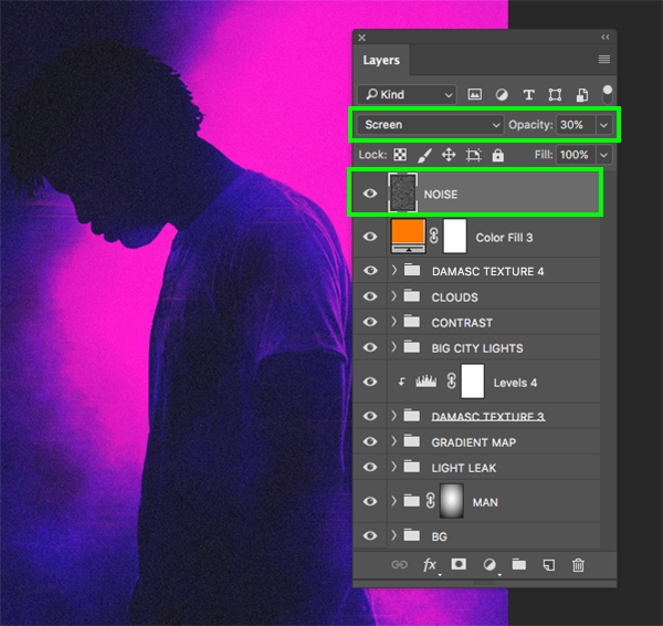
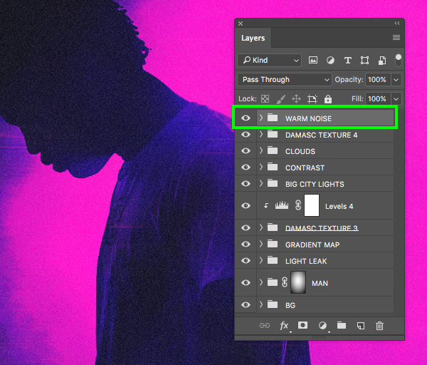
Select the top ‘NOISE’ layer, then hold the Shift key and select the Color Fill Adjustment Layer below it so both of these two layers are selected together. From there, press Command/Ctrl+G to place them into a folder and rename it ‘WARM NOISE’ as shown below:
Step 30: Extra Texture
Go to the File menu once again and choose ‘Place Embedded…’ from the dropdown before navigating to the freebies folder and choosing the ‘Damasc Texture 8.jpg’ file and then clicking ‘Place’ from the lower right to bring it into our document.
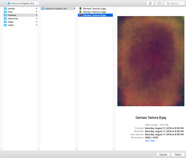
Hold the Alt/Option + Shift keys and scale the texture up from the center until it just extends beyond the live area in our workspace.

Change the Blend Mode of this texture layer from ‘Normal’ to ‘Screen’ as shown below:

Step 31: Texture Tweaks
With the top texture Smart Object layer selected, hold the Alt/Option key and click on the Adjustment Layer icon before selecting ‘Black & White…’ from the menu.
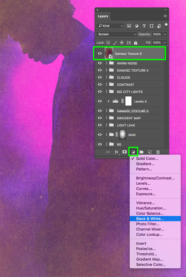
Check off the ‘Use Previous Layer to Create Clipping Mask’ box and then click ‘OK’ to continue.
Step 32: Texture Contrast
Select top texture Smart Object layer again and then return to the Adjustment Layer icon and this time choose ‘Levels…’ from the list.

Now let’s move the left slider way in towards the center until it’s set to ‘122’ and we will crunch the texture a bit to make it darker.
From here let’s place the texture and both of the Adjustment Layers that are clipped to it into a new folder called ‘DAMASC TEXTURE 8’ as shown in the image below:

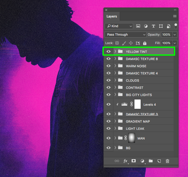
Step 33: Yellow Tint
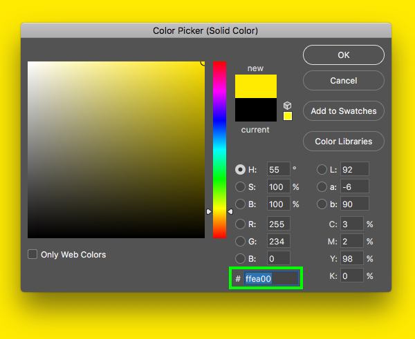
With the top ‘DAMASC TEXTURE 8’ folder selected, click the Adjustment Layer icon and then select ‘Solid Color…’ from the dropdown.
Here we will enter a hex value of ‘#FFEA00’ which is a vibrant yellow color. Once you have done that, press ‘Return’ on the keyboard or click ‘OK’ to apply the changes and continue.
Next we will change the Blend Mode of the Adjustment Layer to ‘Color’ and reduce the opacity to about ‘10%’ to make it a very subtle tint.
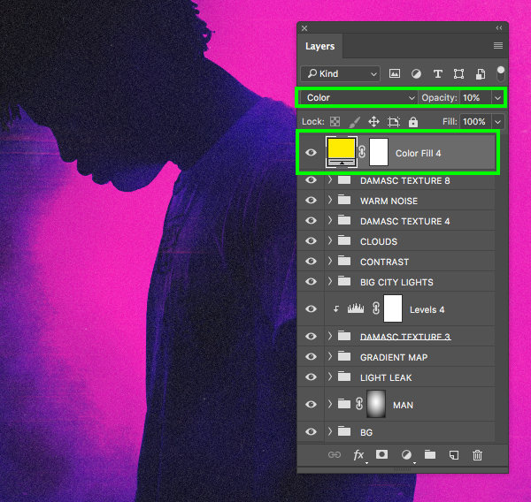
Now we will place this Adjustment Layer into a folder of it’s own and rename it ‘YELLOW TINT’ just to continue to keep things neat and orderly.
Step 34: Radio Text
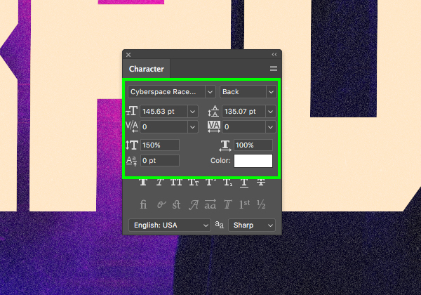
Next, download the free ‘Cyberspace Raceway’ typeface from Dafont.com. Once the font is installed return to Photoshop and create a new layer just above the ‘CLOUDS’ folder. Switch to the Type Tool (T) and then type out the word ‘RADIO’ in all uppercase. Once you have done that, go to the Window menu and open the Character panel so that we can modify our text. Here we want to set the size to about ‘145.5 pt’ with a solid white fill as shown below:
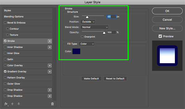
Double click on the text layer to open the Layer Style panel and then check off the ‘Stroke’ option and use the color ‘#08024C’ for the outline and apply the other settings shown below:
Next, check off the ‘Gradient Overlay’ option with the following settings and then click on the ‘Gradient’ section to modify the colors.
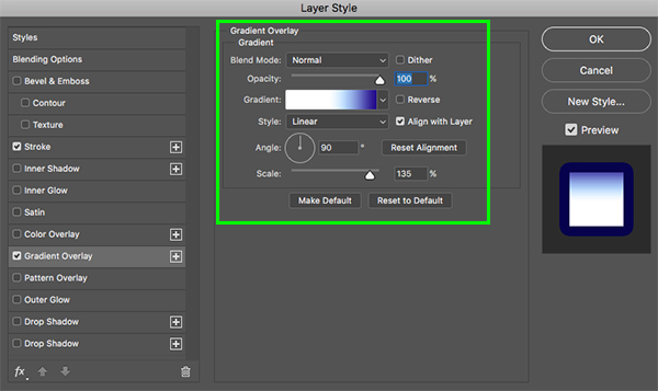
The first color will be solid white and the ‘Location’ for this should be ‘48%’ as shown here:
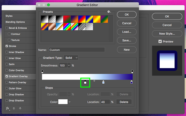
Our second color will have a ‘Location’ of ‘68%’ and here we will use the fill color ‘#A8C6F3’ as shown below:
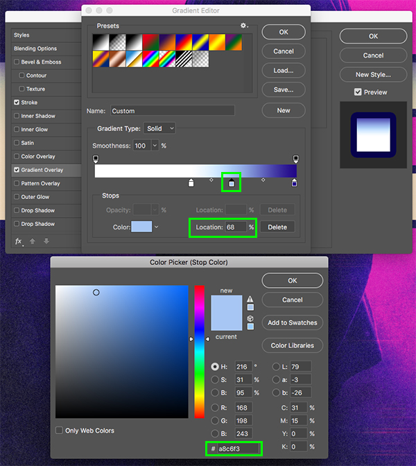
Our third color in the gradient will have a ‘Location’ of ‘99%’ and here we will enter the hex value ‘#220888’ and the click ‘OK’ to apply the changes and return to the document.

Here is how the effect should look so far:
Step 35: Box Fill
Create a new layer just above the ‘RADIO’ text and use the Marquee Tool (M) to draw out a wide rectangle that covers the bottom half of the text. After that, press ‘D’ to reset your default colors and then ‘X’ to toggle between the foreground and background until your foreground color is white. From here, press Alt/Option+Delete on the keyboard to fill the shape with solid white. After that, press Command/Ctrl+D to deselect.
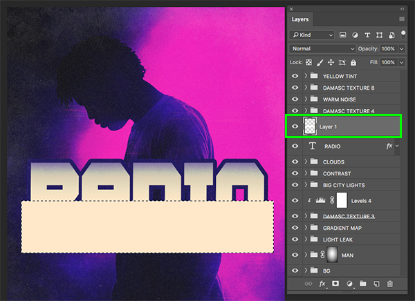
Double click on the layer to once again open the Layer Style panel and apply an ‘Inner Glow’ effect with the following settings:
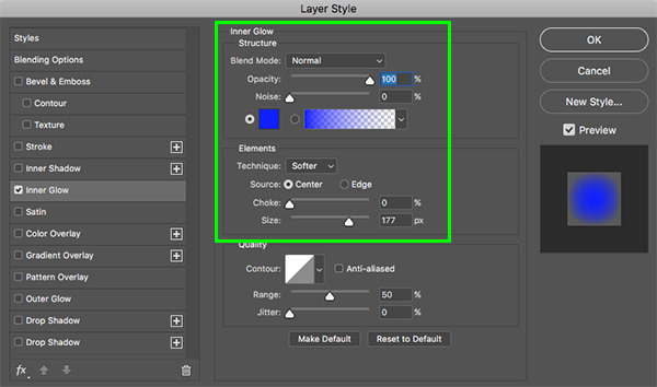
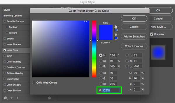
For the Inner Glow color, use the hex value ‘#1021FF’ and then click ‘OK’ to apply the changes and continue.
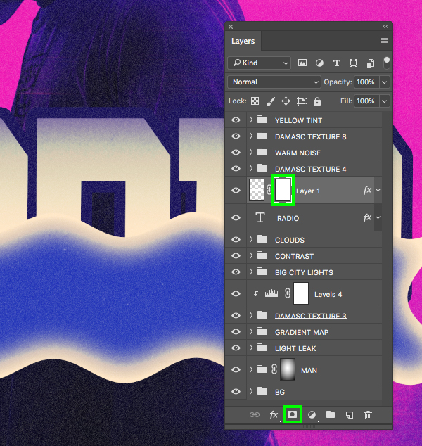
Step 36: Wavy Lines
Select the white rectangle layer and then go to the Filter menu and choose ‘Distort > Wave…’ from the menu.

Here we want to apply the following settings:
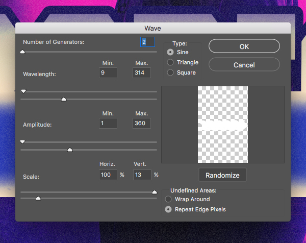
After applying the filter here is how the effect should look:

Step 37: Wavy Line Mask
After applying the wave, click the ‘Add layer mask’ icon at the bottom of the Layers Palette to add a mask to the layer as shown here:
Press ‘X’ to change your foreground color to solid black and then ‘G’ to switch to the Gradient Tool. In the top toolbar we now want to select a black-to-transparent Linear Gradient.
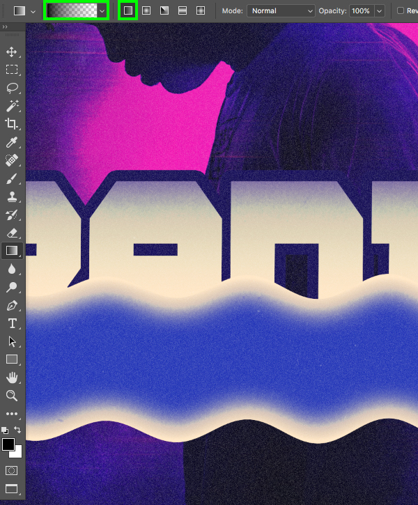
Once we have our Gradient Tool set up, make sure that the mask on the rectangle layer is selected and click and drag from the bottom up to fade out the bottom of the box like this:
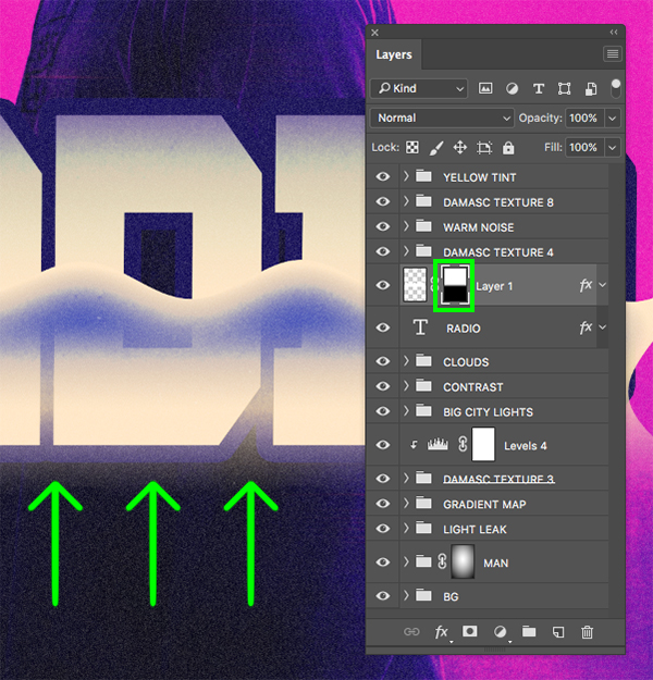
Next, with the layer still selected, press Command/Ctrl+G to place it into a folder and rename it ‘WAVE’ before moving on.
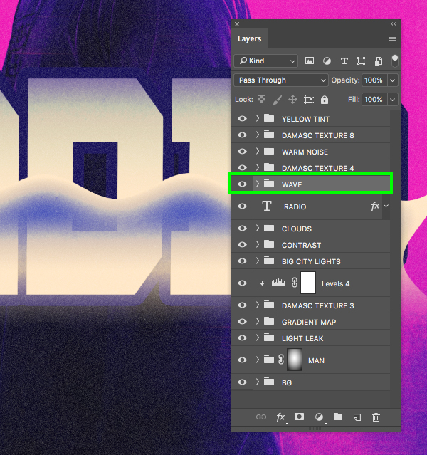
Hold the Command/Ctrl key and click the layer thumbnail icon of the ‘RADIO’ text layer to activate a selection around the letters.
With your selection still active, select the ‘WAVE’ folder and then click the ‘Add layer mask’ icon from the bottom of the Layers Palette to apply a new mask to the entire group.

Step 38: Group FX
Double click on the ‘WAVE’ folder to bring up the Layer Style panel and then apply a ‘Gradient Overlay’ using the settings shown below:

For the gradient itself we will just be using black and white to create the following look:

After applying the effect, press ‘OK’ to return to the main document and let’s take a look at our text effect so far:

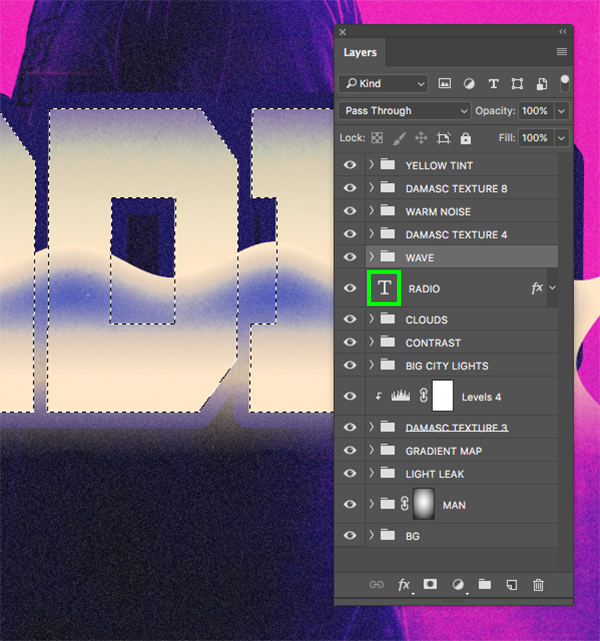
Step 39: Radio Copy
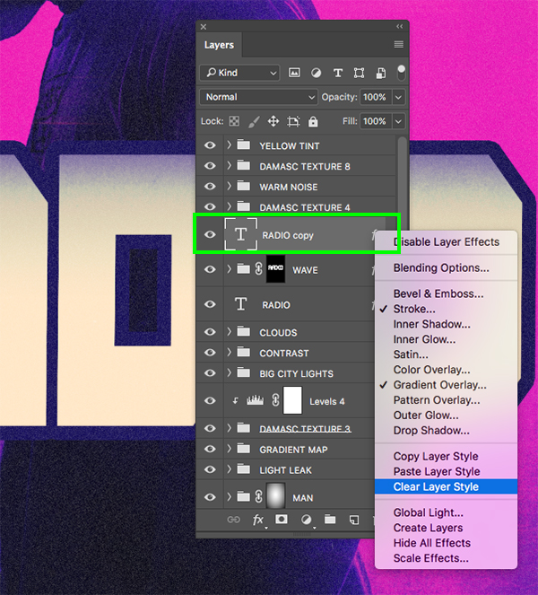
Select the ‘RADIO’ text layer and press Command/Ctrl+J to duplicate it, and then move this copy above the ‘WAVE’ folder. Once you have done that, hold the Control key and click the small ‘fx’ icon on the layer to reveal a dropdown where we want to select the ‘Clear Layer Style’ option to remove the effects.
After removing the effects from this new copy, bring the ‘Fill’ all the way down to ‘0%’ as shown here:

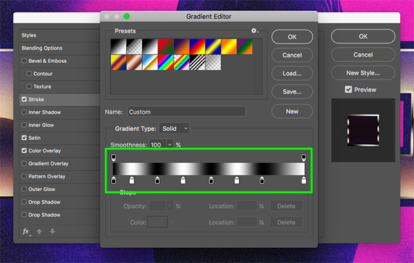
Double click on the layer to bring up the Layer Style panel and apply a ‘Stroke’ with the following settings:
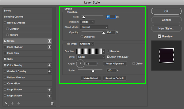
Here we will once again be using black and white to alternate and create a metallic effect like this:
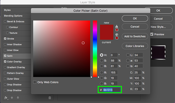
Now we will apply a ‘Satin’ effect with the following settings:
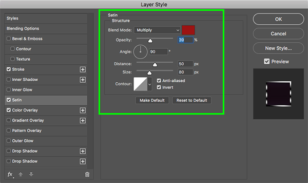
For the fill color let’s use the hex value ‘#9B1313’ and then click ‘OK’ to apply the change.
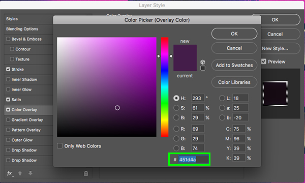
Next, check off the ‘Color Overlay’ option and change the Blend Mode to ‘Soft Light’.

For the fill color here we want to use the hex value ‘#451D4A’ and then apply the changes.
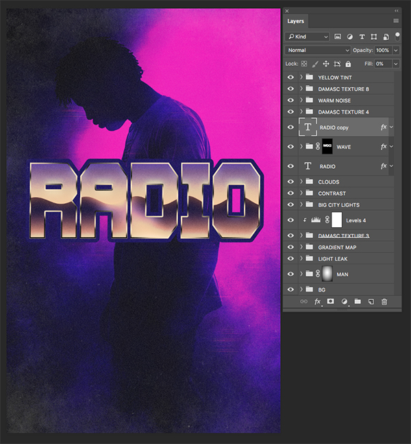
Now let’s take another look at how our effect is coming along:
Step 40: Extra Copy
Let’s make another copy of the ‘RADIO’ text layer and move it above the others before clearing the Layer Style effects and reducing the ‘Fill’ all the way down. This will make the layer appear invisible, only allowing the Layer Style effects that we apply to show up just like we saw in the previous step.

Let’s also reduce the ‘Opacity’ of this layer down to about ‘42%’ as shown in the image below:
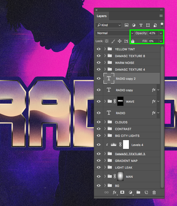
Double click on the layer to open the Layer Style panel once again and apply a new instance of the ‘Gradient Overlay’ with the following settings:

Here we will alternate black and white to create our metallic looking gradient in the following way:

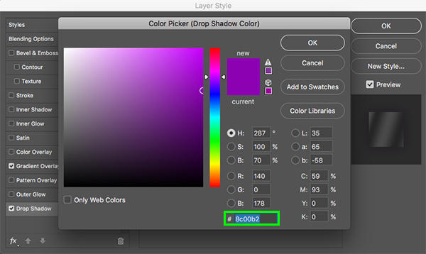
Let’s also go ahead and check off the ‘Drop Shadow’ option using the settings shown below:

For the shadow color use the hex value ‘#8C00B2’ and then click ‘OK’ or press ‘Return’ on the keyboard to apply the changes.
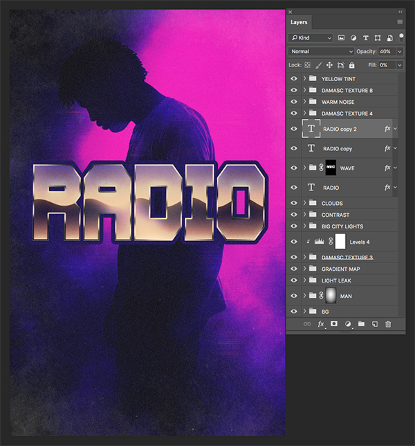
You will now see that we have a nice metallic looking stroke going around our text as we check back in:
Step 41: Painted Stroke
Hold the Command/Ctrl key and click on the layer thumbnail icon for one of the text layers to once again activate a selection around the letters.

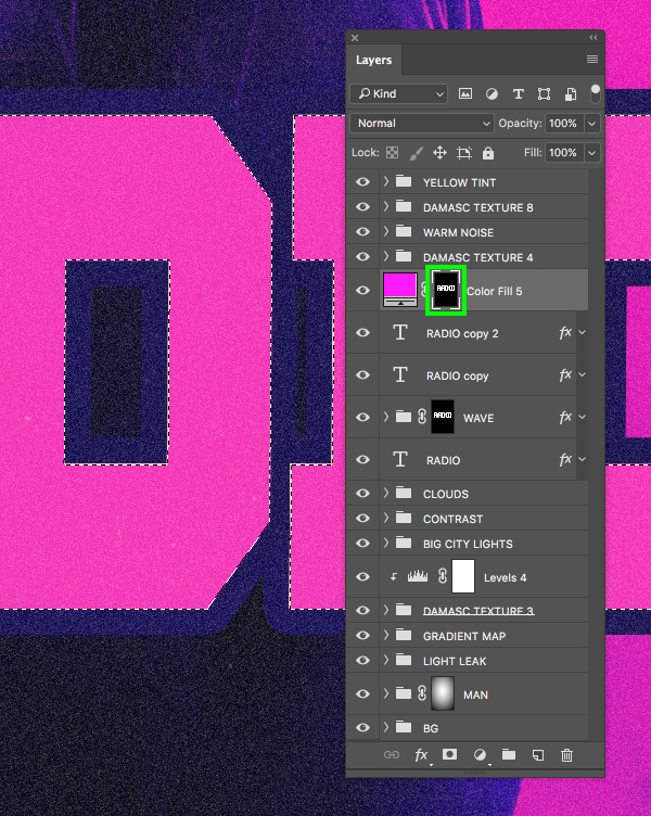
Now make sure that the top ‘RADIO copy 2’ layer is selected and then come down to the Adjustment Layer icon and add a ‘Solid Color…’ from the dropdown.
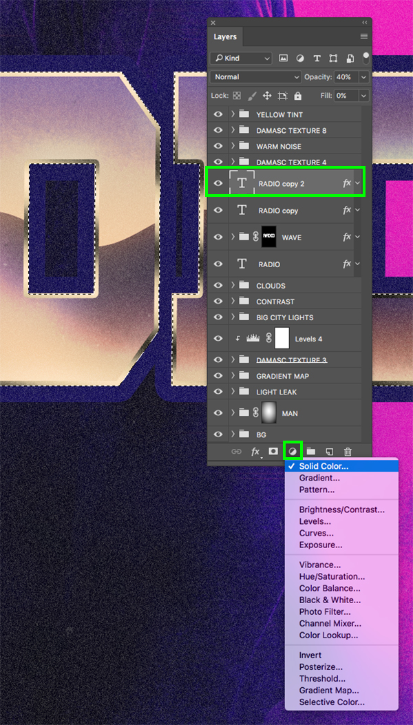
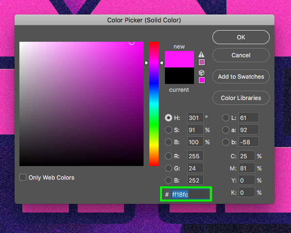
For the fill color let’s use a vibrant magenta such as the hex value ‘#FF18FC’ and then click ‘OK’ to apply the changes.
We should now have our magenta fill color with a mask applied so that it only appears inside of the letterforms. From here, hold the Command/Ctrl key and click on the mask to once again activate a selection around the letters.
With your selection still active, go to the Select menu and choose ‘Modify > Contract…’ from the list.
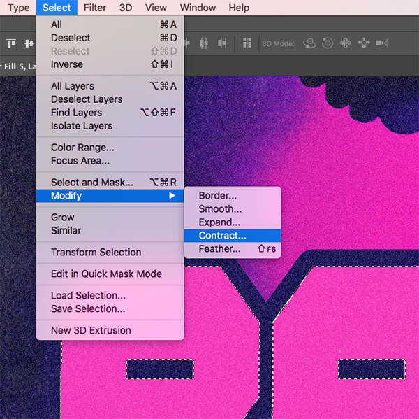
Enter a value of ’14’ and then press ‘Return’ or click ‘OK’ to continue.

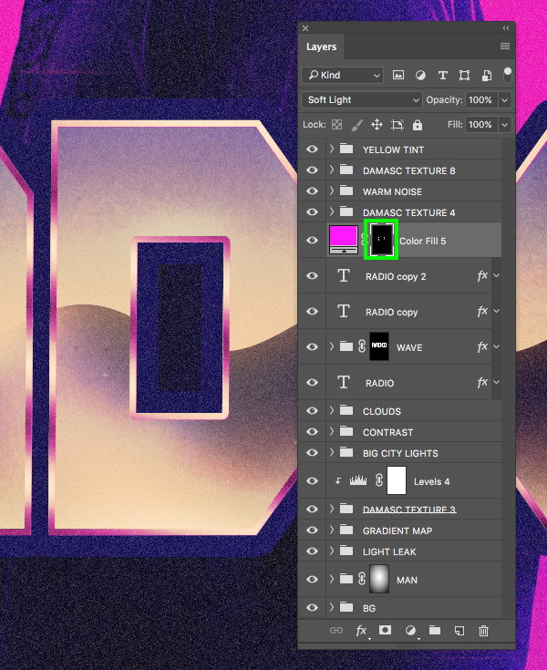
Make sure you have a solid black foreground color and that your mask is selected and then press Alt/Option+Delete on the keyboard. You should now have the magenta color only applied to the metallic stroke around the letters. Once you have that, change the Blend Mode of the ‘Color Fill 5’ layer to ‘Soft Light’ so that our gradient shows through.
Once again let’s check in and see how our effect is coming along as we continue to build it out:
Step 42: Adding Highlights
Press ‘G’ on the keyboard to switch back to the Gradient Tool and select a white-to-transparent Radial Gradient as shown here:
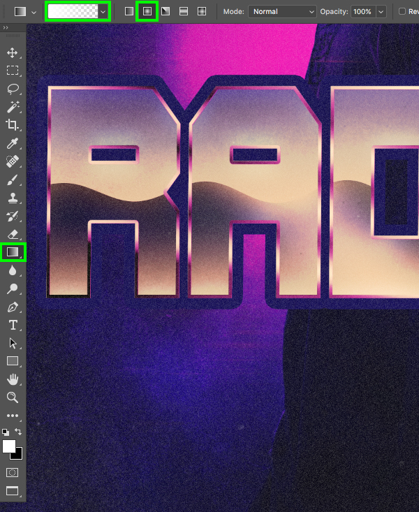
Click and drag outwards to create your gradient on a new layer just above the ‘Color Fill 5’ Adjustment Layer. Once you have done that, apply a Free Transform (Command/Ctrl+T) and drag either of the handles on the sides outwards while holding Alt/Option on the keyboard to stretch it into more of an ellipse she like this:

Next, change the Blend Mode of the layer from ‘Normal’ to ‘Overlay’. After that, hold the Command/Ctrl key and click on the layer thumbnail icon of one of the text layers to activate a selection around the letters.

Return to the Select menu and choose ‘Modify > Contract…’ once again.
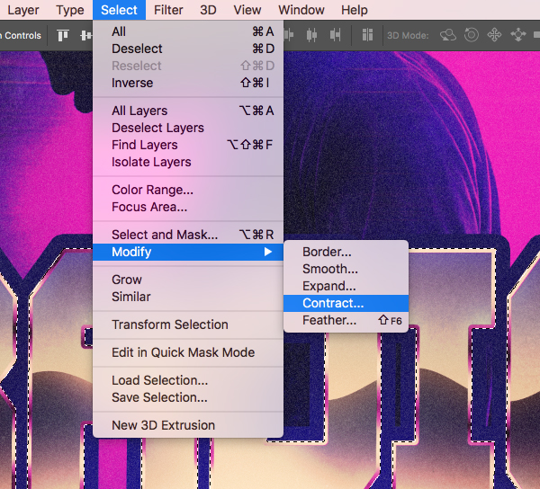
Enter a value of ’14’ and then press ‘Return’ or click ‘OK’ to continue.

After contracting the selection, click on the ‘Add layer mask’ icon while your highlight layer is active and this will keep the highlight on the inner portion of the text.
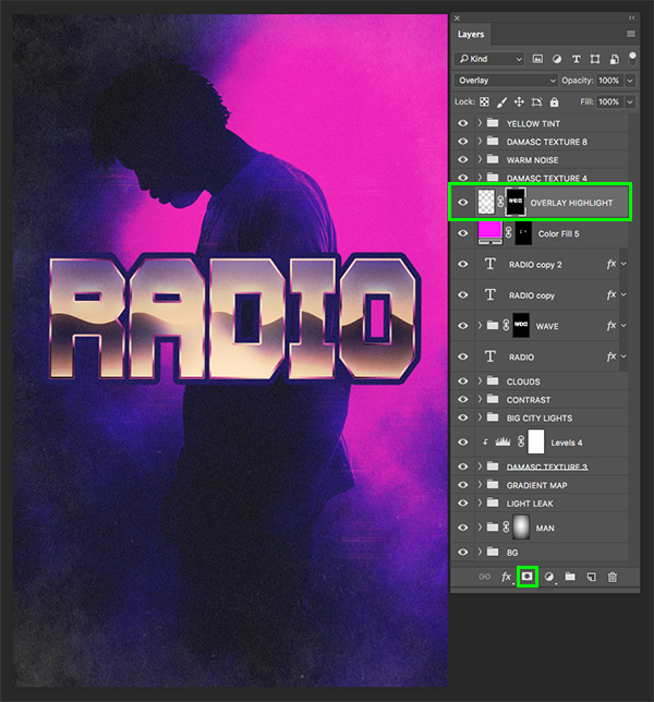
Step 43: Radio Group
Select the ‘OVERLAY HIGHLIGHT’ layer we created in the previous step, and then hold the Shift key and select the bottom copy of the ‘RADIO’ text layer.
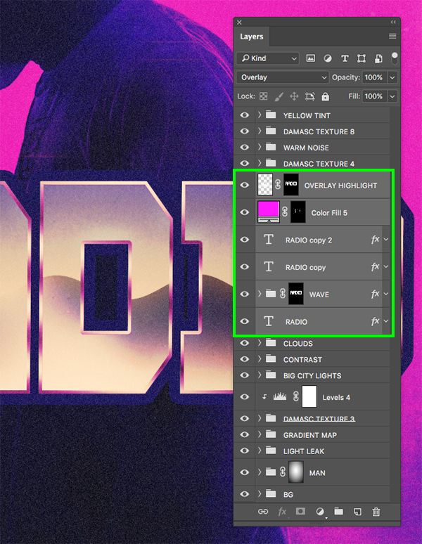
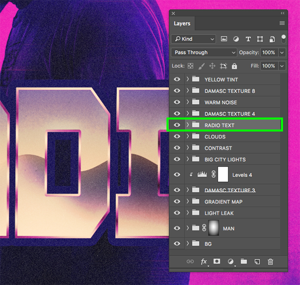
Press Command/Ctrl+G to place the layers into a new folder and rename it ‘RADIO TEXT’ as it will contain all of the effects and layers for the main text.
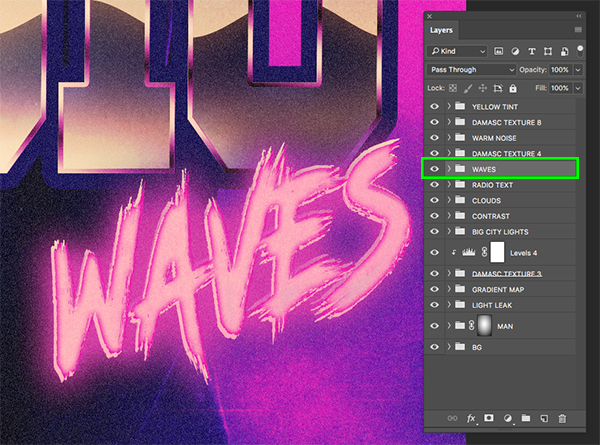
Step 44: Waves Text
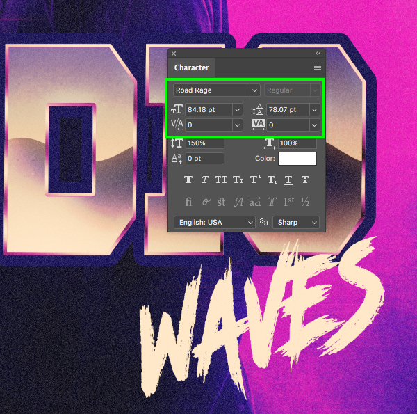
Next, download the free ‘Road Rage’ font from Dafont.com. Once the font has been installed, return to Photoshop and create a new layer just above the ‘RADIO’ folder. Switch to the Type Tool (T) and type out the word ‘WAVES’ in all caps. Use the Character panel to set the size of the text to about ’84 pt’ and then leave the fill set to solid white. Press Command/Ctrl+T to initiate a Free Transform and then rotate the text counter clockwise a bit and position it like the image shown here:
Double click on the layer to open the Layer Style panel and then apply an ‘Inner Shadow’ effect with the following settings:
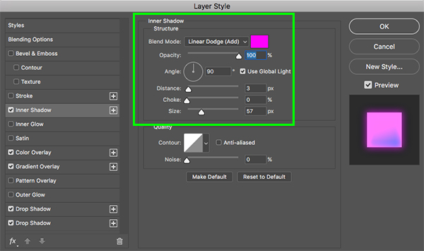
For the fill color enter the hex value ‘#FF00FC’ and then click ‘OK’ to apply the change.

Next let’s check off the ‘Color Overlay’ option and set the Blend Mode to ‘Screen’.
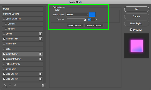
For the fill color enter the hex value ‘#0F75E8’ and then click ‘OK’ to apply the change.

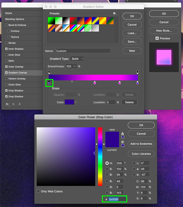
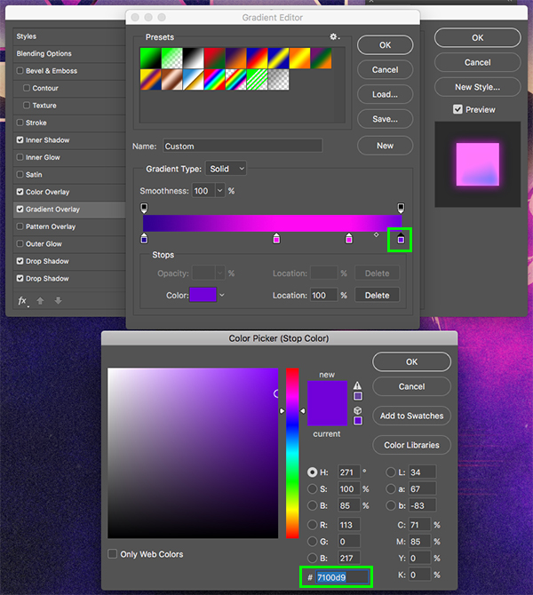
Now check off the ‘Gradient Overlay’ option using the following settings:

For the first color all the way to the left side of the gradient, use the hex value ‘#2E008F’.
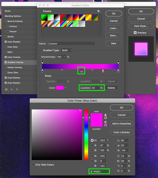
Our second color will have a ‘Location’ of ‘52%’ and will use the hex value ‘#FF08F2’.
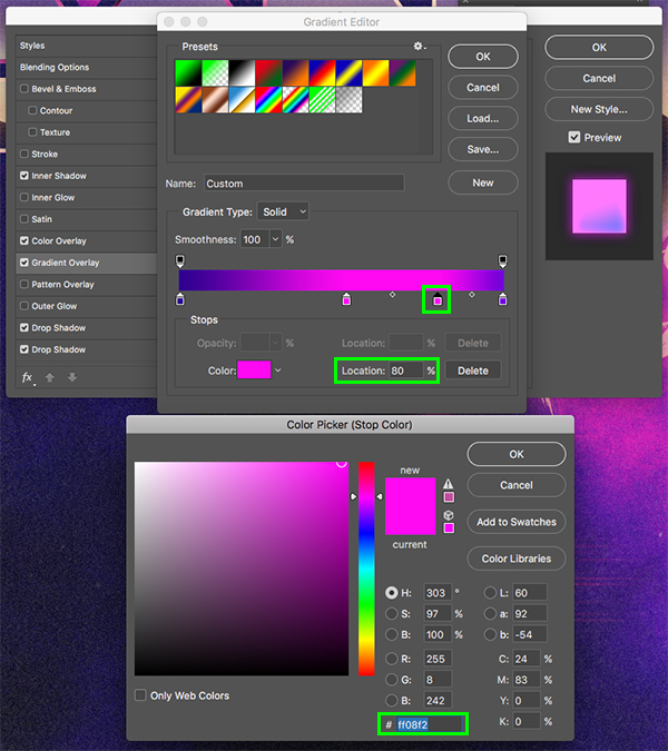
Our third color will have a ‘Location’ of ‘80%’ and this one we will use the hex value ‘#FF08F2’ so it matches the previous color.
The next color all the way to the right will use the hex value ‘#7100D9’.
Let’s now check off the ‘Drop Shadow’ effect at the bottom and apply the following settings:
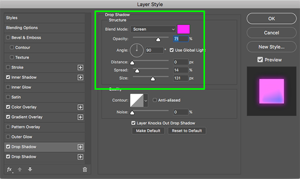
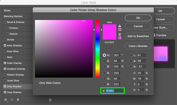
For the fill color enter the hex value ‘#FF28FC’ and then click ‘OK’ to apply the changes.
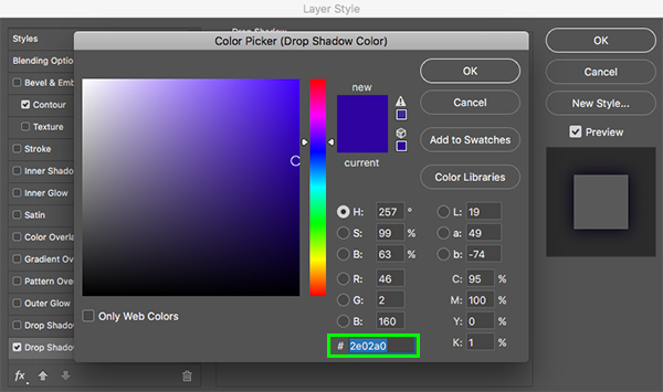
Now add another Drop Shadow effect below the previous one (to do this simply click the small ‘fx’ icon in the lower left and then use the down arrow to move it below the previous instance of the effect). Once you have done that, change the settings for this instance of the effect to match the ones used in the image below:
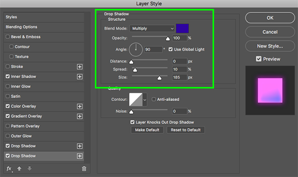
For this Drop Shadow let’s use the hex value ‘#2E02A0’. After that, click ‘OK’ or press ‘Return’ on the keyboard to apply all of the Layer Styles.

Now let’s see how our text is looking so far:
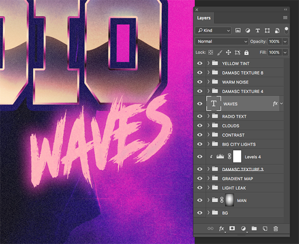
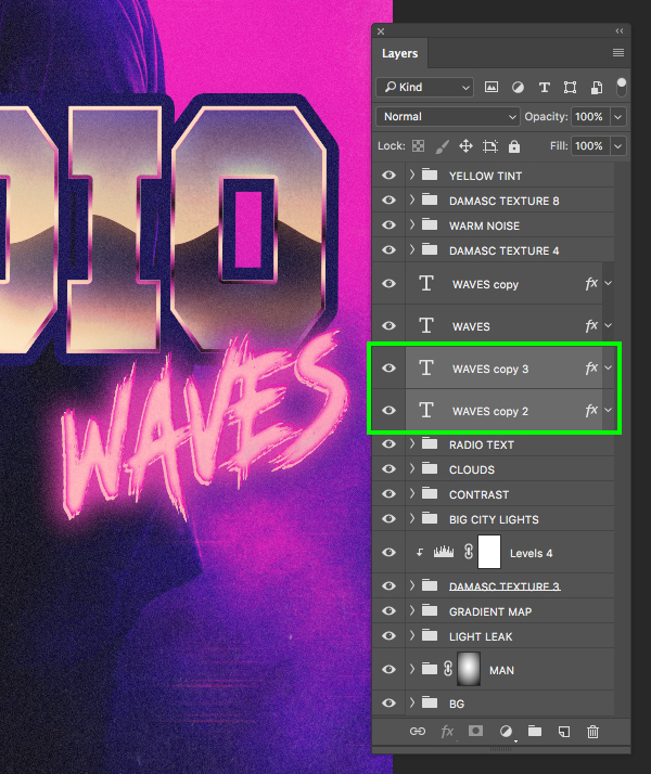
Step 45: Waves Copy
Press Command/Ctrl+J to duplicate the ‘WAVES’ text layer and then hold the Control key and click the small ‘fx’ icon before choosing ‘Clear Layer Style’ from the dropdown menu.
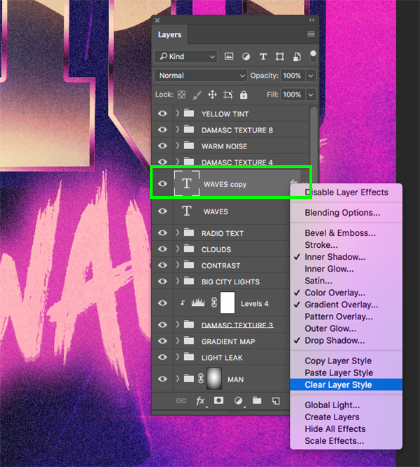
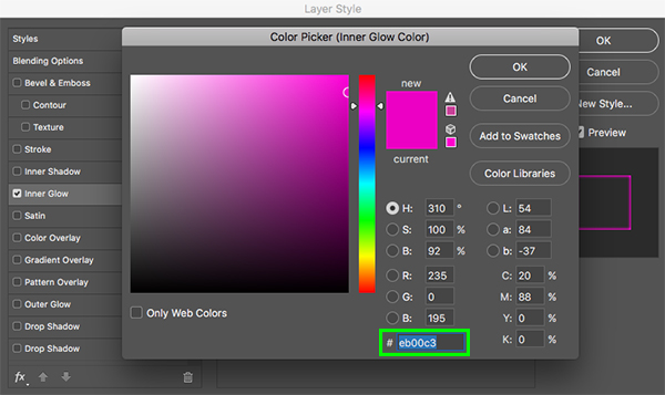
After that, double click on the layer and apply an ‘Inner Glow’ Layer Style using the following settings:

For the fill color enter the hex value ‘#EB00C3’ and then click ‘OK’ to apply the changes.
After applying the effects, reduce the ‘Fill’ of this top copy to ‘0%’ and then tap the up arrow a few times as well as the right arrow to offset it a bit. You should now have something like this:

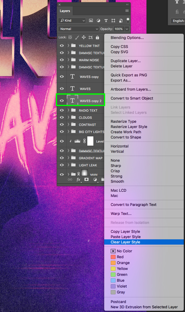
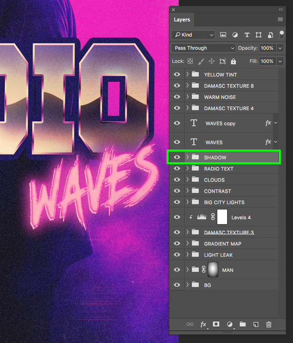
Step 46: Wave Shadows
Press Command/Ctrl+J to duplicate the ‘WAVES’ text layer again and move this copy below the previous two before choosing ‘Clear Layer Style’ from the dropdown menu like we did before.
Double click on the layer and apply a ‘Drop Shadow’ effect with the following settings:

For the fill color enter the hex value ‘#2E02A0’ and then press ‘OK’ to apply the changes.
Step 47: Shadow Group
Next, select the newest copy of the layer from the previous step and duplicate it by pressing Command/Ctrl+J to intensify the shadow a bit. After that, select the top copy, hold the Shift key, and select the copy below so both are selected together.
With both copies still selected, press Command/Ctrl+G to place them into a new folder and double click the ‘Group 1’ text to rename the folder ‘SHADOW’ as shown below:
Play with the offset of the top layer a bit more and then once you are happy with the way the text is looking select the top copy, hold the Shift key, and then select the ‘SHADOW’ folder.
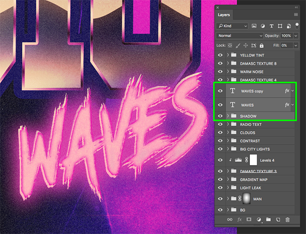
Press Command/Ctrl+G to place all of these layers into another new folder and rename it ‘WAVES’ to keep everything organized.
Step 48: Adding Some Flare
Create a new layer above the ‘WAVES’ folder and use the Radial Gradient to create a white-to-transparent gradient as shown here:
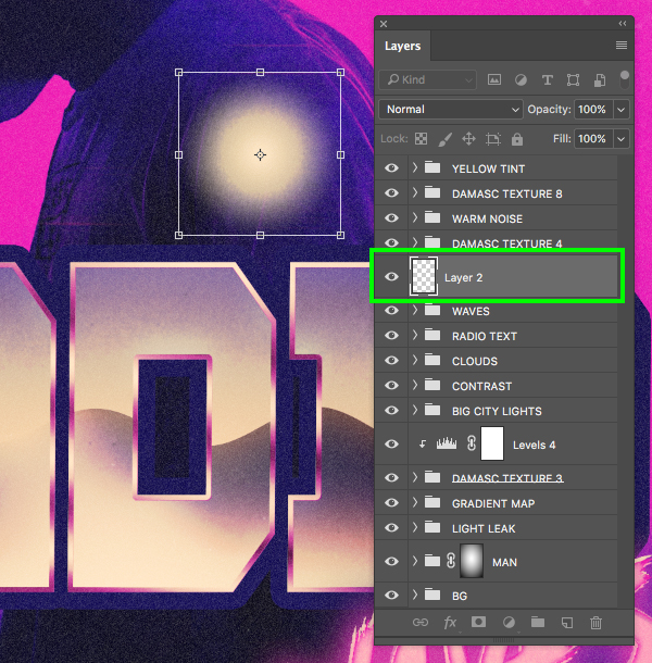
Change the Blend Mode of the layer to ‘Overlay’ and then duplicate it by pressing Command/Ctrl+J. Use a Free Transform to scale up the new copy proportionally from the center, and then reduce the opacity to about ‘50%’.
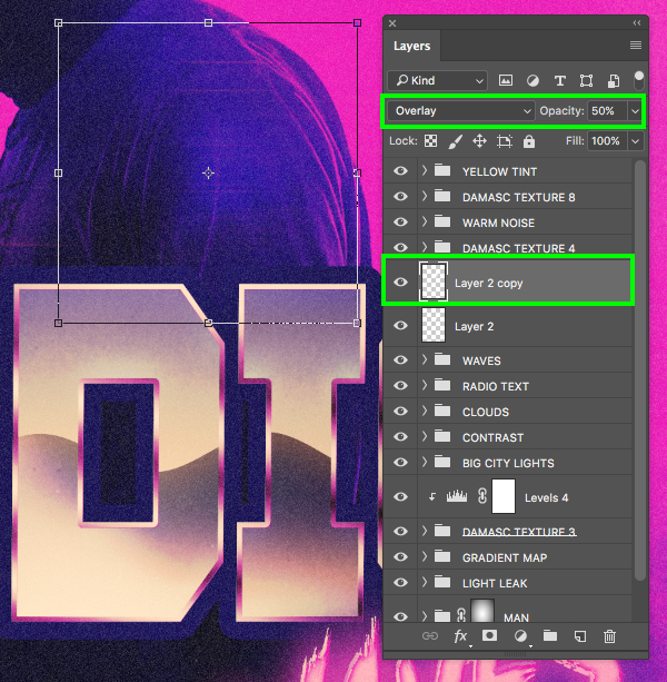
Create a third copy and make it smaller, and then create a forth copy and make it the smallest out of the whole group. For this top copy let’s also change the Blend Mode back to ‘Normal’.
Place all of these gradients into a new folder named ‘FLARE 1’ and place it over the upper left corner of the ‘R’ in ‘RADIO’ like this:
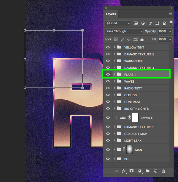
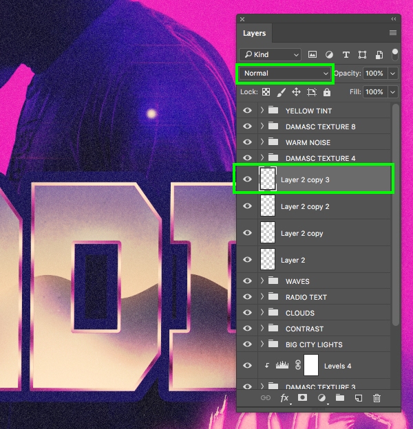
Create a few more copies of the flare and place them around the rest of the word so you end up with something like this:

After placing your flares over the text, let’s put all of those folders into a single ‘FLARES’ group.
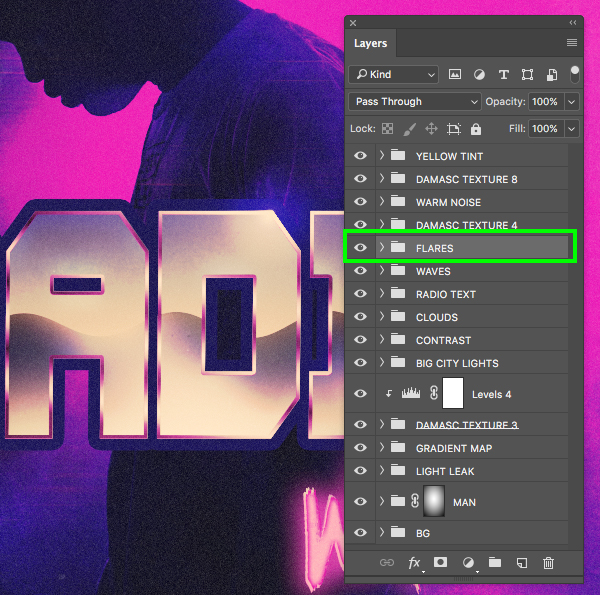
Step 49: Title Treatment
Now that our text effects are completely retro’d out let’s select the ‘FLARES’ folder, hold the Shift key, and then select the ‘RADIO TEXT’ folder so these three folders are selected at the same time:
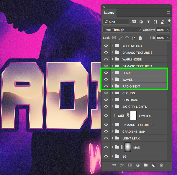
Press Command/Ctrl+G once again to place these three folders into a new group and rename it ‘TT’ for ‘Title Treatment’ so we now have all of our text effects and flares nestled into one nice and neat folder.
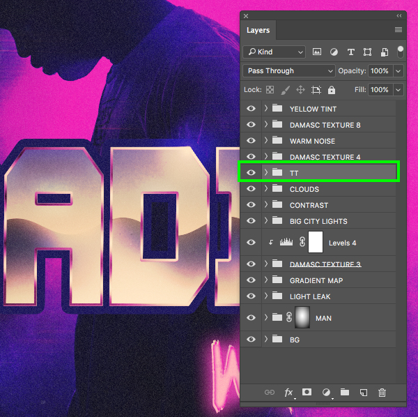
Step 50: Secondary Text
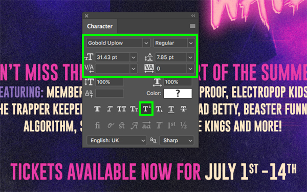
Next, download the free ‘Gobold’ typeface from Dafont.com and install it on your machine. After that, return to Photoshop and create a new layer just below the ‘TT’ folder and type out the line ‘DON’T MISS THE HOTTEST CONCERT OF THE SUMMER!’ in all caps. Let’s use the Character panel once again to change the typeface to ‘Gobold Uplow’ in the ‘Regular’ style, and then make the size about ‘31.5 pt’.
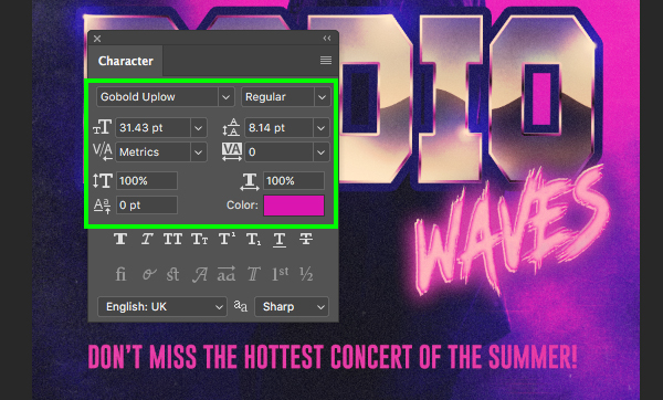
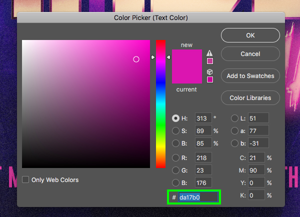
For the fill color let’s use the hex value ‘#DA17B0’ and then click ‘OK’ to apply the color change.
Step 51: Body Copy
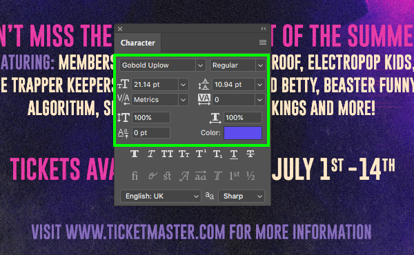
Use the Type Tool (T) to click at the end of the line of text from our previous step and then press the ‘Return’ key to go to the next line. Now we want to type out ‘FEATURING:….’ followed by a few lines of band names. All of these names are made up so feel free to put in anything you’d like here. Once you have three lines, click and drag around them to highlight all three lines of text and then reduce the size of the text to ‘21.14 pt’ and change the fill color to solid white. Press Command/Ctrl+A to select all of the text in this text box and then use the Character panel to change the linespacing to ‘31.92’ so there is even spacing between each of the four lines of text as shown here:
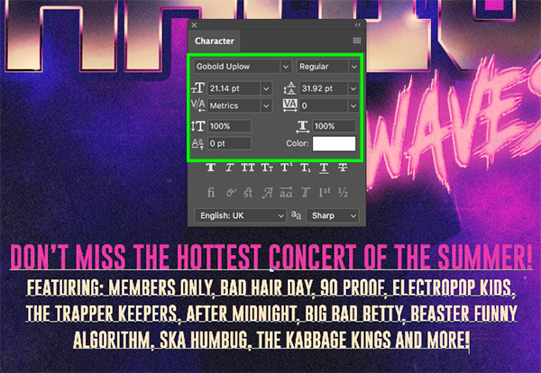
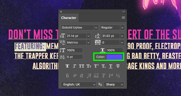
Use the Type Tool (T) to highlight the word ‘FEATURING’ and then click on the ‘Color’ swatch in the Character panel.
Change the fill color of this word to the hex value ‘#5D4CED’ and then click ‘OK’ to apply the change. Click inside of the text box once again and then press Command/Ctrl+A to select all of the text. From here, press Command/Ctrl+Shift+C on the keyboard to center the copy.
Step 52: Tickets Available Now
Create another new layer and use the Type Tool (T) to type out ‘TICKETS AVAILABLE NOW FOR JULY 1ST – 14TH’. Let’s use the same font as before but change the size back to ‘31.5 pt’. For the ‘TICKETS AVAILABLE NOW FOR’ part of the line we want to use the magenta fill color (# DA17B0) and for the date itself we will use solid white. To get the ‘ST’ and ‘TH’ in the dates small we will just want to highlight those letters and then click the small ‘T1’ icon highlighted in the image below:
Step 53: Call To Action
Let’s add one more layer at the bottom and type out ‘VISIT WWW.TICKETMASTER.COM FOR MORE INFORMATION’ so we have a call to action at the bottom. Here we will make the size of the line ‘21.14 pt’ and then for the fill let’s use the same purple color that we used for ‘FEATURING’ which was ‘#5D4CED’ and this will help the copy feel more connected.
Step 54: Subtext
Now that we have added in our secondary copy towards the bottom of our layout let’s select the three layers all together as shown here:
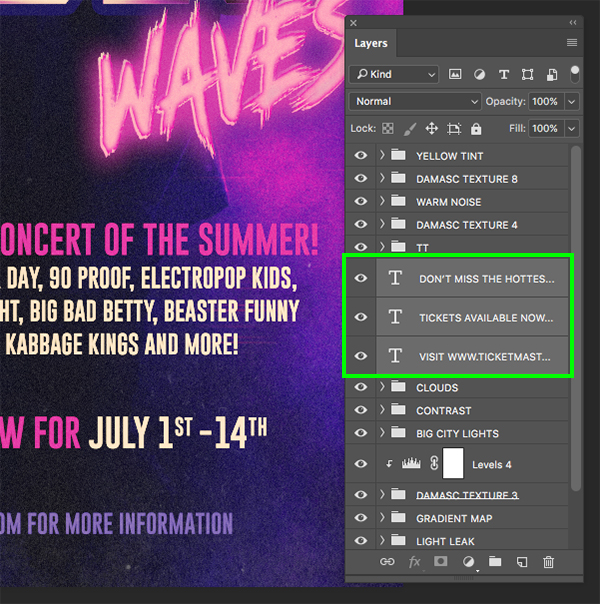
With the three text boxes selected, press Command/Ctrl+G to place them into a new folder and double click the ‘Group 1’ text to rename the folder ‘SUBTEXT’.

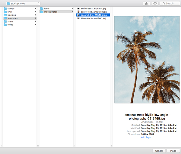
Step 55: Palm Trees
Next we will need to download this free image of the palm trees and save it with the other stock photos we have used for this tutorial. Once you have done that, return to Photoshop, go to the File menu and choose ‘Place Embedded…’ from the dropdown.
Navigate to the image and then choose ‘Place’ from the lower right corner of the window.
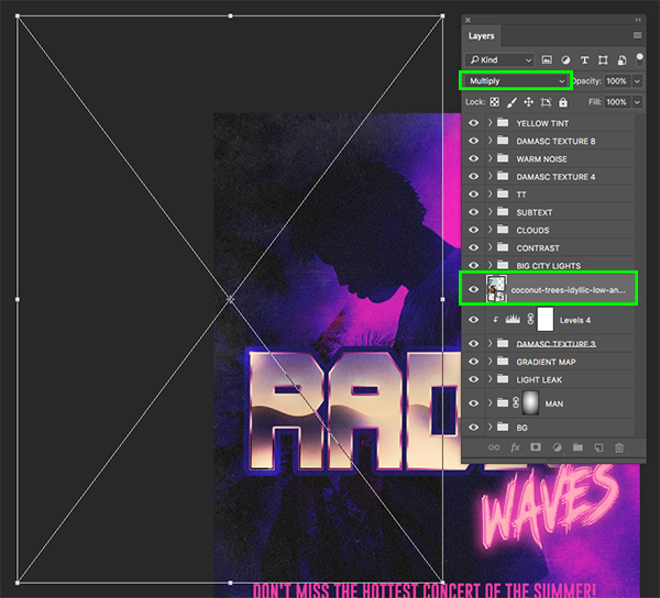
Place the Smart Object layer just below the ‘BIG CITY LIGHTS’ folder and scale and position it over the top and middle of the left side of the image before changing the Blend Mode to ‘Multiply’ as shown here:
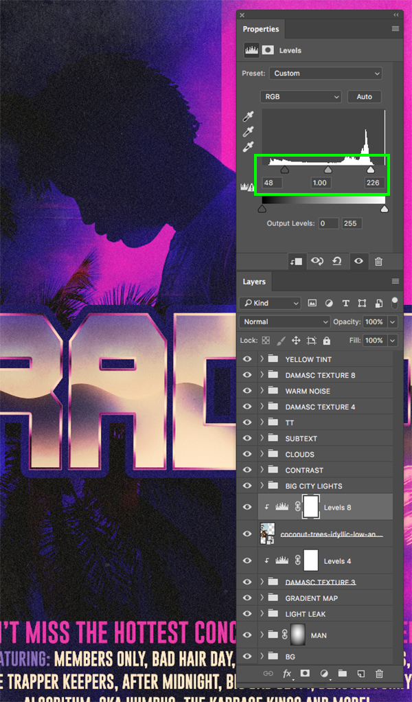
Step 56: Palm Tree Levels
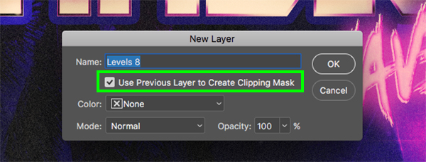
Select the palm tree layer and then hold the Alt/Option key and click on the Adjustment Layer icon at the bottom of the Layers Palette before choosing ‘Levels…’ from the list.
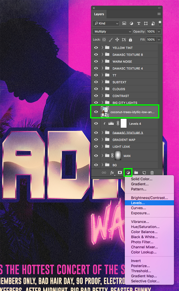
Check off the ‘Use Previous Layer to Create Clipping Mask’ box and then click ‘OK’ to proceed.
In the Properties panel let’s move the left slider in towards the center until it’s set to ’48’ and move the right slider inwards so that it’s set to about ‘226’ as shown below:
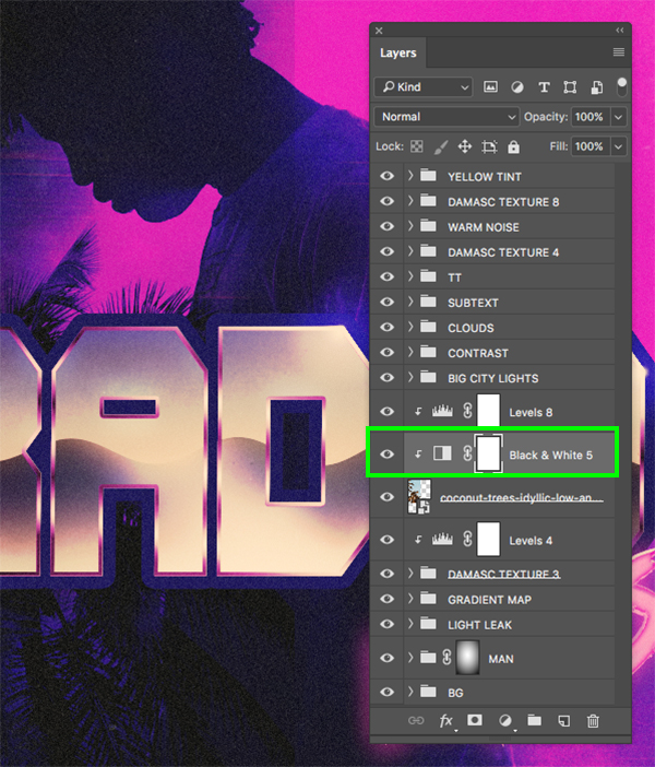
Step 57: Desaturation
Select the palm tree layer once again and then return to the Adjustment Layer icon, this time choosing ‘Black & White…’ from the list. Here we want the Adjustment Layer to be beneath the Levels Adjustment so we won’t need to reposition it or mess with the settings.
Step 58: Tree Group
Next, select the ‘Levels 8’ Adjustment Layer, hold the Shift key, and then select the main palm tree Smart Object layer so all three layers are selected at once.
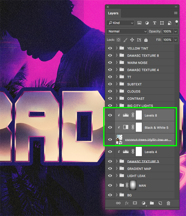
Press Command/Ctrl+G to place these layers into a new folder called ‘PALM TREE’ and then click on the ‘Add layer mask’ icon to add a mask to the entire group.

Step 59: Tree Mask
Press ‘B’ to switch to the Brush Tool and then select a soft round brush with an ‘Opacity’ of about ‘30%’.

With the mask on the ‘PALM TREE’ folder selected, begin brushing over the edges of the palm tree and any hard edges or lines that you want to hide. Let’s also brush over the parts of the tree that overlap the mans body just so it looks like the tree is in the background. The nice thing about using a low opacity brush here is that we can create a more gradual fade, and if you happen to remove too much you can simply brush over the image with white instead of black.

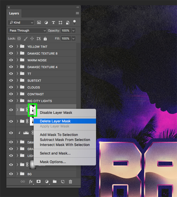
Step 60: Double Tree
Select the ‘PALM TREE’ folder and then press Command/Ctrl+J to duplicate it.
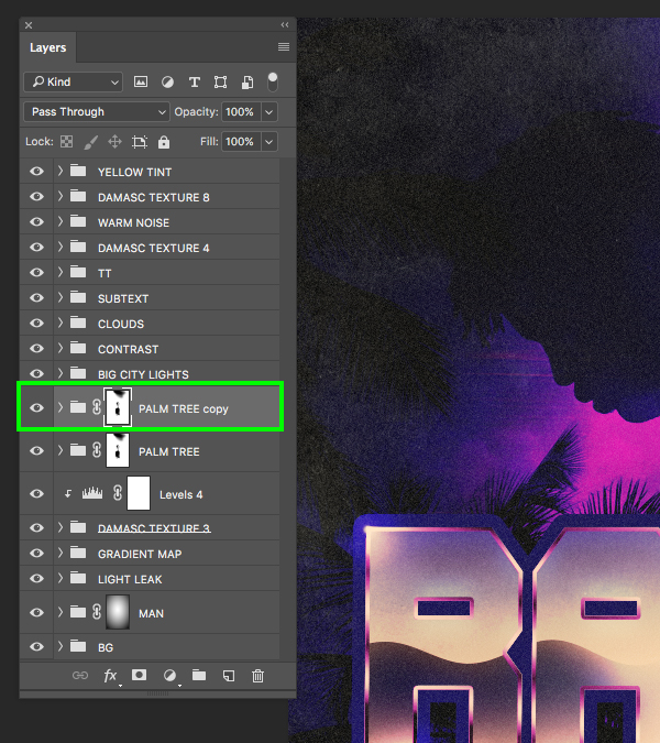
Hold the Control key and click on the mask attached to the group and then choose ‘Delete Layer Mask’ to remove it.
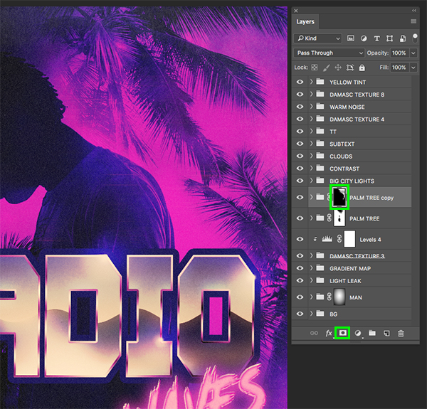
Move this new copy of the folder over to the right side of the image and position the tree more in the top right corner. Let’s also expand the contents of the duplicate folder and turn off the visibility of the ‘Levels 8’ Adjustment Layer to allow more of the color to show through.

Now apply a new mask and use the low opacity brush to gradually fade the tree and make it look more blended with your image. Here I have paid special attention to the area around the man and also the bottom to remove any hard edges or lines.
Step 61: Master Folder
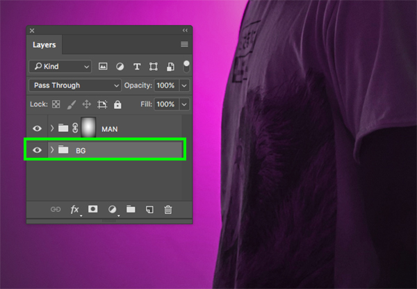
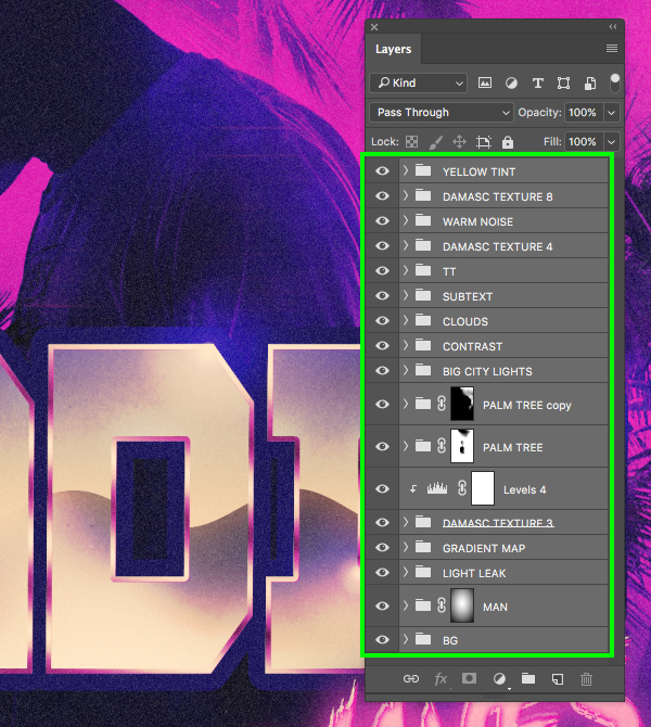
Now let’s select our very top folder, hold the Shift key, and then select the very bottom ‘BG’ folder so all of our layers and folders are selected together.
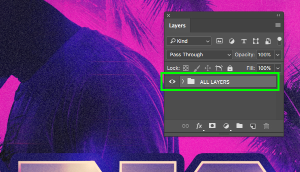
Let’s press Command/Ctrl+G one last time to put all of these folders into a master folder that we can name ‘ALL LAYERS’ or another name of your choice.
We have now completed our Radio Waves Retro Poster Design in Photoshop! To create our poster we’ve used a small handful of textures from the Totally Vibrant Textures and Patterns Bundle that we’ve combined with some photo compositing techniques and a sweet 80’s title treatment using a few free typefaces to help bring it all together. The Totally Vibrant Textures and Patterns Bundle is possibly our most diverse collection yet, and with hundreds of high quality design elements from artists such as Rule By Art, Chroma Supply, Melanie Helena, and an exclusive pack from Design Cuts, you will surely save loads of time so you can focus on what’s really important – designing.
Remember that whether it’s your outcome for this tutorial or something new you’ve made, we’d love to see your designs on our Facebook page.
Please leave a comment if you have any questions or suggestions. I always look forward to hearing from you!
There’s still time to check out theTotally Vibrant Textures and Patterns Bundle that will help you transform your work and stand out from the crowd. Check out the full bundle now at a whopping 99% off of the original price for a limited time only!
Thank you for this great tutorial!!
Is it possible besides being placed in the same tutorial the external resources also to be placed as links at the beginning or at the end of the tutorial? Just in case some of them not to be missed.
You’re so welcome Veselina and I hope that you picked up some great new tips and tricks in this tutorial!
All of the freebies that the designer has used in this tutorial have been embedded in the tutorial at each step that they are being used, so we hope that this helps our community be able to access these as and when they need them, rather than having to scroll back to their freebies section. We really appreciate your suggestion however Veselina, and I will definitely pass this on to our tutorials team to see if we can possibly include something similar for you in future :).
Thank you, I am learning every week.
Yay, thanks so much for commenting Ulrike! It is awesome to hear that you enjoy leaning new things with each of our tutorials, and reading your lovely comment really made our day :).
parabens
Thanks so much for your lovely comment Lincoln, and I hope that you really enjoyed this tutorial :)