WHAT WE’RE CREATING:
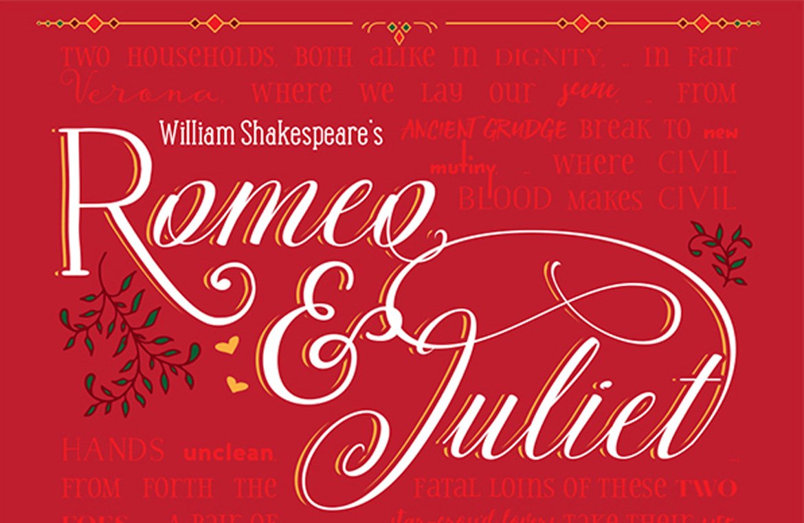
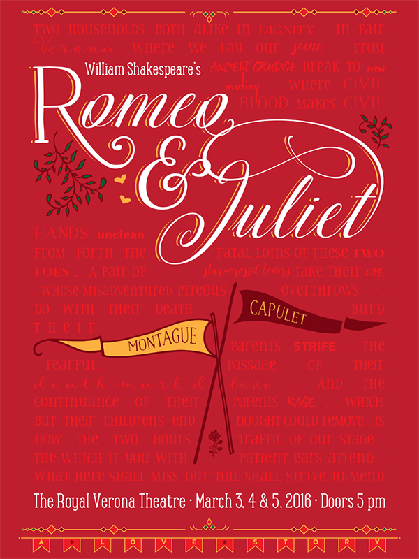
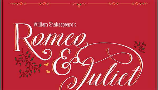
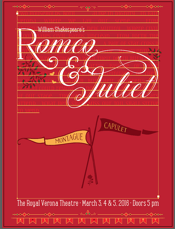
Hello designers! Renee here with a new Illustrator tutorial. We’ll be creating a playbill poster advertising a performance of Romeo & Juliet. We’ll use lots of fun fonts and ornaments, plus we’ll get a look at using Illustrator’s text wrap option.
You can also enjoy a fantastic sample freebie pack from our current bundle, including some great vectors and font ornaments.
HAVE YOU SEEN OUR NEW YOUTUBE VIDEO CHANNEL?
We hope that you enjoy the video version of this tutorial below.
If you’re interested in getting these videos direct to your inbox, please do subscribe to our YouTube channel.
FINISHED PIECE
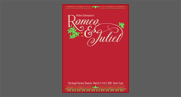
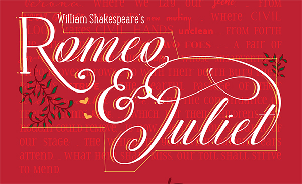
Here’s a quick look at what we’ll be creating.
Follow along with this tutorial: Download the freebies
This freebie pack includes bonus vectors and ornaments from Latino Type, Make Media Co, Type Mates and Type Sketchbook. Plus, we’re super excited to be able to share an entire font of dividers from the Jabana Extras, courtesy of the fine folks at Type Mates!
This freebie pack is the tiniest sample of the resources available in The Font Lover’s Bundle for just $29 (an unbelievable 99% off). This bundle features an incredible variety of unique, world-class fonts that are guaranteed to take your work to the next level.
Step 1: Background
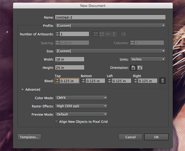
Open Illustrator and go to File > New. In the New Document dialog box, enter a width of 18 inches, a height of 24 inches and a resolution of 300 ppi. We’ll create our poster in CMYK with a bleed of .125” (⅛”) on each side. These settings would allow us to actually send this poster to a vendor who could print and trim for production. Click OK to create the document.
Save your file.
Open your Layers palette (Window > Layers) and double click the existing layer (Layer 1) to rename it to Background.
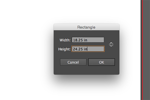
Select your Rectangle tool (M) and click once on the artboard. In the dialog box that opens, enter a width of 18.25” (that’s 18” for our main artboard plus .125” on either side for bleed) and a height of 24.25”. Click OK.
In your Align palette (Window > Align), under Align Objects, click on the Horizontal Align Center and Vertical Align Center icons. Hover over the icons with your mouse to see the tooltip pop up if you aren’t sure which icons to press.
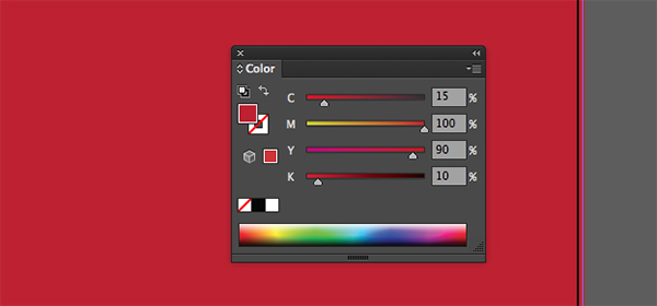
Next, we’ll change the rectangle color to a dark red. Open your Color palette (Window > Color) and change the CMYK values to 15/100/90/10.
That’s it for our background layer. Lock the layer by clicking in the empty square to the left of the layer name in the Layers palette. Now we’ll dig into our main text.
Step 2: Title
In your Layers palette, click the Create New Layer icon. Double click the name of the new layer and change it to Romeo Juliet.
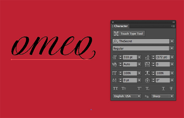
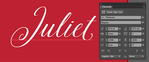
Select your Type tool (T) and click once on the artboard. Type “omeo”. Then, open your Character palette (Window > Type > Character). Change the font to The Secret regular at 310 pt.
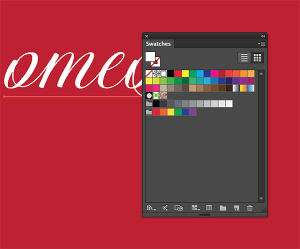
With the text still selected, open your Swatches palette (Window > Swatches) and select white for the foreground color.
Deselect the current text by selecting Move tool (V) and clicking anywhere on the artboard.
Select your Type tool again. Click once on the artboard and type Juliet. It should already be in the correct font and size, but double check your Character palette to make sure it’s The Secret Regular at 310 pt with a color of white.
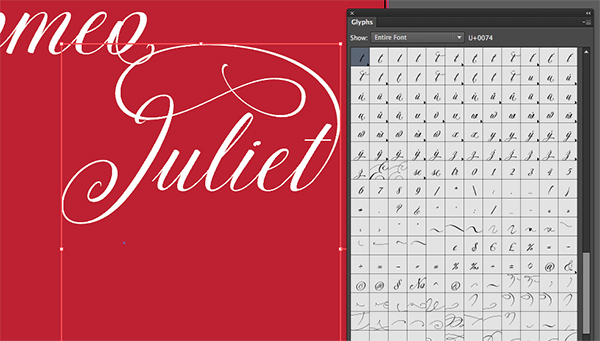
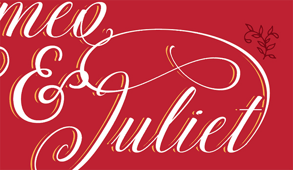
We’re going to create a decorative swoosh at the end of Juliet. Open your Glyphs palette (Window > Type > Glyphs). Click once at the end of Juliet, then double click this swirly swash in the Glyphs palette.
As you can see, our t doesn’t connect with the swash, so we’ll need to replace it with an alternate t. Select the t with your Type tool. An easy way to see the alternates just for the letter you’ve selected is to click on the drop down menu next to Show at the top of the Glyphs palette and choose Alternates for Current Selection.
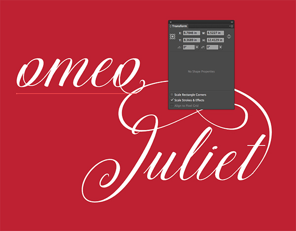
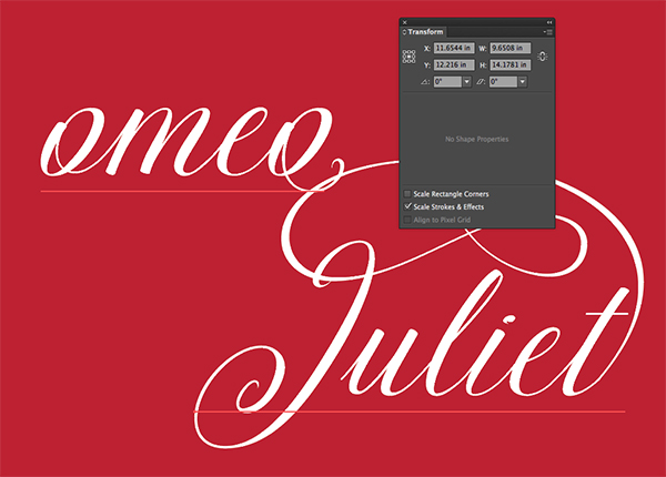
Position in the top middle section of the artboard so that the swash at the end of the t overlaps slightly with the o at the end of “omeo”.
Here are my exact coordinates for each word.
Select your Type tool and click once on the artboard. This time type a capital R. In your Character palette, change the font to Naive Fantaisies Medium, still at 310 pt. Position at the beginning of “omeo”.
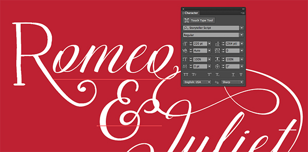
With your Type tool again, click on the artboard and type an ampersand (&). Change the font to Storyteller Script Regular at 220 pt. Position the ampersand below Romeo and slightly above and to the left of Juliet.
We’ll add a little extra decoration now. Press cmd/ctrl + a to Select All. Press cmd/ctrl + c to copy, then lock our existing selection by pressing cmd/ctrl + 2.
Press cmd/ctrl + f to paste our copied text in the exact same place. Now press cmd/ctrl + shift + o to outline the text.
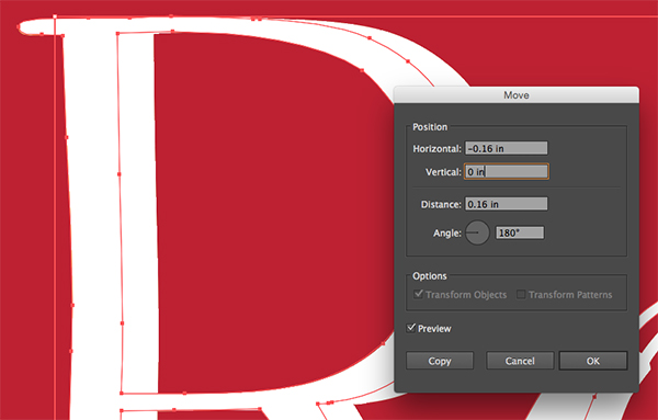
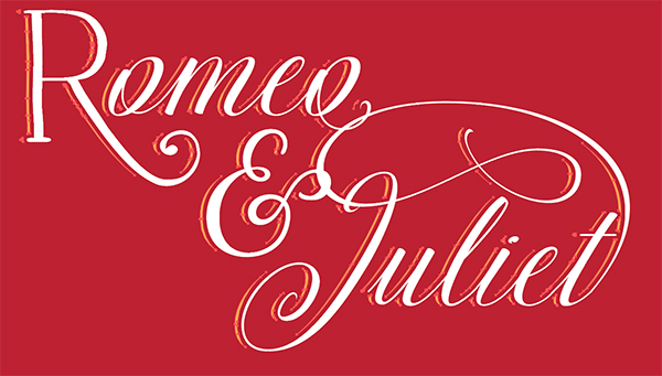
We’ll move our copied and outlined text to the left by going to Object > Transform > Move and entering a horizontal position of -.16 inches in the popup dialog box. Click OK.
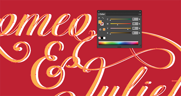
In your Color palette, change the color of the selection to 0/35/85/0.
We want to add a little space between our existing letters and the orange area, so press cmd/ctrl + f to paste a new copy of the text. Press cmd/ctrl + shift + o to outline the new copy.
Open your Stroke palette (Window > Stroke) and enter a Weight of 14 pt. Next to Cap and Join, choose the middle icons for rounded caps and rounded corners.
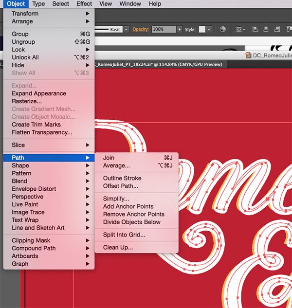
Now go to Object > Path > Outline Stroke. This will (surprise) outline our stroke so we can create a shape with it.
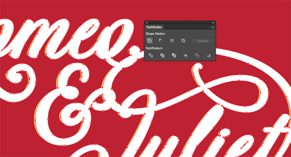
Open your Pathfinder palette (Window > Pathfinder) and click the first option in Shape Modes, Unite. This will create one single shape out of our entire selected piece.
Now here’s the trick that trips a lot of people up when drawing and combining shapes in Illustrator. Although we’ve united all of the shapes, this shape is still made up of multiple paths. To have it act as one single, solid piece, we need to create a Compound Path.
To make a Compound Path, you first have to ungroup any groups in the selection. My usual routine is to press cmd/ctrl + shift + g several times to ungroup any possible groups in my selection. Then, press cmd/ctrl + 8 (or go to Object > Compound Path > Make) to create a Compound Path.
After doing this to our currently selected piece, click on the outlined orange copy we created earlier and do the same thing – press cmd/ctrl + shift + g several times, then press cmd/ctrl + 8.
Now that both of our pieces are compound paths, we can subtract one from the other. Select both the orange words and the fat words on top, then in your Pathfinder palette, click the second icon under Shape Modes, Minus Front.
It can be a little tricky at first, but you’ll find that most of your issues when trying to use Pathfinder can be solved by ungrouping and creating compound paths.
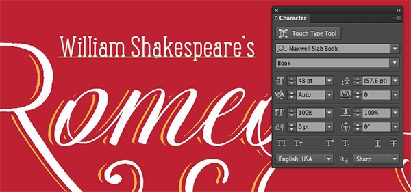
Lastly for our title, we’ll use our Type tool to type William Shakespeare’s in Maxwell Slab Book at 48 pt and position it just above Romeo.
Now lock the Romeo Juliet layer in your Layers palette.
Step 3: Supporting Info and Ornaments
In your Layers palette, create a new layer and name it Main Content. Drag this layer below Romeo Juliet.
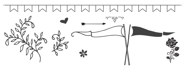
Open the freebies file and copy the larger of the two leafy branch vectors by selecting it with your Move tool (v) and pressing cmd/ctrl + c.
Paste it into our main layout file with cmd/ctrl + v.
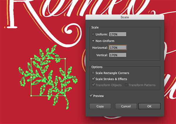
Go to Object > Transform > Scale and enter a Uniform scale of 170%. Press Ok.
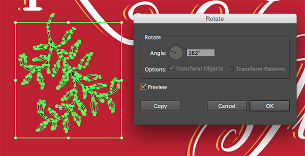
Now go to Object > Transform > Rotate and enter an angle of 162 degrees.
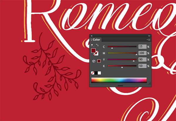
In your Color palette, change the color to a darker red than our background – 15/100/90/50. Now open your Swatches palette and click the New Swatch icon to add the Dark Red. We’ll use this again several times.
Position the branch below the R in Romeo.
Now copy the smaller leafy branch from the Freebies file and paste it into the main layout near the end of Juliet.
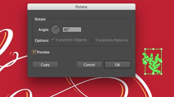
Go to Object > Transform > Rotate and enter an angle of 45 degrees.
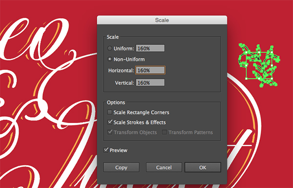
Next, we’ll go to Object > Transform > Scale and enter a Uniform scale of 160%.
In your Swatches palette, click on the dark red we just made, then move the branch to its final position above the t in Juliet.
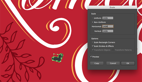
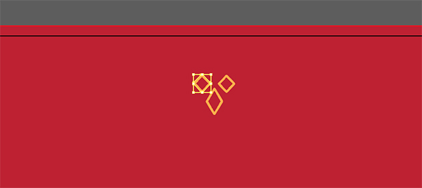
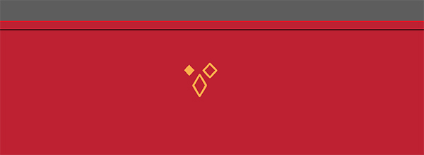
This is a love story, so we’re going to need some hearts. Copy the heart from the Freebies file and paste it into the layout. Go to Object > Transform > Scale and enter a Uniform scale of 140%.
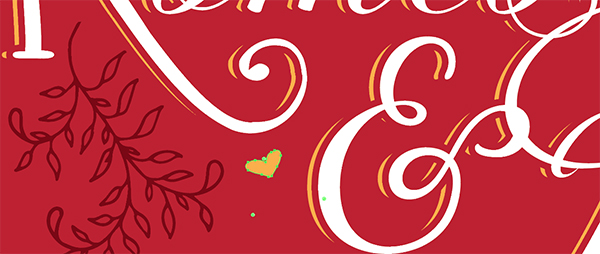
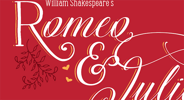
Position the heart below the R in Romeo and to the left of the ampersand. Change the color to the same orange we used earlier. This color should already be in your Swatches palette since it’s a default Illustrator swatch.
Hold opt/alt down and click and drag down on the heart to make a copy. Position the copy just below the first heart and to the right a little. Use the corner handles to rotate the heart to the right a bit.
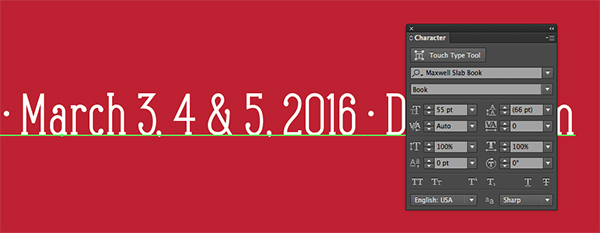
Now we’ll add our theatre and play date info. Select your Type tool and click once on the artboard. Type: The Royal Verona Theatre · March 3, 4 & 5, 2016 · Doors 5 pm. Change the font to Maxwell Slab Book at 55 pt.
Position at the bottom of the artboard. We can perfect our positioning after we add a few other elements. Center it horizontally by using Horizontal Align Center in the Align palette.
Step 4: Borders
Next, we’ll create borders at the top and bottom of our playbill using our super cool dingbat fonts.
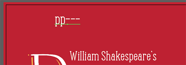
Click once on the artboard with your Type tool and type pp—. Trust me :)
Make sure you’ve installed the Jabana Extras Divider font provided in the Freebies folder.
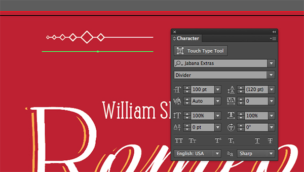
Go to your Character palette and change the font to Jabana Extras Divider at 100 pt.
Use your Type tool to click once at the end of the sentence and add pp plus five hyphens —–.
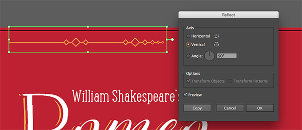
Position the partial border at the very top of the artboard and so that it sticks out just past Romeo on the left. Change the color to the orange we’ve been using. Then go to Object > Transform > Reflect. Select Vertical and click Copy.
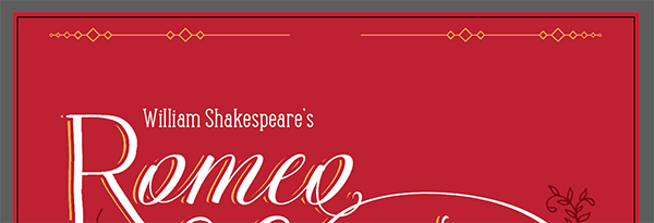
Select the copy with your Move tool and drag it to the right while holding down Shift to stay on the same horizontal axis. It should be the same distance from the right side as the first border is from the left.
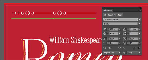
In the vector Freebies file, copy the ornament with three diamonds. Paste into the main layout file and position it at the top of the artboard, between the border sections we just created.
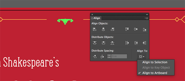
To center the ornament, open your Align palette and click Horizontal Align Center under Align Objects. Make sure that you have Align To set to Align to Artboard.
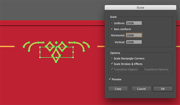
Go to Object > Transform > Scale and change the Uniform scale to 200%.
Manually line the top of the ornament up with the top border sections.
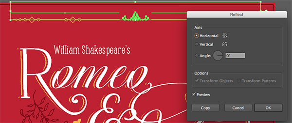
Now we’ll create a copy of our top border for the bottom. Drag your Move tool across all three sections to select them all. Go to Object > Transform > Reflect. Choose Horizontal in the popup dialog and click Copy.
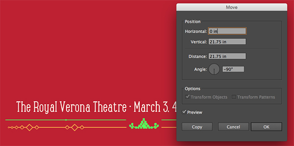
Then go to Object > Transform > Move. Enter a Vertical Position of 21.75 inches, then press OK.
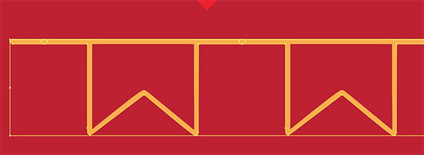
In the Freebies vector file, copy the long string of banners and paste into the main layout file.
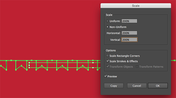
Go to Object > Transform > Scale and enter a Uniform scale of 200%.
Change the color to orange and position at the very bottom of the artboard below the bottom border section.
This is also a good time to adjust the position of the theatre info line if needed.
Now we’ll add some copy to our banners. It will be small and subtle, but a nice detail.
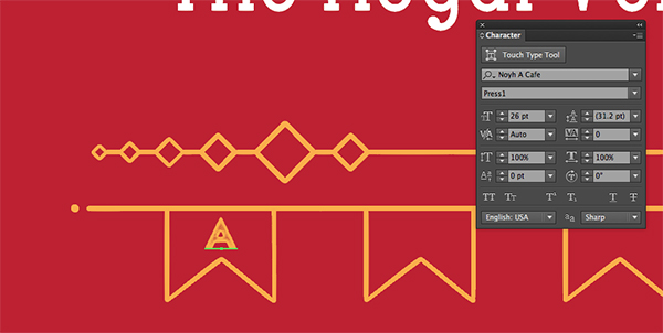
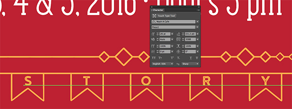
Select your Type tool and click once on the artboard. Type A and change the font to Noyh A Cafe Press1 at 26 pt and change the color to orange.
Position it right in the middle of the banner on the far left.
Use the Move tool to click on the A, hold opt/alt + shift and drag to the right to copy it. Use your Type tool to select the copied A and type LOVE. In the Character palette, change the tracking (the space between letters) to 3065. Skip the banner directly to the right of A and place the L in Love in the next banner over.
Copy LOVE by using the Move tool to click and drag LOVE to the right while holding shift and alt/opt. Change the letters to STORY and the tracking to 3088. As before, we’ll skip a banner and position the S in Story in the next banner over.
We’ll place tiny flowers in the two empty banners. Copy the little 6-petaled flower in the freebies vector file and paste it into the main layout file.
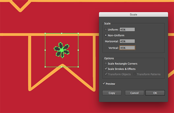
Position it in the first empty banner. Go to Object > Transform > Scale and enter a Uniform scale of 45%. Click OK.
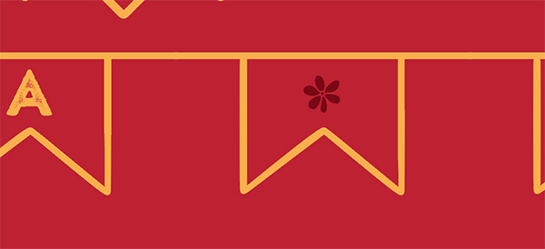
Change the color to our Dark Red.
Now we’ll use the exact same copy process, holding opt/alt + shift and dragging to the right, to copy the tiny flower to the second empty banner.
Step 5: Color Fills
Create a new layer and change the name to Color Fills. Drag the layer below Main Content.
Select your Move tool and hold shift to select multiple items at once. We’ll select the top and bottom borders, the line of banners and the two leafy branches. Press cmd/ctrl + c to copy.
Lock the Main Content layer and select the Color Fills layer. Press cmd/ctrl + f to paste in place on the Color Fills layer.
Now we’ll outline everything by pressing cmd/ctrl + shift + o.
We want the empty spaces of our vectors. To get that, we’ll delete the outside paths, leaving only the inner paths.
Select your Group Selection tool by clicking and holding down on the Direct Select tool (white arrow) in your toolbar until the flyout menu appears. Select the white arrow with the plus sign next to it.
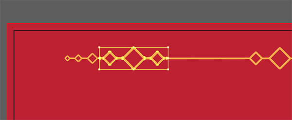
Zoom in to your top border (use z to access your zoom tool or press cmd/ctrl + the plus sign). Click once on the outermost path of the diamond sections.
Then press delete/backspace to delete it and leave just our inner paths.
Work your way across the top border, deleting outer paths to reveal inner paths.
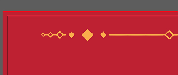
For the solid line sections, just select and delete – they don’t have inner paths. Your final top section should look like this:
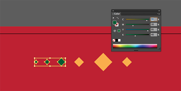
Now we’ll change the colors. Use your Group Select tool to select the three far left diamonds and in your Color palette, change the color to 90/30/95/40. Open your Swatches palette and click the New Swatch icon to add it to our Swatches.
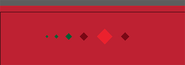
Select the next three diamonds and change them to Dark Red. We want to make the middle diamond a brighter red, but we won’t be able to until we separate it from the other two diamonds. To do this, use your Group Select tool to select just the larger, middle diamond. Press cmd/ctrl + c to copy it, then press delete/backspace to delete it. Press cmd/ctrl + f to paste it in place. Now we can change the color of just the middle diamond to the standard bright red in the Swatches palette – 0/100/100/0.
For the middle ornament, we’ll make the two smaller diamonds dark green and the larger middle diamond bright red. Again, you’ll need to select just the middle diamond, copy it, delete it and paste in place before changing it to red.
Work your way across the top border adding the individual colors.
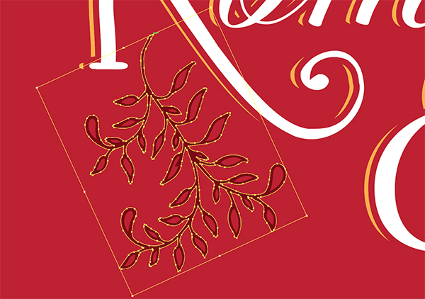
Next, select the outermost path of the large leafy branch with the Direct Select tool.
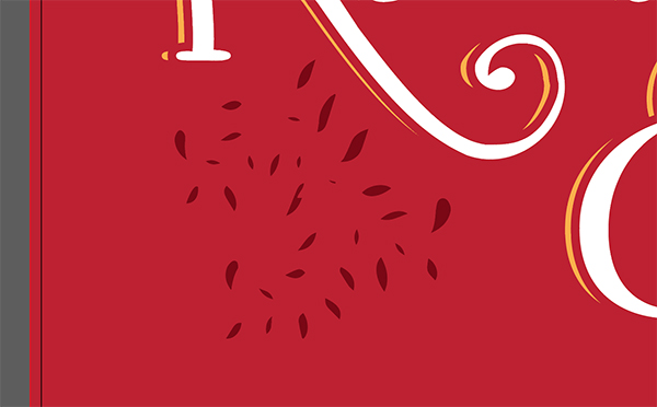
Press delete/backspace to leave behind only the inner paths.
Then change these to Dark Green.
Repeat the same process with the small leafy branch at the top right of Juliet.
Use your Move tool to select the Color Fills for the top border, then go to Object > Transform > Reflect and choose Horizontal. Press Copy.
Hold shift and drag the copy down to the bottom border. Zoom in to get your placement right within the bottom border sections.
Now we’ll repeat the process of deleting outer paths on the banner at the bottom. Just like the top border, the line sections will just be deleted since they have no inner path.
Lastly for this section, we’ll select the color fills for the bottom banners and change them to bright red. This is what they look like with the Main Content layer turned off for easier visibility.
And our final color fill look…
Lock your Color Fills layer.
Step 6: Flags
Select your Main Content layer and unlock it.
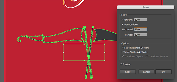
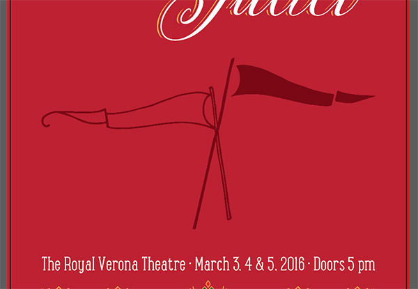
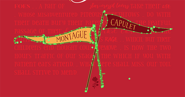
In your freebies vector file, copy the two flags and paste them into the main layout file.
Go to Object > Transform > Scale and enter a Uniform scale of 320%. Click OK.
Change the color to Dark Red.
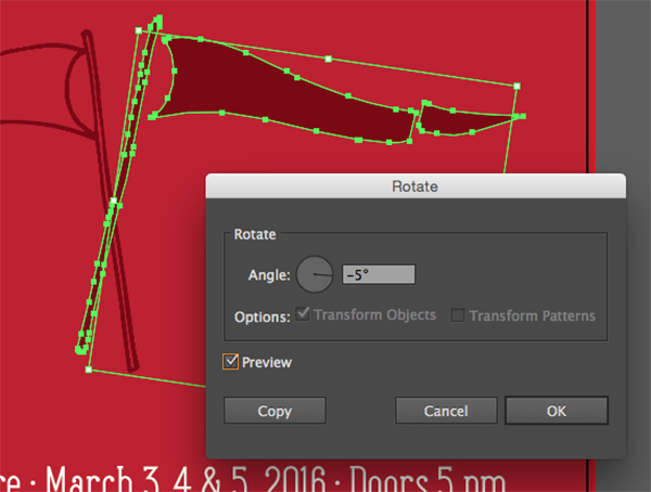
Select the right flag with your Move tool and go to Object > Transform > Rotate. Enter an angle of -5 degrees and click OK.
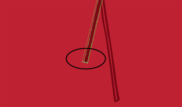
Now we need to lengthen the pole on our right flag a bit. Select your Direct Select tool (a) and drag across the bottom section of the pole (circled below).
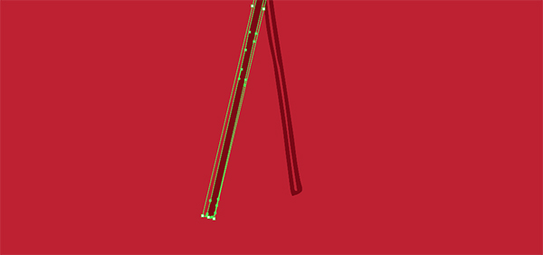
Then use the Direct Select tool to click and drag the section downward until it’s just below the bottom of the other flagpole. Don’t change the angle though – Photoshop makes it pretty easy to stay on the same angle as you drag it out.
Position in the big empty spot in the middle of the poster and use your Align palette to center it horizontally on the artboard.
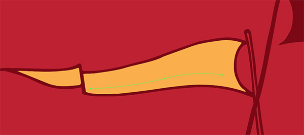
We want to add one more color fill for the left flag. This time, instead of copying the whole thing and deleting outer paths, we’ll only copy the inner paths to start with. Select your Group Select tool (the white arrow with a plus sign available on the flyout menu from the Direct Select tool) and click on the inner paths of the flag. Hold shift while selecting to select both inner paths at the same time.
Unlock the Color Fills layer and select it. Press cmd/ctrl + f to paste the flag color fills in place on the Color Fills layer. Then change the color to orange.
Let’s add names to our flags. Lock your Color Fills layer and select the Main Content layer.
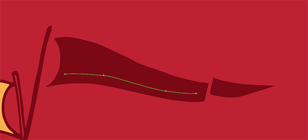
Select your Pen tool (p). Click once at the left bottom of the flag area to create your first point. Then, click again in the middle bottom of the flag and drag to the right as you click to create a curve. Finally, click once to add a point on the bottom right of the flag area.
To make adjustments to the curves of the points, hold opt/alt and click on a point and drag out with your mouse. You’ll see your curves change as you move your mouse. For this path, we just want to mimic the shape of the bottom of the flag section.
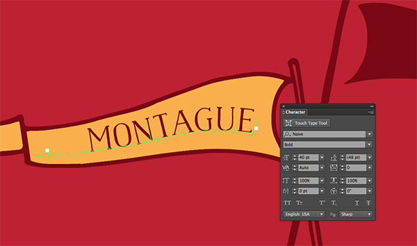
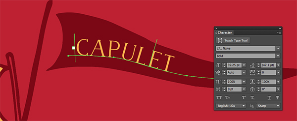
Select your Type on a Path tool, available on the flyout menu of the Type tool on the toolbar. Click once on the path we’ve just made and type Montague.
Change the font to Naive Bold at 40 pt and the color to Dark Red.
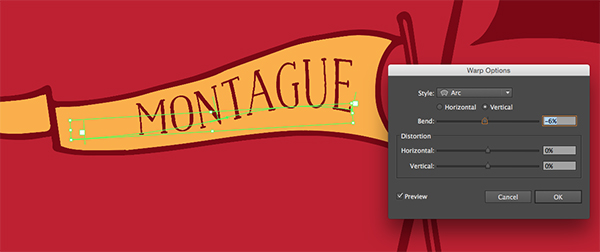
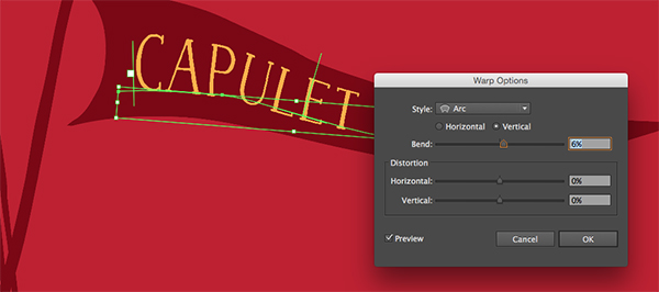
Go to Effect > Warp and choose Arc. Enter a Bend of -6% and click OK.
We’ll repeat this process on the right side. Select your Pen tool and click once on the bottom left of the banner for your first point, the bottom middle while dragging out to create a curved point, and the bottom right for our final point.
Select the Type on a Path tool and click on the path we just created. Type Capulet in Naive Bold at 40 pt and change the color to orange.
Go to Effect > Warp > Arc and enter a Bend of 6%, then click OK.
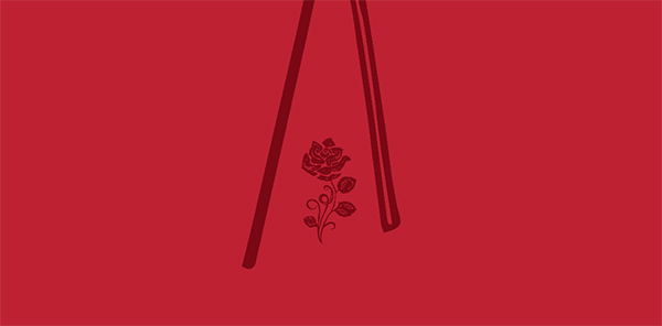
For our last bit of ornamentation, we’ll add a rose. In the freebies file, copy the rose and paste it into the main layout file on the Main Content layer.
Change the color of the rose to Dark Red and position it between the flag poles.
Step 7: Background Words
Lock the Main Content layer. Create a new layer and name it Wrapped Text. Drag this layer just above the Background layer.
Use your Type tool to click in the top left corner of the artboard, just below the border and drag down and to the right to create a text box. Stop just above the theatre info line. The left and right sides of the text box should line up with the left and right edges of the title (Romeo & Juliet).
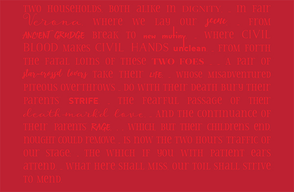
I’ve selected the opening monologue from the play as our background text since it gives the full story in just a few words. I’ve replaced line breaks with ellipses and paragraph breaks with double ellipses since I want my text to flow across the text box without breaks.
The text to paste into the text box:
Two households, both alike in dignity, … In fair Verona, where we lay our scene, … From ancient grudge break to new mutiny, … Where civil blood makes civil hands unclean. … From forth the fatal loins of these two foes … … A pair of star-cross’d lovers take their life; … Whose misadventured piteous overthrows … Do with their death bury their parents’ strife. … The fearful passage of their death-mark’d love, … And the continuance of their parents’ rage, … … Which, but their children’s end, nought could remove, … Is now the two hours’ traffic of our stage; … The which if you with patient ears attend, … What here shall miss, our toil shall strive to mend
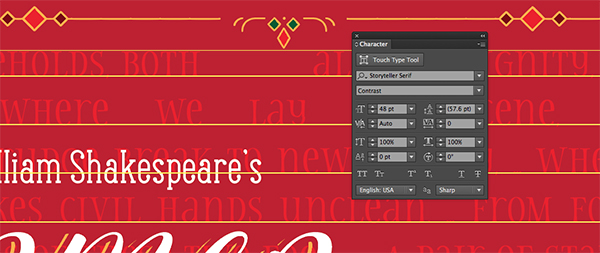
Change the color to Bright Red and the font to Storyteller Serif Contrast at 48 pt.
Now we’ll select some key words and phrases and change the font. Each time, we’ll adjust the font size if needed to keep everything approximately the same size visually. Have fun with it and try to use a font that expresses the feelings behind the words.
Here’s the list of words I changed – unless otherwise noted, the font size is 48 pt:
Verona – Storyteller Script
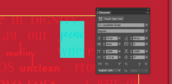
Scene – Love Letter @ 72 pt with a baseline shift of -22 and leading of 40
Ancient Grudge – Stone Harbour Reg
New Mutiny – Jabana Bold at 80 pt with a leading of 54
Civil Blood and Civil Hands – Naive Bold
Unclean – Noyh A Cafe Press 1
Two Foes – Revista Black
Star crossed lovers – Love letter Script at 56 pt with leading of 39
Life – Stone Harbor @ 43 pt
Strife – Noyh Press 1
Death Marked Love – Storyteller Script @ 40 pt
Rage – Stone Harbour
Now we’ll create the shapes we want the words to wrap around.
Select your Pen tool (p) and add points to create a rough shape around Romeo & Juliet. Hold shift as you add points to maintain straight lines where needed. After adding your last point, click on the first point to close the path. This path really doesn’t need to be perfect – it’s just a rough area.
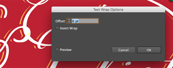
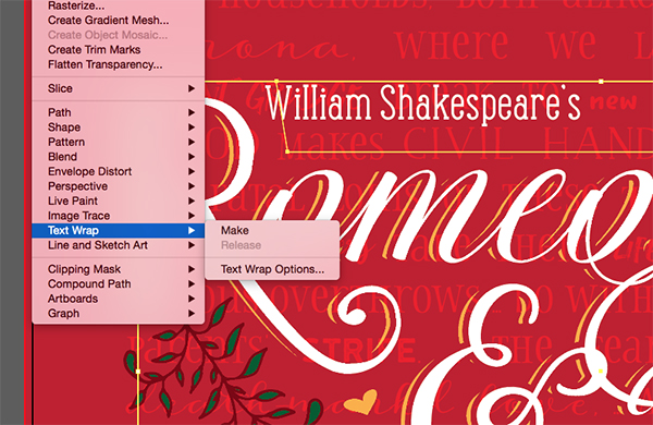
Go to Object > Text Wrap > Text Wrap Options and enter an Offset of 6 pt in the popup dialog.
With the new shape still selected, go to Object > Text Wrap > Make.
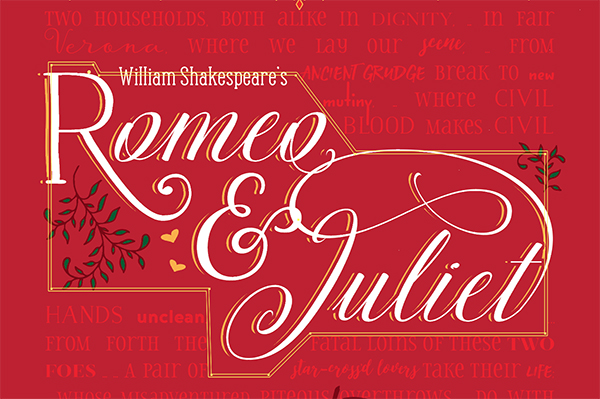
Your text should auto-magically move out of the area we’ve drawn our shape around. I went back in with my Direct Select tool (a) and manually adjusted lines and points as needed to get the red words further away from the title.
Now we’ll do something similar for the flags. Unlock the Main Content layer and copy the two flags. Lock the Main Content layer and select the Wrapped Text layer, then paste in place by pressing cmd/ctrl + f.
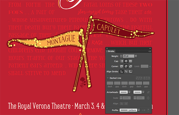
I’m going to add a little more padding to the flags by adding a stroke. Open your Stroke palette and enter a weight of 20 pt.
Go to Object > Path > Outline Strokes, then in your Pathfinder palette, click the first Shape Mode icon, Unite.
Next, go to Object > Text Wrap > Make.
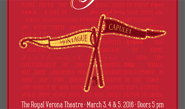
Now this just happens to have lined up my text perfectly so that it ends in the right spot. If that doesn’t happen for you, don’t worry! You can fiddle with font sizes and tracking or move your text wrap shapes around to adjust where the words fall. Alternatively, you could also add a little ornament at the end if you need to fill some space. Have fun with it!
We’re done!
I don’t know about you, but I had way more fun creating this playbill than I probably should have for such a tragic love story.
Remember that whether it’s your outcome for this tutorial or something new you’ve made, we’d love to see your designs on our Facebook page.
Please leave a comment if you have any questions or suggestions. As always, I look forward to hearing from you!
There’s still time to check out The Font Lover’s Bundle. You’re going to love the 20 memorable font families with over 280 individual fonts!



















I think this one will be my next project.
But… I can has The Font Lover’s Bundle, please? Maybe if I smile a really cute smile? :D
That’s fantastic news, Claudia! I hope you enjoy this tutorial as part of your latest project. Please do let me know how you get on with it :)
I’m really sorry but I’m afraid the Font Lover’s Bundle is now completely expired but fear not, I’m sure that a brand new font bundle will be making an appearance very soon! :)
A fun take on the subject for sure. I think that the magic trick (which is awesome) with the word wrap might not be necessary: the contrast of the title block is nice and strong, so the text behind doesn’t detract from legibility too much.
Hey Simon,
Thanks for your comment!
Thank you so much for your feedback, we really appreciate you taking the time. I will be sure to pass this on to Renee for future tutorials!
If there was ever anything I could assist you with please do get in touch. I’m always happy to help!
Beautiful … thanks!! x
Thanks Nat! I hope you’re having lots of fun with the fonts!
Thank you for your kind words, Nat! I’m really pleased you enjoyed Renee’s tutorial :)
Where is the link to download?
Hey Stark,
Thanks for getting in touch, I can certainly help you out with your query!
To download your freebies to use with this tutorial, you would need to enter your email address in the area just above Step 1 that would then direct you to the download links.
I hope this helps, and please don’t hesitate to contact me should you have any other questions. I am always happy to help!
The link for the freebies just subscribes me. It won’t take me to the goodies! Wah! LOL
Sorry about that Su, this should all be fixed for you now :). Thanks so much for the heads up!