What is design theory?
While you may be inclined to start putting pen to paper at the beginning of your journey, it is important to first understand the visual language that connects us all as humans. Design theory covers how and why design works through the lens of principles like balance, emphasis, proportion, hierarchy, rhythm, pattern, negative space, typography, and color, some of which we will be covering in the article.
“Good design is universal. It transcends language and culture. There's a reason for that. It's absolutely vital that you understand what makes good design good. Don't just study current trends, go back throughout history and learn what makes a design stand the test of time.” - Nathan Brown from Trailhead Design Co.
Type theory
One of the secrets to design is through typography and yet many designers do not take the time to fully grasp it. Typography can elevate a design by making it more legible, building harmony and hierarchy, and communicating a message, thus attracting the attention of the viewer and establishing a deeper connection. It is so powerful that it can both enhance artwork and be the artwork.
The more you learn, the more you can experiment with elements of type. In the beginning, we recommend learning the basics (“Nothing screams beginner like making elementary typography errors.” - Leslie Nicole from French Kiss Collections) and keeping your designs minimalistic and clear. Roch suggests developing your ability by playing around with one font in a design, then one font with two weights, then two fonts from one family… building all the way up to three fonts.
While there are many resources out there to help you get comfortable with your type knowledge, we suggest starting with Chris Do’s tutorial on mastering the fundamentals of typography design.
Color theory
Like with typography, colors tend to evoke strong emotional reactions. They are quite prevalent in advertising and design because they influence moods and perceptions by expressing subtle messages. To know which ones to use in your designs, you first need to understand the science behind color. The best way to do this is to familiarize yourself with the color wheel and research color theory. Once you have a solid foundation in color theory and have grasped its principles (ie. color schemes, psychology, etc), you can more seamlessly begin to apply it to all of your creative pursuits.
But remember, color theory is more than just knowing which colors pair well together; colors can affect how long people stay on your website, how they perceive your work, and whether they are likely to make a purchase from you. For these reasons, it is also vital to consider how you will be integrating a consistent color palette throughout your brand.
We recommend watching our Tips N' Tricks session with ShoutBAM (starting at 1:16:43), which covers how to create your own color palette.
Look at compositional theory and techniques
How is negative space used?
Negative space (sometimes referred to as white space) is the area that sits between elements of your design. In the beginning, it can be harnessed to make your designs look clean and uncomplicated, but once you start to develop a stronger foundation, it can be particularly useful for creating a focal point.
In a visual world that is increasingly saturated with overwhelming stimuli, negative space can be a breath of fresh air. Its simplicity and structure are calming and can improve your audience's overall experience. To see it in action, just take a look at Apple’s product advertisements or Google’s homepage and then brainstorm how you too can start integrating it into your designs and improving your compositions.
“Negative space is one of the key elements to control how a viewer’s eye moves around your design composition - it can act to guide the eye and also stop it from moving off the sides and the bottom of a design composition.” - Matt Slightam

Contrast in design
In the same vein as negative space, contrast can be attained through the use of space. But it need not stop there - contrast can also vary through shape, texture, size, font pairings, and color (as well as hue, saturation, intensity, etc). It is handy not only for attracting attention and creating a focal point but also for establishing a hierarchy that will lead your audience through the intended visual journey. When done right, contrast will add visual interest and organize your composition in a way that tells a clear story.
Tip: while contrast and negative space are good to keep in mind, it is also worth spending time studying other important principles and techniques such as focus, layout, circular composition, and more.
Outline your design process
Know your client (or audience)
If you’re working with clients, Claudia Riveros from Riveros Illustration writes, “One of the most important things I’ve learned through my years as a graphic designer is to think about the problem my client is having. Who’s their target audience, what do they want to say, how do they want to be perceived?
To figure this out, I start each of my design projects by asking lots of questions. And when I say lots of questions, I mean lots of questions. Try to organize a call or a video call to go through the project, and go prepared to take some notes.
Ask things like:
- Why did you start this project?
- What’s your mission, what do you wish to achieve?
- What’s your brand about?
- In your opinion, what makes a good design?
- Can you show me at least 3 logos you like?
- Who’s your target audience?
- Are there any particular adjectives you want your audience to associate your brand with?
- Who’s your competition?
- What makes you different than your competition?
- Why will your target audience choose your brand instead of the competition? What makes your brand special?
- What’s the budget for this project?
- What is the expected timeline for this project?
Listen to what they say, and take notes. The idea of this is that both you and your client are on the same page when it comes to the project. I’ve found that asking lots of questions at the beginning has helped me not to get into a revision loop with my clients.”
And if you’re not yet at the point where you work with clients, make connections with other designers, join Facebook groups, and talk to people on social media who might be in the same boat as you. Figuring out who you want your audience to be and what they will be interested in seeing is just as important as creating the designs themselves. Understanding your audience is key to getting your design work to convert, which is the goal for any project.
Tip: for some nuggets of knowledge, make sure to read Matt Slightam’s Instagram post on knowing your audience.

Polish your brand definition
Whatever project you are working on, it is helpful to define your brand (or your client’s) before you begin creating your design. You can start by positioning the brand in the mind of the audience and remaining mindful of these key aspects:
- Service(s) offered
- Key messaging
- Vision
- Values
- Brand personality
- Position in the marketplace
- Competitors
- Tone of voice
Once you have laid these out, you can more readily put together a comprehensive design brief for your client or jump into the ideation process.
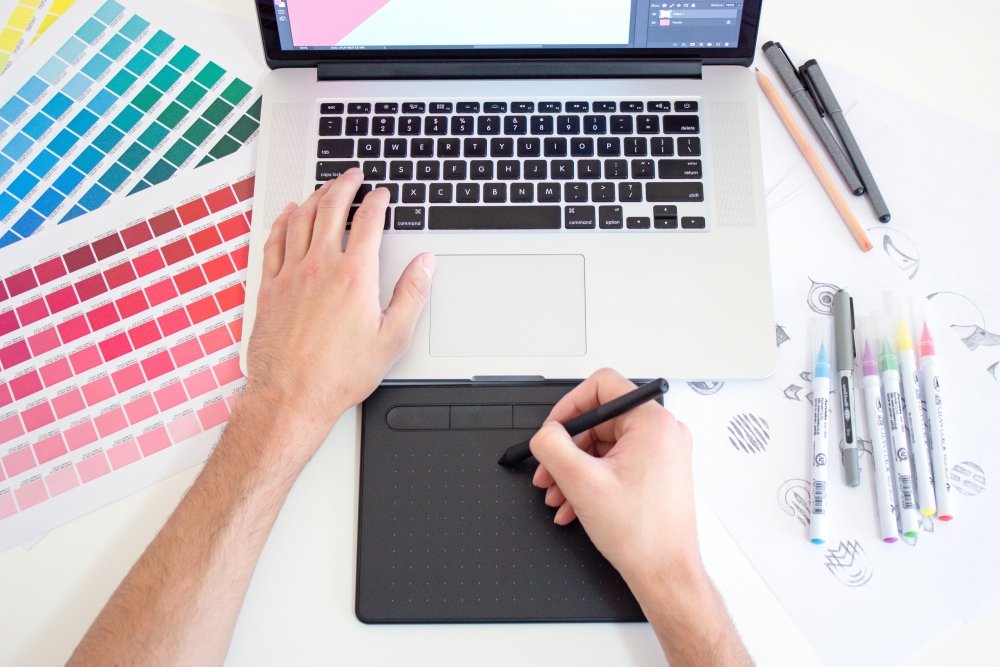
Sketch or brainstorm to help generate ideas
As an illustrator, Nathan Brown believes drawing is an essential skill, “If you convey your thoughts and ideas with pencil and paper (or pen and screen) you'll be ahead of your competition who might be relying solely on pre-existing resources.”
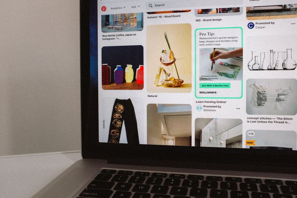
For designers who may not be as interested in illustrating or drawing, moodboards are useful because they allow you to draw inspiration from multiple sources and visualize your concept. They can help you organize your projects by theme and keep your vision on track. Many designers will pool together resources that inspire their color palettes, patterns, and brushes, giving them the perfect jumping-off point for their entire process, from start to finish. If you ever lose sight of your vision, it can be useful to go back to your moodboard for reference.
If you plan on working with clients, creating a moodboard early on can also save you time and make sure both you and your client are on the same page. Websites like Pinterest are the best way to create digital moodboards and find styles or images that best fit your aesthetic. If you already have graphic designers you admire, you can check to see if they have their own Pinterest boards, but if you’re feeling stuck feel free to browse those of existing designers such as Lisa Glanz and Addie Hanson to get a better idea of what you can put together.
Key takeaway: Whether your designs start with drawing or compiling a moodboard, the most important thing is to have a solid design process to work through.
Stay consistent in your designs
Staying consistent applies not only to how many times a week you work or how often you post on social media but also to your design style.
Jumping from one style to another can be jarring for your audience, so ensuring that your graphics have a similar look can make a huge difference. It can also help you build brand equity, meaning you will be more likely to win work in the future. If you do not yet have a style or feel like it is constantly evolving (like it does for many of the biggest designers), worry not, continue experimenting with what feels right to you.
And lastly… take shortcuts
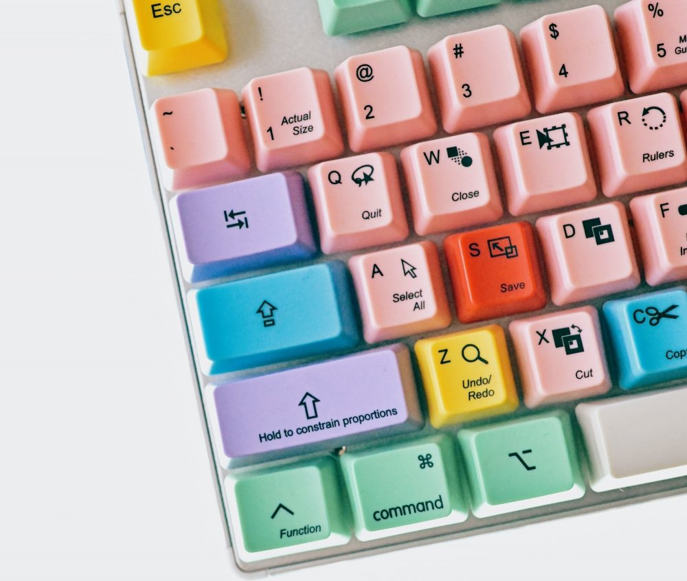
Work smarter, not harder! A good time-saving tip is to use mockups to present your work and another, highly recommended by Leslie Nicole, is to learn your keyboard shortcuts. “Learn to work swiftly and efficiently. This will not only make you a power designer, but you’ll also cut down on repetitive strain injury.” Working your way around software like Illustrator or Photoshop will significantly improve your workflow, giving you extra time to work on more important bits.
You might also like these articles:
Be the first to comment